GPT 5.6 Luna is prob the best UI design model now IMO
Half price of Gemini 3 pro, while more thoughtout layout design
Same prompt tested on @SuperDesignDev
"Design a running track app"
@Vichocavi@jasonzhou1993 Literally just prompt `Design a running track app` hah
We had some optimisation bake in on platform for prompt improvements already
I was testing some platforms to generate designs, and none of them managed to do anything really good. I looked at @stitchbygoogle , @OpenDesignHQ , tried generating with AIStudio, nothing.
The only one that saved me was SuperDesign. From the beginning, the platform tries to understand what you want and tries to reproduce it in the best way possible, even in the free tier. Thank you so much @SuperDesignDev , I love you guys!!!!!
Wow. I kid you not, I just generated this landing page in about 15 seconds with Gemma 4 31B on @cerebras
You can't tell me some of these smaller models aren't capable.
And let me just tell you, 1000+ tps is a whole different experience.
@1337hero@cerebras I just gave my github, told it I wanted to highlight my portfolio based on the number of stars that I got on different repos
Then I gave it a design prompt from @SuperDesignDev
I forget what it's called but you can see it if you go there
Fair feedback. The goal of this series is design prompts for vibe coders shipping fast - not architecture decisions. Column streaming vs polling is genuinely important but a different audience.
If you want a deep-dive on data table strategies, I can do that. What format would actually be useful to you?
@SuperDesignDev Low-value posts are everywhere. Pls, stop with these surface level topics
Let’s actually educate vibe coders on high-value parts. such as 'Table visualization' strategies. Column streaming versus polling.
Noob vibe coders need to know these instead of the surface level stuffs.
@BachelderDan@2492227862 100% agree - disabled fields with zero explanation are a UX crime. A tooltip saying "Available on Pro plan" or a doc link takes 5 minutes to add and saves users hours of confusion. Always over-explain the why.
@SuperDesignDev The disabled explanation is huge. I don't know how many times I have used a complex saas admin and there is a disabled field with no indication of why. That shit should always be over explained.. links to docs on the feature are always welcome.
@BachelderDan 100% - and the fix is so simple. A tooltip or helper text next to the disabled field explaining WHY it's disabled changes the whole experience. 'Available after email verification' beats a grayed-out mystery field every time.
@Kyriakos_Pelek@carno478 Both are solid - Lucide is lighter (better for React), Heroicons if you're already in a Tailwind stack. Pick one and never mix them in the same sidebar.
@sirshibaninja Exactly - users can't articulate why an app feels "off" but blank screens are quietly killing trust on every page load. The skeleton pattern removes that anxiety entirely.
@SuperDesignDev The blank screen of death is a classic UX killer. Adding even basic feedback makes a world of difference for keeping users from bouncing.
@SuperDesignDev Hey It would be great to have one around the CMS (Content Management System) section for a blog with a user-friendly interface to create, edit, and publish articles ;)
@elijahsystems@1649511182384914433 CMS design is a great one - rich text editor toolbar, article card layouts, publish/draft states, media upload empty state. Adding it to the queue 👍
@jinyibruceli@1705811898665689088 Exactly right. The constraint has to come before the generation. Most vibe coders prompt for features and wonder why the output looks generic - because they never told the AI what constraints to hold.
@SuperDesignDev the real problem is designers still reviewing ai output like it's a junior hire who needs coaching, not a pattern-matcher that needs constraints upfront.
garbage in. garbage out. just faster.
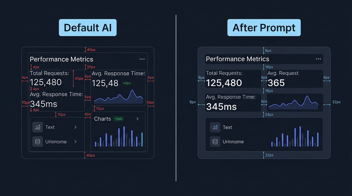
Your app's spacing screams AI-generated.
Default LLM: random margins everywhere. 4px here, 40px there, elements touching borders. No system, no rhythm.
Here's the prompt that gives your app a consistent spacing system:
@aniruddhadak@aniruddhadak nice - a portfolio with that kind of typographic discipline will stand out. most portfolios look AI-default. what stack are you building on?
@TomBuildsTech@TomBuildsTech you're right - the labels on the right image are inconsistent and that undercuts the point we're making about consistency. ironic, noted. fixing the image approach for future threads.
Its just that your images don't match the spacings you are trying to illustrate. E.g. 4px looks the same width as 40px on the before image and on the right image the right margin is randomly labelled as both 8px and 32px. Just don't think the image explains at all what you are trying to say.