Sabitlenmiş Tweet
Swift Half
1.2K posts


Swift Half
@SwiftHalfMag
Visit https://t.co/36hTsp7R42 to sign up for jaw-dropping news and nonsense, plus life-changing exclusives, offers and guides!
Brighton Katılım Ocak 2023
828 Takip Edilen901 Takipçiler
Swift Half retweetledi


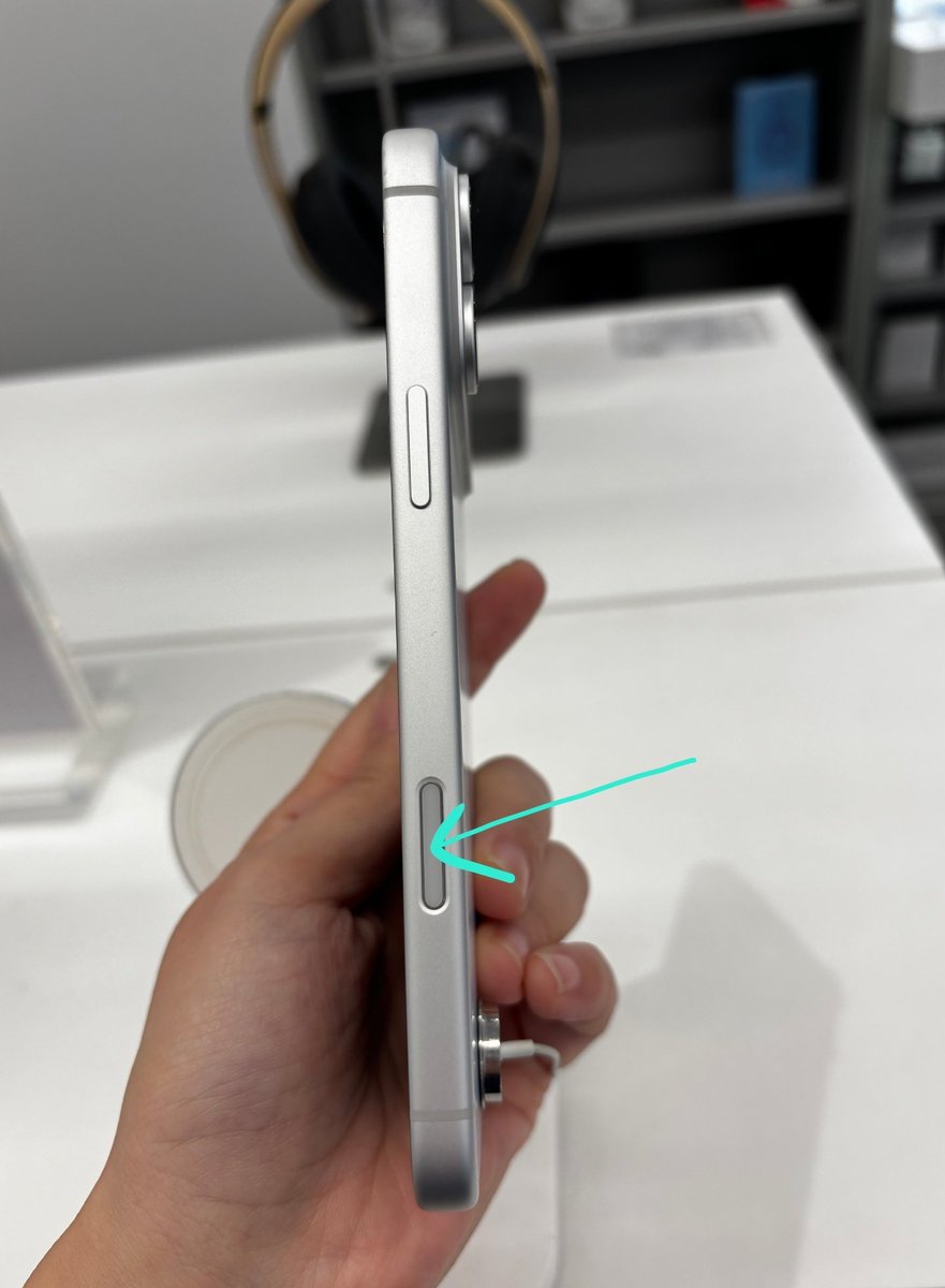
Not the innovation we asked for😅
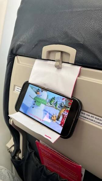
He used the airplane vomit polybag as a phone holder.
English
Swift Half retweetledi


I just vibe-coded a Google Maps Lead Gen Scraper in Claude Code that pulls hundreds of local business leads in minutes 🤯
Enter a keyword, city, & state → get back names, phone numbers, emails, websites, & reviews.
All inside Claude Code.
Perfect for agencies and lead gen operators who need a fresh prospecting list every week without burning $200/month on a scraper SaaS.
If you're still building lead lists by hand...
searching Google Maps,
clicking through listings one by one,
copy-pasting phone numbers into a spreadsheet for hours just to end up with a few hundred decent leads...
This scraper eliminates the entire loop:
→ Enter your keyword (plumber, dentist, realtor, etc.)
→ Pick your city and state
→ Set the number of results you want
→ Hit search and let Apify do the scraping
→ Save the leads you like to a bookmark list
No manual searching.
No copy-pasting into spreadsheets.
No $200/month lead gen tool.
What you get:
→ Full search results with complete business info
→ A bookmark feature to save your best leads
→ Search history to track every past scrape
→ Optional Replit hosting so your whole team can use it
Built 100% in Claude Code.
I recorded a full walkthrough showing exactly how I built this from scratch, plus all the prompts I used.
Want all the prompts so you can build it yourself?
> Like this post
> Comment "LEADS"
And I'll send it over (must be following so I can DM)
English

I just finished writing my most valuable PDF yet:
"$0 to $10K MRR in 14 days" (19 pages)
It's everything I wish I knew when starting out.
I might charge for this in the future, but for now…
Reply "MRR" and I’ll DM it to you for free (must follow)

English
I just built a complete SEO audit plugin in Claude Code that replaces your $200/mo Ahrefs subscription 🤯
One Claude Plugin audits any store: technical SEO, product schema, content, Core Web Vitals, and AI-search readiness.
Parallel agents, a 0-100 score, and a dashboard that renders right in the panel.
All inside Claude Code.
So I pointed it at Ridge .com, one of the sharpest DTC operators out there.
It came back 56/100, and what stood out wasn't a knock on them at all:
Ridge has a better AI-commerce setup than 99% of stores.
A real llms.txt, an agent-discovery sitemap, a live MCP endpoint, genuinely ahead of the curve.
And even on a store that dialed-in, the audit surfaced fixable gaps in ~90 seconds:
→ Room to add product structured data
→ A mobile Core Web Vitals score worth tightening
→ A thin meta description on a high-traffic collection
Perfect for e-comm operators and SEO agencies who are sick of paying $200/mo for tools that bury the real issues, running quarterly audits that take a week, and shipping reports nobody can act on.
So I put together the full playbook to build your own.
The complete guide to building this Plugin in Claude Code: branded to you, tuned to exactly how you audit, repeatable across every client.
The kind of audit you run in minutes and hand over as a deliverable that looks like it cost thousands.
What's inside:
→ The architecture (orchestrator + parallel sub-agents)
→ How to fetch any store past Cloudflare
→ The 0-100 scoring + falsifiable-findings framework
→ How to ship the HTML dashboard for client demos
→ The full build, start to finish
Want the playbook for free?
> Like this post
> Comment "SEO"
And I'll send it over (must be following so I can DM)
English
Claude vient de sortir les "Skills".
On en a créé 10 pour le SEO.
Voici comment transformer Claude en équipe SEO complète :
(sans code, sans clé API)
La plupart des gens utilisent l'IA pour le SEO comme un chatbot.
Tu poses une question, tu obtiens un conseil générique, tu copies-colles, tu recommences.
Le souci : ce conseil n'est pas basé sur TES données, et il ne fait pas le boulot à ta place.
Seul souci : La plupart des gens font encore leur SEO à l'ancienne, lentement, à la main.
Voilà ce qui se passe généralement :
→ Ils jonglent avec 5+ outils SEO qui ne communiquent pas entre eux
→ Ils paient 100€+/mois pour des dashboards qu'ils n'ouvrent presque jamais → Ils copient-collent entre ChatGPT, Search Console et des Google Sheets toute la journée
→ Ils obtiennent des "best practices" génériques qui marchent pour personne → Résultat : des heures de boulot inutile, zéro mouvement réel sur les positions
Ce n'est PAS comme ça que le SEO devrait marcher en 2026.
Les Claude Skills changent tout. Chaque skill est un expert SEO spécialisé qui lit tes vraies données et fait le boulot. Toi tu fais juste glisser, déposer, et demander.
Les 10 skills que tu reçois :
On-page & contenu :
→ meta-optimizer : réécrit les title tags + meta descriptions qui se font vraiment cliquer
→ internal-linker : trouve les pages orphelines et suggère des liens depuis ton contenu existant
→ content-gap : compare ta page au top 10 des SERP, te dit ce qui manque
→ schema-generator : génère un balisage schema valide pour n'importe quel type de page
→ cannibalization-finder : repère les pages qui se battent pour le même mot-clé
Technique & GSC :
→ gsc-auditor : récupère tes données Search Console, fait remonter les quick wins
→ ctr-booster : trouve les pages avec beaucoup d'impressions mais un faible CTR
→ robots-checker : détecte les problèmes d'indexation avant qu'ils te coûtent du trafic
→ keyword-clusterer : regroupe tes requêtes en clusters thématiques → backlink-analyzer : note ton profil de liens, repère les liens toxiques
Comment les utiliser :
→ Glisse le dossier que je t'envoie dans Claude
→ Connecte ta Google Search Console
→ Dis-lui ce dont tu as besoin
→ Il lit la skill, puis s'occupe de ton SEO
Pas de setup compliqué. Pas de clé API. Pas de code. Juste glisser, déposer, demander.
Ce que c'est : 10 experts SEO spécialisés qui tournent dans Claude, gratuitement.
Ce que c'est PAS : une énième liste de "meilleurs prompts ChatGPT pour le SEO".
-----
Tu veux les 10 skills ?
1. Follow moi
2. Commente "CLAUDE" en-dessous
3. Reposte ça

Français
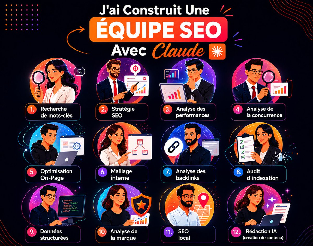
J'ai créé une squad SEO Claude de 12 agents spécialisés.
Je ne ferai plus jamais de SEO en solo.
La plupart des gens n'échouent pas en SEO par manque d'effort.
Ils échouent parce qu'ils n'ont pas de système.
Aujd, Claude peut faire tourner une équipe SEO complète pour toi. Stratège, rédacteur, auditeur technique, netlinker, tous qui bossent ensemble.
Si tu le setup correctement.
Seul souci :
La plupart des gens utilisent Claude complètement à côté de la plaque pour le SEO.
Voilà ce qui se passe généralement :
→ Ils balancent tout dans un seul gros prompt générique
→ La même conv gère le keyword research, le contenu ET l'audit technique (le contexte devient une bouillie)
→ Ils attendent de Claude qu'il "fasse du SEO" comme par magie sans lui donner de rôle clair
→ Ils donnent des instructions vagues et obtiennent du contenu vague et superficiel
→ Résultat : du contenu IA qui a l'air SEO-friendly mais qui ne ranke sur rien
Ce n'est PAS comme ça qu'on utilise Claude pour le SEO.
Le vrai déclic : tu divises le travail entre des agents spécialisés, chacun entraîné pour UN rôle précis.
Exactement comme une vraie agence SEO en interne.
C'est le système que j'ai construit. 12 agents qui bossent ensemble comme une vraie équipe SEO.
Je partage la squad entière :
→ Agent stratégie & positionnement SEO
→ Agent keyword research (qui ranke vraiment)
→ Agent analyse concurrentielle
→ Agent création de contenu (articles complets, pas des plans)
→ Agent optimisation on-page
→ Agent maillage interne
→ Agent backlinks & autorité
→ Agent indexation & SEO technique
→ Agent données structurées
→ Agent brand & SEO local
→ + 2 autres
Pas de blabla. Pas de prompts génériques. Chaque agent est focus, entraîné pour un seul rôle, et bosse avec les autres comme une vraie équipe SEO.
Ce que c'est : une équipe SEO complète plug-and-play que tu peux utiliser dès aujourd'hui.
Ce que c'est PAS : un énième thread "utilise ce prompt pour x10 ton SEO".
-----
Tu veux la squad complète ?
1. Follow-moi
2. Commente "SQUAD SEO" en-dessous
3. Reposte ça pour m'encourager à créer plus de guides gratuits
Français

@SwiftHalfMag @darrenrovell Because you need to have the right foot strike and running form for them to work efficiently, if you don't run like that and suddenly change you will very possibly injure yourself
English
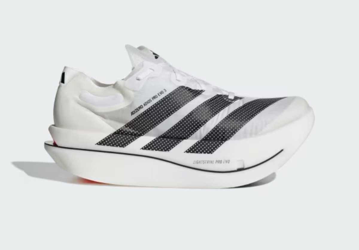
Adidas said the record breaking marathon shoe would be available for $500 on its app at 10am.
Wasn’t even available for 2 minutes.
English

PROMPT:
Build a premium electric vehicle landing page with a dark, cinematic aesthetic. The entire site uses a black background (hsl(0,0%,0%)) with light text (hsl(0,0%,95%) as primary) and orange accents (hsl(25,100%,50%)). No default fonts — keep it minimal and editorial. Use shadcn/ui design tokens. Here are the sections in order:
Design System (index.css)
--background: 0 0% 0%
--foreground: 0 0% 12% (used for dark elements like CTA button inner circles)
--primary: 0 0% 95% (near-white, used for all text)
--primary-foreground: 0 0% 12%
--accent-warm: 25 90% 55% (orange accent)
All section backgrounds are pure black hsl(0,0%,0%)
Section 1: Navbar
Fixed top, full-width, rounded-full pill shape
Transparent initially, on scroll: black bg with backdrop-blur-xl, border primary/10
Logo left: "Electric" with an orange dot "." — logo color changes from black to white on scroll
Nav links: Services, About, Team, Contact — hover has a scale-up rounded bg pill effect
CTA button right: "Get Started" with a rounded-full pill, contains an ArrowUpRight icon inside a circular foreground bg
CTA switches from black bg to white bg on scroll
Mobile: hamburger menu, opens a rounded dark overlay with links + CTA
Section 2: Hero
Full viewport height, video background (/videos/hero_bg.mp4, autoplay, loop, muted)
Large heading top-left: "Drive Beyond. / Unlock Pure Power" — white text, 78px on desktop
Below heading: "Learn more" link with arrow icon, bordered button (border-foreground), no fill
Section 3: Connected Systems (BigLinks)
Top half: Video background (/videos/biglinks_bg.mp4) with 60% black overlay
Left-aligned content: pill badge "Connected Systems", heading "Seamlessly Integrate / Every System", subtitle paragraph
12-column icon grid (4 cols mobile, 6 tablet, 12 desktop): each icon is 80x80px, rounded-xl, border white/10, bg white/5, backdrop-blur. Icons are orange with glow (drop-shadow-[0_0_8px_hsl(25,100%,50%)]). Icons: Gauge, Zap, Shield, Cog, Fuel, Navigation, Bluetooth, Wifi, Radio, Car, Wrench, Settings (from lucide-react)
"Explore All" rounded pill border button
Bottom half: 3 big full-width text links stacked vertically: "Find a dealer", "Fleet & lease", "Book a test drive" — each is huge text (110px desktop), with a ChevronRight icon right-aligned, separated by border-b border-primary/10, hover reduces opacity
Section 4: Services
Video background (/videos/services_card.mp4, autoplay, loop, muted)
Centered content: pill badge "Next-Gen Driving", heading "Design, build and perfect / every single detail"
Below: a glass-morphism card (max-w-2xl, centered, bg-primary/5 backdrop-blur-xl border-primary/10 rounded-2xl)Heading: "Effortless, All-Electric / Performance"
Paragraph describing adaptive tech
3 bullet points with orange Zap icons (with glow): "Full-spectrum torque & drivetrain control", "Personalised driving & comfort profiles", "Track range & plan routes easily"
Section 5: About
Black bg, left-aligned
Label: line + "About Us" text
Heading: "Why You Absolutely Should / Experience Our Electric Range" (last part in primary/50)
Below: two-column layoutLeft: 3 abstract shape images side by side (shape-1.png, shape-2.png, shape-3.png), each object-contain, 256px tall
Right: two paragraphs of body text in primary/70
Section 6: Audience (For Whom?)
Black bg, left-aligned
Label: line + "For Whom?"
Heading: "Who Should Experience / Our Electric Range" (second line in primary/50)
4-column grid of cards:First card: circular with a background image (audience-icon.png), aspect-square rounded-full border-primary/10
Other 3 cards: rounded-3xl bordered cards with lucide icons (Users, Gauge, Wrench) in primary/50, label text below
Bottom: rounded info bar with descriptive paragraph
Section 7: CTA
Black outer bg, inner rounded-2xl card with video bg (/videos/services_card.mp4) + 50% black overlay
Left-aligned content: heading "Experience the future / of driving today."
Subtitle: "Book your test drive — one click, instant access. / No commitment, pure electric."
Rounded-full CTA button: "Book a Test Drive" with ArrowUpRight in a circular foreground-colored badge, pill shape with bg-primary
Assets needed:
4 videos: hero_bg.mp4, biglinks_bg.mp4, services_card.mp4 (used twice: services + CTA)
3 abstract shape PNGs: shape-1.png, shape-2.png, shape-3.png
1 audience icon image: audience-icon.png
Use lucide-react for all icons
Key design patterns:
All section padding: px-7 py-16 md:px-12 lg:px-20 lg:py-24, max-w-7xl centered
Label pattern: h-px w-6 bg-primary/40 line + small text
Badge pattern: rounded-full pill with border primary/30, uppercase tracking-widest
CTA button pattern: rounded-full, bg-primary text-primary-foreground, with inner circular icon badge
Orange accent color used only for: logo dot, icon glows, specific highlights — always hsl(25,100%,50%) with optional drop-shadow glow
Here's the exact prompt to recreate this landing page:
PROMPT:
Build a premium electric vehicle landing page with a dark, cinematic aesthetic. The entire site uses a black background (hsl(0,0%,0%)) with light text (hsl(0,0%,95%) as primary) and orange accents (hsl(25,100%,50%)). No default fonts — keep it minimal and editorial. Use shadcn/ui design tokens. Here are the sections in order:
Design System (index.css)
--background: 0 0% 0%
--foreground: 0 0% 12% (used for dark elements like CTA button inner circles)
--primary: 0 0% 95% (near-white, used for all text)
--primary-foreground: 0 0% 12%
--accent-warm: 25 90% 55% (orange accent)
All section backgrounds are pure black hsl(0,0%,0%)
Section 1: Navbar
Fixed top, full-width, rounded-full pill shape
Transparent initially, on scroll: black bg with backdrop-blur-xl, border primary/10
Logo left: "Electric" with an orange dot "." — logo color changes from black to white on scroll
Nav links: Services, About, Team, Contact — hover has a scale-up rounded bg pill effect
CTA button right: "Get Started" with a rounded-full pill, contains an ArrowUpRight icon inside a circular foreground bg
CTA switches from black bg to white bg on scroll
Mobile: hamburger menu, opens a rounded dark overlay with links + CTA
Section 2: Hero
Full viewport height, video background (/videos/hero_bg.mp4, autoplay, loop, muted)
Large heading top-left: "Drive Beyond. / Unlock Pure Power" — white text, 78px on desktop
Below heading: "Learn more" link with arrow icon, bordered button (border-foreground), no fill
Section 3: Connected Systems (BigLinks)
Top half: Video background (/videos/biglinks_bg.mp4) with 60% black overlay
Left-aligned content: pill badge "Connected Systems", heading "Seamlessly Integrate / Every System", subtitle paragraph
12-column icon grid (4 cols mobile, 6 tablet, 12 desktop): each icon is 80x80px, rounded-xl, border white/10, bg white/5, backdrop-blur. Icons are orange with glow (drop-shadow-[0_0_8px_hsl(25,100%,50%)]). Icons: Gauge, Zap, Shield, Cog, Fuel, Navigation, Bluetooth, Wifi, Radio, Car, Wrench, Settings (from lucide-react)
"Explore All" rounded pill border button
Bottom half: 3 big full-width text links stacked vertically: "Find a dealer", "Fleet & lease", "Book a test drive" — each is huge text (110px desktop), with a ChevronRight icon right-aligned, separated by border-b border-primary/10, hover reduces opacity
Section 4: Services
Video background (/videos/services_card.mp4, autoplay, loop, muted)
Centered content: pill badge "Next-Gen Driving", heading "Design, build and perfect / every single detail"
Below: a glass-morphism card (max-w-2xl, centered, bg-primary/5 backdrop-blur-xl border-primary/10 rounded-2xl)Heading: "Effortless, All-Electric / Performance"
Paragraph describing adaptive tech
3 bullet points with orange Zap icons (with glow): "Full-spectrum torque & drivetrain control", "Personalised driving & comfort profiles", "Track range & plan routes easily"
Section 5: About
Black bg, left-aligned
Label: line + "About Us" text
Heading: "Why You Absolutely Should / Experience Our Electric Range" (last part in primary/50)
Below: two-column layoutLeft: 3 abstract shape images side by side (shape-1.png, shape-2.png, shape-3.png), each object-contain, 256px tall
Right: two paragraphs of body text in primary/70
Section 6: Audience (For Whom?)
Black bg, left-aligned
Label: line + "For Whom?"
Heading: "Who Should Experience / Our Electric Range" (second line in primary/50)
4-column grid of cards:First card: circular with a background image (audience-icon.png), aspect-square rounded-full border-primary/10
Other 3 cards: rounded-3xl bordered cards with lucide icons (Users, Gauge, Wrench) in primary/50, label text below
Bottom: rounded info bar with descriptive paragraph
Section 7: CTA
Black outer bg, inner rounded-2xl card with video bg (/videos/services_card.mp4) + 50% black overlay
Left-aligned content: heading "Experience the future / of driving today."
Subtitle: "Book your test drive — one click, instant access. / No commitment, pure electric."
Rounded-full CTA button: "Book a Test Drive" with ArrowUpRight in a circular foreground-colored badge, pill shape with bg-primary
Assets needed:
4 videos: hero_bg.mp4, biglinks_bg.mp4, services_card.mp4 (used twice: services + CTA)
3 abstract shape PNGs: shape-1.png, shape-2.png, shape-3.png
1 audience icon image: audience-icon.png
Use lucide-react for all icons
Key design patterns:
All section padding: px-7 py-16 md:px-12 lg:px-20 lg:py-24, max-w-7xl centered
Label pattern: h-px w-6 bg-primary/40 line + small text
Badge pattern: rounded-full pill with border primary/30, uppercase tracking-widest
CTA button pattern: rounded-full, bg-primary text-primary-foreground, with inner circular icon badge
Orange accent color used only for: logo dot, icon glows, specific highlights — always hsl(25,100%,50%) with optional drop-shadow glow
English
❤️🔥Gemini 3.1 just one-shotted this insane aniamted website
Prompt included ↓
English
@jhendy_10 Indeed, impeccable manners and having spent my life in hospitality I can tell you that good service is often a two way street. Be more like big John 👊🏻
English

You can tell a lot about someone by the way they speak to staff serving them
big john the boshfather@Johnfis08605918
Chinese in Dubai Marina ? Oh go on then. Bosh
English
@cosmicjester Went to see the amazing @MidlakeBand in Brighton and the times were printed everywhere. Midland started 1 minute late from the advertised time! No bullshit there. Spot on! Loved it.
English

Why can’t music venues just tell you the time the fucking band starts? I don’t want to go in 1 and a half hours early especially at a gig with no support
English
@UiSavior I’ve been looking for a replacement to Lottie for a while. Bit of a sting that Lottie force a years sub, so I’d rather use these guys for sure.
English

Spartan! 😂😂
Jeremy Vine & Daytime on 5@JeremyVineOn5
"You were a minister under Boris Johnson." "You had a landslide." "You could've done whatever Brexit you wanted, and you still fluffed it." @MarinaPurkiss says serving under Farage won't fix 'lies' and living standards. @andreajenkyns | @theJeremyVine | #JeremyVine
English
@kwharrison13 @srinireddy85 People who didn't even read the whole tweet! 😂
English

@srinireddy85 People who didn’t get the joke, for $200 Alex.
English
A friend of mine doesn't work in tech, has no background as an engineer or designer.
But heard about vibe coding and set out to investigate.
A few weeks later? He was generating $10M ARR.
A month in? $20M ARR!!
Just him. No employees or VCs.
What was his secret? Simple.
"I don't know what ARR is. But if I say a big number, a lot of people follow me on Twitter."
With that, he had uncovered the secret to success in tech. "Nobody checks."
Follow along for more tips.
English
@alphafox I used to work in France and theft was rife especially at the bottom of the hill. That was 20 years ago though. Luckily there seems a lot less these days.
English

@romaindewolff @UniverseIce You can permanently switch it off. I did this and its much better!
English

@UniverseIce it's actually annoying - I press it when I dont need to ...
English