
Aaquib Wani
1.1K posts

Aaquib Wani
@Waaquib
Spatial & Experiential Design Studio, Forbes 30u30


An overload of sponsor logos, inconsistency in designs, and sticking to two colours have made the IPL jerseys look functional and not iconic. Alan Jose John in conversation with Aaquib Wani on where IPL kits are losing their soul. Read in detail: intdy.in/pqo81u #IPL2026 #Cricket | @Waaquib @ALAN_JOSE_JOHN

I could not agree more. All of the jerseys need to be standardised. We had put in that rule. I wonder if it’s changed. Let me find the original guidelines and upload here


@64MohsinKamal (5/5) Look at TheHundred in🏴, fresh colours, bold identities, even the scorecards and graphics feel new. In IPL the system has been more conservative, so most teams stay within a safe, familiar template. Personal take, the shiny gold in IPL jerseys should be banned - its tacky!


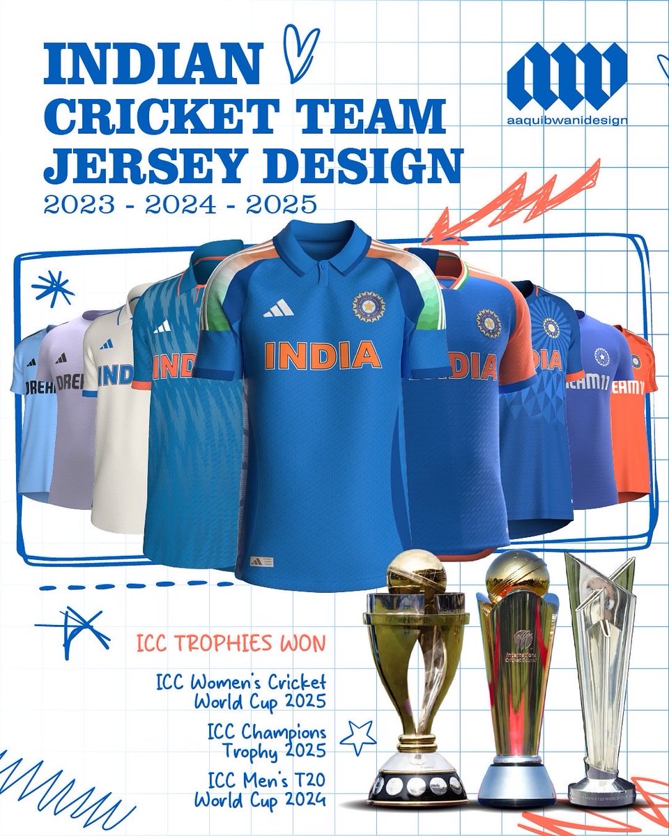
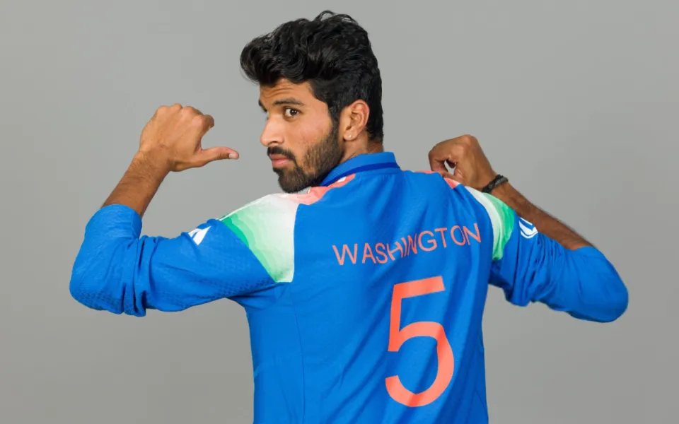
#IPL teams seem to have moved from a blue obsession to a red one. Strange how franchises still struggle to get jersey designs right. Talent isn’t the problem; creative freedom probably is. Maybe @Waaquib, who designed India’s current Adidas kit, can explain what really goes on.