Oscar Hache

2K posts

Oscar Hache

Oscar Hache

@_Os

La salsa de espaguetti con la receta secreta

Querétaro Katılım Nisan 2009
1K Takip Edilen190 Takipçiler
Oscar Hache retweetledi
ORBAT Mapper
ORBAT Mapper@orbatmapper·
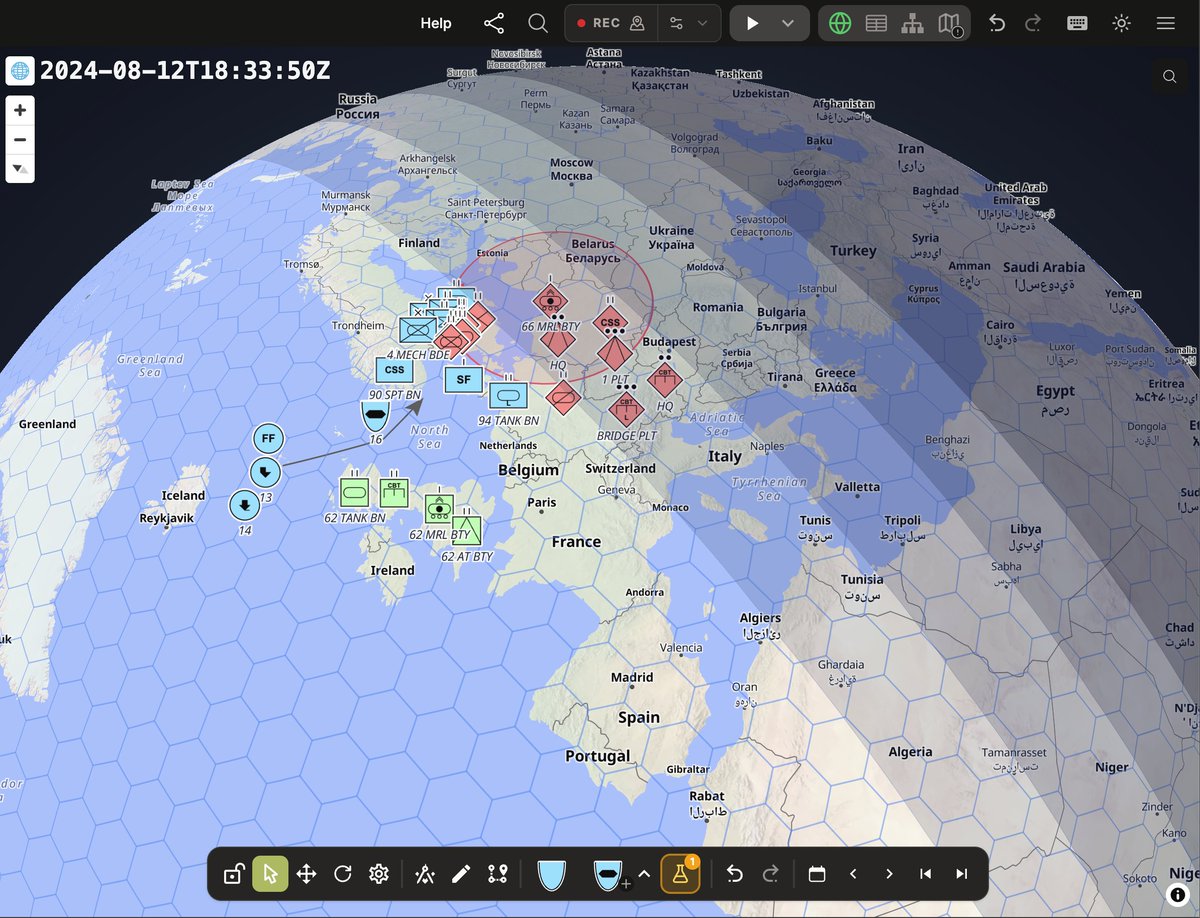
MapLibre is now the default map mode in ORBAT Mapper. KML rendering is still in progress, but most features from the original OpenLayers mode are now available.
ORBAT Mapper tweet media
English
3
26
395
20.8K
Oscar Hache retweetledi
Dr. Kohan🏛🏛🏛
Dr. Kohan🏛🏛🏛@kohantoys·
Para los estudiantes de arquitectura que anden buscando arboles para sus renders, pueden probar esta web; hay como 400 arboles con fondo transparente ordenados por temporada y por especie. Muchas especies incluso pueden visualizarse en verano y en invierno. Recomendable. meye.dk
Dr. Kohan🏛🏛🏛 tweet mediaDr. Kohan🏛🏛🏛 tweet mediaDr. Kohan🏛🏛🏛 tweet media
Español
20
468
3.6K
130.2K
Oscar Hache retweetledi
Dalson Figueiredo
Dalson Figueiredo@DalsonFigueired·
Resumo Este tutorial explica como usar o R para baixar dados históricos de precipitação, organizar essas informações, construir gráficos e gerar uma previsão de chuva usando modelos de séries temporais. O exemplo principal usa dados de Recife, mas a mesma lógica pode ser aplicada a qualquer município brasileiro, desde que se informe corretamente o código do município no IBGE. O script usa como base o pacote brclimr, que permite acessar dados climáticos para municípios brasileiros, incluindo estimativas de chuva, temperatura, umidade, entre outros. Além dele, usamos pacotes para manipulação de dados, gráficos e modelagem de séries temporais. O código original está estruturado em quatro etapas principais: instalação e carregamento dos pacotes, obtenção dos dados, organização e visualização da série histórica, e modelagem/previsão da chuva. youtu.be/jasSu4fiej0
YouTube video
YouTube
Português
1
7
27
2.1K
Oscar Hache retweetledi
rob.
rob.@robiartec·
Una herramienta open source que extrae cualquier negocio de Google Maps con una sola búsqueda. Nombre, teléfono, dirección, web, reseñas, horarios, todo en un CSV. El código está ahí, para cualquiera.
Español
8
37
417
18.3K
Oscar Hache retweetledi
Abraham John 🦄🦓
Abraham John 🦄🦓@Abmankendrick·
UI/UX Designers, this might be one of the cleanest color palette generators I’ve seen lately. Kigen is a color generator that helps you quickly create beautiful palettes for your UI projects, making it easier to pick colors that actually work well together instead of guessing. Bookmark it for later 💜
English
26
266
2.2K
112.3K
Oscar Hache retweetledi
Google Gemma
Google Gemma@googlegemma·
Curious what Gemma 4 can do in a local agentic setup? This notebook uses Haystack to walk through four practical demos: • A multimodal map/weather agent • Dynamic tool discovery via a GitHub MCP server • Visual Question Answering • RAG implementations
Google Gemma tweet media
English
27
82
995
54.1K
Oscar Hache retweetledi
Muhammad Rizwan Munawar
Muhammad Rizwan Munawar@muhammdrizwanmr·
Region + total in and out counting using @ultralytics YOLO26 😍 Here I am using the bar plot for every zone. I have simply integrated the region counting module with analytics (area plots). The process is very simple; you can store the region counts in the dictionary, and later you can call the bar plot function from ultralytics to draw graphs. #trafficanalysis #ai #MachineLearning
English
5
18
165
8.5K
Oscar Hache retweetledi
Mapbox
Mapbox@Mapbox·
Evaluate up to 1M geocoding requests for free. Mapbox processes billions of reverse geocoding requests every day — powering asset tracking and fleet management at scale. From shipments to vehicles to connected devices, turn raw location data into actionable insights. With support for forward and reverse geocoding, bulk or on-demand requests, and precision down to rooftop or building entrance level, Mapbox gives you the flexibility to build exactly what you need. Apply now to test with up to 1M free Geocoding API requests: mapbox.com/geocoding/eval… #BuiltWithMapbox #GeocodingAPI #Developers
Mapbox tweet media
English
1
2
56
3.6K
Oscar Hache retweetledi
Geek Lite
Geek Lite@QingQ77·
在终端里展示 NASA 开放数据的实时仪表盘,包括世界地图、事件追踪、ISS 位置、小行星、太空天气等。 github.com/irahulstomar/c… 基于 Textual 和 Rich 的终端仪表盘,将 NASA 多个开放 API 的数据集成到一个界面中。Braille 点阵世界地图实时绘制自然灾害事件(火灾、风暴、地震、火山、洪水),ISS 跟踪器用 TLE + SGP4 轨道计算每 30 秒更新位置,小行星追踪和撞击风险监测显示近地天体的近距离接近数据和 Palermo/Torino 评级,太空天气面板覆盖太阳耀斑和地磁风暴,还有每日天文图片和火流星事件。
Geek Lite tweet media
中文
0
4
18
1.5K
Oscar Hache retweetledi
ぴっかりん
ぴっかりん@ra0kley·
leafmapなどのPythonパッケージや、STACやNASA Earthdataのワークフロー、QGISプラグインなどをツールとして扱い、地理空間的な分析や可視化を行うAIエージェントを実現するのか 連休中に触っておきたいな github.com/opengeos/GeoAg…
日本語
1
20
143
5.2K
Oscar Hache retweetledi
Jarrett Walker
Jarrett Walker@humantransit·
The most complete map of public transit in Mexico City that has ever existed. This should be everywhere. Amazing work from @Clarion_Prjct ... Link in 1st reply 1/
Jarrett Walker tweet media
English
7
112
856
41.8K
Oscar Hache retweetledi
瀬尾研究室(東京科学大学)
タイのGPSプローブカーデータがオープンデータとして公開されたので,さっそくWeb GISで可視化するシステムを作ってみました.JICA/JSTのタイ国際研究プロジェクトの一環です
日本語
1
45
224
16.2K
Oscar Hache retweetledi
nm
nm@forestgeoinfo·
新作のQGISプラグインです。Open-MeteoとウェザーニューズのAPIを使いました。 ↓ 気温・風・雨・花粉飛散を時系列解析できるデータを出力するプラグインを開発 forestgeo.info/2026/04/29/%e6…
nm tweet media
日本語
0
30
161
22.7K
Oscar Hache retweetledi
Rafael H. M. Pereira 🚡 Urban Demographics
📢If you use #geobr to access spatial data of Brazil in #rstats, we'll be upgrading to v2.0.0 in a few weeks This version includes: - a few breaking changes💔 - several data fixes + updates🔨 - new data sets!💕 - integration with gearrow⏩ Please test the dev version, see below👇
Rafael H. M. Pereira 🚡 Urban Demographics tweet mediaRafael H. M. Pereira 🚡 Urban Demographics tweet media
English
10
74
413
19.5K
Oscar Hache retweetledi
ぴっかりん
ぴっかりん@ra0kley·
Sentinel HubやNASA Earthdataから使いたいデータを検索、取得、処理して、機械学習に対応した地球観測データセットを作成するPythonライブラリなんてあったんだ terrastackai.github.io/terrakit/
日本語
0
21
134
7.6K
Oscar Hache retweetledi
Yohan
Yohan@yohaniddawela·
Urban planning models just crossed 90% accuracy using free map data anyone can edit. A new paper builds a single deep learning pipeline that turns OpenStreetMap into a full urban intelligence system. Land use, buildings, traffic, and air quality all predicted together, not separately.  Most studies treat these as isolated problems. One model for land use. Another for traffic. Another for pollution. This one connects them. The system fuses three data layers: • OpenStreetMap for structure • Satellite imagery for surface detail • Environmental and demographic data for context  Then assigns each task a specialised model: • CNNs for land use • U-Net for building footprints • LSTMs for traffic • Hybrid models for air quality  Each model solves its own problem. The pipeline ties them into one view of the city. The results are pretty strong: • Land use classification: 91.6% accuracy • Building detection: 94.0% accuracy • Traffic prediction error: 3.6 vehicles per hour • Air quality prediction error: 2.3 µg/m³  These sit at the upper end of current GeoAI benchmarks. The improvement comes from integration. OpenStreetMap gives topology. Satellite data gives physical signals. Environmental data gives dynamics. Each fills gaps in the others. That reduces ambiguity where models usually struggle. Mixed-use zones. Dense urban cores. Noisy or incomplete maps. The system learns a more complete representation of the city. The workflow is quite simple: 1.Collect multi-source data 2.Align and standardise it 3.Train task-specific models 4.Combine outputs into urban indicators  Raw geodata in. Policy-relevant outputs out. The implications are practical. Traffic models identify congestion hotspots. Land use maps reveal missing green space. Building extraction supports infrastructure planning. Air quality forecasts guide mitigation.  All from largely open data. The constraint is compute. Training requires GPUs and careful preprocessing. Smaller cities may struggle to deploy this directly. Data quality also matters. OpenStreetMap varies by location. Even so, the direction is clear. Urban planning is shifting from static GIS layers to integrated, predictive systems. One pipeline. Multiple urban signals. Continuous updates. Cities are becoming modelled environments, not just mapped ones.Urban planning models just crossed 90% accuracy using map data that anyone can edit. A new paper builds a single deep learning pipeline that turns OpenStreetMap into a full urban intelligence system, predicting land use, buildings, traffic, and air quality together rather than treating them as separate problems.  Most existing work fragments the city into isolated tasks. One model classifies land use. Another extracts buildings. A third forecasts traffic. This paper links them into a single system. The key idea is simple. Combine three types of data that each see the city differently: • OpenStreetMap provides structure such as roads, buildings, and land use • Satellite imagery captures physical and spectral detail • Environmental and demographic data add temporal and social context  Each task is then handled by a model suited to its structure. CNNs for land use, U-Net for building footprints, LSTMs for traffic, and hybrid models for air quality. The novelty is that all outputs are combined into one coherent view of the city rather than analysed in isolation. The performance is strong across the board. Land use classification reaches 91.6% accuracy. Building detection hits 94.0%. Traffic prediction errors fall to 3.6 vehicles per hour, and air quality prediction to 2.3 µg/m³.  These results sit at the upper end of current GeoAI benchmarks, and the reason is not a single model improvement. It is the interaction between data sources. OpenStreetMap encodes topology but misses detail. Satellite imagery captures detail but struggles with semantics. Environmental data adds dynamics but lacks spatial structure. When combined, each compensates for the others, reducing ambiguity in dense or mixed-use areas where models typically fail. The workflow follows a clear pipeline. Multi-source data is collected, aligned, and standardised. Task-specific models are trained. Their outputs are then fused into multi-dimensional urban indicators that describe structure, function, mobility, and environment together.  This produces something closer to a live model of the city rather than a static map. The implications are practical. Traffic forecasts identify congestion hotspots. Land use maps reveal gaps in green space. Building extraction supports infrastructure planning. Air quality predictions guide mitigation strategies.  All of this is built largely on open data.
Yohan tweet media
English
6
24
160
14.5K
Oscar Hache retweetledi
Google Maps Platform
Google Maps Platform@GMapsPlatform·
Get ready to map a smarter future with BigQuery and Google Earth AI models and datasets and harness AI for planetary understanding → goo.gle/4mWFdwz 👁️ Street View Insights is generally available to draw on a vast repository of images and turn them into actionable infrastructure insights. LiDAR data will be available in the coming weeks to provide precise measurements of infrastructure. 🛰️ Imagery is expanding soon to include Aerial and Satellite Insights. When combined with Street View Insights, it provides multi-perspective view of infrastructure including aerial, satellite, and Street View imagery. 🔎 Aerial and Satellite Models are now in Experimental within Model Garden to build custom applications on any high-res aerial or satellite imagery source. 🧑‍🤝‍🧑 Population Dynamics Insights is available in Preview to help organizations decode the complex relationship between human behavior and the physical world. 🛣️ Roads Management Insights in Preview helps to better understand traffic flow, road closures, and more so authorities and fleets can better plan and react with improved information. 🌞 Solar dataset is now available in BigQuery to provides high-res, building-level data on solar potential and existing arrays to help providers accelerate renewable energy adoption and optimize planning. 🌄 New environment datasets including Air Quality, Pollen, and Weather in experimental enable you to unlock insights through hyper-local historical data, seamlessly integrated into BigQuery. Learn more at the link above about how these datasets can work together to uncover patterns and help organizations to proactively manage outcomes.
Google Maps Platform tweet mediaGoogle Maps Platform tweet mediaGoogle Maps Platform tweet mediaGoogle Maps Platform tweet media
English
0
32
162
8.5K