

B
1.2K posts
B
@bartbak_
I design buttons for a living @beeper / Automattic
Zürich, Switzerland Katılım Şubat 2011
354 Takip Edilen160 Takipçiler


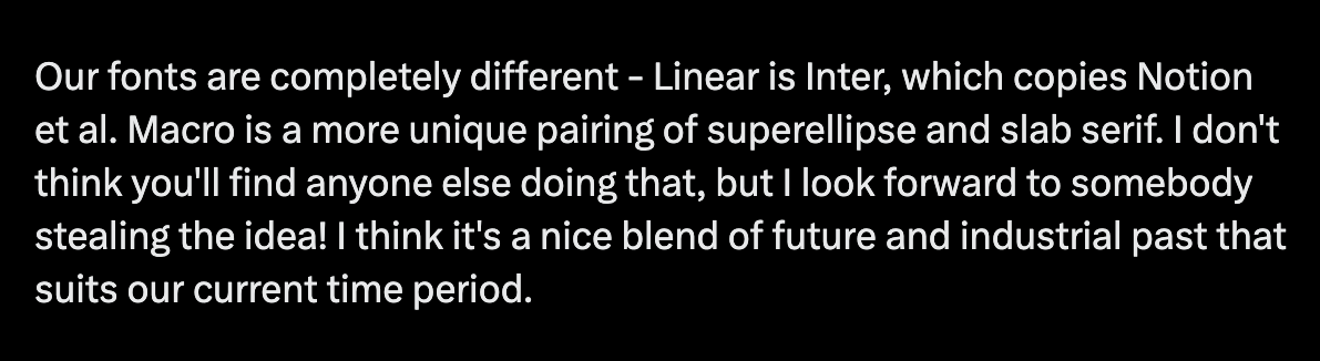
My favourite part of having my own designs explained back to me by the CEO of a competing company that had copied them (but changed the fonts, colours, generally made things worse, etc...) was the idea that one day someone might copy the type pairing of Roboto Slab and Rajdhani.
English

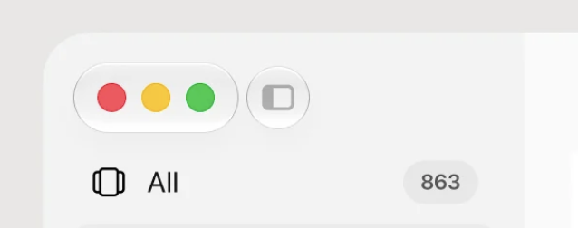


I like this new milky frosted navigation. Took a bit of layer stacking to get it right but it feels good now.
English
@DavidePacilio @framer Joking, those days it feels like all logos are just variations of the same :)
English


Built this tiny tool in @framer to quickly generate logo placeholders.
Used to spend way too much time creating these in Figma.
English

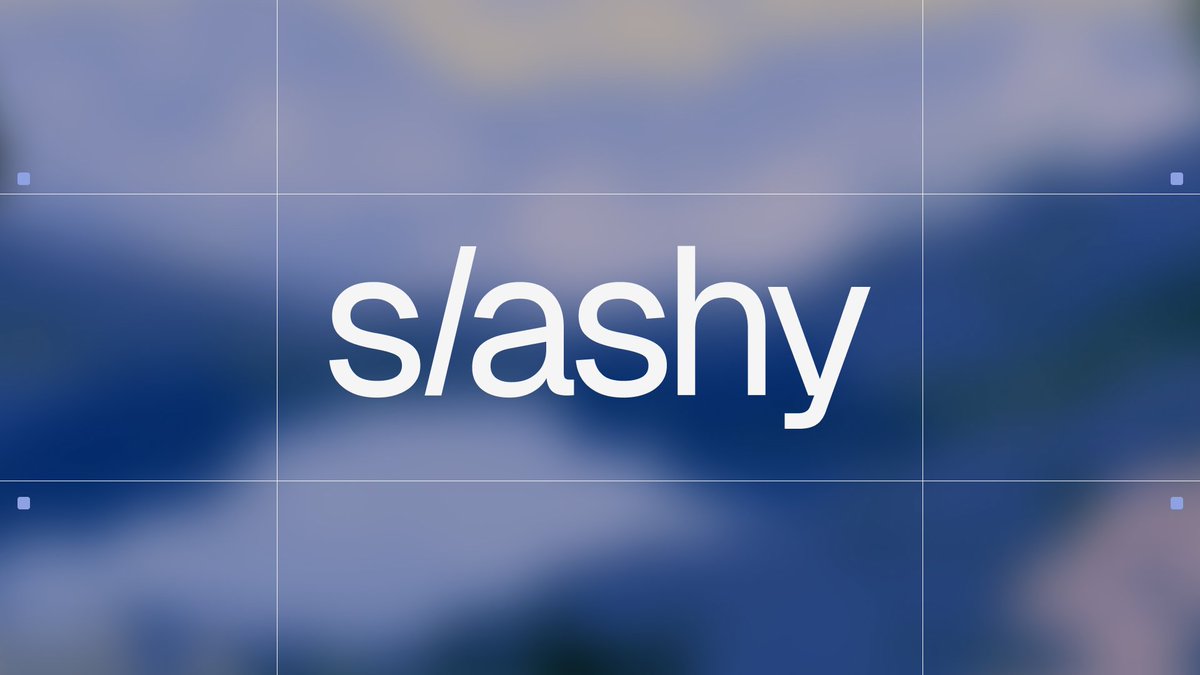
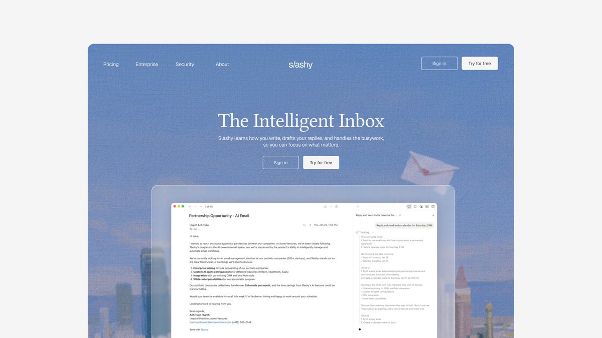
worked on slashy's new branding 💌
super excited for the next generation of email. @slashyemail has made my inbox so much easier, check it out !


Harsha from Slashy@GaddipatiHarsha
changed our logo today. spent two years telling myself branding didn't matter because the product did. turns out both are true. it just took me a while to admit the second one. new slashy. same obsession.
English
@nonzeroexitcode Too disturbing? Imo they look much better when you don't blur them. You have a well balanced set of icons and type.
English

this effect can be achieved using only css by combining the :has() and :not() pseudo-classes:
`.menu:has(.item:hover) .item:not(:hover) {
filter: blur(8px);
}`
which simply means:
when a menu has a hovered item, blur every item inside it that isn't being hovered
English

we're designing one of the best apps you probably use
is this design clean?


rico@_heyrico
i just love clean design
English

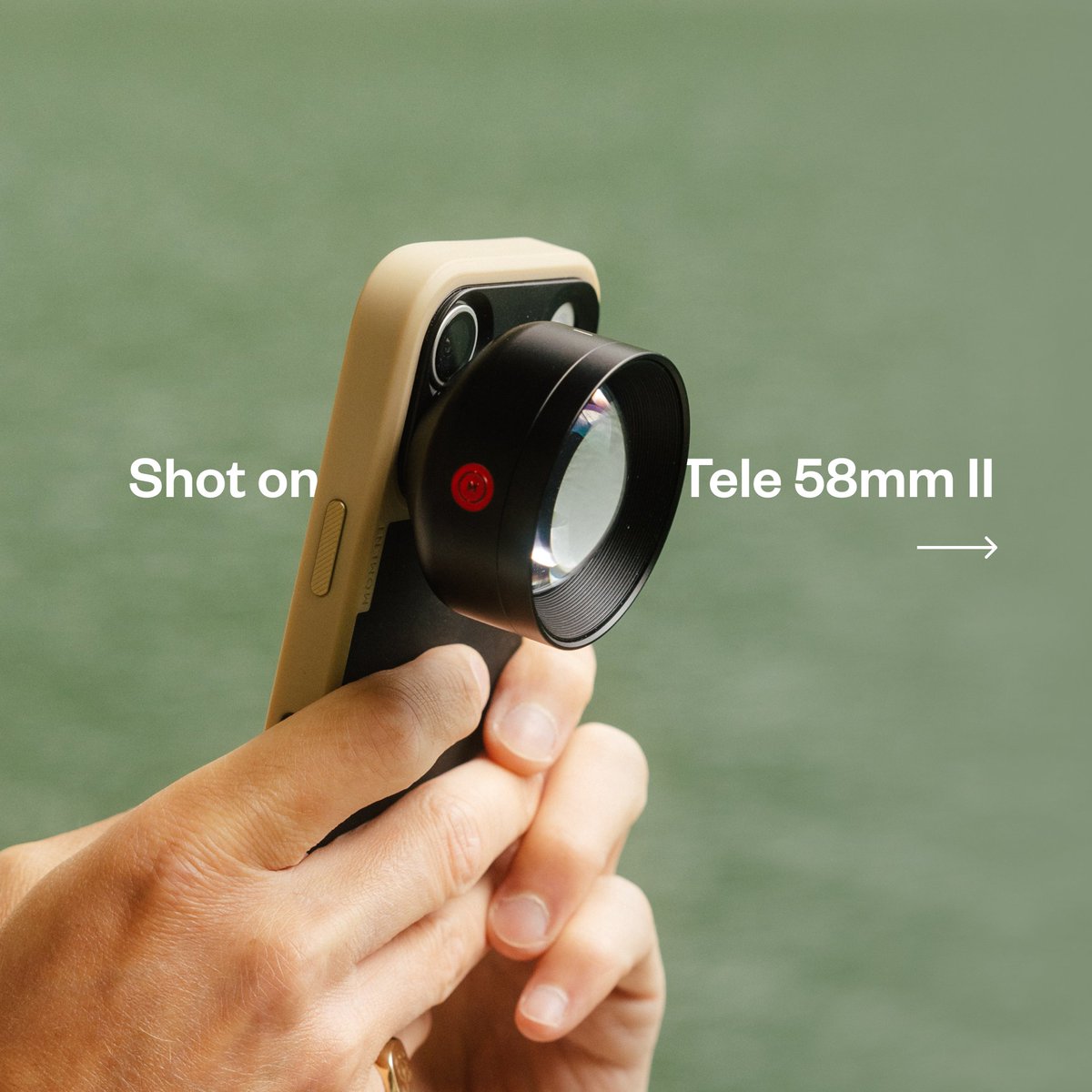
The bestselling mobile lens just got even better!
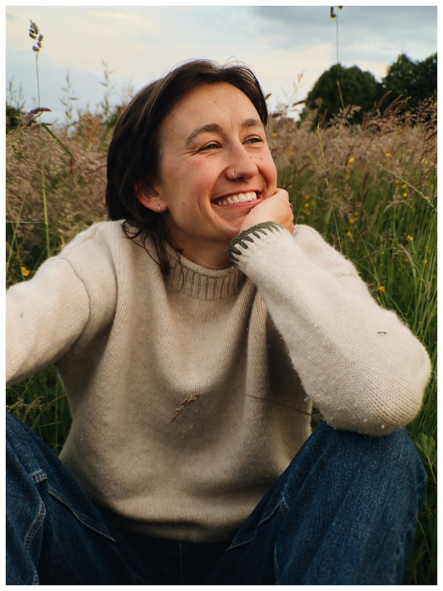
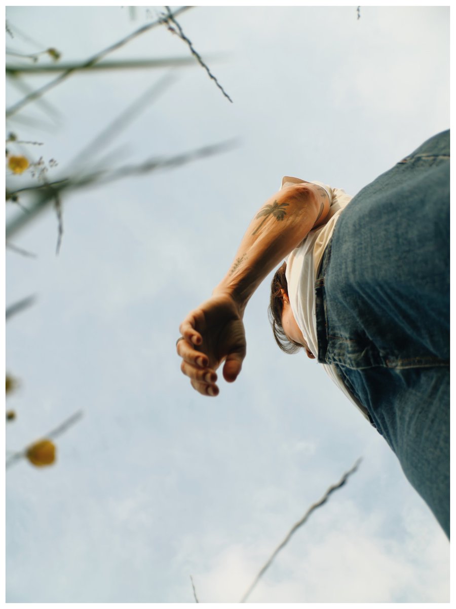
Meet the Tele 58mm II. Redesigned with 30% more glass, it delivers sharper images, smoother background blur, and the classic portrait look photographers have loved for decades.
📸@amslebrun

English
Product design cheatsheet, bookmark this:
- Font: SF Pro, regular and medium
- Font size: 12px, 13px (base size), 14px, 16px, 18px, and 24px (the biggest)
- Colors: subtle (7F7F7F), default (5D5D5D), strong (292929), bg-selected (F5F5F5), border (F2F2F2)
- Icon: @nucleoicons with 1px width
What else do I miss?
rico@_heyrico
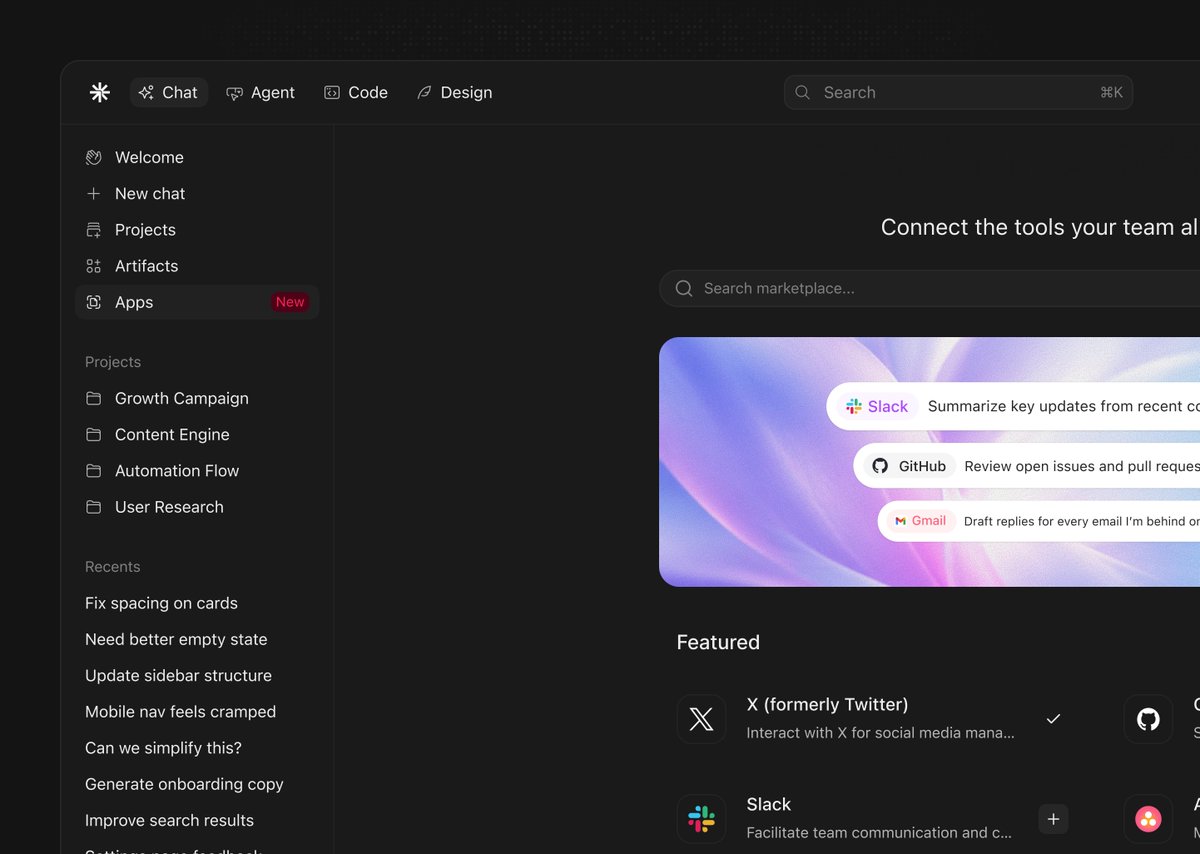
Dark mode product design ✨ Is this a clean design?
Français
B retweetledi

B retweetledi
