
Data Science retweetledi

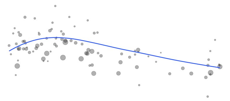
I've just explored the brand-new tidyplots package in R, and it’s impressive how effortlessly it enables you to create beautiful, publication-ready plots. Designed with scientific papers in mind, tidyplots lets you build, adjust, and refine plot components gradually, all with a consistent and intuitive syntax that takes the complexity out of visualization.
✔️ Simple Syntax: Tidyplots offers user-friendly functions for creating polished visuals with minimal coding, saving you time and effort.
✔️ Consistent Style: Achieve a cohesive look across all visuals, eliminating the need for repetitive adjustments.
✔️ Flexible Customization: Easily customize colors, labels, and themes to align with your project’s goals, resulting in professional and engaging data displays.
✔️ Enhanced Data Storytelling: Built for clarity, tidyplots helps you convey insights effectively, making your data stand out.
The example visualizations shown here were created by the package author, Jan Broder Engler, and are featured on the tidyplots website: jbengler.github.io/tidyplots/
#rstats #dataviz #tidyverse

English