Sabitlenmiş Tweet
Eve Bigaj
385 posts


Eve Bigaj
@evebigaj
Jack of all trades starting with p: painting, programming, Polish poetry, (previously) philosophy
Katılım Temmuz 2020
89 Takip Edilen82 Takipçiler


@hypatia_mc Also, there's currently a show about those last paintings that I really want to go to! theartnewspaper.com/2023/05/09/van…
English
@hypatia_mc Intriguing! Just glancing at my dataset (I have data for months in addition to years), it looks like his paintings might have gotten less colorful for the first months after moving to the mental hospital, then sprung back up for the following months.
English

@mecbordel (Of course, the darkness of the paintings could in turn be an effect of aging / lack of restoration!)
English
@mecbordel FWIW, I think the lightness trend is, if anything, *stronger* in reality. Here are some 1884-85 paintings in consistent lighting - they look darker than in my dataset, which makes me suspect that the lights in the darker photos are generally keyed up for legibility.
English
@mecbordel I think the "brilliance" part of the analysis is the most vulnerable to this worry, since I'm looking at *maximum* (e.g.) blueness, which is a brittle measure - but I'm pretty confident in the result that overall, chroma (colorfulness) rose between 1885 and 1888.
English
Also, if you’re interested in *why* Van Gogh changed his palette, I once wrote a much more personal and qualitative essay about that evebigaj.medium.com/everything-but… (DM me if you’re out of free Medium articles and would like a paywall removing link)
English
Thanks to Madeleine Filloux for ten weeks of generous mentorship, @yurivish for patient help with an ancestor of this project, and Camen Piho for methodological advice (=letting me steal his idea). All errors are 100% mine; all paintings below are (chronologically) Van Gogh's.
English
@BevilConway Intriguing! Is the thought in (1) that late Van Gogh painted things as they are remembered more than as they are seen?
English

How did Van Gogh’s palette evolve? This is a neat analysis. Two things strike me: 1. Saturation is linked w/ memory effects (the mind makes things more vivid). VG gets more saturated over time. 2. The analysis suggests selective fading of red—so the color balance has changed.
Eve Bigaj@evebigaj
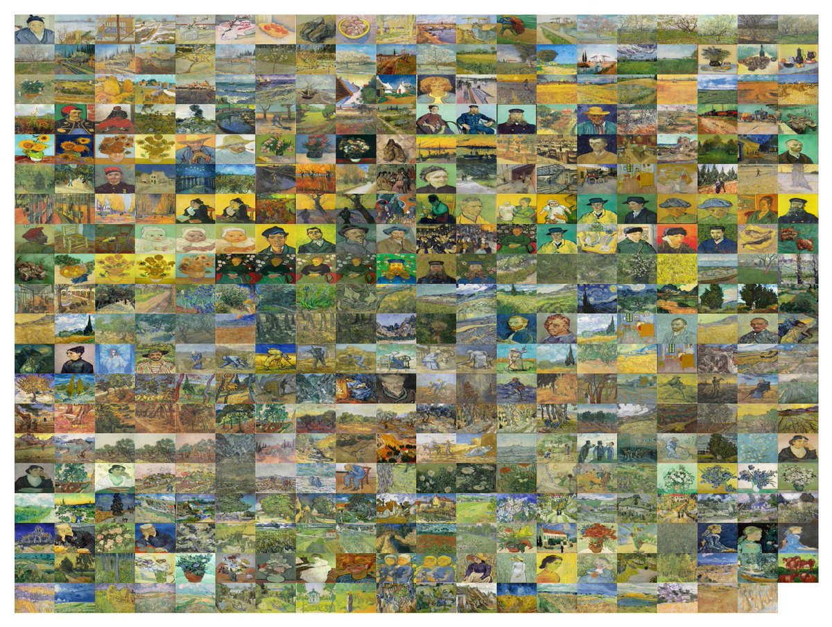
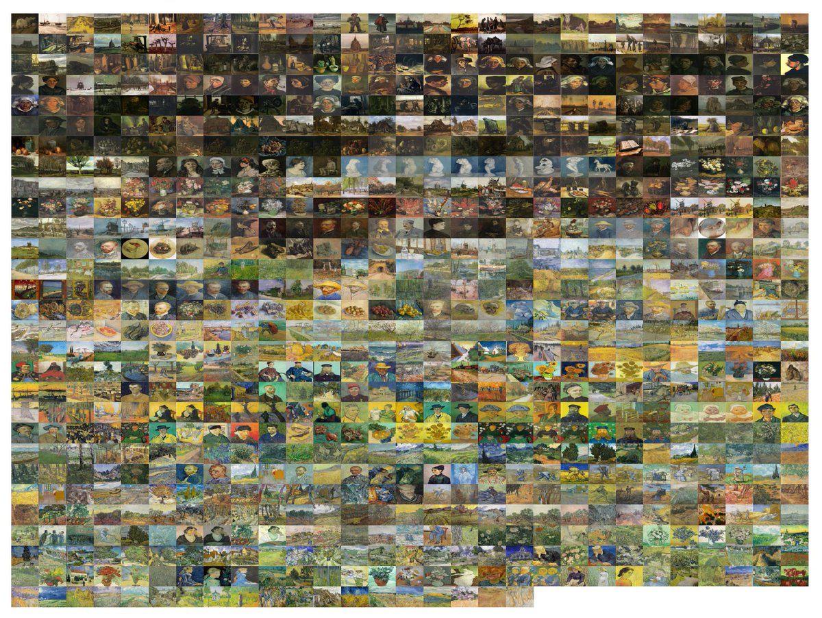
When Van Gogh started painting, he made the artworks on the left. Fewer than three years later, at the end of his life, he was making the works on the right. This is a thread about his journey through color space.
English

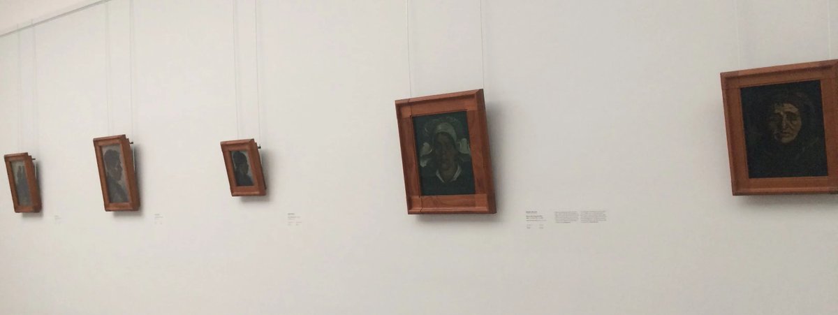
@Ferrum_of_omega @shotanat Yeah! That’s when he painted the Potato Eaters and a bunch of portraits of peasants in dark interiors. It was a very conscious decision to realistically depict poorly lit interiors, and probably also to capture the metaphorical darkness of those settings
English

English
@StructBioinfo Also, what’s a good place to start to get into Indian art?
English
@StructBioinfo Next in my queue is Monet (he had cataracts late in life so it’d be cool to see how that affected his palette) and maybe an overview of western art history (expecting big jumps when more intense pigments got available/affordable) I’ll add your suggestions to the queue :)
English

I want to see this for all artists, would love the color transitions of their work. Renoir, Picasso, Dali, etc. Also, old masters of Indian art.
Eve Bigaj@evebigaj
When Van Gogh started painting, he made the artworks on the left. Fewer than three years later, at the end of his life, he was making the works on the right. This is a thread about his journey through color space.
English
@DBriggs60 @DataVizSociety Thank you - and it seemed only right, since I couldn’t have done it without your course! I actually came across oklab halfway through the project and was kicking myself for not using it - definitely planning an oklab version eventually
English

@evebigaj @DataVizSociety This is a fascinating project and the Lab plots and 3D visualizations are beautiful. And it's very thoughtful of you to mention my course - thank you! If you're doing more of this, keep an eye out for Bjorn Ottosson's oklab, a newer space that's closer to Munsell than Lab is.
English
@DBriggs60 I hear you! It’s really maximum chroma (for a given image) though, which makes it a mouthful, and I wanted a term that someone with no prior color space knowledge would have some intuitive grasp of… I’d definitely call it something more precise for a specialized audience.
English
@evebigaj "Brilliance" is pretty much taken by Ralph Evans though, even though it's not a CIE standard term yet. How about "LAB chroma"?
English
@DBriggs60 That’s a great suggestion - I should be able to figure out how to do that!
English
@evebigaj Follow the link, everyone! I don't know if it's possible but it would be good to show the limits of the RGB gamut of your photos, to show where the paint colours might be "clipped" (as in the red and orange colours here).
English