
Jayden Qin
53 posts

Jayden Qin
@jaydenqin_
I build landing pages for SaaS businesses | Web designer & dev
Katılım Mayıs 2025
26 Takip Edilen3 Takipçiler

@AlfiFromToasty Light one for sure. Orange and white looks better
English

Which version do you prefer
Dark or Light mode?


English


@prathamdesigns Purple one looks good. Orange is nice, but I think purple suits the content more.
English


3 free icon packs that I use:
- Heroicons
heroicons.com
- Streamline icons
streamlinehq.com
- Feather icons
feathericons.com
English


Nobody:
Tech twitter every 3days:
“Designers are cooked”
“Figma is dead”
“Startups and clients won’t need designer anymore”
“I’ve stopped using Figma since I discovered Claude design”
(Someone who’s probably not a designer)
English
@adeebrq Personally I think the light background suits the image more
English

@jaydenqin_ Solid pick, anything particular you dint like about dark mode?
English

@rondeleonid I like the first one. I've seen the same layout in the second one way too many times.
English

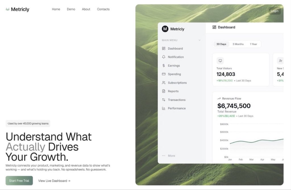
Exploring a new style with two new hero sections
Which one do you like more?

English
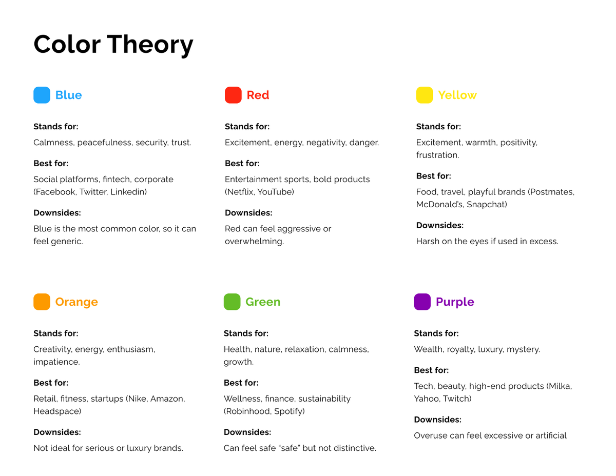
If you ever struggle with colors as a web designer, here's a quick overview:
Blue: builds trust and familiarity
Red: grabs attention instantly
Yellow: very visible and feels optimistic
Orange: encourages action and excitement
Green: growth and positivity
Purple: shows luxury
English
@erfnbshiri The bottom one with a scrollable video or some sort of motion would be cool
English


@VadimCarazan It's sad to see people placing text over an AI generated image and calling it "design".
The designs look aesthetically pleasing, but the AI images/videos usually don't have any purpose.
English

every brand is dropping mysterious AI-generated scenes on their site. cinematic. atmospheric. completely irrelevant to who they are.
English


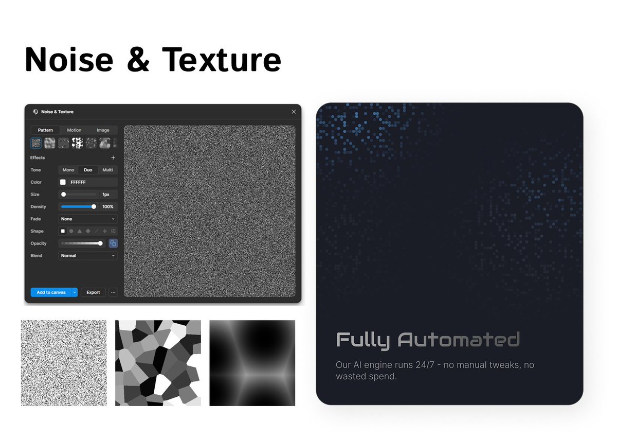
4. Noise & Texture
Flat colours can make your UI feel lifeless.
This plugin adds subtle grain and texture to your designs.
English
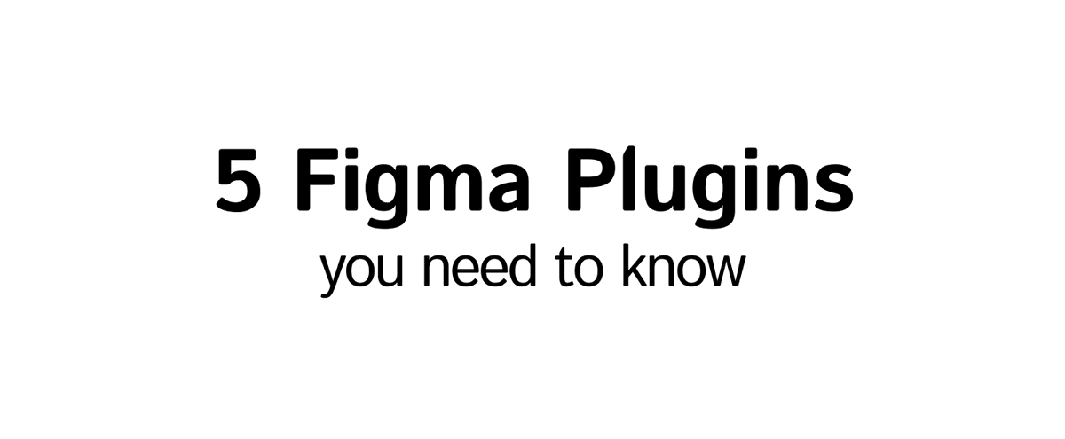
I've gathered a list of 5 Figma plugins you might find useful for your designs:
English