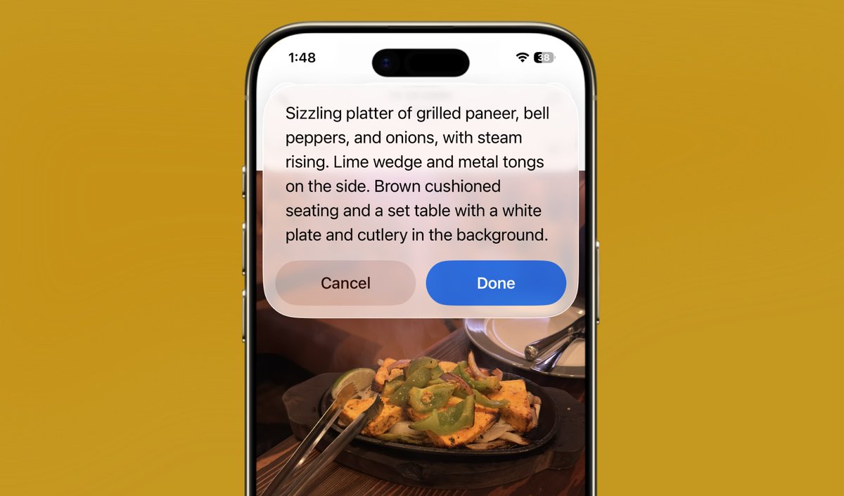
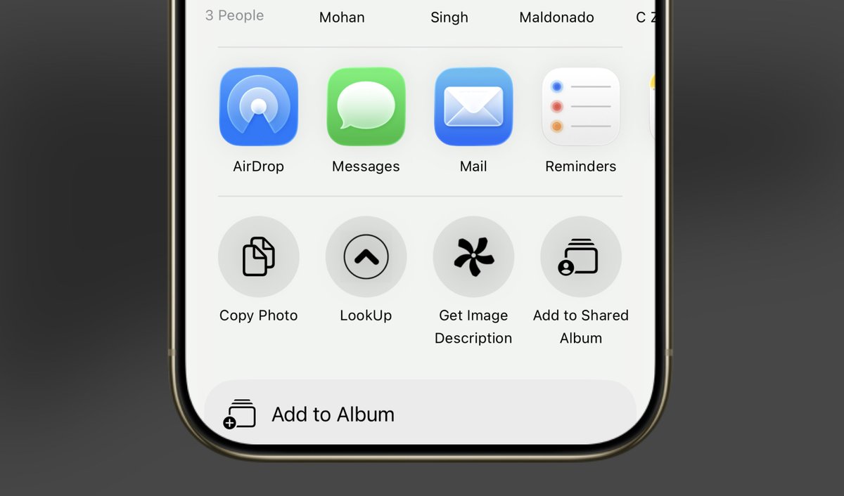
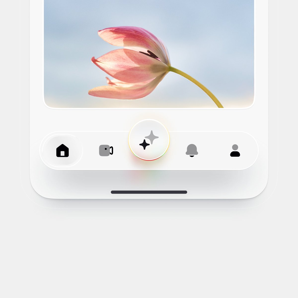
Wrapping up Shiuli and releasing it soon.
Shiuli is the simples alt-text generation tool you'll find.
Coming soon to iOS.
Test here: testflight.apple.com/join/A5Q17RYp
The battle of the browsers.
As a mac user I always get back to Safari, a true browser. The rest are just Chrome skins.
We need something more than a side chat.
Just found out I was one of the winners of the @contra#shareyourwork challenge!! I've been meaning to get all my work onto Contra for a while - definitely going to be a very active user from now on. Thanks Contra!
x.com/SebCornelius/s…
@_Akash_Kundu_ A killer feature is great for getting exposure and customers early. But it is important that - at the same time - the overall experience will make customers stay with your product.
when you’re building a product,
should one killer feature make it stand out or should the entire experience feel connected and remarkable?
what do you think?
#buildinpublic#startuplife#productdesign
Just got rejected by a dream client.
Growth requires loss – and sometimes, it looks like doors closing you really wanted to walk through.
But every level of growth asks you to let go of old identities, habits, and even people.
Mourn the loss. Then move forward.
Recently, I was working on the Select component for @hero_ui native. It’s simple to use, highly customizable - and honestly, I’m really happy with how it turned out.
Here’s why 👇
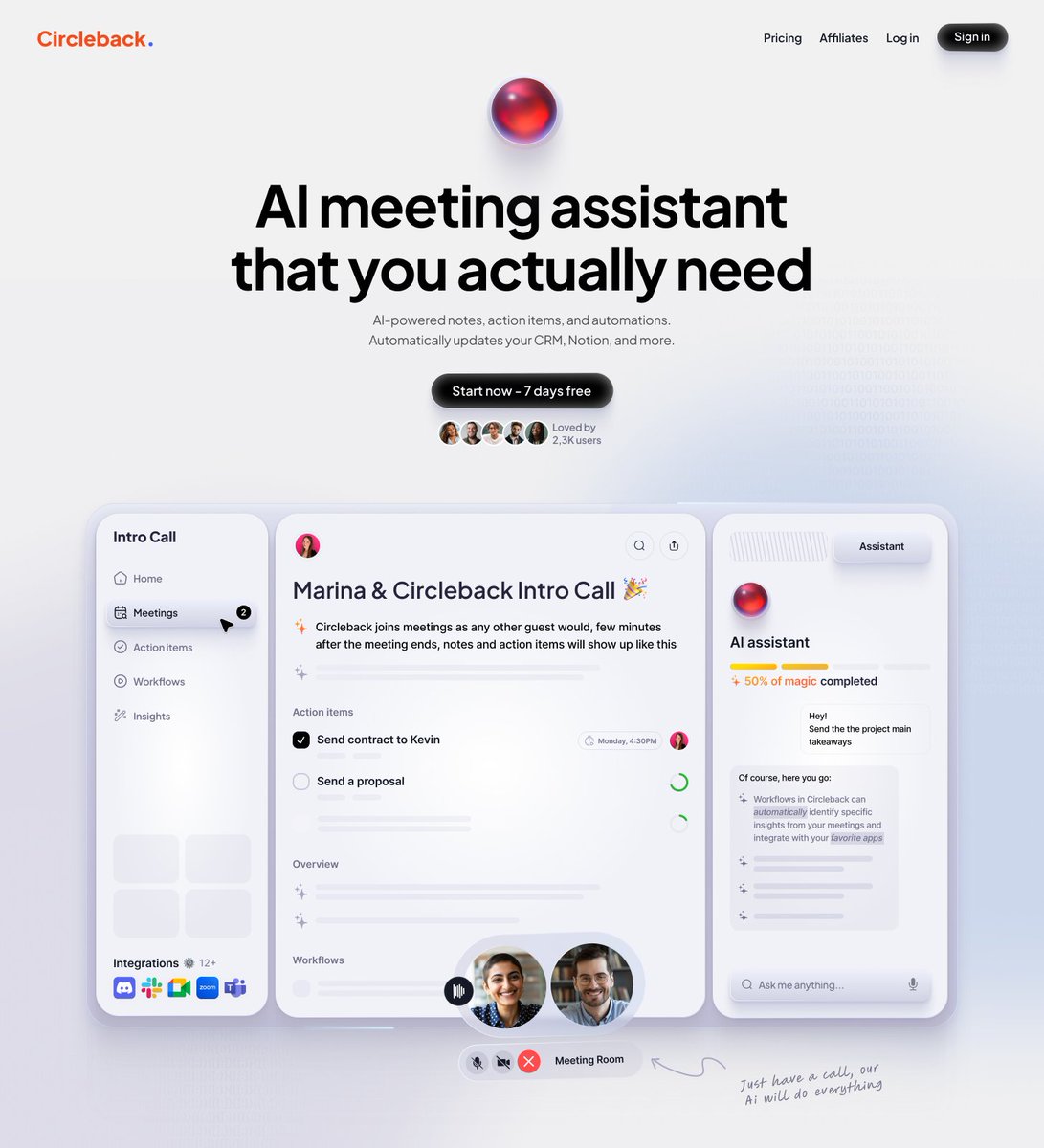
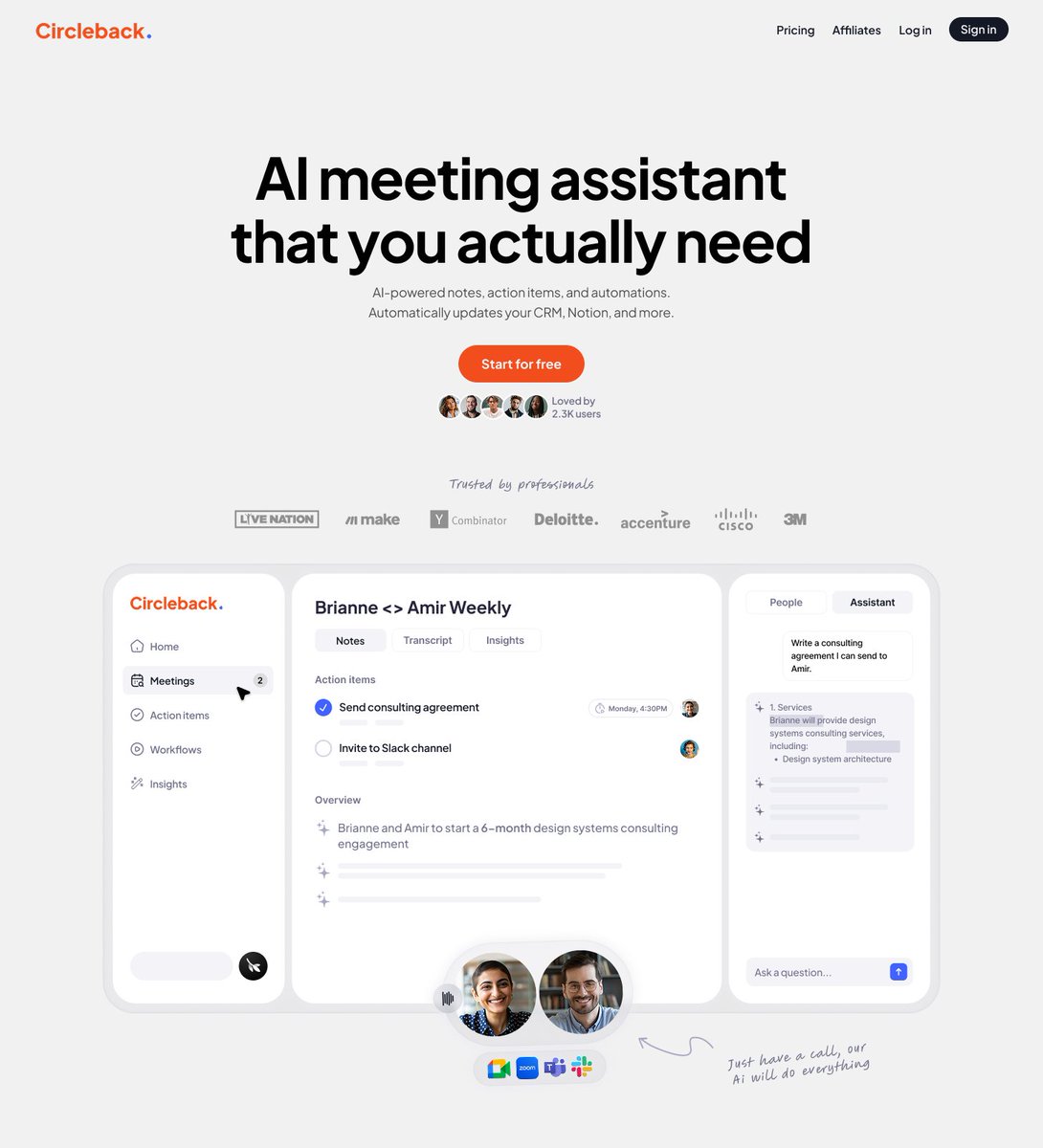
@marina_uiux@framer Love the effort in style 1 (left), but style 2 (right) just feels way easier on the eyes. Clean and not too much all at once. Nicely done!