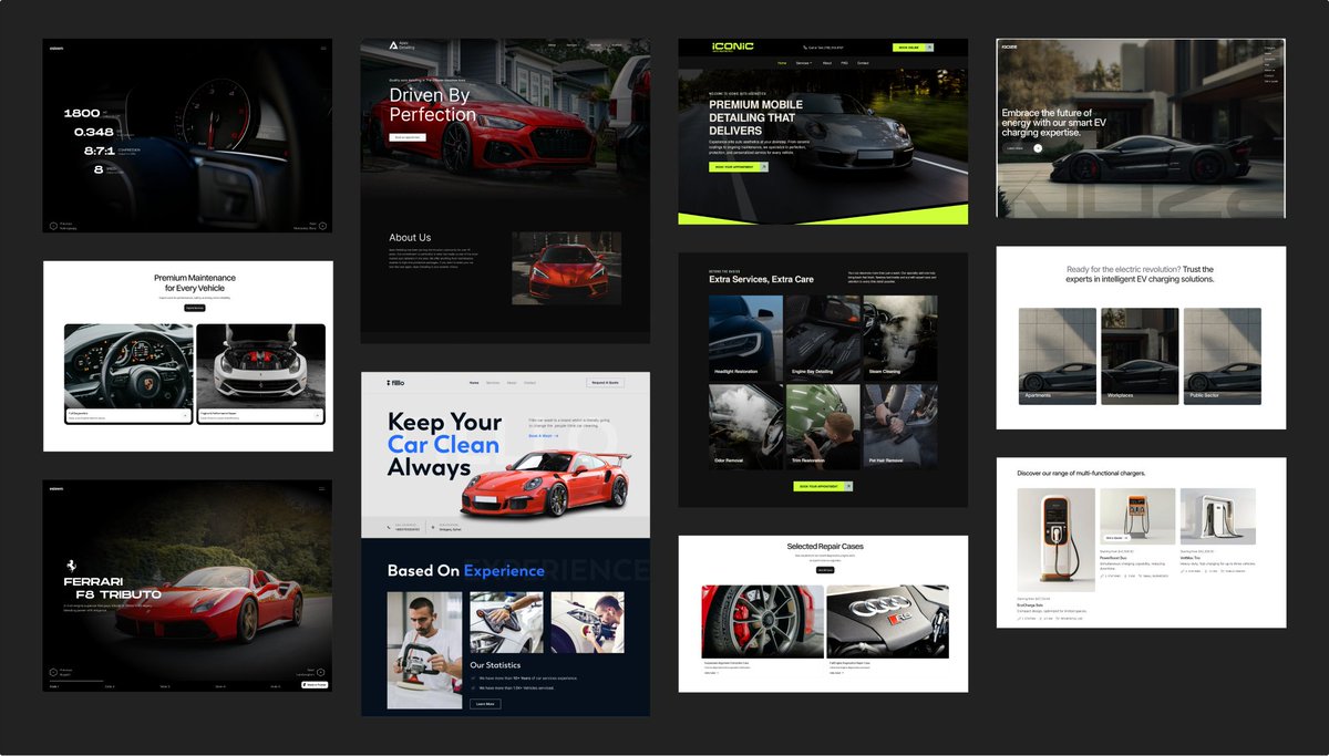
Sabitlenmiş Tweet
Patryk Baranowski
1.4K posts

Patryk Baranowski
@pat_baranowski
Growth-driven creative partner for tech companies | Design & Webflow trusted by 50+ startups | Founder of https://t.co/a4os1DRVpI
Book a call → Katılım Mayıs 2019
166 Takip Edilen740 Takipçiler

A fast website and a well-designed website are two different things.
Site speed is a technical metric. But the experience of loading - how elements appear, how content settles, whether things jump around - is a design problem.
Users don't measure milliseconds. They measure whether a site feels sharp and confident or hesitant and unfinished.
If your site loads fast but still feels slow, the problem isn't your host or your code - it's how the page is built to present itself.
English

I've worked with a company that raised $18M after a full rebrand and site redesign.
I've seen conversion rates improve over 40% after a redesign that fixed structure, not just aesthetics.
The website is rarely treated as the growth lever it actually is, until it becomes the obvious thing holding everything else back.
A weak website doesn't just hurt conversions. It undermines every other investment you're making.
English

To all fellow designers - do you also see so many websites with URL structure problems?
Almost every client I work with has this problem before we touch a single design file. No hierarchy, no parent-child relationships, no clear logic between pages.
That's why I started working on the SEO strategy even before the design kick-off.
Are you seeing the same thing?
English

Had a blast working on this one!
Car-related projects hit different when you're actually into cars - but what made this one satisfying was the structure underneath the design.
Clear call to actions at every decision point. No dead ends, no confusion about what to do next.
Good design isn't just how it looks. It's how well it moves people through.


English

Hot take: Social proof placed at the bottom of your homepage is almost useless.
Most visitors never get there.
When I redesign homepage layouts, reviews and credibility signals move up.
The section order of your homepage is a persuasion sequence. Every element should be earning the next click - not just existing on the page.
English

After migrating 25+ sites from WordPress to Webflow I see a clear pattern.
"Launch fast" often costs startups six months of SEO recovery.
Most companies find out the hard way.
The team is excited to go live. The new site looks sharper. Then three months later, organic traffic is down, rankings shifted, and nobody knows why.
The answer is almost always the same.
URL structure changed without redirects. Heading hierarchy was redesigned without considering what was ranking. Page templates were consolidated in ways that stripped out keyword-relevant content.
Speed matters. But launching fast without a clear migration strategy isn't speed, it's technical debt with a launch date attached.
English

@pat_baranowski Always joy when you have real assets to work.
English

Loved working on this website not only because I love cars but also:
1. The team had a large library of real photography instead of stock.
2. Visual consistency was intentional, not accidental.
3. The brand already reflected something specific about who they are and who they serve.
Good inputs lead to great outputs. When a client comes prepared, the work shows it.

English

@BenjaminUIX The overall direction looks great!
But I feel like the headshots should be a bit more visible (less effect added)
English

@yourmazdalover @MazdaUSA And you'd pick it up over G wagon?
English

@uialexk Depending on what are the brand guidelines. Are they using sharp edges or rounded?
Hard to say without this information but in general V1 looks much sharper and nicer
English

@rahulluthra22 That's why it's called revenue, and not monthly recurring profit.
I wonder what tools do you use that cost you 7k month??
English

Document processing animation for SaaS Legal AI Startup
Patryk Baranowski@pat_baranowski
One more animation. No AI was used to create those
English

A website that frustrates your internal team will eventually frustrate your customers too.
It starts internally.
→ Editing a page requires a developer.
→A new landing page takes two weeks.
→The marketing team works around the site instead of with it.
Then the cracks show externally. Pages that haven't been updated in months. Campaign traffic sent to generic pages because no one had bandwidth to build proper ones.
The fastest-growing companies I work with treat their website as an internal tool first.
The marketing team stops waiting on developers and starts executing.
That's what a well-built site actually delivers - not just good design.
English

Your B2B sales are taking a long time?
B2B sales cycles are long and go through multiple stakeholders. A clear "what we do" page isn't a nice-to-have - it's a sales tool.
It does the explaining before anyone picks up the phone, so every stakeholder who lands on it can make an informed decision without waiting for a demo.
Here's a scroll-through of my client's core product page - built to clearly explain what the platform does and why it matters.
English

@uxkosta It's awesome! So different from their competitors. Every law tech website feels the same..
English


