
Ib
218 posts
Ib
@pushnowornever
Leave the world a better place then you found it.
Seattle, WA Katılım Mart 2020
33 Takip Edilen29 Takipçiler

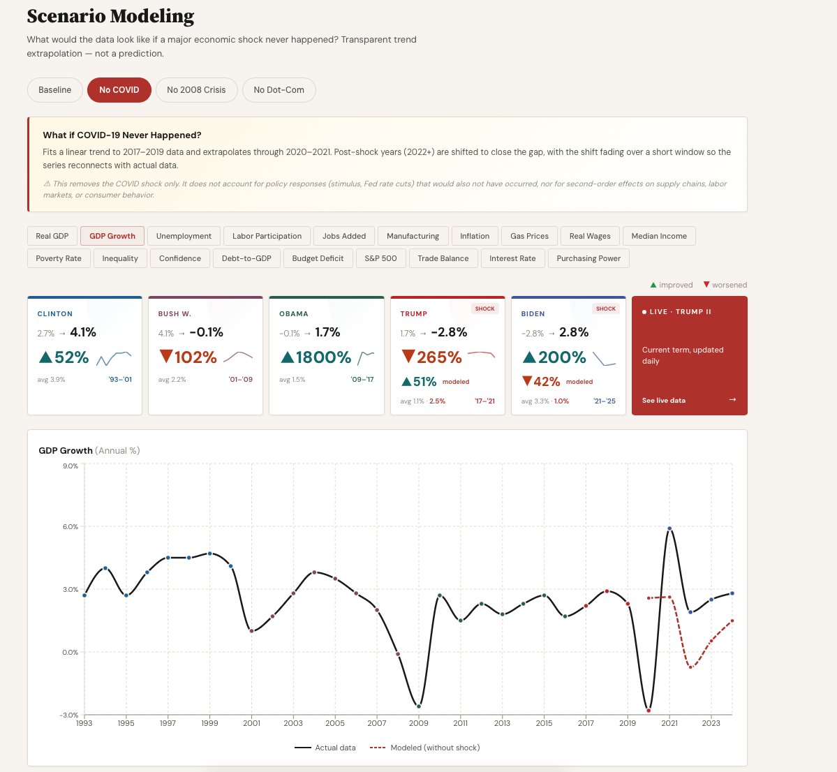
@PeterDennis7 We fit an ordinary least-squares (OLS) linear regression on the pre-shock years, then project that line forward through the shock window.
English


Do you know how I know without getting too much into detail that you are not using fair methodology? You are not excluding effects of COVID if you look at all the numbers prior to covid you will get a very different picture also the bounce back for Biden had to do with that also so if you compared pre covid levels to Biden economy you would get different comparison so no you are not neutral or objective just using probably AI for propaganda
English

@ibrahimlari7 Claude Dashboard... so tired of seeing these dashboards.
English

@YoungGennifer Hey! Thanks for the feedback. We've actually already added a Scenarios tab where you can remove crises like COVID and see what the data would have looked like otherwise.
English

@ibrahimlari7 Think Covid might have had anything to do with this?? 🙄
English
@DanOinOside Hey! Thanks for the feedback. We've actually already added a Scenarios tab where you can remove crises like COVID and see what the data would have looked like otherwise.


English

@ibrahimlari7 Extremely useless chart........only one had a global pandemic and performance until then should be noted.
English
@PeterDennis7 Hey! Thanks for the feedback. We've actually already added a Scenarios tab where you can remove crises like COVID and see what the data would have looked like otherwise.


English
@ibrahimlari7 Without removing 9/11 and Covid these are meaningless stats
English


@ibrahimlari7 But it is biased because it doesn't take into effect everything from bidens term is a rebound from trumps actions and covid returning back to normal from a dead stop. Its ridiculous
English
@_Sand_Angel_ Hey! Thanks for the feedback. We've actually already added a Scenarios tab where you can remove crises like COVID and see what the data would have looked like otherwise.


English

@ibrahimlari7 Covid was a pretty big factor in Trumps first term numbers. Because it was rather unprecedented, that probably 'should' be notated.
English
@MichaelASerio2 Thanks for the feedback! Could you explain what parts were confusing? Was it the % signs? Was it the UI/Ux on mobile / pc? Would love to hear your feedback when you get a chance to take a deeper look!
English

@ibrahimlari7 I haven't studied this and at first glance found it very confusing. Will bookmark for later. However, there is a Wikipedia page that does the same thing for a much longer period and is easy to follow.
en.wikipedia.org/wiki/U.S._econ…
English

@ibrahimlari7 Loving the Claude UI entirely vibe coded aesthetic
English


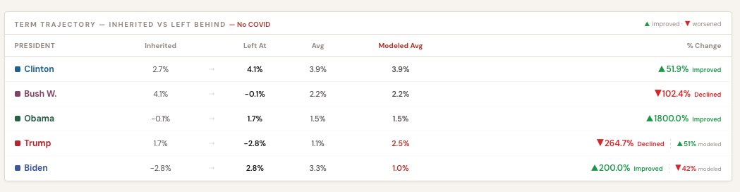
We hear the Feedback! Introducing ‘Scenario Modeling’ Tab where you can view data and take out certain major crisis like Covid and the model will estimate what would have been otherwise. Again, the goal is transparency and data driven insight. Thanks for your attention to this matter!
English
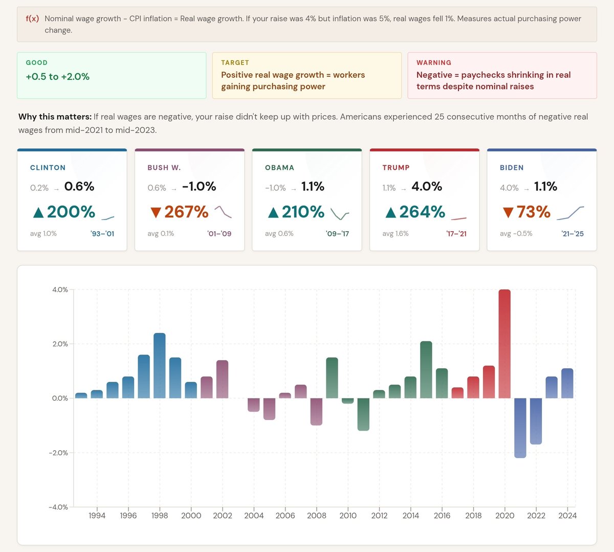
@MrAmazingBoz I think you need to learn how to interpret data better. Inflation rose and as a result % change shows a decline relative to performance!
English
@MrAmazingBoz Again in this example same logic, declined under Biden hence red arrow.
English

@ibrahimlari7 Here's real wages did Biden increase real wages or decrease real wages?does the arrow point up or down? We disagree in the way you're intentionally trying to deceive.
English