Swapnil

7.9K posts

Swapnil

Swapnil

@swaaaapnilaaa

Head of Design Glance TV @glancescreen @InMobi. Love, empathy, happiness, laughter. I like to enhance experiences in products and in life.

Bangalore, KA, India Katılım Eylül 2010
1.7K Takip Edilen617 Takipçiler
Swapnil
Swapnil@swaaaapnilaaa·
@hckmstrrahul Ya this works well since the logo already is a circle! Nice :)
English
0
0
0
26
Swapnil retweetledi
Ranjith
Ranjith@align_all·
Let’s GO with Spotify’s way!!
Ranjith tweet media
English
15
3
135
3.7K
Finn McKenty
Finn McKenty@thefinnmckenty·
I really dislike how much the Internet design community dog piles on almost any change to branding or UX in any consumer app. I understand that part of being a designer is being critical, but it’s just exhausting to see everybody jump on the chance to shit on the target of the week (Spotify in this case). If you think you have something constructive to add, that’s one thing. But if you’re just showing up to dunk on someone for Internet points, that’s weak shit. (And yes, I’ve done it many times in the past, and every single time I felt shitty about it and I regret it)
Farzad 🇺🇸 🇮🇷@farzyness

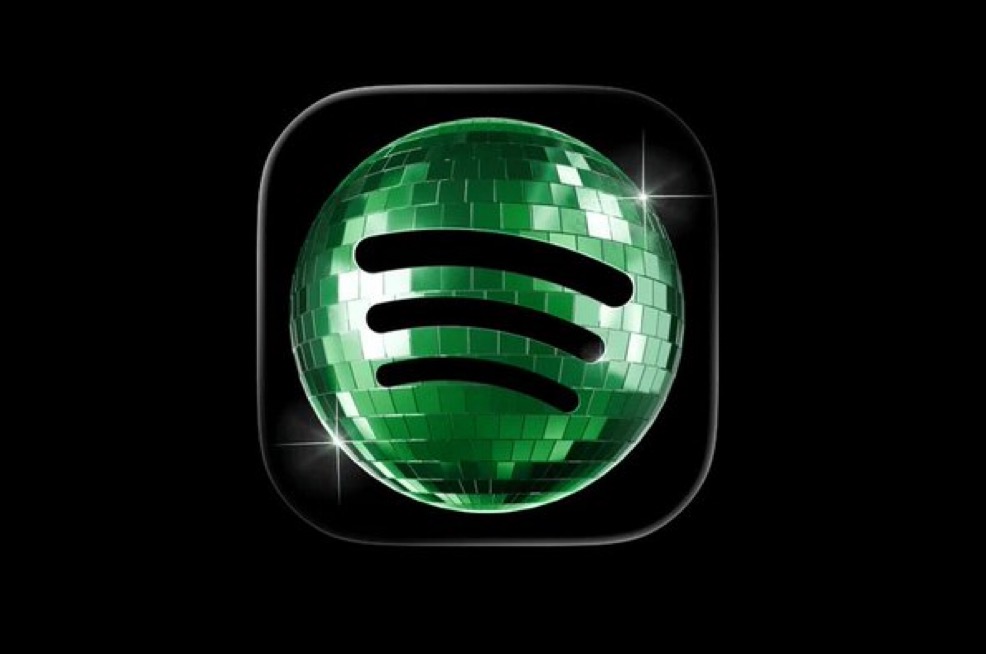
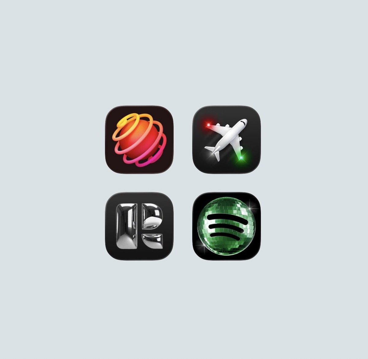
Whoever designed this needs to be fired immediately:

English
23
2
98
13.2K
Swapnil retweetledi
Robert Bye
Robert Bye@RobertJBye·
We need more fun app icons like these
Robert Bye tweet media
English
119
497
14.9K
195.9K
Swapnil
Swapnil@swaaaapnilaaa·
It's a disco ball for an anniversary, not a brand system overhaul. Spotify has earned the right to play with their own icon. Nobody's failing to find it. Head of design here, and letting your team ship something fun is the job. Treating every surface like it has to defend a thesis is how brands get boring. But you do you.
English
0
0
3
277
Jack Appleby
Jack Appleby@jappleby·
@swaaaapnilaaa If you’re a head of design and this is how you honestly think about marketing… Godspeed.
English
1
0
1
408
Fons Mans
Fons Mans@FonsMans·
Everyone talks about craft and opinionated design, but as soon as Spotify drops a fun app icon, those same people freak out. The temporary icon is great. You know you’ve made something great when people have extreme reactions to it. Never aim to please everyone.
Fons Mans tweet media
English
64
33
845
28K
Andreas Storm
Andreas Storm@avstorm·
I genuinely don’t understand the outrage over Spotify’s temporary app icon. A 20-year anniversary is exactly when a company should be allowed to do something playful and different. The default will be back soon.
Andreas Storm tweet media
English
623
525
16.3K
499.7K
Swapnil
Swapnil@swaaaapnilaaa·
@hckmstrrahul lol.. this is what happened with those Airbnb 3D icons. Everyone was just asking GPT to “make it in this style”
English
0
0
0
297
Pedro Duarte
Pedro Duarte@peduarte·
when i first saw spotify's new app icon, my immediate gut reaction was: wow that's pretty cool then some dude with a few thousand followers and said it sucked and in a blink of an eye everyone started hating on it i still think it's pretty cool
Pedro Duarte tweet media
English
712
2.7K
43.5K
532K
Swapnil retweetledi
Ben Geskin
Ben Geskin@BenGeskin·
Just experienced streamable 4D Gaussian Splatting content on Apple Vision Pro… and it's insane 🤯 Seeing life sized volumetric people performing right in my room is kind of mind blowing. It really feels like real humans are standing in front of you. And it streams online just like regular video. No massive downloads. No waiting. Awesome work by @gracia_vr 👏 Apple Vision Pro + Gaussian Splatting is one of the most futuristic things I’ve seen in a long time.
English
135
204
2.5K
1M
Swapnil
Swapnil@swaaaapnilaaa·
@align_all I liked it. It is temp, it’s for their 20th anniversary.
English
0
0
3
349
Ranjith
Ranjith@align_all·
Spotify’s new app icon feels like one of those redesigns nobody asked for! Hoping it’s temporary 🫣
Ranjith tweet mediaRanjith tweet media
English
26
3
343
35K
Swapnil retweetledi
Rahul Bhadoriya
Rahul Bhadoriya@rahulbhadoriiya·
Question to my fellow designers: This is an app icon I made using AI. The process was actually very similar to how I normally design. I collected multiple references, explored directions, and built the visual. The only difference? Instead of using Blender, I used a node-based AI tool. Now here’s my question: Do you think this is good or bad? Personally, I like the result, but it didn’t feel satisfying. I’ve spent hours in Photoshop extending backgrounds or tweaking tiny details. This one, I could’ve also made in Blender in maybe 2–3 hours. So now I’m wondering: Is this still design?
Rahul Bhadoriya tweet media
English
43
6
219
28.4K
Swapnil
Swapnil@swaaaapnilaaa·
@ilyamiskov This is a real question.. and needs some real answers. The other day I was using Air m4, and it worked all great and good! Wondering if I really need a Pro even.
English
0
0
0
10
Ilya · イリア
Ilya · イリア@ilyamiskov·
Let’s discuss. How much actual performance does a product designer need from a computer? I doubt most designers would benefit from say, 128GB of RAM or an Ultra grade chip. Where is the sweet spot?
Ilya · イリア tweet media
English
50
0
66
19K
Aleks
Aleks@aleksliving·
hear me out … what if we add reminders that print out like restaurant orders?
English
38
26
1K
79K