UXRadar

30 posts

UXRadar banner
UXRadar

UXRadar

@theuxradar

Bad UX? We see it. We post it. Crowdsourced, constructive, relentless. 🛠️ Tag us with #UXRadar

Katılım Mart 2025
31 Takip Edilen3 Takipçiler
UXRadar
UXRadar@theuxradar·
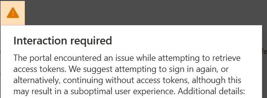
UX Issue 🚨 | @scaler_official Correct phone number, but OTP never arrives. Tried 5+ times. Voice OTP also doesn’t work. Critical onboarding blocker - users are stuck with no fallback or clarity. This kills trust instantly. #Uxradar
UXRadar tweet media
English
1
0
0
9
UXRadar
UXRadar@theuxradar·
UX Issue 🚨 | @ycombinator Small UI detail, but it impacts trust. A link on the page appears visually inconsistent/misaligned, making users question whether the link is legitimate or safe to click. Tiny UI issues can unintentionally signal credibility problems. #Uxradar
UXRadar tweet media
English
0
0
0
11
UXRadar
UXRadar@theuxradar·
UX Issue 🚨 | @Microsoft The Rewards option appears in the Microsoft account menu, but clicking it opens an error page: "Bing isn’t available right now." If a feature isn’t accessible, it shouldn’t appear available. Dead-end navigation creates confusion. #UXRadar
UXRadar tweet media
English
0
0
0
91
UXRadar
UXRadar@theuxradar·
Tried creating a new organization on Azure DevOps: aex.dev.azure.com/signup/ Click → Nothing happens. No loader. No error. No feedback. A critical onboarding step just… stalls. When primary actions fail silently, users lose confidence instantly. #Uxradar
UXRadar tweet media
English
0
0
0
10
UXRadar
UXRadar@theuxradar·
4. Continuous interaction issue: A popup appears and doesn’t close properly — blocking flow and progress. Interruptive + no clear recovery path. For identity & access systems, clarity and reliability are non-negotiable. #Uxradar (Screenshot cropped)
UXRadar tweet media
English
1
0
0
13
UXRadar
UXRadar@theuxradar·
🚨 Account Access UX Issues on @Microsoft @Azure Multiple login & verification problems across Microsoft Account & Azure. Sharing a thread with 4 major issues 👇 (1/x)
English
1
0
0
40
UXRadar
UXRadar@theuxradar·
(2/x) Alternate email change shows a 1-month waiting period. No strong contextual explanation. During access issues, forcing users to wait 30 days is extreme friction. #Uxradar
UXRadar tweet media
English
0
0
0
8
UXRadar
UXRadar@theuxradar·
(3/x) For creators & brands, this impacts visibility, reach, and profile consistency. If it’s not technically a reply, it shouldn’t be treated like one. Platform logic ≠ user expectation. @X needs clearer UX here. #Uxradar
English
0
0
0
10
UXRadar
UXRadar@theuxradar·
(2/x) There’s no clear indication while posting that starting with @username changes how the post is categorized. For most users, this looks like a normal post — but it silently gets pushed to “Replies.” That’s misleading behavior. #Uxradar
English
1
0
0
13
UXRadar
UXRadar@theuxradar·
🚨 UX Bug on @X If you start a post with @username (person/brand), it doesn’t appear in the “Posts” tab on your profile. It only shows under “Replies” — even though it’s NOT a reply to anything. It’s treated like one (1/x) #Uxradar
English
1
0
0
16
UXRadar
UXRadar@theuxradar·
🚨 UX Issue | @Namecheap While adding a domain record, the error isn’t visible at all. ❌ An empty, misaligned toast bar appears — no context, no guidance. Users are left guessing. Error visibility is basic UX hygiene, especially in critical DNS settings. #Uxradar
UXRadar tweet media
English
1
0
1
228
UXRadar
UXRadar@theuxradar·
🚨 UX Issue on @udemy The coupon input section isn’t visible at all. No hint that more content exists below. On scroll, it still feels missing. Only noticed it after decreasing zoom — a normal user would never know. That’s lost savings + frustration. Big UX miss. #Uxradar
UXRadar tweet media
English
0
0
0
40
UXRadar
UXRadar@theuxradar·
@Practo Thanks for acknowledging, @Practo. Appreciate you flagging this to the relevant team.
English
0
0
0
29
Practo
Practo@Practo·
@theuxradar We sincerely apologize for the inconvenience caused. We have highlighted this concern to the relevant team, and the necessary changes will be made.
English
1
0
0
85
UXRadar
UXRadar@theuxradar·
🚨 UX issue on @Practo (Consult page) practo.com/consult • Stretched doctor images (wrong aspect ratio) • Footer still shows “2017” Small polish gaps, but they hurt trust—critical for a healthcare product. #Uxradar
UXRadar tweet mediaUXRadar tweet media
English
1
0
0
151
UXRadar
UXRadar@theuxradar·
@jd_justdial Thanks for acknowledging 👍 Looking forward to a fix that improves clarity and makes the flow usable.
English
0
0
0
22
Justdial
Justdial@jd_justdial·
@theuxradar We hear you and would never want our users to have such an experience. We are looking into this matter and will resolve it promptly and accurately.
English
1
0
1
11
UXRadar
UXRadar@theuxradar·
UX Issue 🚨 | Justdial Business Editor @jd_justdial The “Average Cost” edit screen uses extremely unclear input labels. No context, no examples, no hints. Users are left guessing what to enter. A simple edit turns into confusion—this is avoidable bad UX. #uxradar #UXDesign
UXRadar tweet media
English
1
0
1
48