This! You gotta let that shit marinate. I find the best ideas often surface after you’ve stepped away, when your mind has space to wander and connect new dots. Returning with fresh eyes shows what matters and what can go. It’s not about slowing down; it’s about giving ideas space to grow stronger.
It’s refreshing to see one of my favourite designers tweet this.
I’ve always been intentional with the language I use on @x and on my website–avoiding phrases like “quick turnaround” or “fast delivery.”
Design is art. It needs time. That doesn’t mean you shouldn’t streamline your workflow or automate where it makes sense — but the craft itself can’t be rushed.
I’m often asked, “How long did this illustration take?” or “How long did it take you to design this?” My answer is always the same: "as long as it takes."
Everyone wants things done yesterday but great work needs time, not pressure.
2026 = calm, considered design work at @wireframe.
Do you name your brand marks?
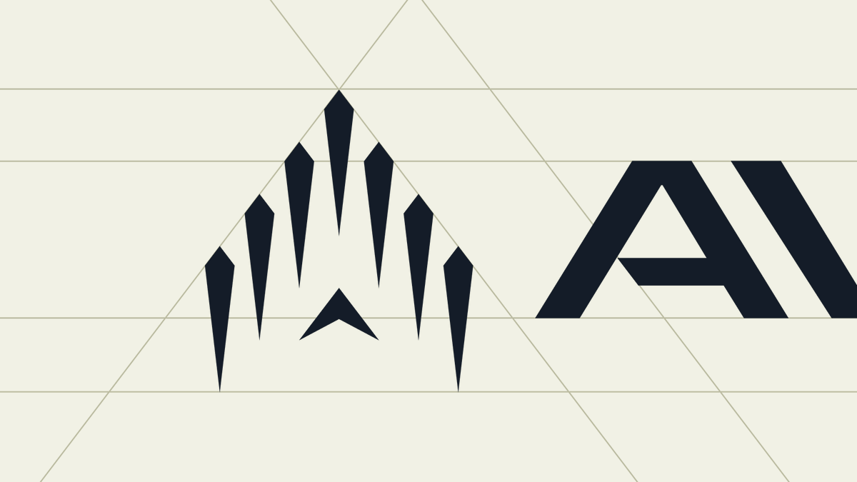
At @diverdotstudio , we try to design brand symbols with story and meaning. Just as we name colors within a palette, we name the symbol that represents a company. For the eVTOL aircraft brand Avo Aero, we created the Ascension mark. It conveys vertical takeoff, forward momentum, leadership, energy efficiency (inspired by birds in a flying V formation), and subtly forming the letter A.
A closer look at some Avo Aero logo details. The Ascension Symbol was designed to convey vertical takeoff, forward motion, leadership, and energy efficiency (referencing a flying V formation), while subtly forming the letter A.
Calling it.
In the next two or so years, there will be a whole new wave of rebrands for AI companies as they realize they look too similar and have anchored their brand around something that will become table stakes.
Ai will become what the internet was.
“E-this” “e-that”
Everyone integrated the internet.
Now…
“AI-optimized this” “AI-powered that”
Anchor your brand around something that is actually a differentiator.
Solve your customers pain and be more emotionally enjoyable better than competitors. That’s how you win.
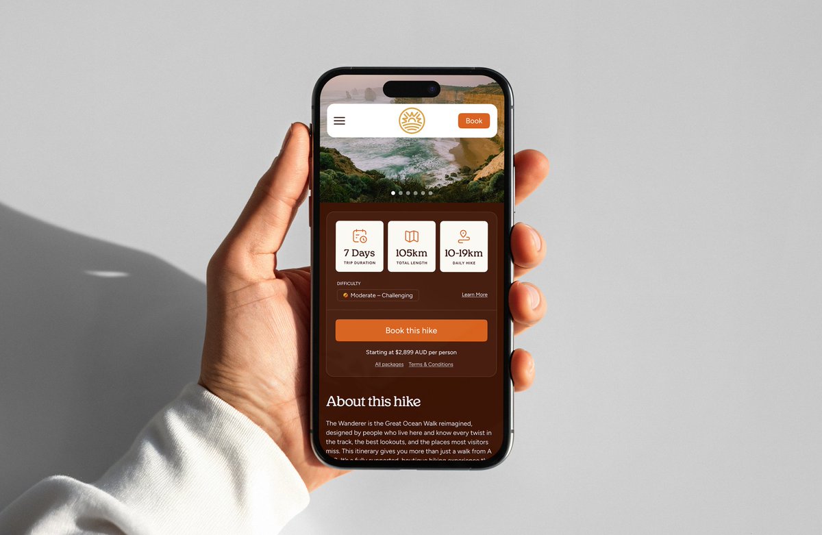
Lastly, it's about taking all of those identity elements and building out the digital experience. We designed a full website that the team at @inputlogic is building, where guests can view the different hiking packages and book their trip. Overall, a very fun, full visual identity and web design for an awesome client.
If you’re looking for something similar, hit us up! We’d love to create something unique and memorable for you.
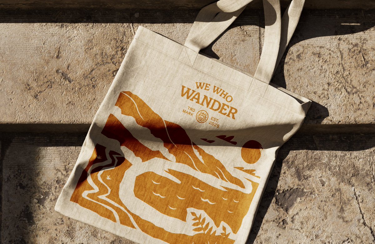
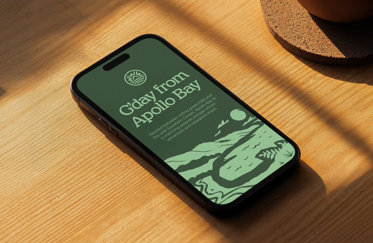
Sebastian created a killer set of landscape illustrations, each highlighting a key stop along the journey. These will become core storytelling pieces across the website, merchandise, hiking guides, and more. At Diver we have been exploring the idea of “Illustrative Identities,” and this project represents that approach perfectly.
Here’s a look at the visual identity we created at @diverdotstudio for We Who Wander, a premium hiking tour operator on Australia’s Great Ocean Walk. It’s designed for travellers who value adventure, quality, and a genuine connection to nature. We worked closely with the founder to define the audience and brand pillars, then built an identity that pushes past hiking clichés and the usual Australian motifs.
This summer we worked with Backland Expedition Gear to reimagine their visual identity. The products themselves served as our north star in designing the visual system, guiding our choice of typefaces that echo their angles, and graphic devices that mirror their shapes and geometries. The result is a visual identity that cuts through a category crowded with loud, condensed typefaces and aggressive design—something that feels technical, rugged, and precise, just like the products they build.
Back in December, we were hired by an agency overseas to sketch logo concepts for a cooking app. They wanted to see doodle-y explorations of characters, animals and blobs wearing chef hats…
Say no more! 👨🍳👨🍳👨🍳
Earlier this year we worked with the wonderful folks at Bonfire on the visual identity for Campout, their new digital community space for creative marketers.
Naming is so hard... We initially explored ~150 different options while trying to figure out what to call our studio. (shortlist 🟡)
We’d find a name we loved, only to discover it was taken by other design studios or had no good domains available. Rinse and repeat.