
Sabitlenmiş Tweet
Omar
686 posts


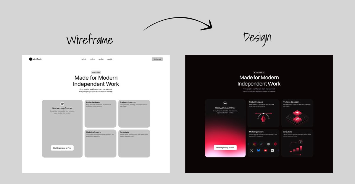

Your hero section decides if people stay or leave.
This is the kind of visual direction that makes visitors stop scrolling.


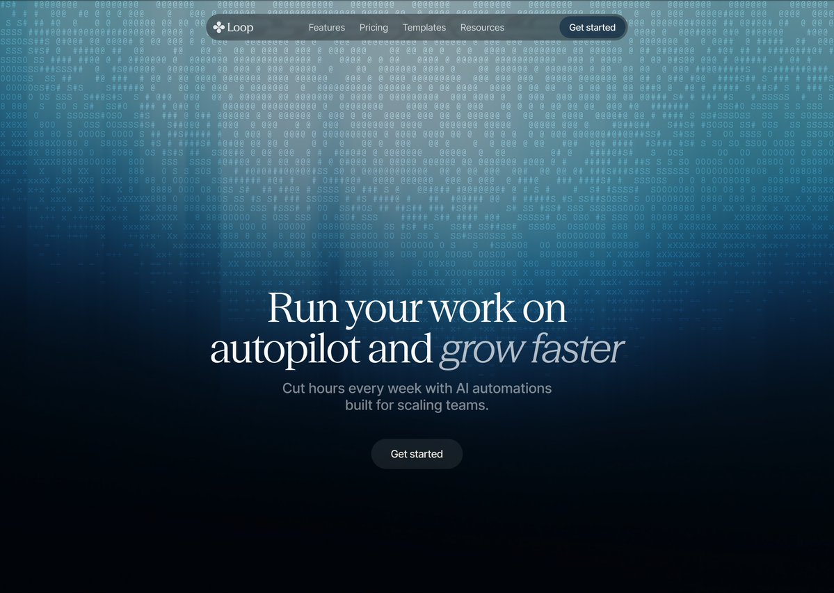
English
@BreejeAnadkat I really liked the squared - matrix type Hero section background
English



@vanshdevx For the copy "clear Outcomes" background A goes better because it is clearly bold and feels less noisy
English


@webdev_Omar tbh it's multiple prompt and reiterate manually the code before it can be like that hahaha
English
@vanshdevx 1st & the 1st one in 2nd column ... The sunrays in bothh ...ufff I love these kind of Nature sceneries❤️
English
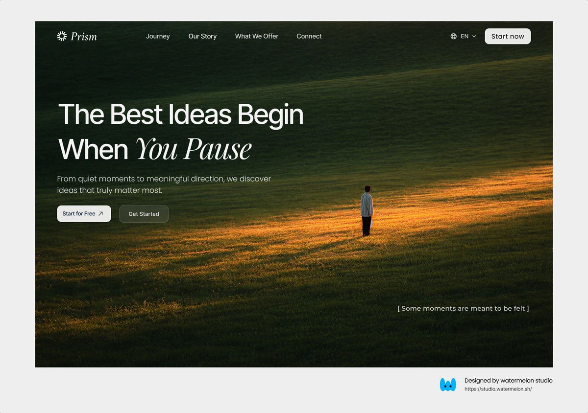

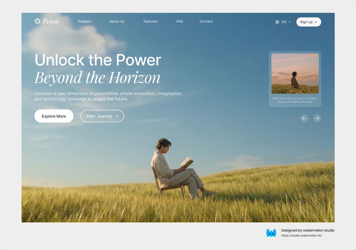


A little blend of colors can increase the visual enhancement by 10X. Glimpse of gradient 💙

Basit A. Khan@basit_designs
The internet has enough “pretty” websites. What brands actually need is clarity, trust, and conversion.
English
@BreejeAnadkat it's awesomeeee ...with just light grey , shadows & black the design is awesomee..Gotta try replicating thesee
English
What started as a one-off pitch deck project turned into 2 more decks, 3 landing pages, and now ongoing product work.
When you overdeliver, clients keep coming back.
Sneak peek from the first deck ↓

English

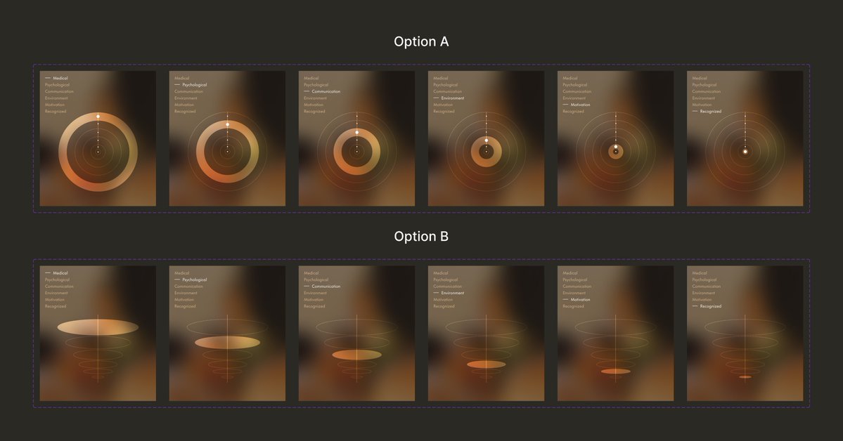
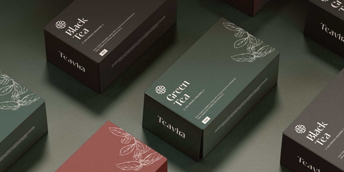
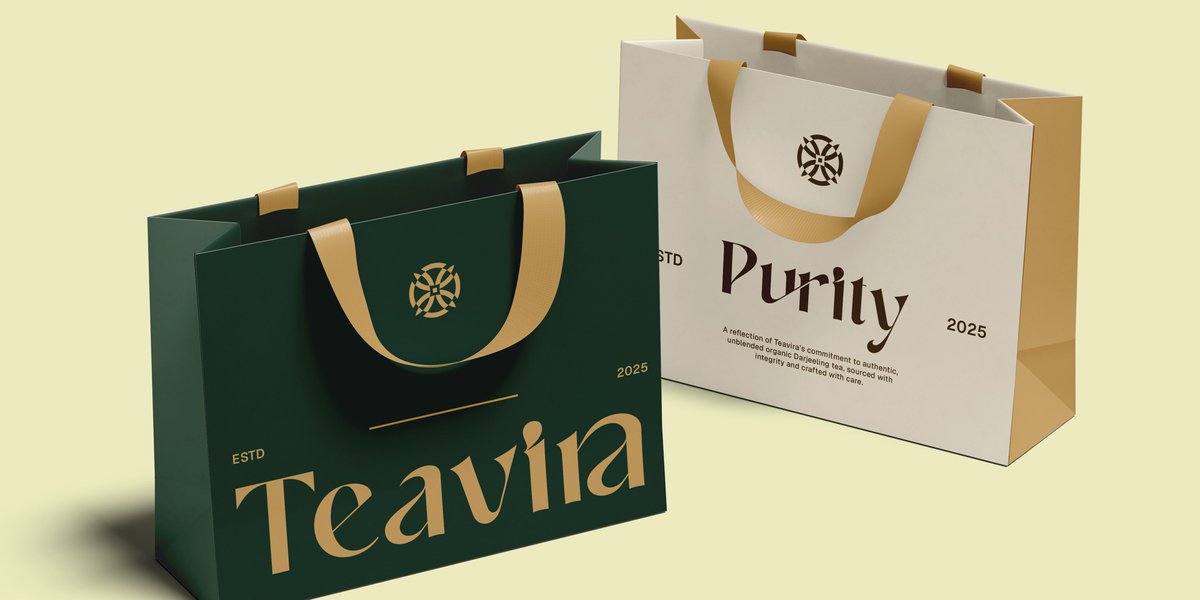
@AdityaSur11 Teavia branding is incredible gives organic & premium feel but the purity gives jwellery vibes ...
English



@webdev_Omar I design in on figma first, and ask claude to animate that with specific prompt, assets and etc
English


