Mitchell

2.3K posts

Mitchell banner
Mitchell

Mitchell

@MitchellHart

Working the day shift at that graveyard and the graveyard shift at that Days Inn.

PNW เข้าร่วม Aralık 2008
1.3K กำลังติดตาม684 ผู้ติดตาม
Mitchell
Mitchell@MitchellHart·
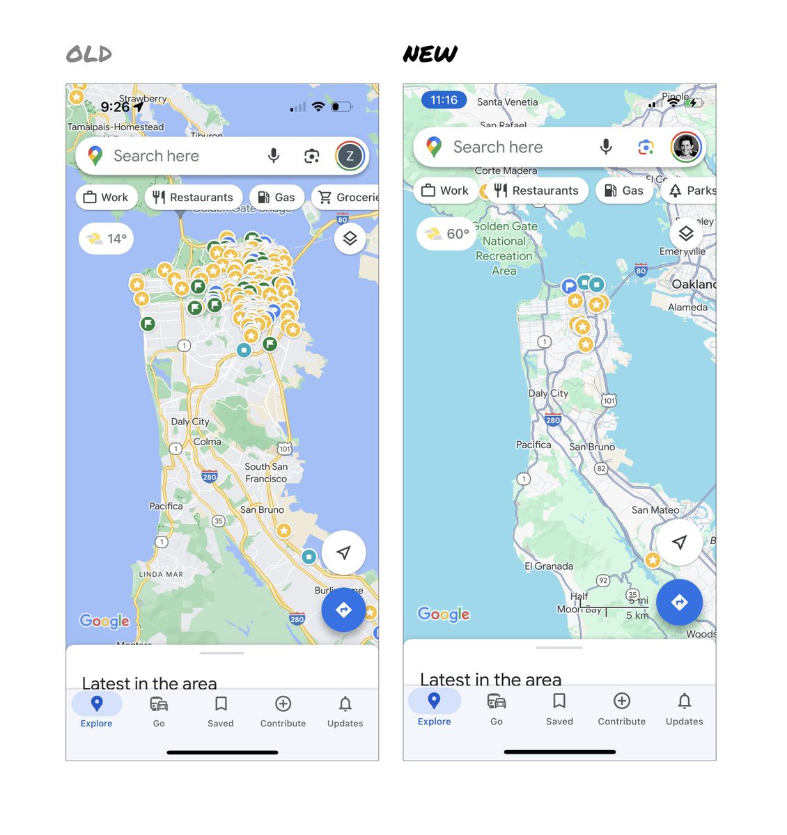
@elizlaraki Usage metrics alone shouldn’t drive the placement of a feature - on a car would you remove the hazard lights if they weren’t used often? How about the windshield defroster? I don’t think the new design is perfect but I don’t agree with your proposed approach.
English
0
0
1
19
Elizabeth Laraki
Elizabeth Laraki@elizlaraki·
15 years ago, I helped design Google Maps. I still use it everyday. Last week, the team dramatically changed the map’s visual design. I don’t love it. It feels colder, less accurate and less human. But more importantly, they missed a key opportunity to simplify and scale. ––– Google Maps has started to widely roll out updated map colors: - All roads are now gray - Water changed from blue to teal - Parks and open spaces are now mint green It seems the goal was to improve usability and make the maps more readable. Admittedly, I do think major roads, traffic, and trails stand out more now. But the colors of water and parks/open spaces blend together. And to me, the palette feels colder and more computer generated. But color choices aside… If the goal was better usability, the team missed a big opportunity: Google Maps should have cleaned up the crud overlaying the map. ––– So much stuff has accumulated on top of the map. Currently there are ~11 different elements obscuring it: - Search box - 8 pills overlayed in 4 rows - A peeking card for “latest in the area” - A bottom nav bar (Personally, I would LOVE to see usage metrics for all these overlays.) The map should be sacred real estate. Only things that are highly useful to many people should obscure it. There should be a very limited number of features that can cover the map view. And there are multiple ways to add new features without overlaying them directly on the map. ––– Here’s how it could look: - Keep the search box - Keep the bottom bar - Remove everything else from the map - Roll the most used features into the bottom bar - Bury the less used features elsewhere in the app I assume the search box and directions are top priority and should remain prominent. My Location and map layers (satellite, traffic, etc.) could move to the bottom bar. The explore overlays (restaurants, gas, etc.) could live in the bottom bar in “Explore” and open as cards. The additional space in the bottom bar could be used for Saved, as a “More” option, or could be removed entirely. There are many variations of how features could be arranged. But the key points are: - Dramatically simplify - Strongly prioritize map visibility - Bury legacy and low use features ––– It’s normal for products to accumulate features over time. But it’s also super important to stay vigilant and continually clean them up. In many ways, it’s interesting to see history repeating itself. In 2007, I was 1 of 2 designers on Google Maps. At that time, Maps had already become a cluttered mess. We were wedging new features into any space we could find in the UI. The user experience was suffering and the product was growing increasingly complicated. We had to rethink the app to be simple and scale for the future. It seems like it’s time for Google Maps to do this again… ––– For more on design + tips for early stage founders, follow me on X: @elizlaraki
Elizabeth Laraki tweet mediaElizabeth Laraki tweet mediaElizabeth Laraki tweet mediaElizabeth Laraki tweet media
English
1.1K
2.5K
17.9K
4.1M
Mitchell
Mitchell@MitchellHart·
@okaysee @figma 1. Publish to web 2. Simple timeline or stagger for smart animate 3. Private working - disables the follow function for a set amount of time.
English
0
0
1
31
KC Oh
KC Oh@okaysee·
We’re heading into planning season at @figma and I could use a hand—what would you like to see in the design tool if you were running things?
English
241
14
132
142.3K
Hey Detya
Hey Detya@HeyDetya·
@webflow We need update for multiple layer/object selection similar to figma or framer 🤭
English
1
0
3
247
Webflow
Webflow@webflow·
Small update, big impact. Right click is now supported in the Navigator panel. Move an element, wrap it, manage its styles all without leaving the navigator.
English
47
32
565
61.5K
2000s
2000s@PopCulture2000s·
18 years ago today, madonna released one of the greatest songs of the 21st century ‘hung up’
English
482
8K
52.8K
4.5M
Eric Hsu
Eric Hsu@lawyer4SMBs·
Yesterday I posted about how to use $75K to buy a $1M business that can pay you $200K. Lots of naysayers, and also lots of curious people. So here's an actual deal that meets this criteria (currently on BizBuySell). Let's talk about how we can buy it!
Eric Hsu tweet media
English
48
69
819
389.4K
John Maeda
John Maeda@johnmaeda·
Kevin Bethune’s “Reimagining Design” is an eminently useful tool for considering the sheer breadth of the field of “design.” I often turn to it for relearning the many things that I missed.
John Maeda tweet media
English
3
12
148
22.8K
Mitchell
Mitchell@MitchellHart·
@emilwidlund This is really cool! Do you know of a resource for implementing the GLSL in @threejs or elsewhere?
English
0
0
0
112
emil
emil@emilwidlund·
Still have no clue what Alma is & how it works? I compiled a quick 30 seconds demo which showcases the gist of it. See you at React Summit 2023 in Amsterdam on Friday! :)
English
16
14
213
31.2K
Mitchell
Mitchell@MitchellHart·
@cedric_design @figma @framer I like Framer - been using their products for a long time but it won’t take long for Figma to shake things up.
English
0
0
0
47
Mitchell
Mitchell@MitchellHart·
@cedric_design @figma @framer - Framer Motion is open source - no reason why it couldn’t be used or extended. - All Figma’s tooling have web analogs (auto flow => flexbox ). - Figma has always been native to the web - Figma co-founder created a web bundler that’s 10-100x faster than what’s out now…
English
1
0
1
130
Cédric
Cédric@cedric_design·
My take on why @figma won't beat @framer any time soon: - Framer Motion is 🔥 - Framer is made for websites, Figma for design - Animation possibilities like scroll, appear & states - Powerful CMS - Insane performance & speed - Strong SEO features Whats your opinion? Tell me👇
English
18
1
67
17.7K
Mitchell
Mitchell@MitchellHart·
Nope nope nope
Mitchell tweet media
English
0
1
4
171
Mitchell
Mitchell@MitchellHart·
@DeejayForte I could go for a bowl of Skrtarn right about now.
English
0
0
0
47
Mitchell รีทวีตแล้ว
Maxim Leyzerovich
Maxim Leyzerovich@round·
we’re going to look back at how we designed the world around computers with the same regret that we look at how we’ve designed cities around cars
English
71
238
1.5K
161.8K
Mitchell
Mitchell@MitchellHart·
@genmon Cool! I soft pitched adobe an idea like this for designing and visualizing website page connections and hierarchy.
English
0
0
1
79
Matt Webb 🌸🌼 genmon.fyi
What if your browser could zoom out from a page to see the connections? Not 100% sure where I'm going with this yet... something about pages vs overviews which will marry up with previous hyperlink/presence sketches (somehow). So I wanted to get the underlying code working
GIF
English
19
13
230
22.1K
Mitchell
Mitchell@MitchellHart·
@MonsieurHart @matthewer It’s important to note that OpenAI / GPT data is relatively old when considering how fast place data changes. Tripnotes uses its own data that is constantly updated.
English
1
0
1
75
Matthew Rosenberg
Matthew Rosenberg@matthewer·
Travel planning starts in a variety of places but a majority of it is text: notes, emails, articles, etc…
English
70
86
1.3K
212.1K
Mitchell
Mitchell@MitchellHart·
@MonsieurHart @matthewer We’ll show you all locations if we can’t determine which one you mean —then you can choose one from there.
English
0
0
1
34
Kieran
Kieran@k_mcmaps·
@matthewer This is awesome - I'm on the waitlist! What mapping service are you using to power this?
English
1
0
1
788
Mitchell
Mitchell@MitchellHart·
@Rubicon_Caesar_ @tomcoates 90% of Twitter’s revenue is advertisement, so this is a false claim of the platform’s impact. Fraud 101.
English
0
0
2
0
Tom Coates
Tom Coates@tomcoates·
Musk just deleted his widely derided tweet claiming Twitter generates more referrals/traffic on the internet than anyone else. Unclear whether that’s because of some liability problem stating it, irritation at sustained mockery, or just pure embarrassment.
Tom Coates tweet media
English
3
6
48
0
👣KᗪᗩᗯG👣 🔶
👣KᗪᗩᗯG👣 🔶@Kdawg5000·
@MitchellHart If I could write python script (or took the time to figure it out) there's probably a way to automate it. But I just did each frame individually. I believe there's a Google Colab notebook where you can input video though.
English
1
0
7
0