isogrid

65 posts

isogrid banner
isogrid

isogrid

@_isogrid_

UI & Industrial Design | Apple Fanboy

เข้าร่วม Haziran 2026
19 กำลังติดตาม2 ผู้ติดตาม
Tarun Vats
Tarun Vats@tarunvats33·
Which Quick Panel UI looks better — iOS or One UI? 🤔 Be honest, which one actually wins in design? 👀
Tarun Vats tweet media
English
60
5
248
13.7K
isogrid
isogrid@_isogrid_·
@bzamayo Is that an iPhone Air? For some reason the text on new Siri feels misaligned and slightly awkward on the iPhone Air, compared to the pro and pro max.
English
0
0
0
5
Benjamin Mayo
Benjamin Mayo@bzamayo·
"Is this renewed?"
Benjamin Mayo tweet media
English
5
3
180
17.3K
isogrid
isogrid@_isogrid_·
@MichalLangmajer The circle looks kinda generic. The oval looks way much better!
English
0
0
1
19
Michal Langmajer
Michal Langmajer@MichalLangmajer·
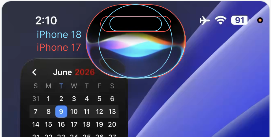
If you were wondering why the iOS 27 Siri AI has such a weird shape, it’s because of the notch. On the iPhone 18 (with its speculated smaller notch), it could become a perfect circle.
Michal Langmajer tweet media
English
10
19
338
104.5K
Keshav
Keshav@kshv_me·
hot take: iPhones looked better with the notch than the dynamic island
Keshav tweet media
English
3
0
7
491
isogrid
isogrid@_isogrid_·
@iconredesign Because it will remain liquid, liquid stands for the fluid interactions and glass for the refraction. No matter if its clear or not, it still is Liquid Glass
English
0
0
1
2
Tech Actually
Tech Actually@techactually·
iOS 26 beta 1 vs iOS 27 beta 1 the differences aren’t huge, but it feels a lot easier to look at now a glass intensity slider in iOS 26 probably would’ve fixed some of the complaints, at least to an extent😭
Tech Actually tweet mediaTech Actually tweet media
English
11
1
207
16.8K
isogrid
isogrid@_isogrid_·
@coderaw_ Functionly, yes. But aesthetically, its the iPhone Air
English
0
0
0
18
Aaryv
Aaryv@coderaw_·
Aesthetically, this is the best iPhone ever created by Apple
Aaryv tweet media
English
55
13
502
25.4K
SHARIAR
SHARIAR@shariar_design·
Apple, if you're not doing this, we need to talk.......👀🔌
SHARIAR tweet mediaSHARIAR tweet mediaSHARIAR tweet media
English
9
0
38
2.6K
Bhuvan
Bhuvan@Bhuvan_RJ46·
Which is better? One UI Gallary iOS 27 Photos
Bhuvan tweet mediaBhuvan tweet media
English
21
4
39
2K
isogrid
isogrid@_isogrid_·
@HeyAliux Visual intelligence and circle to search are NOT the same as google lens
English
0
0
0
5
@Ali_
@Ali_@HeyAliux·
Google 2017 vs Apple 2026 😅
@Ali_ tweet media
English
1
5
68
1.2K
Mohit Kharbanda
Mohit Kharbanda@NexToWeb·
I think @claudeai should use it's own generative model and design a better logo for themselves
Mohit Kharbanda tweet media
English
1
0
1
117
isogrid
isogrid@_isogrid_·
@SwiftDev_UI It looks like that to match the radius of your screen
English
0
0
0
1
Swift Dev
Swift Dev@SwiftDev_UI·
The tab bar vs sheet radius (when collapsed) in FindMy is killing me
Swift Dev tweet media
English
9
0
121
7.5K
isogrid
isogrid@_isogrid_·
@_prophet_futu If you have ever handled some optics you will notice how glass has some sort of compressed shadow on the inner edges when placed on a flat surface. These are not randow black outlines, thats how glass actually looks.
English
2
0
1
16
Clement
Clement@_prophet_futu·
One of the huge issues with liquid glass with clear mode in ios 27 *The icons are super over sharpened *Ugly black outline around icons I hope apple will fix Asap
Clement tweet mediaClement tweet mediaClement tweet mediaClement tweet media
English
42
11
452
39.3K
isogrid
isogrid@_isogrid_·
@pugson If you mean the elements being stretchy thats not a bug and its a part of Liquid Glass’s design. If you mean that green glitch inside the button when being stretched, yes its is a weird bug
English
0
0
0
2
pugson
pugson@pugson·
iOS 27’s Liquid Glass has some questionable behavior
English
12
2
144
35.7K
Daniele Margutti
Daniele Margutti@danielemargutti·
can't believe someone in the world think these UI button are pleasant to see, but at least there are less round corners than before. So it's a step forward #WWDC #macOS
Daniele Margutti tweet media
English
7
0
69
6.3K
Saksham
Saksham@Saksham_9996·
The new photos app icon is such a crap!🤮
Saksham tweet media
English
2
0
24
1.1K
Hieu Dinh
Hieu Dinh@hieudinh_·
The first true Liquid Glass app icon
Hieu Dinh tweet media
English
2
0
26
2.7K
isogrid
isogrid@_isogrid_·
@asherdipps The new iOS 27 Liquid Glass is peak!! And those black highlights everyone is hating actually adds nice depth!
English
0
0
0
0
Asher
Asher@asherdipps·
iOS 27 new Liquid Glass diffusion… which one do you like?
Asher tweet mediaAsher tweet media
English
10
3
122
12.9K
isogrid
isogrid@_isogrid_·
@Cartidise I love it, though I think the should smooth it a little bit
English
0
0
1
14