Elias

564 posts

Elias banner
Elias

Elias

@Lightstudio__

Building websites & brands. Let's have fun. Available for Client work - https://t.co/YOkuG3TPoI

Europe شامل ہوئے Şubat 2024
132 فالونگ45 فالوورز
Elias
Elias@Lightstudio__·
@Praha37v turn them into a template
English
0
0
0
4
Praha
Praha@Praha37v·
here are a few rejected hero concepts from our recent client project. lots of sweat got wasted, as usual 😢
GIF
English
8
0
45
788
Elias
Elias@Lightstudio__·
@enodrift animation looking slick!
English
0
0
0
0
Eno
Eno@enodrift·
It’s not real product
English
1
0
7
88
Ava Thiery
Ava Thiery@ava_thiery·
Love this hero from my @framer template Das Studio
Ava Thiery tweet media
English
16
4
66
1.1K
Elias
Elias@Lightstudio__·
@byJWXN Nice interactions mate!
English
1
0
1
8
jamie 🌾
jamie 🌾@byJWXN·
actions menu 🔎
Français
7
0
26
685
Elias
Elias@Lightstudio__·
@Izabysof Love the effect! Feels cinematic!
English
0
0
0
2
Sofiane Izabachene
Sofiane Izabachene@Izabysof·
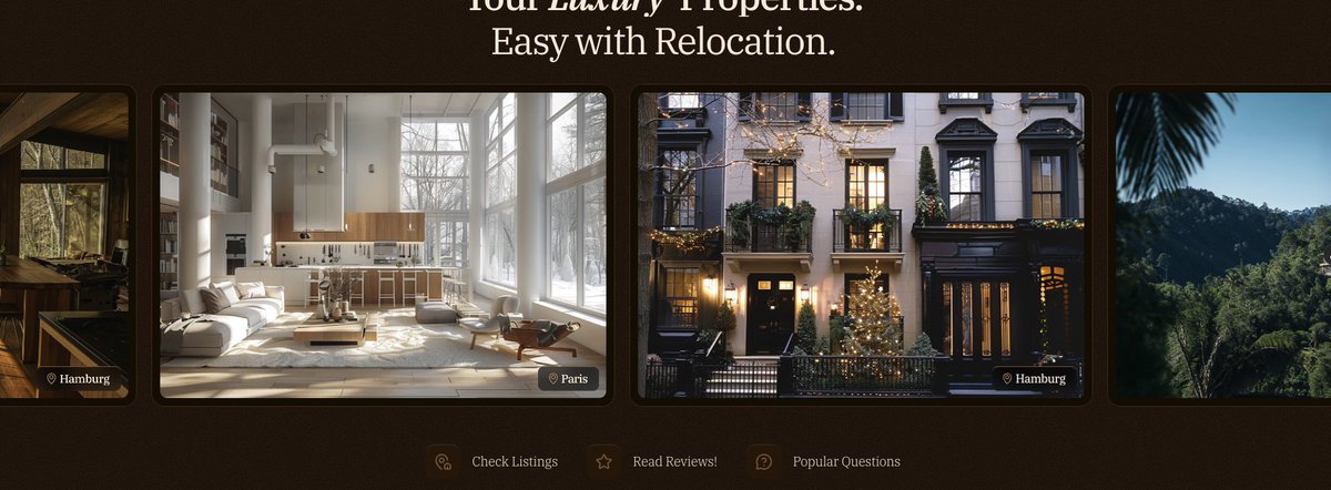
Exploring a new hover effect for video cards. what do you guys think?
English
3
0
13
521
Elias
Elias@Lightstudio__·
@uiNerd Love the arrow!
English
1
0
1
23
Alex Tatu
Alex Tatu@uiNerd·
AIs are cooked. made this in Figma.
Alex Tatu tweet media
English
3
1
30
789
Satya
Satya@heysatya_·
perfecto 🤌
Satya tweet media
Español
26
11
306
8.1K
Elias
Elias@Lightstudio__·
Real Estate Property Card Light or Dark?
Elias tweet media
English
1
0
3
25
Adam Fard
Adam Fard@AdamFard_·
if you're seeing this and building something, lmk and I'll follow you back
English
276
5
272
16.5K
Amena
Amena@AmenaiSabuwala·
Rejected hero section design 🥹
Amena tweet media
English
26
2
105
2.9K
Shihab
Shihab@heyshihab·
brand work in progress
Shihab tweet mediaShihab tweet mediaShihab tweet mediaShihab tweet media
English
32
16
520
14.7K
Elias
Elias@Lightstudio__·
@FredWanders Oh, Right on spot! Thank man. I was having quite rough time with this buttons But in general I agree with you! Gotta fix this! Thank you so much!
English
1
0
1
17
Fred Wanders
Fred Wanders@FredWanders·
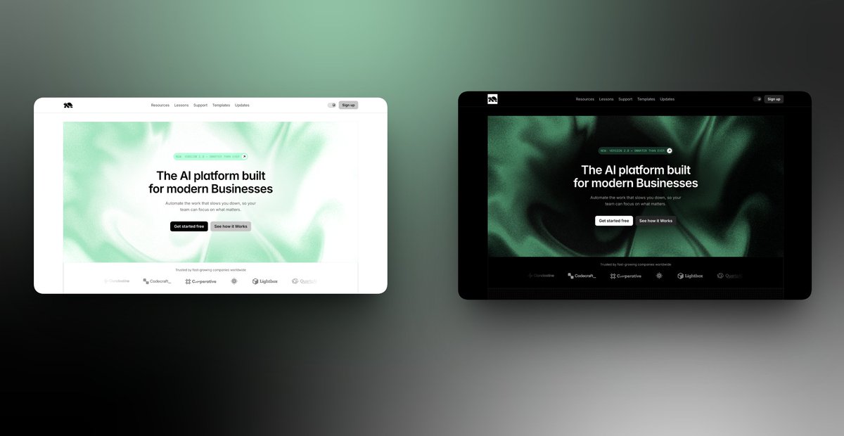
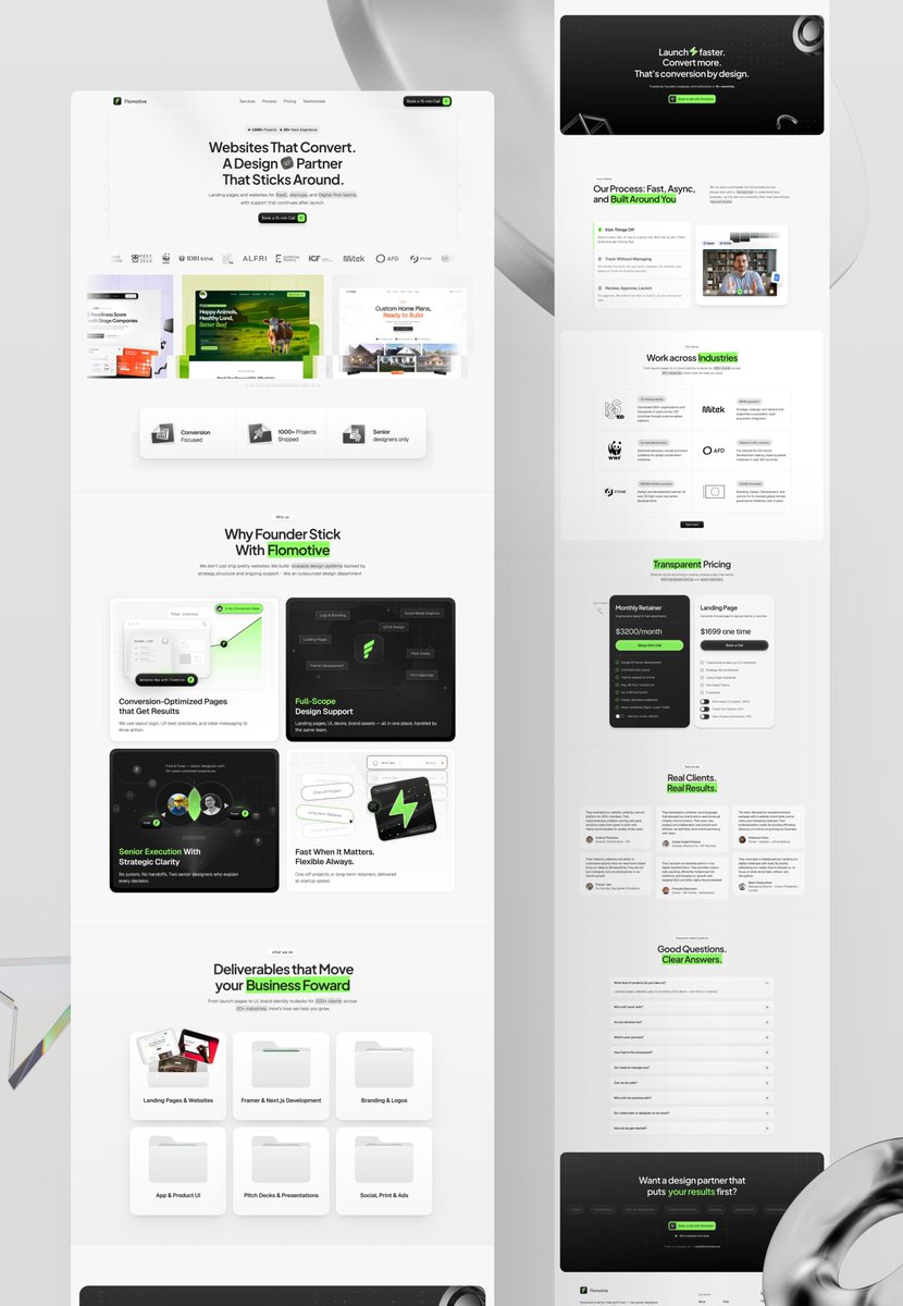
7/10 - lovely color scheme just too low contrast overall - so key elements don't stand out to the eye. that slider animation shouldn't be resetting each time just make it appear once. make CTAs / Buttons stand out more too low contrast right now. You can have lower contrast but 'secondary buttons' but def. for your main CTAs they need to pop.
Fred Wanders tweet mediaFred Wanders tweet media
English
1
0
1
74
Fred Wanders
Fred Wanders@FredWanders·
Share your website and I'll rate it + give 1 tip on how to improve it.
Fred Wanders tweet media
English
25
4
145
3.4K
Elias
Elias@Lightstudio__·
Web Page & Filter System for Bootcamp Courses Thoughts?
Elias tweet media
English
1
0
2
25
Elias
Elias@Lightstudio__·
Subscription Plan Card Design.
Elias tweet media
English
1
0
5
38
Jonathan Paul
Jonathan Paul@Jonathan7SP·
Light or Dark mode? Take your pick.
Jonathan Paul tweet media
English
27
0
59
2.2K
Santu
Santu@santu_design·
landing page for a wealth advisory firm
Santu tweet media
English
24
4
174
4.1K