Harshad | Web 3 | Designer

2.4K posts

Harshad | Web 3 | Designer banner
Harshad | Web 3 | Designer

Harshad | Web 3 | Designer

@harshadux

designer for web3 crypto, SaaS, and AI | available for freelance work. https://t.co/R1UMpobcU3

In your heart 💛 شامل ہوئے Aralık 2022
1.6K فالونگ258 فالوورز
پن کیا گیا ٹویٹ
Harshad | Web 3 | Designer
Harshad | Web 3 | Designer@harshadux·
My 2025 wrapped. → X. Took it seriously. 200 followers. Few real leads. → Upwork. Lost Top Rated. Hurt. Learned. → Contra. Started fresh. 
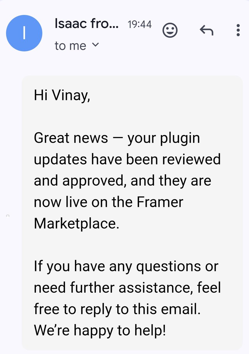
→ Framer. Earned Expert badge. Everything else. 
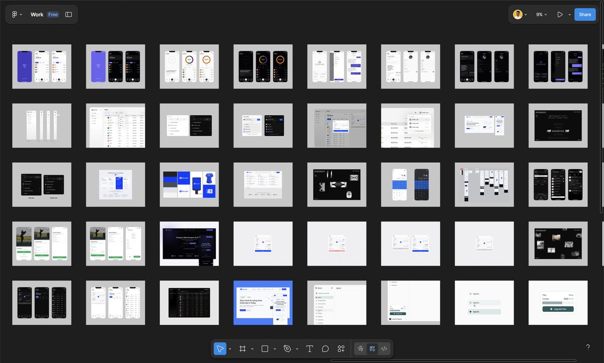
→ Shifted from UX to product design. → Portfolio moved. Webflow to Framer. → Free products shipped on Gumroad. 
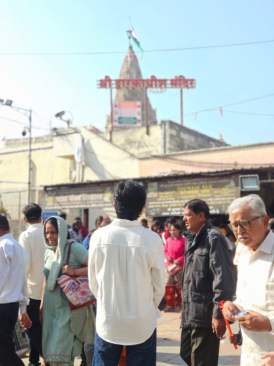
→ Traveled. Prayagraj. Dwarka. Pawagadh. → Spent less. Saved more. Helped dad reduce debt. → Stocks down ~4 percent. Still here. → Health issues. Kept going. 2025 taught me progress feels quiet and heavy sometimes. 2026 is for execution. LFG if you’re still standing and building.
Harshad | Web 3 | Designer tweet mediaHarshad | Web 3 | Designer tweet mediaHarshad | Web 3 | Designer tweet mediaHarshad | Web 3 | Designer tweet media
English
4
0
14
874
judy
judy@judycantcode·
much needed portfolio refresh :P judyzhou.me
English
86
81
2.2K
80.7K
Ilya · イリア
Ilya · イリア@ilyamiskov·
“deSiGneRs aRe cOokEd” 🤪
Ilya · イリア tweet media
English
9
5
89
5.1K
Darius Dan
Darius Dan@dariusdan·
I don’t know about you, but I’ll never prefer designing by firing prompts like a machine gun. I want to draw rectangles, tweak bezier curves, and polish gradients and radiuses for hours. That’s the craft I fell in love with. 🫠
English
71
105
725
17.9K
luis.
luis.@disco_lu·
Slack showing us just how hard yellow is to work with on this promo banner
luis. tweet media
English
5
0
18
6.1K
Breeje Anadkat
Breeje Anadkat@BreejeAnadkat·
Never in a million years did I imagine I’d buy a MacBook. 4 years ago, I was just getting started and had no idea this career would take me here. Today, I’m sitting with my new MacBook, grateful for the journey and proud of how far I’ve come. Hard work pays off. Keep going.
Breeje Anadkat tweet media
English
60
3
216
4.6K
Oykun
Oykun@oykun·
sketch took design from photoshop. figma took it from sketch. ai is taking it from figma. designers keep surviving. because the tool was never the point.
English
18
8
174
12.9K
Hamed
Hamed@AfolabiDewale·
Another morning to try my best. What are you starting with today?
Hamed tweet media
English
12
1
54
633
Dhruv
Dhruv@thelazylines·
pinterest winning me back
English
6
4
130
5.8K
Satya
Satya@heysatya_·
ever wondered why app shakes when we hold down.. cause they are all so nervous that we’re going to delete them 💀
English
49
9
251
13.4K
kais
kais@kais_rad·
i still can't accept how bad they ruined the Linear design
kais tweet media
English
22
1
174
42.2K
DANN©
DANN©@DannPetty·
I won fan favorite with Reframe! Wow. Thank you, friends! 🙌 I’ll be releasing the new updates and features asap. So stoked seeing everyone use this.
Figma@figma

x.com/i/article/2033…

English
22
3
134
10.8K
charlota
charlota@0xCharlota·
Eyeballing Things™ is a legitimate design practice. No, really! (well, okay, it's actually called Optical Alignment) For years I felt guilty nudging something 2px without a reason I could write in a handoff note. I remember my teammate at IDEO watching my screen asking "are u gonna just eyeball it??" in shock But squinting at your design from a distance and moving things until they feel right is exactly what you should be doing. And nowhere is it more obvious than with circles. 🔵🟣🟡🟠 Circles lie. Put one next to anything flat-edged and your eye will tell you something is wrong, even when the numbers say it's perfect. I built these examples in @Framer to show exactly where it might be happening in your web design or brand design: — A circle next to a square at identical dimensions looks smaller. It only touches the edges at four points, the corners are empty. Scale it up slightly and they finally feel equal. Especially helpful if you create grids of vector icons! — The ® symbol aligned to cap height is mathematically correct. Still reads like it's floating. Push it above past the line and it snaps in. — A notification badge centered exactly on an icon corner looks like it's slipping off. Pull it inward so it overlaps. now it reads as part of the icon. you'll hit this constantly: — Circular icon inside a button. Centered by the tool. Reads low, nudge it up. — Round logomark next to a wordmark. Align it to the optical center of the wordmark — Radio button next to label text. Looks high. Drop it a bit. Unfortunately, none of these have a formula. The fix is always the same: move it until it LOOKS right, not until the number does.
charlota tweet media
English
4
11
202
5.9K
Victoria
Victoria@victoria_framer·
Hey hey, what’s your favorite song 🎵?
English
17
0
11
1.6K
blue
blue@bluewmist·
What is the highest-paying job that doesn't require a college degree?
English
202
10
244
66.5K
Vinay Juneja
Vinay Juneja@vinayjunejaa·
Built a Framer plugin I wish existed sooner. It's live now - looking for beta users to test it out. DM me if you want to try it out? 🔥💙
Vinay Juneja tweet media
English
14
2
33
969
Orin
Orin@orinfitzgerald·
Motion design for @learnframer completed for $10,000.
English
51
12
769
52.5K