Mode_0 retweetet

A Canticle For Leibowitz is a classic early (1959) post-apocalypse novel where an order of monks preserved the last remnants of learning (the memorabilia) after a nuclear exchange turned the remains of society into book and scientist burners.
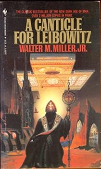
I first read it in the 80s as a mass market paperback that I somehow lost along the way. Other paperbacks from that time are yellow with age and getting brittle, but still readable.
I read it again in the late 2000s on a first edition Kindle. I eventually migrated to iPads for Kindle reading, but every couple years I would come across an old Kindle in a drawer, charge it up, and check out what I had been reading on it. They eventually stopped working entirely.
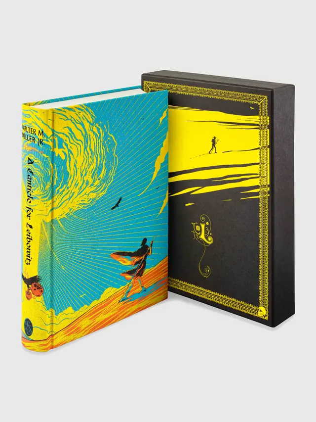
I’m just finishing reading a new Folio Society edition, printed on heavy, acid-free archival quality paper. If it doesn’t get soaked or burned, it could still be in good shape for centuries.
The ephemeral nature of digital storage does give me some pause. We can still read Sumerian tablets full of administrative trivia from four thousand years ago, but there are no known copies of some important software products from just fifty years ago.
I am a proud supporter of the Internet Archive!
English