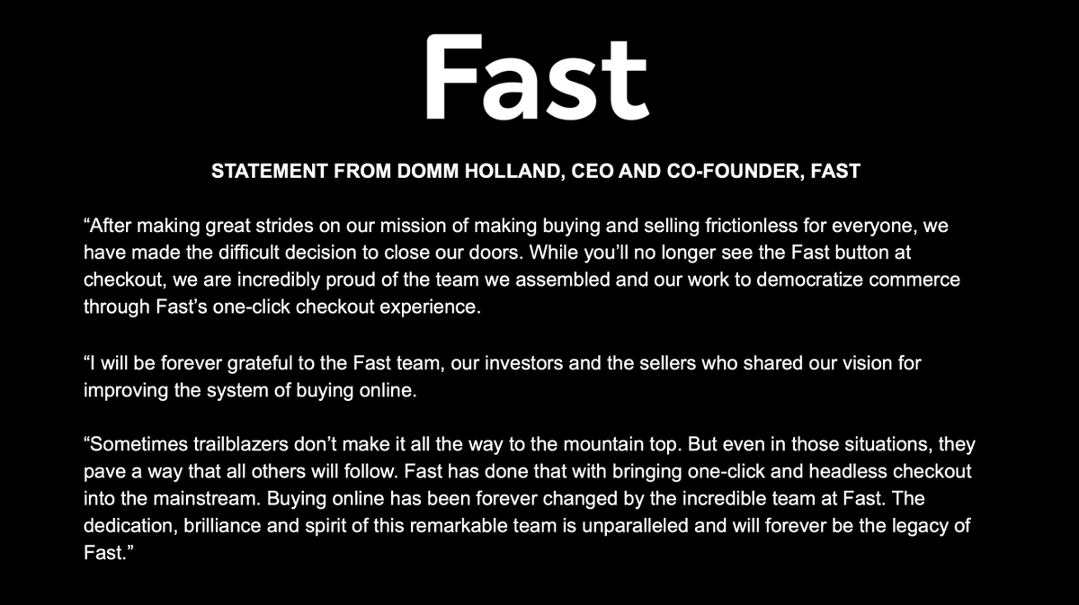
Fast
8.4K posts

Fast
@fast
One-click checkout, nowhere.
The entire internet Katılım Ekim 2018
386 Takip Edilen31.2K Takipçiler


Hey let's check in on the company whose founder encouraged his employees to take recourse loans to buy their shares at an $11B valuation 2 years ago:

English


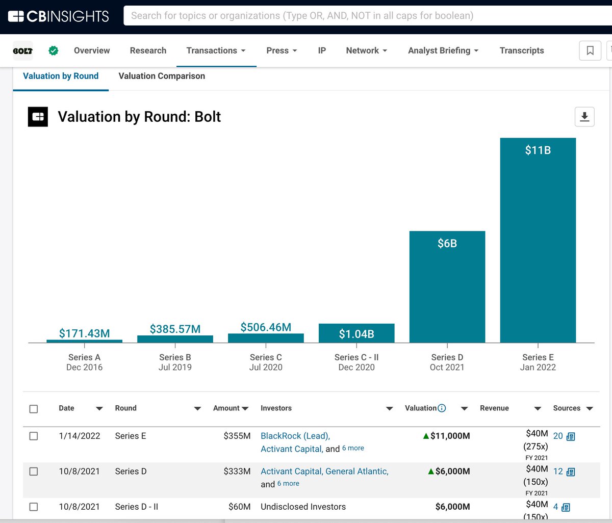
Valuation cut - from $11 billion to $300 million
1-click checkout unicorpse Bolt is said to be valued at $300 million in recent buyback per The Information
It's raised over $1B of financing
Every round of investors getting torched here (as are employees)
Liq pref not going to help much here
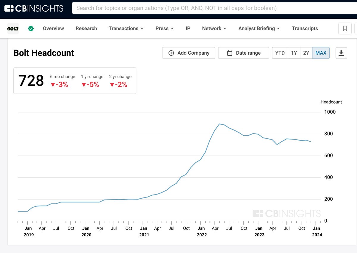
For some reason, the company still has 700+ folks on the team
Brutal (but not surprising at all)
Sources:
Bolt financing history
app.cbinsights.com/profiles/c/zny…
Bolt headcount trend
app.cbinsights.com/profiles/c/zny…
Bolt valuation cut news
theinformation.com/articles/bolt-…
English


Every time you ask the user click you lose half of them.
(AKA why tutorials, splash screens, and lengthy signup flows are a bad idea)
If you’ve been building apps for a long time and have seen the results of a lot of A/B tests, you quickly realize that people are a flighty bunch. Ask them to download an app and 80% will bounce right on that page. Ask them to sign up and 90% will hit the back button to avoid putting in their email and password. Ask people who’ve arrived from Google to read an article, to subscribe and get more updates, and 99% will head back to find the next article.
In the early days of Uber the only way to sign up was to give your email address a bunch of other fields and also your credit card number. Some of the big early winds in acquiring customers was just to make it so that you could sign up with a phone number and a password, and put in your credit card lead in the flow. If memory serves me right, these were increases on the order of +50%.
You get the drift of what I’m arguing.
So what happens when your designer has the fantastic idea of a stark and beautiful homepage for your new product that takes a few clicks to sign up, followed by a lengthy tutorial to explain all the features? Sometimes this becomes a life and death decision, because rather than signing up thousands of users into your private beta, which provides the traction to raise your next round of funding, instead only a few hundred make it through.
This is why, when I get feedback on a critical flow within a product, I always start by minimizing the number of clicks and steps. I asked whether each field in a sign-up form is really needed, or is optional. I ask the question of whether you need to user to do something now versus having them set it up in the future, when they’re more bought into the product. I ask to remove all the glitzy, visual steps that explain things and just ask the user to hit next. I move the sign-up form to the first experience, whether that’s on the homepage, or the opening screen of an app. If there’s a call action, while the user is doing something else, like reading an article, my theory is that you should be very upfront with it and make it a blocking modal, or not do it at all. No half measures.
The point of all, this, of course, is to get people into the magic of your product. The magic is not in filling out forms or watching cute videos about your product, it’s about using your product as quickly as possible. As a result, the only acceptable forms of friction are ones that ultimately enhance the users ability to have a great experience. Thus product is much better experienced as an app, where you have a notifications channel and a richer experience, then, by all means, ask the user to download something. If a product is much better, when used with colleagues or friends, that it might make sense to take a lower conversion rate during the sign-up flow in exchange for some sharing or inviting functionality, that brings more people into the app. Ultimately, it’s all a trade-off, where every click drops off a huge number of users, so you need to spend that user intent very very well.
Ironically, it can also be an anti-pattern to not ask users to sign up or install or do anything at all, because once they bounce, which they will inevitably, do, you have no way to get them back. That’s why it’s all a trade-off, and one of the trickiest things about the user growth discipline is knowing when to add friction, and when to take it away.
Also, interestingly enough, as you make it easier and easier to sign up to reduce friction the quality and intent of the users also decreases. If you double the number of sign-up typically, you do not get twice the number of paying customers.
Nevertheless it’s an important thing to remember: Every time you ask the user click you lose half of them. Be careful.
English


Kinda wild how VCs were investing hundreds of millions of dollars into one-click checkout companies
English


English


English

Having our first DTC Dinner at the Olive Garden in Manhattan Beach this November!!
Looking for a sponsor so we can eat unlimited breadsticks and salad.
Also the topic, “you’re not a loser, it’s just Meta”.
If you’re in LA/SD and want to attend hit me below. If you’re rich and think you can afford that bill to be our lead sponsor, DM me.
English


My company @unspun_io bought second-hand furniture at an office liquidation in SF. They gave us these for free.
Offer me a trade— hoping they go to a good home :)

English

I DO NOT NEED ANOTHER HOODIE.
I DO NOT NEED ANOTHER HOODIE.
I DO NOT NEED ANOTHER HOODIE.
I DO NOT NEED ANOTHER HOODIE.
I DO NOT NEED ANOTHER HOODIE.
I DO NOT NEED ANOTHER HOODIE.
Portland, OR 🇺🇸 English


What’s a technology that no one is currently talking about that will have the biggest impact over the next 20 years?
English


@fast hey can i still buy a hoodie tho mine is getting worn out
English