Hanmiru
51 posts

Hanmiru
@HanmiruLee
I design & build premium Framer templates. Real design, real code — Luminacle Studio.
Katılım Şubat 2026
37 Takip Edilen4 Takipçiler


Framer just quietly ended the template business as you know it.
When I started there were maybe 1k @framer templates on the whole marketplace, and with a quality product the hardest part was just getting approved.
Now anyone can publish ∞ templates a day with no approval, so we're heading toward 1k a week.
When everyone can publish anything, the hard part is just getting noticed.
The best designer no longer wins.
The designer people actually follow does.
That's uncomfortable for a lot of us who just wanted to build, but it's where this is going.
Nobody finds you by accident anymore.

English


Of course design doesn't begin with a blueprint -that's obvious. The blueprint is the point where a designed building becomes precisely visualized. And that's exactly what this is: a website for showing architecture. Seems like that's the part you didn't quite understand.🤔
English

@HanmiruLee @framer No, architecture does not begin with a blueprint. If you don't understand this, you don't understand design.
English
@cedric_design @framer Love that the playful vibe still comes through in a clean framer build. That balance is hard👏
English

@jbcode_it Second one already. nice pace👏 The testimonial quote section layout is clean
English

@AdityaSur11 The fact this is pure framer, no code. respect. Timing is so smooth 🔥
English

@Adkolibraheem The cozy and cute illustrations sells it instantly. Congrats on pushing through 🙌
English

My first Framer template got approved 🎉
My Coffee Shop template is now live on the Framer Marketplace.
Took me ~8 months of building, reworking, and pushing through rejections.
It’s finally out.
Preview link below 👇
GIF
English
@ArbiDesign03 Love this energy. Currently building a portfolio site + just dropped my first template 🙌
English

Been a little quiet here, but I'm back building.
Lately, I've been working on improving my Framer skills and experimenting with better layouts, stronger CTAs, and cleaner website experiences.
From today, I'll be sharing more of the process — wins, mistakes, experiments, and everything in between.
If you're into Framer, web design, or growing as a creator, stick around. 🚀
What's one thing you're currently building?

English
@simoom_design I love dark. That green color makes something special
English


the full version

Vektora Studio@vektorastudio
Hero and bento for AI Process Automation Landing Page
English

designing a wildlife hero section,
which one do you prefer?
glass or gradient.


English

@watermelonshstd I like white. But the background looks dark to make readable. How about to use angled gradient? Top right to bottom left. Or vertical from upper part.
English


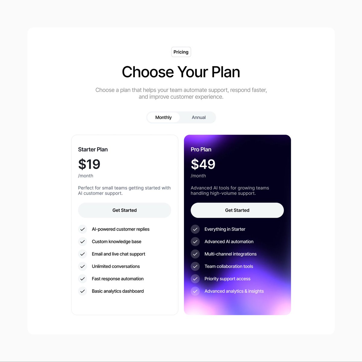
@pankajstwt Perfect! Satisfying designs. Especially pricing section is awesome
English

landing page designed for keldron
(a closer look 👁️)


Pankaj@pankajstwt
you only need $1499 to stop looking like a side project.
English
@sketchtosoul Maybe bottom left card’s description text is not ‘Fill’
English

Another Framer component right before Sunday service.
Is it Framer marketplace worthy or too basic?
English