Iván B.
5.2K posts

Iván B.
@PuzleGraphics
Visual Explorer — Branding, Art Direction, Strategy For business inquiries — [email protected]
Barcelona, Spain Katılım Mart 2013
563 Takip Edilen1.9K Takipçiler

Hola hola! Desde hace unos meses estoy colaborando con MKOI en la parte estratégica y creativa de licensing.
Tenemos preparadas varias colecciones y están planteadas no solo como apparel sino como content. Creo que las vais a disfrutar. Hay mucho cariño y un equipazo detrás!
Movistar KOI@MovistarKOI
A Dragon is born. AKO Collection 08/05
Español

Necesito freelance para traducir y localizar un juego de mesa de español a catalán. HELP ☺️
Español
Iván B. retweetledi

The last two weeks has seen an incredible response to our call for submissions from designers around the world to share their logo work. Many of us owe a great deal to the legendary Spanish designer Cruz Novillo who, we are sad to learn, has passed away 🥲 His contribution, not just to much of the pioneering work he did in his country, but the effect it had on the wider international design community was substantial. He must remember, the work we do today was founded on those that came before and show humility in this understanding. Sending love to his family, friends and all those influenced by and cared deeply for his work ❤️

English
Iván B. retweetledi

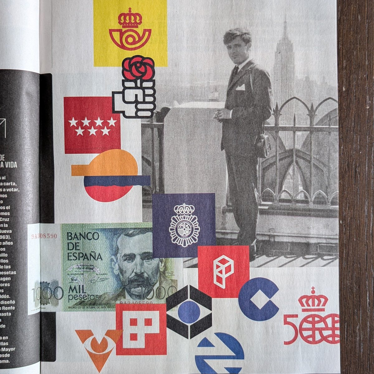
Hoy nos ha dejado Cruz Novillo, con 89 años:
El hombre que rediseñó nuestra galleta y la imagen de toda España.
Gracias por tu legado. 🖤

Gràffica@graffica_info
Español
Logos y marcas — ©C2
Una selección de logos realizados entre 2025 y 2026
Disponible en behance: behance.net/gallery/247857…
GIF
Español
Iván B. retweetledi


Me gustaría encargar el diseño de un logo, ¿me recomendáis gente?
Español
Iván B. retweetledi

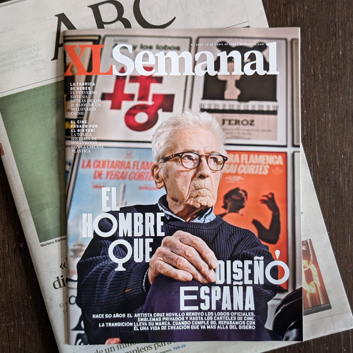
El señor del que tanto aprendo cada día es hoy portada en XL Semanal.
abc.es/xlsemanal/pers…
Madrid, Spain 🇪🇸 Español
Iván B. retweetledi

Architect vs. Artist: Who Actually Drew the Century’s Most Iconic Logo?
The creation of the Mexico 68 logo remains one of graphic design’s most storied power struggles. While history often highlights American designer Lance Wyman for the technical execution of the radiating parallel lines, archival evidence and testimonies from the Organizing Committee strongly support Pedro Ramírez Vázquez as the conceptual architect. As the Committee’s President, Ramírez Vázquez rejected initial proposals as too "Western" and dictated the core vision: a fusion of the five Olympic rings with the digits "68." He sought to marry modern Op Art with the linear geometry of indigenous Huichol wax paintings, ensuring the identity was undeniably Mexican.
The drama between the two men stems from a fundamental clash over authorship versus collaboration. Wyman has long maintained that his arrival in Mexico City and subsequent sketches birthed the "68" logotype. Conversely, Ramírez Vázquez’s estate has produced documents suggesting the geometry was already being prototyped under his strict direction before Wyman was even hired. This friction illustrates the tension between a visionary director who sets the "Total Look" and the talented designer who refines it. While Wyman provided the expert hand, it was Ramírez Vázquez’s cultural authority and specific geometric instructions that ultimately defined the logo’s soul, leaving a legacy of brilliance shadowed by a lifelong dispute over who truly held the pen.
#logodecks

English
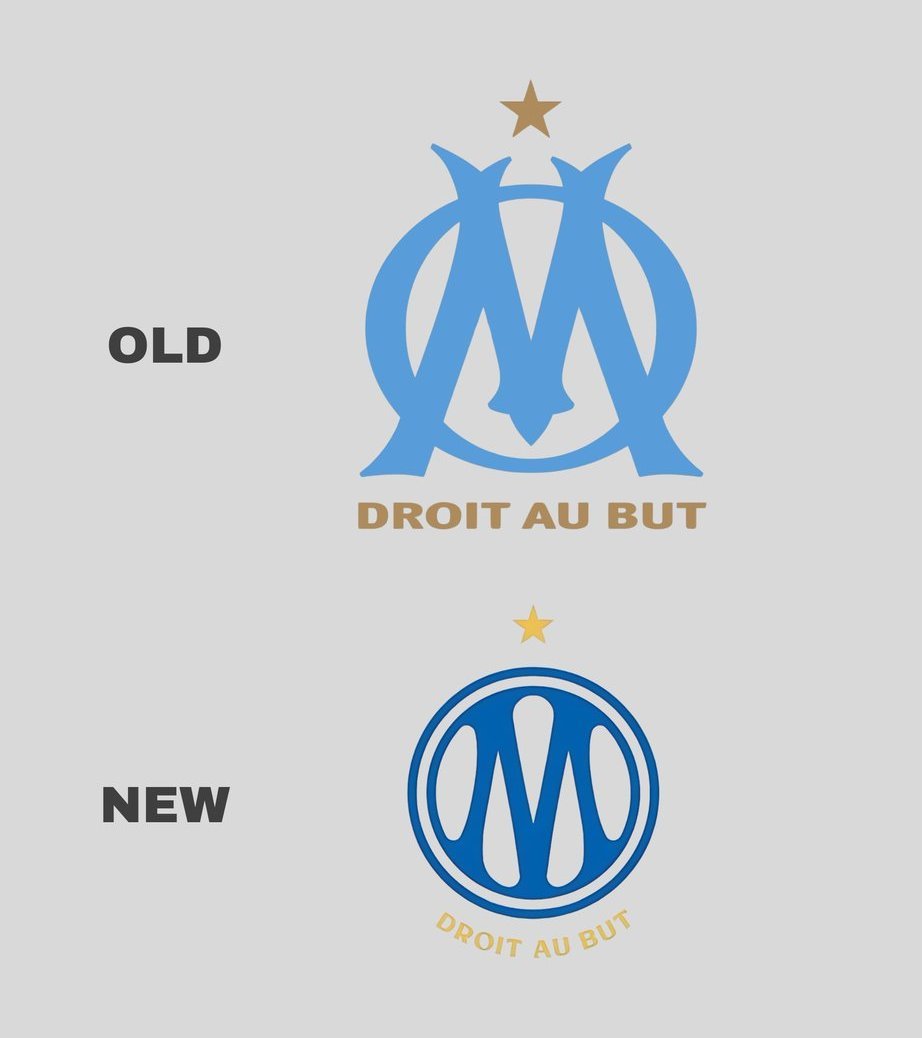
@ka1zen Lo mejor del cambio de este logo es que algunos se estan dando cuenta que una W es una M al reves 😭 x.com/_BeFootball/st…
BeFootball@_BeFootball
Vous trouvez qu’ils se ressemblent ? 👀
Español

Thoughts on Olympique de Marseille new logo?
I can understand some of the hate since the previous one was there for 22 years and lots of detail was lost, but I see where they're coming from, and it's a change they needed to adapt to modern times. Believe me, we've seen worst.

English

@PuzleGraphics Me puedo imaginar que la embarcada que debe de ser sacar algo propio de cada país organizador + un branding general podría ser un quebradero de cabeza y han preferido tirar por algo mas general y luego trabajar la linea gráfica para adaptarla a cada sitio
Español
Por qué se ha puesto de moda entre los aficionados del fútbol criticar cualquier trabajo de una agencia profesional y acto seguido poner los logotipos más difíciles de aplicar de la historia
Noubari@Noubariii
Había conceptos interesantes para el mundial que se viene, no entiendo el porqué dejaron un png sin más
Español
@zoLa_21 Yo si le tengo que poner una pega al branding en general o lo que hecho de menos como aficionado es que no tienen un distintivo propio de cada país como si que lo tenían otros, este lo veo más corporativo y más diferente. Pero igualmente me parece un trabajazo
Español
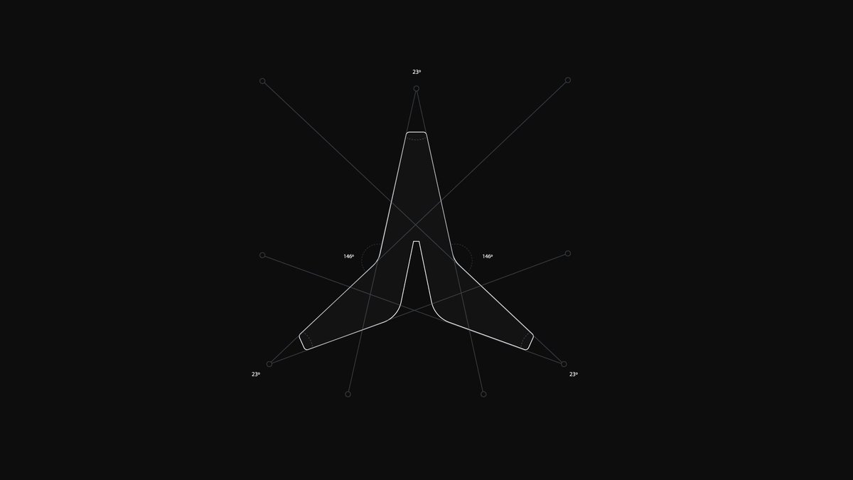
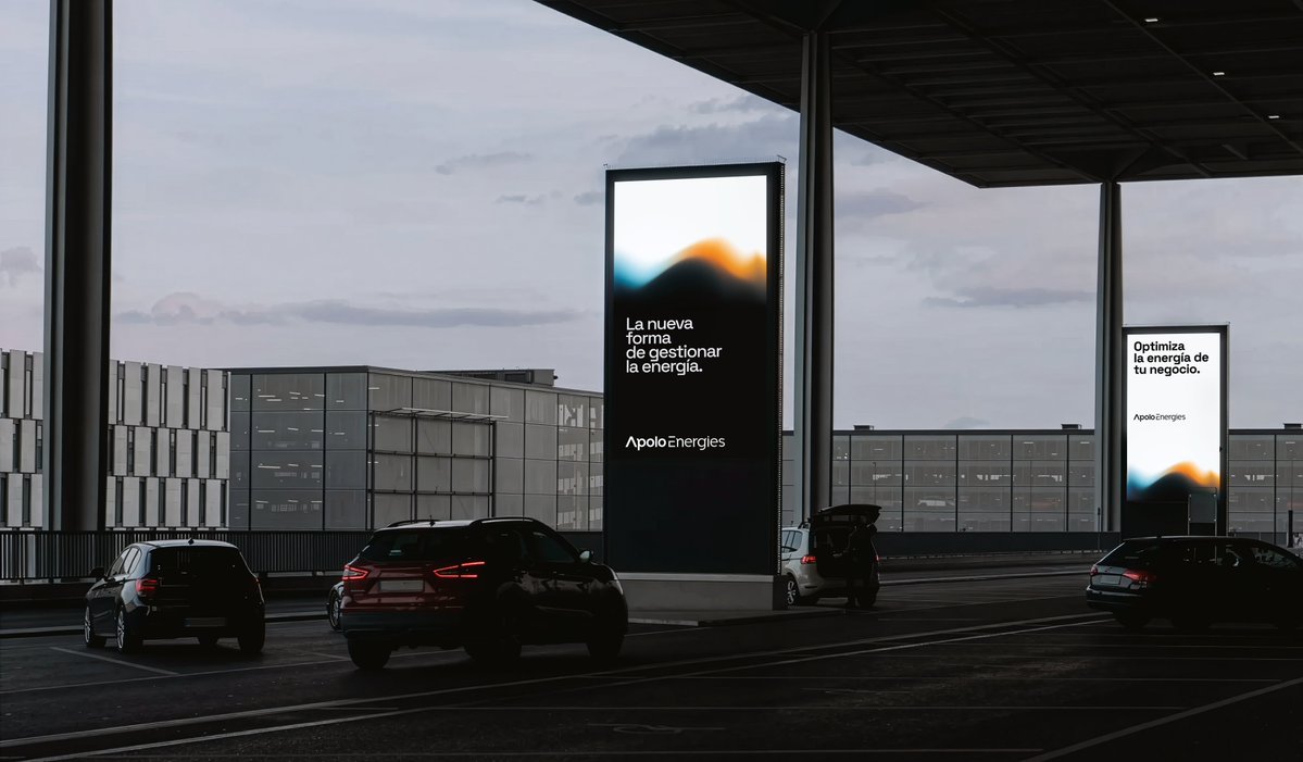
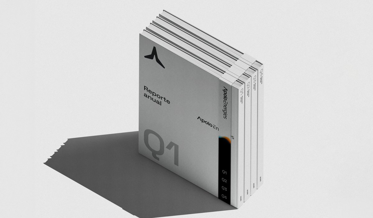
More content — Apolo Energies
Full project on my behance.
GIF
Iván B.@PuzleGraphics
Apolo Energies — Logo & Visual Identity ©2026 Full case study available in the description.
English
Iván B. retweetledi