SauveCrypto

8.5K posts

SauveCrypto banner
SauveCrypto

SauveCrypto

@SuaveCrypto_Btc

●Blockchain Scouter●Typical Trader●Crypto Security●Web3 Opinionator ●Crypto Market Analysts●GTA5 Racing Legend●Mdot Btc.Thesis Writer.

Crypto Market Affiliate of UDS Katılım Kasım 2021
1K Takip Edilen1.4K Takipçiler
Sabitlenmiş Tweet
SauveCrypto
SauveCrypto@SuaveCrypto_Btc·
1. Clarifying Alpha Concepts • Full cycle = 1,460 days • Halves: 624 / 836 days
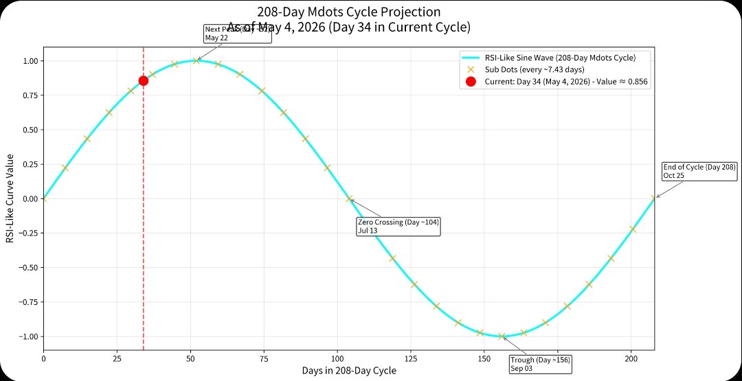
 • Phase = 208 days • Mdots = divisions within the phase • Spillovers = 116 / 17 days Key Concept specified • Full Cycle (Halving to Halving): 1,460 days • Halves: 624 days (pre-top), 836 days (post-top) • Phases: Divisions of the cycle into 208-day segments (7 total per cycle) • Mdots: Each 208-day segment marks a macro inflection zone • Sub Dots: ~28 intermediate points per cycle (~52-day intervals) • Nano Dots: ~94 micro pivots per cycle (~15.5-day intervals) • Spillover Periods: Observed extensions of 116 or 17 days, typically post-cycle. 10-11 Day spike before cross over. Theoretical drift toward 1.0588 (Pi-based circle deviation) Alignment with RSI peaks, alt-season delays, and cycle top intensity (e.g., RSI peak after halving) 2. Observational Confirmation from Chart Cycles: • Clearly delineated cycles (Cycle 2, 3, 4) • RSI peaks: Visible post-halving • Dates: Line up roughly with Bitcoin halving timeline • Price peaks in late parts of cycles (suggesting a lag/spillover) 3. Next Step: To compose an visual framework & Key Concepts for The following • The current price chart behavior • Cycle RSI reactions • Mdots spillover hypothesis • Pi-based angular shift theory (680° vs 720° and the 1.0588 remainder Mapping Bitcoin’s Rhythm: A Study in Macro Dots, Sub Dots, and Nano Dot Theory By Nathan Since its genesis block in 2009, Bitcoin has displayed behavior that seems to echo more than just market speculation. Behind the volatility lies a deeper cadence — a clockwork rhythm with periodic peaks, troughs, and transitional phases. This paper introduces a multi-layered model known as The Days of Transitions Theory, designed to map Bitcoin’s time-based structure using cycles, harmonic pivots, and fractal intervals. The Bitcoin network, has operated not only as a decentralized financial system but also as a reflection of deep cyclical behavior. By examining and modeling its temporal rhythms, we may gain insights into human behavior, economic reflexes, and even cosmic alignment. This multi-layered model of Bitcoin’s behavior, utilizing a time-based methodology centered around “Microdots,” “Sub Dots,” and “Nano Dots” — all nested within the 4-year halving cycle. 
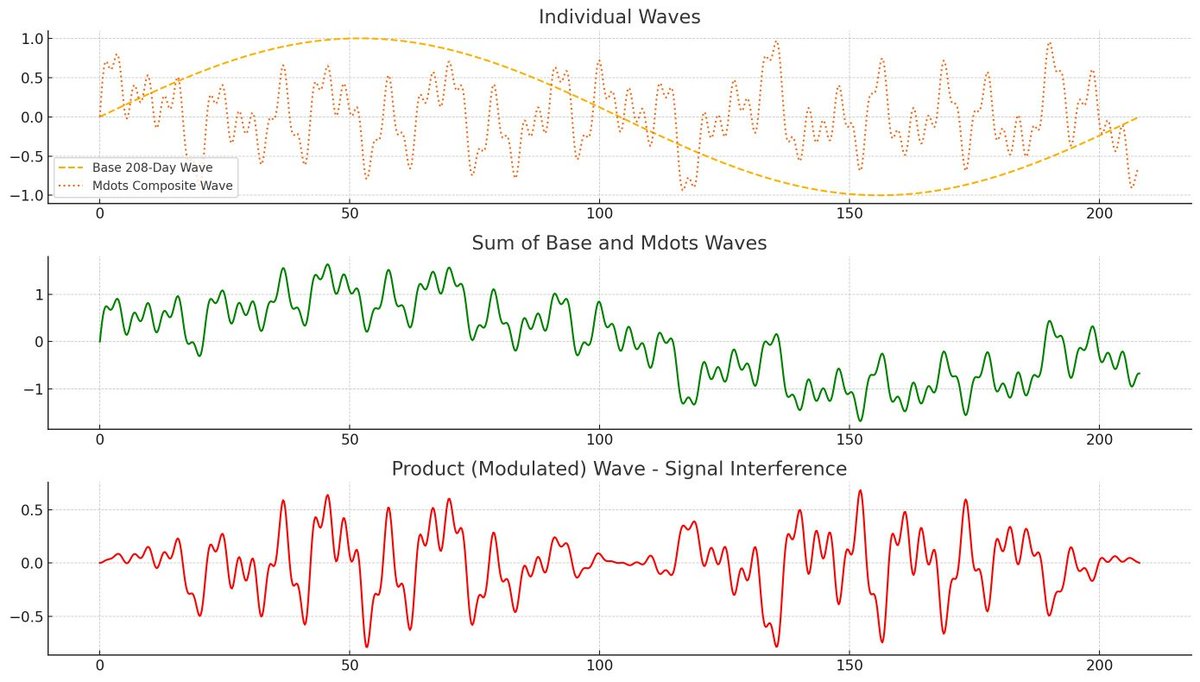
Bitcoin's Gravitational Drift Toward 1.0588 Bitcoin appears to follow a rhythmic macro-cycle roughly every 1,460 days (4 years), primarily driven by the halving events. These halvings cause a fundamental shock in Bitcoin’s supply issuance, often acting as a pivot point in its price behavior. But while many models treat these cycles as neatly repeating, real-world price action often spills over past predicted peaks. This is where the 1.0588 remainder concept comes in. Bitcoin's macro structure has suggested it has a gravitational drift toward a 1.0588 cycle remainder — a number that echoes Pi-based angular deviations (e.g., 720°/680° = 1.0588). This remainder accounts for RSI peaks, alt-season lag, and the extended price surges we see after traditional halving top predictions. @elonmusk @saylor @GaryCardone #Bitcoin #CryptoMarket #Crypto
SauveCrypto tweet media
SauveCrypto@SuaveCrypto_Btc

My Thesis about Bitcoin acting on a Mathematical formula. Something I've been looking at close to 8 years. Pic 1: Microsoft chart of Bitcoin for 1st week April: Pic2: 2021 Bullrun correlation picture Pic3: Bitcoin 208 day Chart Pic4: Key Chart explanation.

English
13
20
73
17K
SauveCrypto
SauveCrypto@SuaveCrypto_Btc·
🚨 BTC CYCLE SYNC CHECK — May 4, 2026 We are EXACTLY here: • Day 34/208 in the Mdots sub-cycle → RSI-like sine wave = +0.856 (STRONG rising leg) → Next peak: May 22 • Perfectly nested inside the 1,460-day halving sine wave (RSI ≈ 60.2) • Final 8 months of the 18-Year Pre-Run Window (Oct 2022 → Jan 3, 2027) Mdot sequence nailed the Feb 2026 flip. Every layer is aligned.Structural symmetry is not a coincidence. This is the highest-conviction bullish setup across all timeframes. Who else is riding? 👀 #Bitcoin #Mdots #CycleAnalysis
SauveCrypto tweet mediaSauveCrypto tweet mediaSauveCrypto tweet media
English
3
1
7
97
SauveCrypto
SauveCrypto@SuaveCrypto_Btc·
@NotEzzAI I was in a space listening thinking wow. The noobies gonna fall for this shit.
English
0
0
1
5
NotEzzAI
NotEzzAI@NotEzzAI·
🚩 Alchemist and Ben rugged the room again. 🚩Alchemist even deleted the recording of the space after the rug so if you weren’t there, you wouldn’t know.
NotEzzAI tweet mediaNotEzzAI tweet mediaNotEzzAI tweet media
English
18
6
49
8.7K
SauveCrypto
SauveCrypto@SuaveCrypto_Btc·
The First Image is $Bitcoin & 2nd Image is $Ethereum. I Hope you See The Pattern.
SauveCrypto tweet mediaSauveCrypto tweet media
English
0
0
0
34
SauveCrypto
SauveCrypto@SuaveCrypto_Btc·
Bitcoin is going to hesitate while Ethereum rise overtime. (2ND image) the RedLine = Bitcoin and GreenLine = Ethereum. Chart will be provided.
SauveCrypto tweet mediaSauveCrypto tweet media
English
1
0
1
103
SauveCrypto
SauveCrypto@SuaveCrypto_Btc·
@TedPillows This $BTC on Dex. I can see liqudity grabs more clearly. We going to 88k
SauveCrypto tweet media
English
0
0
0
6
SauveCrypto
SauveCrypto@SuaveCrypto_Btc·
@YazanXBT That becuase you dont live in a country with first world money
English
0
0
0
9
Doctor Profit 🇨🇭
Doctor Profit 🇨🇭@DrProfitCrypto·
Why the Stock Market Is Going to Crash: Part 1: What the 1973 Oil Crisis Teaches Us: The Big Sunday Report: Back in 1973, about 5–7% of the world's oil demand was cut off for roughly 5 months, and the consequences led to the worst crash in history since the Great Depression! Today, around 20% of the WORLD'S OIL DEMAND has been affected for 2 months, and there's no end in sight. This means the situation today is even worse than it was during the 1973 oil crisis, and yet most don't understand the pattern! This brings me to the question of how the $SPX (SP500) behaved then, and we need to compare it with now. In 1973, the #SPX crashed 20% as in October 1973 the Oil Embargo was announced. During that time, the S&P 500 was 7% away from its ATH, recovering from an earlier 17% correction, and the market was in strong euphoria believing in the next rally. Investors thought the worst was over, and out of the sudden the embargo hit the market and we saw a sharp drop of 20% that followed in October 1973. The same we saw in March 2026, the Strait of Hormuz was closed and the S&P 500 reacted with a 10% downside move. This is what I call the first shockwave, but what if I tell you that the real, and much worse downside move happened after the announcement of the end of the oil embargo was made ? The oil embargo officially ended on March 17, 1974. This is when the real crash began, and the S&P 500 crashed 40% within the next 6 months! This was the worst crash since the Great Depression, and only 2008 was worse. The crash didn't happen during the embargo. It happened after the embargo was lifted, when everyone assumed things were going back to normal. The damage to the economy, the inflation, the higher input costs, the broken consumer, had already been done, and the market understood the damage and we see it today as well, as the parallel today is direct. The S&P 500 is making new highs while an oil supply shock is unfolding. Investors are doing exactly what they did in 1973: assuming the issue will resolve and pricing in a soft landing. But once the economic damage becomes visible in earnings and consumer spending, the same delayed reaction is likely to play out, and this is exactly what was addressed by Jerome Powell in the most recent FOMC meeting! Inflation is rising again, the FED can't ease anymore! Part 2: The Private Credit and Banking Risk: There's a type of investment fund called a private credit fund. These funds lend money to large companies, working a lot like hedge funds. The problem is that they borrow huge amounts of money themselves to make bigger loans and bigger profits. This is called leverage, and it's a double edged sword. When things go well, profits are programmed, but when things go badly, losses are programmed too. The situation right now is alarming. Investors are pulling their money out at a record pace, with over $7 billion withdrawn from major private credit funds in late 2025. BlackRock has even blocked some investors from withdrawing money. Loan defaults are at record highs as well, with 5.8% of private credit loans in default as of January 2026, the highest level ever recorded! About 40% of the companies that borrowed from these funds are now burning more cash than they earn, and the stock market is starting to notice, with shares of big private equity and credit firms falling sharply. If these funds collapse, banks go down with them, because banks lent them much of the money in the first place. So what happens if banks fail? Since the 2010 Dodd-Frank Act in the U.S. and the 2014 EU bank rescue rules, governments are no longer supposed to bail out failing banks with taxpayer money. Instead, they use something called a bail-in. They take money from depositors and bondholders and turn it into bank shares. The result is that bank stocks crash and ordinary people lose part of their savings. This is why physical gold and silver are the only real safe haven. I consider owning them a MUST. The Main Warning Signs The first and most important is oil. In 1973, oil first moved up, and the stock market crash came after the Arab nations reopened oil supply. The damage was already done. What we're seeing now in the S&P 500 looks like the final push higher before the expected crash. History is repeating itself. The second is the yield curve inversion. This happens when short-term interest rates rise above long-term rates, which is a clear warning sign. It has come before every U.S. recession in the past 50+ years, usually 12 to 24 months in advance. Back in 2025, I wrote a full report pointing to June 2026 as the likely crash zone, and the report was written in September 2025 and can be found here: x.com/DrProfitCrypto… The third is insider selling at record speed. Company executives and big shareholders have been dumping their own stock at a pace never seen before, especially since August–September 2025. When insiders are selling this aggressively, it tells you everything you need to know and thats something I observe since many months! The fourth is extreme risk appetite, and right now it's at its highest point since 2021. In simple words, risk appetite means how much investors are willing to bet on risky things like stocks instead of keeping their money safe. Right now, investors are throwing money into risky assets like never before. According to EPFR fund flow data, risky assets have seen record net inflows exceeding safe assets by 220bn over the last 4 weeks, the strongest since the 2021 meme-stock peak. To put it simply, people are pouring much more money into stocks than into safe places, and the gap is the biggest we've seen in years. This also aligns with updates to S&P Global's Investment Manager Index risk appetite gauge and Goldman's proprietary RAI, both hitting multi-year highs. This is the same type of euphoria we saw right before the 2021 top, and history shows that when everyone is greedy and chasing the market at the same time, the top is usually very close and this is the moment when risk appetite is this extreme, it's a clear warning sign, and trust me, you dont want to be among the losers who bought the top! The 1929 Parallel: Why You Need to Study the Great Depression Study the Great Depression of 1929, and I can't repeat it often enough. Study it, you need to study 1929! You will notice many similarities. The people who owned physical gold and silver back then were the big winners. Land was sold for even one penny because there was no liquidity at all. Farmers had tons of wheat but there was no one able to buy it. The US President Herbert Hoover famously said right before the great depression, "Prosperity is just around the corner," talking about the stock market and its bullish movements and claiming that nothing could stop the upside move. Everyone in the US was invested in stocks back then, the same as today, as record amounts of retail investors are sitting on stocks currently, the highest amount of retails ever recorded. Now, a hundred years later, we have another president talking about the stock market like no one else. Trump is talking about being tired of winning, or calling it the best economy ever based on the stock market, and ignoring the real economy that is suffering and has no liquidity to breathe currently. I see tons of similarities, and I am scared to even speak it out, but my biggest concern is a repeat of the Great Depression. I am not a doomsday caller, but I am here to remind you that physical gold and silver are more important than ever, no matter what the price says. My Trade and My Targets Let me be clear about where I stand. I am not just talking, I am positioned. I have shorted the S&P 500 at 6400, 6700, 6900, and 7100, and my final order remains open in the 7400 region if the market gives us that opportunity. In my view, we are deep inside top territory, and I am placing my shorts right here, right now, for every single reason laid out above. The signs are everywhere. Spotting the top is not the hard part, anyone paying attention can see it. The hard part is pinpointing the exact target on the way down, because that depends entirely on one thing: will the FED print again? And the answer that history teached us is simple. The FED only starts to print once a crisis hits, and now lets ask the same for 2008, where the FED wasnt able to print more money, and the Lehman crisis and the 2008 crash started and how likely is it in the current time ? In 2008, the FED did not intervene to save Lehman Brothers. Everyone expected a rescue, everyone assumed the FED would step in like it did with Bear Stearns just months earlier. But the FED let Lehman fail, the bank went bankrupt, and the entire financial system nearly collapsed with it. That single decision changed everything. It triggered the worst financial crisis since the Great Depression, and it is the exact reason the bail-in laws I mentioned earlier even exist today. Dodd Frank in the US and the EU bank rescue rules were both born directly out of the chaos of 2008, designed so that taxpayers would never again foot the bill. Next time, depositors and bondholders pay, and this is where the real risk hits the ordinary person. In simple words, if your bank fails, the government will not save it with taxpayer money like in 2008. Instead, the bank takes a part of your savings, anything sitting in your account, and converts it into worthless bank shares of the failing bank. Your money is gone, replaced by stock in a bank that just collapsed. In the EU, deposits up to €100,000 are technically protected by deposit insurance, and in the U.S. up to $250,000 by the FDIC, but anything above that is fair game, and history has already shown us this is not theory. It happened in Cyprus in 2013, where depositors lost a huge chunk of their savings overnight, and this will let the fire of the crash expand. So for my targets, I see three realistic scenarios, and they all depend on the FED: Scenario 1: The FED panics and prints again. If inflation cools enough to give them room, they flood the system with liquidity, and the crash is contained to a sharp but limited drop. This is the most "comfortable" outcome for the market. Scenario 2: The FED is trapped by inflation and cannot print. With inflation rising again, as Powell himself just confirmed, the FED may have its hands tied. No money printing, no rescue, and the market bleeds out for months. This is the painful, drawn-out scenario. Scenario 3: A full 2008-style collapse. The FED lets something break, just like they let Lehman break, and the entire system cracks open. Bail-ins get activated, banks fall, savings get wiped, and the SP 500 sees a crash on the scale of 2008 or worse. This is a very real option, and I refuse to take it off the table. I am positioned for all three, and depends on the targets the probability that we are at top area is extreme high. The only question left is how deep the FED is willing to let this fall, and based on inflation, based on Powell's own words, and based on the political climate, I believe the risk of scenario 2 or 3 is far higher than the market is currently pricing in. The top is in, or it is extremely close. I am short, and I am staying short with an invalidation once the FED starts printing once again! The next weeks will be very important and many will miss out on real time updates and thats where premium is worth everything. It costs $59 / month and thats less than some of the trading fees you are paying! I cant repeat it more often but premium offers insights you are getting no-where else. Join here: whop.com/joined/drprofi…
Doctor Profit 🇨🇭 tweet media
English
183
245
2K
171.7K
Mikki
Mikki@Like_Mikki·
@Raindropsmedia1 Fire her immediately. These girls treat work environment like a village square.
English
2
21
2.7K
36.2K
Rain Drops Media
Rain Drops Media@Raindropsmedia1·
A Whataburger employee is upset with her manager for refusing to let her wear her shirt like a crop top. She claims it’s too big and asks, ‘How is my stomach harming anybody?’ 👀🍔👕
English
3.7K
1.5K
16K
4M
Chaotic Good
Chaotic Good@_ChaoticGood42·
@Raindropsmedia1 She needs to just go next door to Hooters, because ma’am no one is coming to the Whataburger to see anyone dressed like that 🤣
English
6
24
1.1K
30.2K