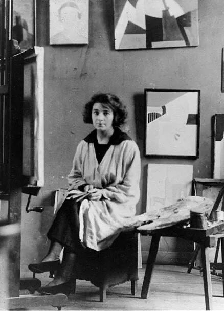
Marthe Donas was one of the very first women abstract painters.
Born in Antwerp, Marthe studies at the local Academy. In 1916 she settles in Paris where she rents a studio in Montparnasse.
Donas worked under the androgynous pseudonyms Tour d'Onasky, Tour Donas and M. Donas.
'A Wiltsire Landscape,' (1928) casts up an early morning mood, a magic realm. By the time of this work, William Nicholson had married Edie Stuart-Wortley and moved to the Old Manor House in the village of Sutton Veny in Wiltshire.
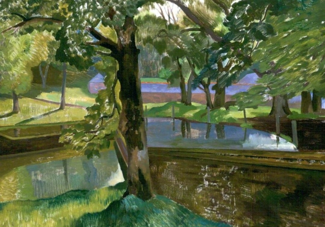
John Nash painted many landscapes around Dorset in the interwar years. He rarely attempted to paint directly from nature, preferring to work in the constant light of his studio from the sketches and watercolours made on the spot. 'Walled Garden, Bredy,' was painted in 1923.
The replies to this person's tweet lack a nuanced understanding of aesthetics. Let me tell you why I don't think this room works.
First, the gold decorations make the room look like an ersatz Versailles. Go to Getty Images and type in "Oval Office." Then zoom in on the gold decor. You'll notice that the lines are very blunted and muddied; they lack the sharp lines and fine detailing that you'd expect on something made by an artisan. Hence why some people have suggested these decorations are from Home Depot (true or not, that's the impression).
You can see the difference between the first and second photos. The first, of course, is of the Oval Office; the second is the reception room from the Hotel de Cabris in France, which was made during the 18th century under the direction of Louis XVI. Even at this distance, the second image looks much better because it was designed and executed by artisans working within a coherent visual language. You can really see the crisp lines and detailing.
Second, the White House was designed by James Hoban, an Irish architect who migrated to the US for economic opportunities (what a great American story!). He originally designed it in the Neoclassical style, drawing on Palladian and Georgian influences.
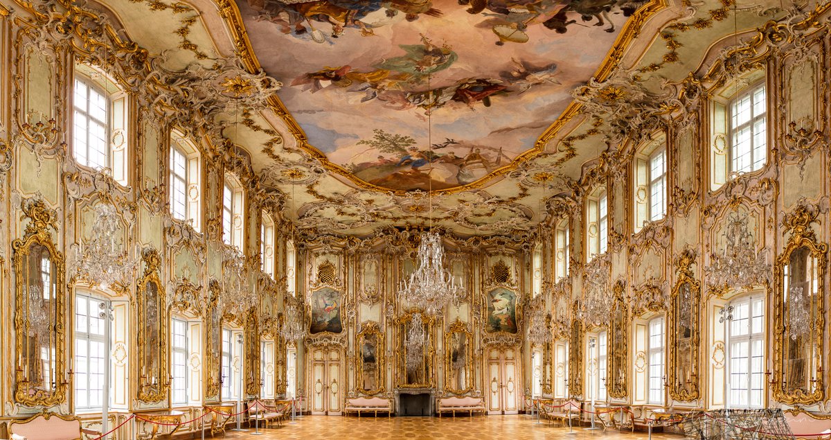
Neoclassicalism was a reaction against the Rococo movement, which reactionaries saw as overly ornate and frivolous. A bit of gold used sparingly and strategically can look fine in a Neoclassical building, but the amount Trump used has so radically encrusted the room that it's now in Rococo territory, making it look like a mismatch of aesthetics. You can see an example of gilded Rococo architecture in the third slide. Although it's not my thing, the effect is totally different because it's coherent.
IMO, architecture sets the terms for you can decorate a space. Modernist furniture looks best in modernist buildings, just as Craftsman furniture looks best in Craftsman homes (see fourth slide). You don't have to do period recreations — sometimes mixing two aesthetics, or old and new, can make a space feel more natural — but having a sense of aesthetic history (art, architecture, furniture, fashion) can help you create better aesthetics.
The Oval Office offends on at least three levels: the ersatz nature of the decor, the way it grates against Hoban’s Neoclassical vision, and the way it misunderstands the classical-republican symbolism that the White House was meant to project in the first place. As others have noted, this is the kind of decor you'd expect from dictators who rob their own country.
I wish I could send my grateful thanks individually to everyone who has wished me a Happy 80th birthday!! Truly wonderful of you ALL . THANK YOU SO MUCH 🙏😊