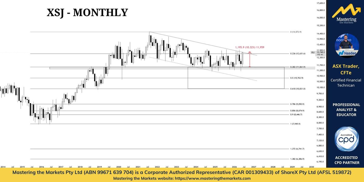
Consumer Staples (XSJ) have been one of the standout sectors this month, already rallying more than 10%.
You've probably noticed Woolworths and Coles breaking above key technical levels, while Metcash has also delivered a strong rebound off the zag zone. The sector is now approaching a major inflection point.
The 13,000 level is the one to watch.
A decisive break above that level would see Consumer Staples break out of a five-year bear channel. What's interesting is how cleanly the sector found support at the 38.2% Fibonacci retracement, which also aligned with a major historical support and resistance zone. From there, price transitioned into an accumulation phase before pushing higher.
Technically, that's a very constructive structure.
The defensive sectors continue to show relative strength, and Consumer Staples remains one of the better-looking areas of the Australian market right now.
For transparency, I still hold significant long positions in names such as Woolworths, with entries from around $26. The trend remains favourable while these recent breakout levels continue to hold.
@CraigDicksonMTM Thanks, that was very helpful to understand.
To help the fall, I believe it may of also been in "Distribution" on the weekly, so with bad news it fell futher than in the other phases?
Graincorp - GNC:ASX and how to play the Agri commodity reality 👀
Being exposed to a market that’s flooded with supply is rarely a good thing as an investor/trader, but that is literally the reality of the grain market right now 🌽🚜
Right now the grain market is still dealing with:
❌ global oversupply
❌ low grain prices
❌ compressed margins
And GNC were caught right in the middle of it - I flagged in @MasteringMkts Academy a month or so back that GNC did let us know abut the challenges back in February 😶🌫️
Unfortunately their latest half year result was poor and many were caught out 😬
With GNC it’s fair to ask “But aren’t wheat and grains meant to be pumping because of supply issues and geopolitical tension?”
GNC’s result is actually a really good example of the disconnect that happens between an agricultural commodity market and the actual companies involved 💪
So despite the bullish long-term narrative…the CURRENT reality is still soft 😬
And while the commodity price itself may spike/run on fear and froth, the actual market itself usually takes time to actually be impacted by the issues the spot price market is freaking out about.
This is where understanding commodity cycles matters.
Usually the sequence goes:
1️⃣ supply issues begin forming
2️⃣ inventories slowly tighten
3️⃣ spot commodities react
4️⃣ then producers/processors improve later
There’s often a lag.
And sometimes we get what’s happened in this current case with the war where number 3 moves to number 1 in anticipation, but that anticipation takes time to play out in to on-the-ground market reality 👍
Either way, business like GNC usually benefit last in the chain.
—
So if you’re bullish Agri over the next 6–12 months because of:
• geopolitics
• fertiliser costs
• weather risks
• supply chain disruptions
…then the cleaner trade may actually be:
➡️ commodity exposure itself - wheat/corn etc
➡️ ETFs
THEN later:
➡️ businesses leveraged to improving grain margins like GNC.
Bottom line:
The long-term Agri setup is still very interesting.
But GNC’s result was a reminder that:
…the current grain market is still oversupplied and margin pressured right now 📊
The play is there, just not through GNC at the moment 🫡💪
$GNC #asx
The majority of investors consistently lose money by following the crowd, with recent silver and hydrogen examples proving sentiment trumps headlines, writes ASX Trader.
Full story: bit.ly/4mRNTnO
At gym and decided to make a post since i’ve been quiet on here.
Whipped this up in 5 mins so if you want a deeper explanation I am happy to record a video for you guys to help it make sense.
For the following:
All of this applies on every timeframe.
Reversal signature: ASSUMING BIAS IS BULLISH**
Price always sweeps liquidity/runs out impatient traders stops to begin with. This sweep must be into a key level (I’m happy to make a video on this as well).
The way price reacts to that low means everything.
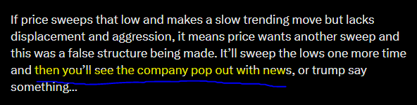
If price sweeps that low and makes a slow trending move but lacks displacement and aggression, it means price wants another sweep and this was a false structure being made. It’ll sweep the lows one more time and then you’ll see the company pop out with news, or trump say something…
If it sweeps the low and makes a v shape off that low, you can safely trace continuations higher with your stop being protected. It’s very simple once you know what to look for in terms of trusting lows.
Tung working his magic in NZ at our first international Mastering the Markets event 🇳🇿
I could honestly listen to him speak all day.
This feels like the first of many…
So I’ll throw it to you — where should we come next year?
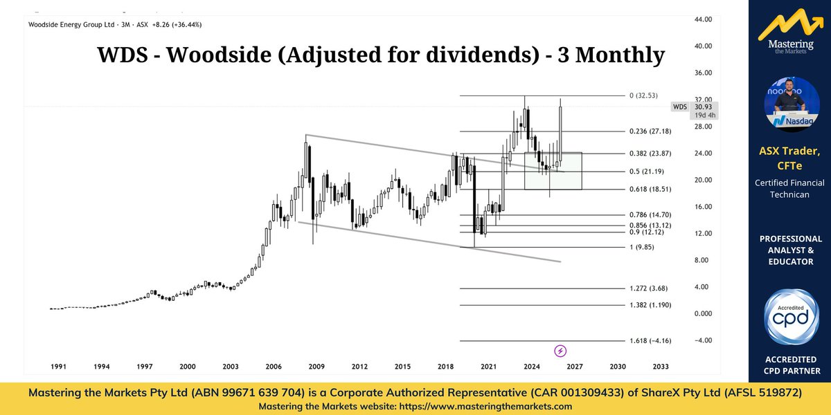
What you will notice on the dividend adjusted chart is that Woodside was actually in a major bear market from 2008 to 2020, moving largely sideways during that entire period. The COVID low in 2020 marked the major bottom, very similar to what we saw in silver.
From that point, Woodside began a new bull market, rallying strongly and pushing up to a new high into 2023. Over the past few years we have simply seen a healthy correction, pulling back toward the 0.618 Fibonacci level, which also aligns with the old resistance channel now acting as support.
Technically this is exactly the type of structure you would expect to see during a developing bull market.
And now price is beginning to move again about to take out new highs which suggests Woodside may be entering the early stage of an expansion phase and the beginning of the next major leg higher.
In other words, it is likely approaching the point where the move shifts into the public phase of the cycle, even though most investors do not realise it yet because they do not fully understand how income stocks behave on dividend adjusted charts.
A small tip that can completely change how you look at dividend stocks.
This is Woodside on the 3 month chart.
One thing you will notice is that every time the market becomes extremely oversold and momentum crosses back bullish, something very interesting happens.
100% of the time Woodside has reached this level of oversold conditions and crossed bullish again, it has delivered at least a one year bull market.
Every single time.
That does not mean the market goes straight up. Markets never move in a straight line. But historically when Woodside reaches this level of oversold momentum and then turns bullish, it has marked the start of a major move higher. This is where combining technical analysis, fundamentals, and macro becomes powerful.
Most people buy Woodside for income because it pays a strong dividend. But there is also a little trick inside TradingView that can completely change how this chart looks. When you see it, the entire structure of Woodside makes a lot more sense.
I have left a small clue in the comments for anyone curious enough to go looking.
This is one of the reasons I hold a large position in Woodside across my long, medium and short term portfolios.
I look for income stocks that also have the potential to deliver strong growth. My view is simple. I believe Woodside will take out its previous highs within the next five years, and while I wait I will be collecting a very healthy dividend along the way. That combination is incredibly powerful. You are getting paid while the asset appreciates.
In many ways its like buying property at the bottom of the GFC. The difference is you do not have the headaches that come with property.
No tenants
No repairs
No maintenance
No phone calls when something breaks
You simply own the asset, collect the income, and let time do the heavy lifting while you go and enjoy your life.
check the comments for Woodside adjusted for the dividends chart and you'll see what I'm seeing.
People get caught up in the butterfly effect. The day to day moves. Even the week to week noise.
That is why I love zooming out to the big timeframes.
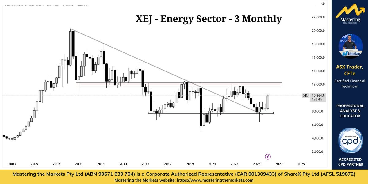
The energy sector in Australia, XEJ, is in clear accumulation mode. It had a beautiful spring back at the COVID bottom, which marked the end of the bear market.
Now the structure is building.
Once it clears the red zone around 12,000, that is when the public participation phase begins. That is when everyone suddenly turns bullish on energy again.
But by that point the move is already well underway.
I know where energy is going. I know where oil is going. And in my view it is one way.
Up.
I have positioned myself accordingly. And unless the data changes, the evidence is overwhelming.
When you look across 100 charts telling the same story, they cannot all be wrong. Follow the data!
4 months ago I posted this picture and message about oil.
At the time oil was quiet. Sideways. Boring. Most people had no interest in it because nothing exciting was happening. But that was exactly the point.
This is what I try to teach you in real time.
Most people wait until something is already moving before they become interested. By then the opportunity is already well underway.
You all wanted silver after it had already started moving.
We accumulated silver before everyone wanted it in the low 20s.
Now the same thing is happening again. You all want oil now that it is starting to move. But we accumulated oil before everyone wanted it.
That is how professionals think about markets. You do not chase what has already moved. You position yourself where the next attention is likely to go.
Markets move in cycles. Capital flows from one area to the next. It is telling a story if you know where to look. The real question traders should be asking right now is not “Did I miss oil?”
The better question is:
Where is capital likely to flow next?
What is currently quiet, ignored, and historically undervalued?
What market, asset or sector today looks boring… but is quietly preparing for its next move?
Because the next opportunity is usually building long before the crowd notices it.
Drop your ideas in the comments below.
Q: Based on that, AbbVie’s transaction with Gilgamesh suggests increasing #pharma interest in next-generation #neuropsychiatric therapies. What does that deal tell you about where big pharma sees value in this space? youtu.be/Zk2gIMqZqeA $ENP #health
Will the best performing sector continue its leadership?
I positioned a large portion of my long-term and position account into the Energy Index in December 2025. It’s performing very well so far and I believe it’s still only just begun. Energy is rotating into leadership. And leadership is best spotted through relative strength, not headlines.
1) Money never leaves the market — it rotates
When a sector starts outperforming, it’s usually because capital is rotating out of something that’s become over owned / overvalued, and into something that’s been ignored / undervalued. That’s why I focus heavily on ratios.
2) The most important chart isn’t Energy… it’s Energy vs NASDAQ. The chart I’m watching is the Energy Index / NASDAQ ratio. This ratio answers a simple question:
“Is energy outperforming growth — or not?” And what matters here is the location. This ratio has only been down at these extreme levels a handful of times: COVID crash
March 2000 (the exact month the tech bubble peaked)
When ratios hit generational extremes like that, it usually marks a transition point — not a continuation of the old trend.
3) Structure tells you when the rotation starts. On the higher timeframe, we’re seeing signs the ratio is trying to base and reverse. On the lower timeframes, you can see:
Change of market structure. Bullish divergence. Early-stage rotation behavior. This is the market quietly shifting from “old leaders” to “new leaders”.
4) My thesis for 2026 (and likely beyond) My view is that Energy will outperform for at least 2026, and potentially for years, because the setup is not a short-term momentum play — it’s a multi-year mean reversion + leadership rotation setup. If you remember, I showed the same style of setup in 2024 with Silver / NASDAQ when silver was around $24. Same story. Different commodity.
5) How to manage this like a pro. I don’t manage this off news. I manage it off the ratio. If Energy continues to hold higher lows and keep building structure on the ratio, the thesis remains intact. If the ratio breaks down and loses the base, that’s your early warning the rotation is failing.
That’s the difference between investing in a theme and trading a narrative.
Same story.
Different cycle.
Let’s see if history rhymes again.
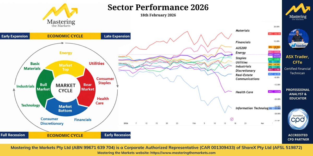
Australia’s market is behaving like it’s in defence mode too and the sector data makes that pretty clear. When investors get cautious, money usually rotates toward areas with stable cash flows, pricing power, and tangible assets. That’s exactly what we’re seeing right now.
What’s leading vs lagging
Holding up (defensive / hard-asset exposure):
- Materials (strongest)
- Energy
- Financials
- Utilities
- Consumer Staples
Struggling (more growth-sensitive):
- Consumer Discretionary
- Real Estate
- Communications
- Healthcare
- Information Technology (weakest)
The strongest being materials up 16% and the weakest being information technology down 25%.
This isn’t “good” or “bad” it’s simply the market pricing risk differently. Two large caps that help explain the rotation
BHP (Materials): why it matters in a defensive tape
BHP sits in the “hard asset” bucket. In risk-off periods, Materials can outperform because:
- they’re linked to real-world demand (energy, infrastructure, industrial inputs),
- they’re supported by global commodity cycles, and they often offer strong cash generation when prices cooperate.
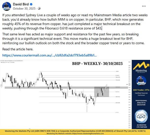
BHP also gives a useful read on iron ore + copper themes, which tend to become more important when investors rotate toward tangible assets and away from long-duration growth. Have explaining why I believe BHP would make new highs for months.
CBA (Financials): Banks can act like defensive holdings when:
- earnings are relatively predictable,
- dividends are reliable,
and investors prefer “known” cash flows over uncertain growth stories. Recent CBA news/results have reinforced that “certainty premium” and that’s often enough to lift the whole Financials sector when positioning is cautious. Saw this strength in CBA at $150 in December.
Sector leadership is a form of market messaging. When defence is leading, the playbook is usually:
- Respect the rotation (don’t argue with it)
- Focus on relative strength (what’s holding up vs breaking down)
- Prioritise risk management (position sizing and stop placement matter more)
- Stay flexible (rotations change but only after the data changes)
If/when the laggards start to reclaim leadership (Tech/Discretionary etc), that’s when you’ll see the market’s “risk appetite” returning.
Until then: follow the strength, keep it simple, and let the data guide the next decision.
@ASX__Trader I'd say this FY has proven to me that what you teach publicly on YT & X can actually increase profits 5x compared to previous years in under 7 months.
I knew some TA but just needed a leg up with using EW & Fib together.
Thank you for being so kind in sharing your heart & soul.
Hit 50,000 followers on FB yesterday.
And it made something really obvious…
This page is growing fast — nearly 20,000 new followers in the last 3–4 months l and the comment section has changed a lot.
Six months ago, most people here were long-time followers. They knew my track record. They’d watched calls play out in real time.
Now, there’s a wave of new people… and with it comes the usual:
“Tea leaves.”
“You can’t time markets.”
“Technical analysis doesn’t work.”
“It’s all luck.”
And look — I get it.
There are a LOT of fake people out there who’ve given this space a bad name. If you’ve been burned before, you’re going to be skeptical.
When you’re a professional trader, you realise most people talking in this space are full of it and they ruin it for the ones who are real. Honestly 95% are fake.
That’s why I keep coming back to one question:
What data does someone need to accept that this can work?
Because it’s not like this is based on vibes.
You’ve watched me make call after call after call for years — publicly.
You’ve seen me open a public account and grow it to over triple in just over 18 months.
There are hundreds of testimonials from real people.
And inside our school, we ran a poll on last year’s results — 80% of students outperformed the market, and a lot of them massively outperformed.
And here’s the part most people don’t understand:
I can’t make this up.
We’re ASIC licensed as an authorised representative.
That means we don’t get to play the influencer game. We can’t use fake accounts. We can’t post made-up screenshots. We can’t “bend the truth” to sway people liike the crypto bros can.
Everything we say has to be true because if it isn’t, our business gets shut down and ASIC is knocking on the door.
So I’ll ask again — genuinely:
If you’re still a skeptic… what would it take to convince you that technical analysis works?
What would you need to see, specifically?
And if you’ve been here for a while…
What was the moment you went from “maybe” to “okay… this is real”?
👇 Comments are open.
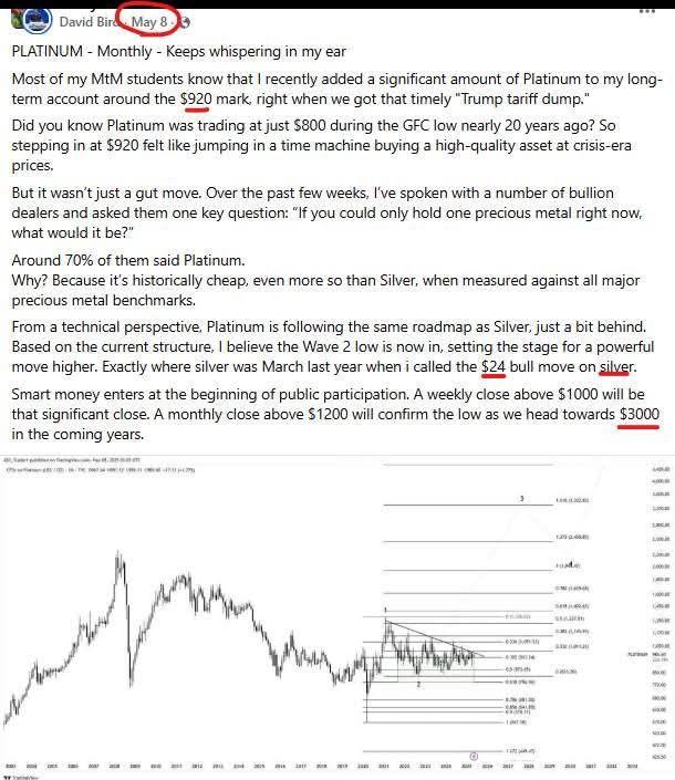
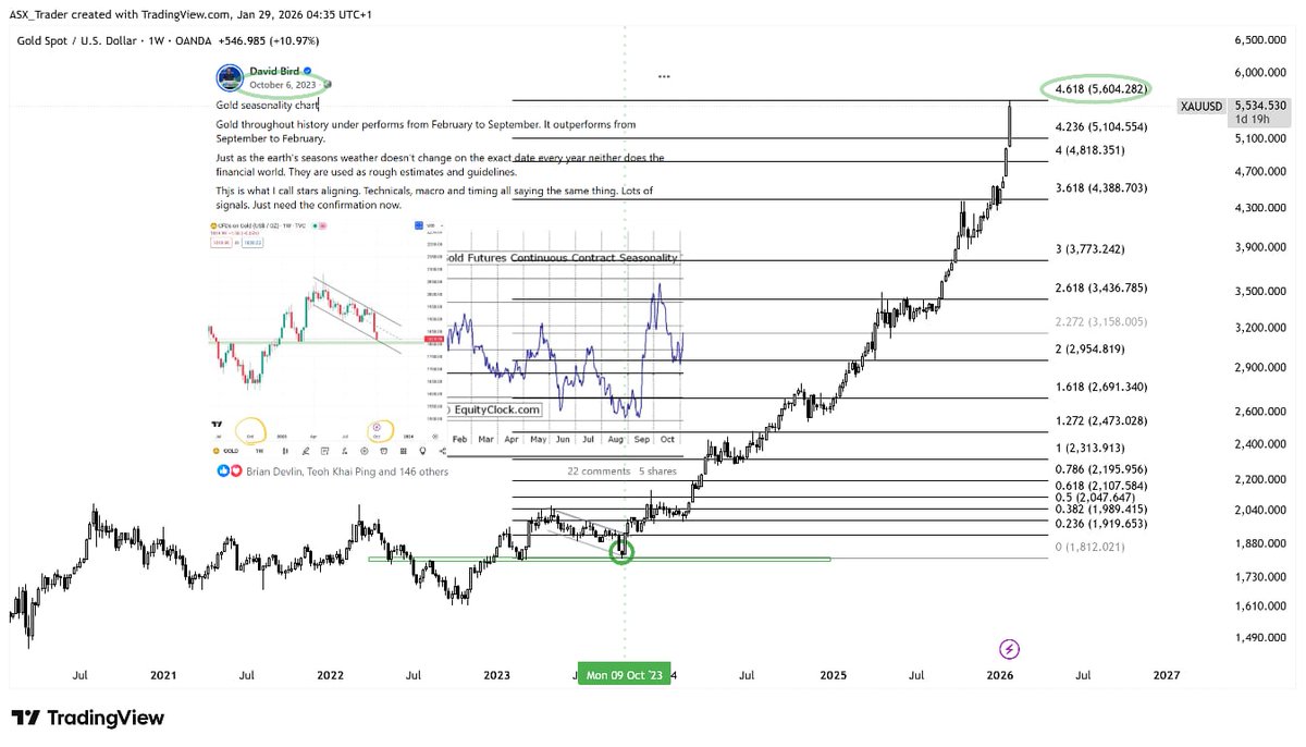
Those who’ve followed me for a while know I went very long Gold at $1,800, Silver at $24, and Platinum at $930.
My targets were Gold $5,600, Silver $110–$130, and Platinum $3,000 — and all of those levels have recently been hit.
Technical analysis also helped me time the exact bottom — within a week — on Gold (October 2023), Silver (March 2024), and Platinum (April 2025). As you can see from the attached charts.
Yesterday morning I saw extreme weakness across the commodity sector and posted a stack of charts and videos explaining why a commodity top is coming.
A couple of weeks ago I publically have you the key targets to be careful on — on Silver it was $110–$130 — and to look for weakness inside that zone. That weakness showed up on the hourly timeframe at $120, and it was confirmed at $109. Will post in comments.
When I gave that forecast on silver, I was told, “You can’t forecast that far ahead of time where it’s going to reject.” My answer was: that’s exactly what they told me about Bitcoin when I projected on stage at AusCryptoCon the 125K was a key Fib level, which enabled me to see that top too.
People will tell you charts don’t matter.
This is the exact atmosphere you get at the top of every excess phase. It’s typical. It’s normal. I’ve seen it a million times — and it humbles those people over and over and over again.
So what does this mean?
I took profit on all the trades I’ve been holding open for a while. I pulled out my original investment. I could’ve sold it all — I chose not to — because the charts also say it’s not over in the big picture.
This is what’s called a Wave 4.
This is what’s going to capitulate a lot of people.
And it’ll probably last a good six months.
Seasonality in precious metals is typically bearish from February to September — this is normal. This is healthy.
And I can tell you right now — I’m going to be down multiple six digits today… and that was my choice. Because I know what’s coming, and I have a long-term plan for that — in all of my short-term and medium-term positioning.
I chose to take profits because I knew a correction was coming.
Did I know it would come this fast? No.
Did I think it would come this deep? Yes.
And I guess what I’m trying to say is this:
For the people trying to get rich quick… this is what happens when you follow herd behaviour.
For long-term investors with a long-term mindset — like I’ve said a million times — it’s only just beginning.
Top of a wave… beginning of the cycle still.
This is why you must have a plan. And you better be one of the best traders on the planet to exit an excess phase.
Now — for those in Academy, you already know all of this because you’ve had access to everything in real time. For those that aren’t, I’ll try to get a YouTube video up next week showing exactly where we are in the cycle, and why long-term investors still have nothing to worry about.
So for the people who mocked technical analysis — this is your karma.
And for anyone that lives on the Gold Coast or anywhere in Australia — I’ll be speaking at the massive gold event on the Gold Coast as a keynote speaker, where I’ll break all of this down in depth and show you — using data — why you’ve got nothing to worry about with a long-term mindset.
Hope to see you there.
Gold Coast Gold
WED 25th – Thurs 26th March 2026
goldevents.com.au
Luckily, in MtM, we were prepared.
And Craig — the freak — shorted it from the exact dollar at the top at $120.