@oykun They redesigned the whole thing without actual need to do so. The old UI was good, there was no need to redesign it other than the need to "show at least something new at the presentation".
designers love to hate on raw, unfinished things.
redesigning the whole ios/watchos/macos/... ui after a decade is a brutal challenge for any design team!
almost impossible to satisfy the expectation.
most haters around here have never designed in a large organization like apple and are not aware of challenges such as politcs, opiniated stakeholder, impossible deadlines, the list goes on...
i empathise with the ui designers in apple.
yes!
os26 and liquid glass feels rough at the moment!
so did the ios7 at launch. it evolved.
this will too.
i appreciate the brave direction apple has taken with this liquid glass ui.
yes it comes with challenges including readability, compatibility and more...
let's stop b*tching about it and contribute to solutionise these challenges.
@felixhhaas Everything you described has nothing to do with this liquid glass nonsense. You can achieve all that without huge legibility issues, unnecessary & overused transparency of every single element on screen.
I see a lot of negative feedback about Apple’s new UI updates. But you are missing the point.
It’s not about glass effects or making every UI element transparent / shiny.
It’s about liquidity, depth, and movement. UI that feels alive.
We are entering a new era of interface design.
What was once static, flat, and fixed is becoming dynamic, adaptive, dimensional.
Flat design is over. And flat screens will be too. Sooner than you think.
I think Apple’s new UI system is less about a visual update.
It’s the first real step toward multimodal interfaces.
Where components aren’t bound to a rigid screen but float, shift, and respond.
They appear where you need them, and disappear where you don’t.
It’s about removing unnecessary clutter and making human-computer interaction feel… well, more human.
Just because we’ve spent the last decade staring at opaque UI components doesn’t mean it’s the optimal way to interact with computers.
Sure, it’s not perfect, but it’s the first real step into a new era of UI.
The future is screenless.
And dynamic components are the new screens.
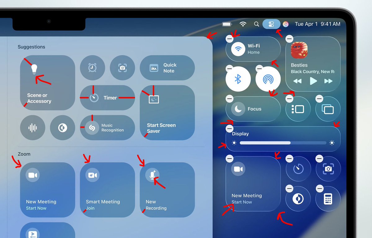
@yashwanth941v You don't calculate spacing to each unique icon edge. You calculate it to the icon's container edge, which is not visible. As junior designer you should know it already.
@0xgaut Why would anyone need it in video calls though. What’s the use case?
In regular, everyday phone calls it would make much more sense (millions of immigrants not speaking local languages would be absolutely happy).
Guys, stop it. You're digging a deeper hole for your platform's grave.
Just be Dribbble as it originally was.
- Invite-only system between designers.
- Allow designers to share their work with the world.
- Charge designers a subscription for extra Pro features.
- Allow seamless communication via comments and messaging between ANYONE (links, socials, everything!)
Do that, and you'll do well. Stop making this so complicated.
Oh, and keep improving Search.
Starting today, we're introducing a new policy that requires clients and designers who meet on Dribbble to make and receive payments through Dribbble. This is to protect both parties and mediate any issues during the course of the project.
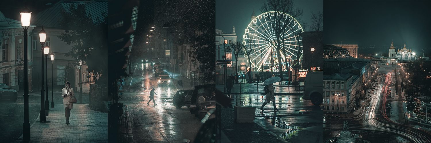
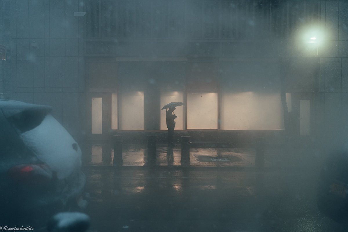
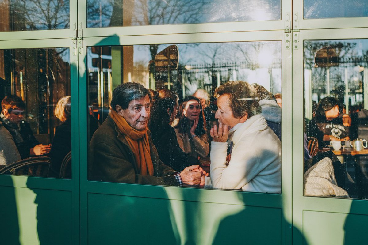
Beauty of black&white photography is the play of light and shadow. Randomly turning a photo into grayscale mode doesn't make it any better but rather shows lack of color grading skills.