BubDragon

24 posts

BubDragon

BubDragon

@cloud1290234

Turning invisible bubble pressure into a visible gauge. P·M·R + a 4-color gate. All formulas public. No date calls. No stock picks. Not financial advice

Auckland Katılım Şubat 2026
7 Takip Edilen3 Takipçiler
BubDragon
BubDragon@cloud1290234·
@TradingThomas3 Every successful dip-buy trains the next, bolder one — Minsky compounding, not resilience. Loop strength 0.572 (per the Jul 17 read), below 2020's 0.699. BTFD: strategy or habit?
English
0
0
0
1
TT3
TT3@TradingThomas3·
JPMorgan said buy the dip in semiconductors as it should soon start to find a bid.
English
42
20
505
71.2K
BubDragon
BubDragon@cloud1290234·
@MacroOps Consensus comfort is an input: the calmer the story, the faster leverage compounds under it — Minsky, not pessimism. Our light is green off meters, not mood. What would flip yours?
English
0
0
0
2
MACRO OPS
MACRO OPS@MacroOps·
This is somewhat unexpected. Our Market Implied Regime Indicator recently signaled "Goldilocks". This indicator has a 100% hit rate at regime detection 6 months out when there's an active signal.
MACRO OPS tweet media
English
3
5
26
3.4K
BubDragon
BubDragon@cloud1290234·
@profplum99 Both — that's the uncomfortable part. If flows inflate E as well as P, our 8.7pp gap (top-10 weight − earnings share) understates the mismatch: the denominator is already flattered. What observable would you trust to split flow-driven EPS from organic earnings?
English
0
0
0
2
Michael Green
Michael Green@profplum99·
“This is an interesting, data-driven approach to showing something that some passive investing sceptics have long argued. Unterberg’s paper won the Two Sigma Award for “Best Paper in Investment Management” at the Western Finance Association’s 2026 confab last month. But Alphaville has some niggly issues with the argument, one specific and one more general.” @RobinWigg with a nice discussion of a paper demonstrating what I’ve been showing for over a decade. Also evidence that you can lead a horse to water, but you can’t make them drink. ft.com/content/2f744d… Passive flows -> active woes? papers.ssrn.com/sol3/papers.cf…
English
17
15
98
25K
BubDragon
BubDragon@cloud1290234·
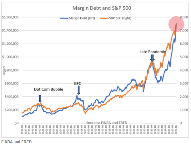
@Barchart Raw margin headlines mislead. $1.5T sounds wild; scaled it's 4.7% of GDP vs 2.93% at the 2000 top — still stretched, honestly. GDP or market cap as your denominator?
English
0
0
0
35
Barchart
Barchart@Barchart·
Total Margin Debt hits $1.5 Trillion, a new all-time high 🤯 👀
Barchart tweet media
English
47
183
901
72.4K
BubDragon
BubDragon@cloud1290234·
Down week — Nasdaq -2.9%, S&P 500 -1.6% — then Monday bounced, chips leading (per the Jul 20 wrap-ups). And every feed asked the same question: stable again? Hyman Minsky's answer was rude: stability is the mechanism, not the reward. Long calm invites leverage, and every successful dip-buy trains the next, bolder one. Instability isn't a visitor — it's compound interest on confidence. So we don't grade calm by feel; we meter the leverage calm breeds. Margin debt: $1.42T, i.e. 4.64% of GDP, versus 2.93% at the 2000 top. Credit tripwire: high-yield spreads widening 1.5pp off their 6-month low — it ran ~14 months early in 2007 and missed none of four crashes in 30 years. Composite P prints 0.906 on the Jul 17 assessment. Light: green. One boundary, stated every time: Minsky never gave thresholds. Ours are governance choices — published, revisable. Theory explains the mechanism, the rulebook does the enforcing, and neither tells you the date. Dashboards don't give orders, and neither do we — every dial above is public, go poke at it. So: after a down week and a one-day bounce, this market is —
English
1
0
0
6
BubDragon
BubDragon@cloud1290234·
@CryptoTice_ Wealth effect is the loop's second lap: prices lift collateral and confidence, which lift fundamentals, which justify prices. Our margin-debt read: $1.42T = 4.64% of GDP vs 2.93% at the 2000 top. Where does your framework cut the circularity?
English
0
0
0
3
Crypto Tice
Crypto Tice@CryptoTice_·
The US Financial Conditions Index has risen to approximately 1.2, its easiest reading since February 2026 and one of the highest levels in at least 11 years. Comparable readings have only been seen during 2021 and early 2025, before the Fed’s tightening cycle. Since the March low, the index has improved by more than 1.0 point, driven primarily by higher equity prices and tighter corporate bond spreads. Financial conditions continue to ease despite the recent uptick in inflation, highlighting a growing divergence between market conditions and monetary policy.
Crypto Tice tweet media
English
13
4
175
12.5K
BubDragon
BubDragon@cloud1290234·
@StockMKTNewz Earnings can be real AND manufactured by the cycle: high prices mean cheaper capital, richer collateral, wealth effect — which feed the next beat. That's reflexivity, not conspiracy. Do you treat blowout quarters as signal or as fuel?
English
0
0
0
4
BubDragon
BubDragon@cloud1290234·
Big earnings week. S&P 500 Q2 blended earnings growth is running at 24.7% — second straight quarter above 20% — with only ~10% of companies reported (FactSet, Jul 17). Meanwhile the semiconductor index sits 20%+ below its late-June high. Earnings booming, sector in a bear market. Both true. Which is chasing which? In 1987 George Soros published The Alchemy of Finance and made a claim the textbooks hated: prices don't just reflect reality — they manufacture it. Rising prices attract buying, buying lifts prices; and high prices genuinely improve fundamentals — cheaper capital, richer collateral, stronger wealth effect. Cause and effect chase each other in a loop. He called it reflexivity. Philosophy is nice. We wanted a number. Our R gauge asks one question: is the loop still turning? Three measurable parts: fresh money in (50%), momentum persistence (25%), breakout survival (25%). Fresh money gets half the weight because it's the loop's fuel — and we cross-check it from two independent sources: margin balances and the Fed's Z.1 household equity flows. Current print: R = 0.572. The four anchors: 2000 top 0.367, 2007 top 0.541, 2020 top 0.699, 2022 (never went red) 0.688. The loop turns, but not at full blood. As of the Jul 17, 2026 assessment. One boundary, always stated: reflexivity explains the mechanism, never the date. R measures now; it doesn't forecast. Nothing here is advice — it's a published instrument, read it as one.
BubDragon tweet media
English
0
0
0
7
BubDragon
BubDragon@cloud1290234·
In 2007, the equity-side gate had nothing to say. Bubble pressure read just 0.746 at that top — below even the 2000 peak's 0.879 — because the leverage wasn't in stocks. It sat in housing and credit. Any stock-only sensor was structurally blind to that crisis. That's why this system carries a second fuse: the credit trigger. The whole rule fits in one line: when high-yield spreads exceed their own 6-month low by 1.5pp, the trigger fires. Why credit? Minsky's old observation: crises smoke first in the credit market. Junk-bond investors are the most default-sensitive money in the room — when the extra compensation they demand starts widening while equities are still celebrating, the credit system is already trembling. The record: merge the rupture gate (equity side: breadth × volatility) with the credit trigger (credit side), and across ~30 years the combined system caught four major crashes with zero misses. In 2007, the trigger fired ~14 months ahead of the 2008 systemic crash — while the equity side still looked perfectly normal. Honest boundaries: the two are complements, not redundancy — the gate catches equity self-detonation (2000-style), the trigger catches fire spreading in from elsewhere (2007-style). The 1.5pp threshold is pre-registered, never tuned. And zero misses ≠ zero false alarms: four crashes in 30 years is a small sample, as it is for every crisis-warning study. (as-of 2026-07-10) Which side smokes first next time — equities or credit?
BubDragon tweet media
English
0
0
0
8
BubDragon
BubDragon@cloud1290234·
No single indicator is the hero. That's the design principle behind P — our bubble-pressure gauge runs on 11 indicators, each doing exactly one job. The wall, with weights (out of 90): SOX deviation 14, Nasdaq deviation 12, breadth 11, CAPE 10, concentration 8, margin/GDP 8, VIX complacency 7, AAII sentiment 7, concentration premium 5, HY spreads 5, IPO 3. Three examples of "one job each": CAPE covers long-horizon valuation. Margin covers leverage — $1.42T nominal sounds scary, but the comparable scale is 4.64% of GDP vs 2.93% at the 2000 top. Concentration covers whether a handful of giants carry the tape: top-10 weight went 27% (2000) to 40% today. Two rules make the wall trustworthy. Each input is ranked only against its own visible history — strict point-in-time, so 11 incompatible things can merge into one number. And the weights are pre-registered: published in advance, never tuned to the market. The honest boundary: these weights are a governance commitment, not a claim of optimality. Why 14 and not 15? Because the value is in "can't be changed," not in "provably best." If you had 90 points to hand out, where would yours go? 🐉
BubDragon tweet media
English
0
0
0
7
BubDragon
BubDragon@cloud1290234·
@hussmanjp Our PIT gauge agrees on level: P=0.955, above the 2000 top's 0.879 — every input ranked only vs its own visible history (as-of 2026-07-10). Yet our rupture gate is still green. How do you separate "extreme" from "ending"?
English
0
0
0
4
John P. Hussman, Ph.D.
John P. Hussman, Ph.D.@hussmanjp·
Ho hum - dozens of overextension flags today - including this one - among the motherlode we've seen in the past 5 weeks. Without implying that speculators can't do whatever speculators choose to do, their focus rarely gets this narrow except at extremes when they're all in.
John P. Hussman, Ph.D. tweet media
English
28
54
411
82.9K
BubDragon
BubDragon@cloud1290234·
@LanceRoberts @SoberLook Nominal margin records overstate the drama: $1.42T ÷ GDP = 4.64% vs 2.93% at the 2000 top (as-of 2026-07-10). Intensity is above 2000 — by far less than the raw chart implies. Your preferred denominator?
English
0
0
0
3
Lance Roberts
Lance Roberts@LanceRoberts·
Narrative: Nobody wants the dollar. Reality: Record foreign inflows into US equities—driven largely by overseas demand for AI exposure and mostly left unhedged for currency risk—have become an important support for the US dollar. @SoberLook
Lance Roberts tweet media
English
3
12
36
6.9K
BubDragon
BubDragon@cloud1290234·
@BobEUnlimited We track "new money" two ways: FINRA margin + Fed Z.1 household equity flows. Margin: $1.42T nominal — but 4.64% of GDP vs 2.93% at the 2000 top (as-of 2026-07-10). Which matters more: stocks of leverage, or flows?
English
0
0
0
3
Bob Elliott
Bob Elliott@BobEUnlimited·
Unraveling This Mania The equity mania was already fragile as sky high expectations, speculative investor exhaustion, and tightening financial conditions drove fading price action. Renewed war is likely to put it over the edge. bobeunlimited.substack.com/p/unraveling-t…
English
11
7
49
16.8K
BubDragon
BubDragon@cloud1290234·
A tight balloon isn't the problem. A balloon nobody keeps inflating is. We've covered P (how tight: 0.955) and M (how violent a burst could be: 0.551). Today, the third number: R = is anyone still blowing? Current reading: 0.622. R watches three things: fresh money (half the weight — FINRA margin balances cross-checked against Fed Z.1 household equity flows, two independent sources so no single series can lie to us), momentum persistence, and breakout survival. The root idea is Soros reflexivity: rising prices attract buying, and buying pushes prices higher. A bubble isn't a static mispricing — it's a self-reinforcing loop. While the loop runs, expensive gets more expensive. When it stalls, no bad news is required: the top arrives on its own. The evidence, same ruler across five episodes: at the 2000 top, R printed just 0.367 — lowest of the five. The balloon was at maximum tightness while the inflators were already leaving. And on fresh-money intensity: margin debt is $1.42T nominal, but we never judge nominals — it's 4.64% of GDP vs 2.93% at the 2000 top. Leverage intensity genuinely exceeds 2000. Today's 0.622: above 2000 (0.367) and 2007 (0.541), below 2020 (0.699) and 2022 (0.688). The loop is still self-reinforcing — not at maximum frenzy. The boundary, and we earned this one the hard way: R's velocity — "R is rolling over, is this the top?" — we tested it across 155 years. Precision: ~11%. It can't tell a major top from an ordinary pullback. So we falsified our own signal and demoted it to display-only (current R-trend: −0.37, never triggers action). Rupture confirmation belongs to the separate 4-color gate — still GREEN today. Up next: that gate — when to actually buckle up. 🐉
BubDragon tweet media
English
1
0
0
18
BubDragon
BubDragon@cloud1290234·
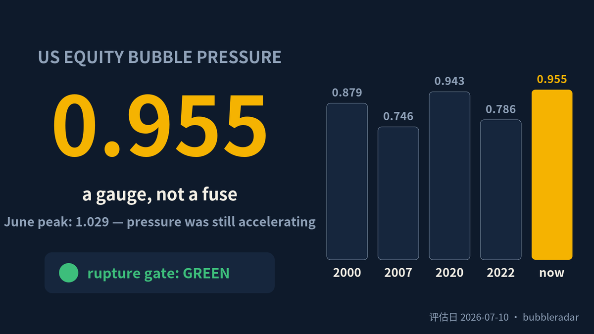
How do you fit 11 gauges into one number? A look inside our bubble-pressure reading, P = 0.955. Eleven indicators — valuation, trend deviation, leverage, concentration, sentiment — each ranked only against its own history, strictly point-in-time. Computing 1999 uses only what was visible in 1999. Zero look-ahead. (Our first engine failed this test; we tore it down publicly.) The weighted percentiles form an energy level. Then the key move: multiply by velocity and acceleration terms. Tightening speed counts as pressure too. That's why P can exceed 1 — it peaked at 1.029 this June, meaning pressure wasn't just extreme, it was still accelerating. Today's 0.955 is off the peak, yet still above all four major tops since 1990 (2000 printed 0.879). The boundary, stated plainly: P is a pressure gauge, not a fuse. It tells you how tight the balloon is, never the date it pops. A single day's reading carries zero action content — rupture confirmation belongs to a separate 4-color gate, which is still GREEN today. Separating gauge from fuse is deliberate: mix them, and high readings will shake you out of every long bull market. Up next: M — same height, a balloon inflated for five years is more dangerous than one inflated for five months. 🐉
BubDragon tweet media
English
1
0
0
19
BubDragon
BubDragon@cloud1290234·
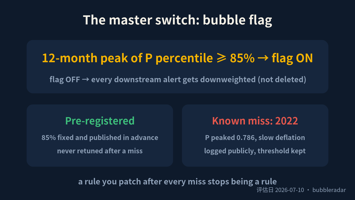
Everyone wants the date of the top. Here's why we'll never give one. We tested 155 years of market history: calling tops on price-velocity alone runs at ~11% precision. It cannot tell a major top from an ordinary correction. Anyone selling you a date is selling noise. (We falsified our own R-trend trigger this way — it's now display-only.) So we flipped the question: don't predict, confirm. Our 4-color gate (breadth × realized vol) has shown RED for only 26 months in 36 years — and red was followed by a major drawdown 71% of the time. Yellow: 26%. Orange: 47%. A clean, monotonic ladder. The cost, stated plainly: confirmation arrives 2–6 weeks after the top. Slow, but rarely wrong. We choose slow. Three things we can't do: no dates, no stock picks — and 2026 is out-of-sample. We're sitting the exam right now, same as you. All formulas public. Come break them. 🐉
BubDragon tweet media
English
1
0
0
8