@bandiaditya @noondesign Sweet! How are you guys tackling documentation and feedback?
English
Elwin
1K posts
@elwindewitte
Analog photography lover 📸


unpopular opinion: Figma proficiency is becoming a liability and nobody wants to say it. you mastered a tool that still ends with a developer rebuilding your work from scratch. it's giving "expert trap".

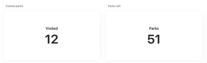
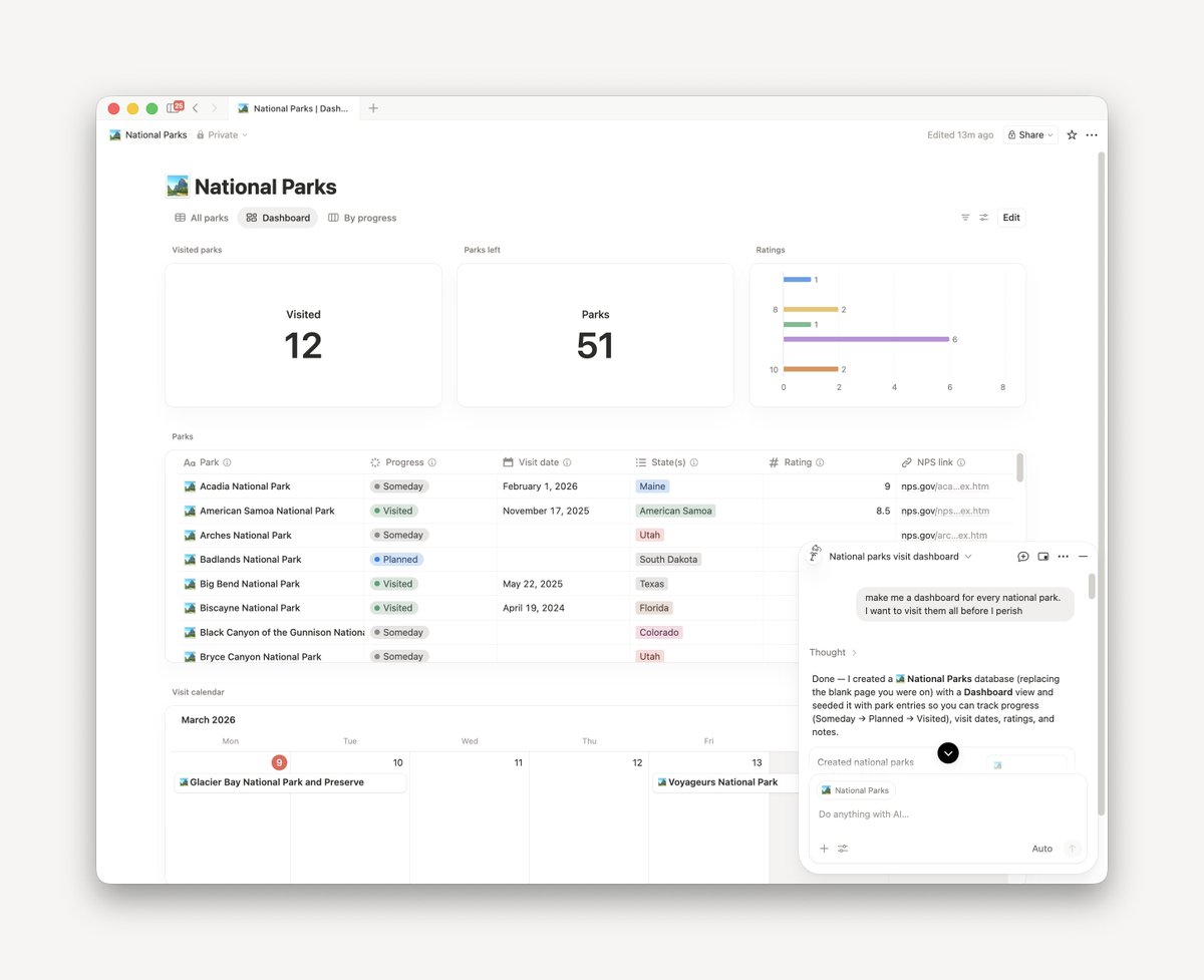

Introducing Dashboards. The bird's-eye view your databases needed. Boards, tables, charts, timelines — all in one clear, glanceable DB view. Rolling out now.


After many years of development, I’m excited to share the interior of the first electric Ferrari designed by LoveFrom. Tactile controls and digital interactions blend into one cohesive interface, shaped through deep collaboration across engineering, interaction, graphics, typography, sound, and industrial design. So incredibly proud of the thoughtfulness and care the team brought to every detail. ferrari.com/en-US/auto/fer…
After many years of development, I’m excited to share the interior of the first electric Ferrari designed by LoveFrom. Tactile controls and digital interactions blend into one cohesive interface, shaped through deep collaboration across engineering, interaction, graphics, typography, sound, and industrial design. So incredibly proud of the thoughtfulness and care the team brought to every detail. ferrari.com/en-US/auto/fer…