Florian

6.8K posts

Florian

Florian

@hardwig

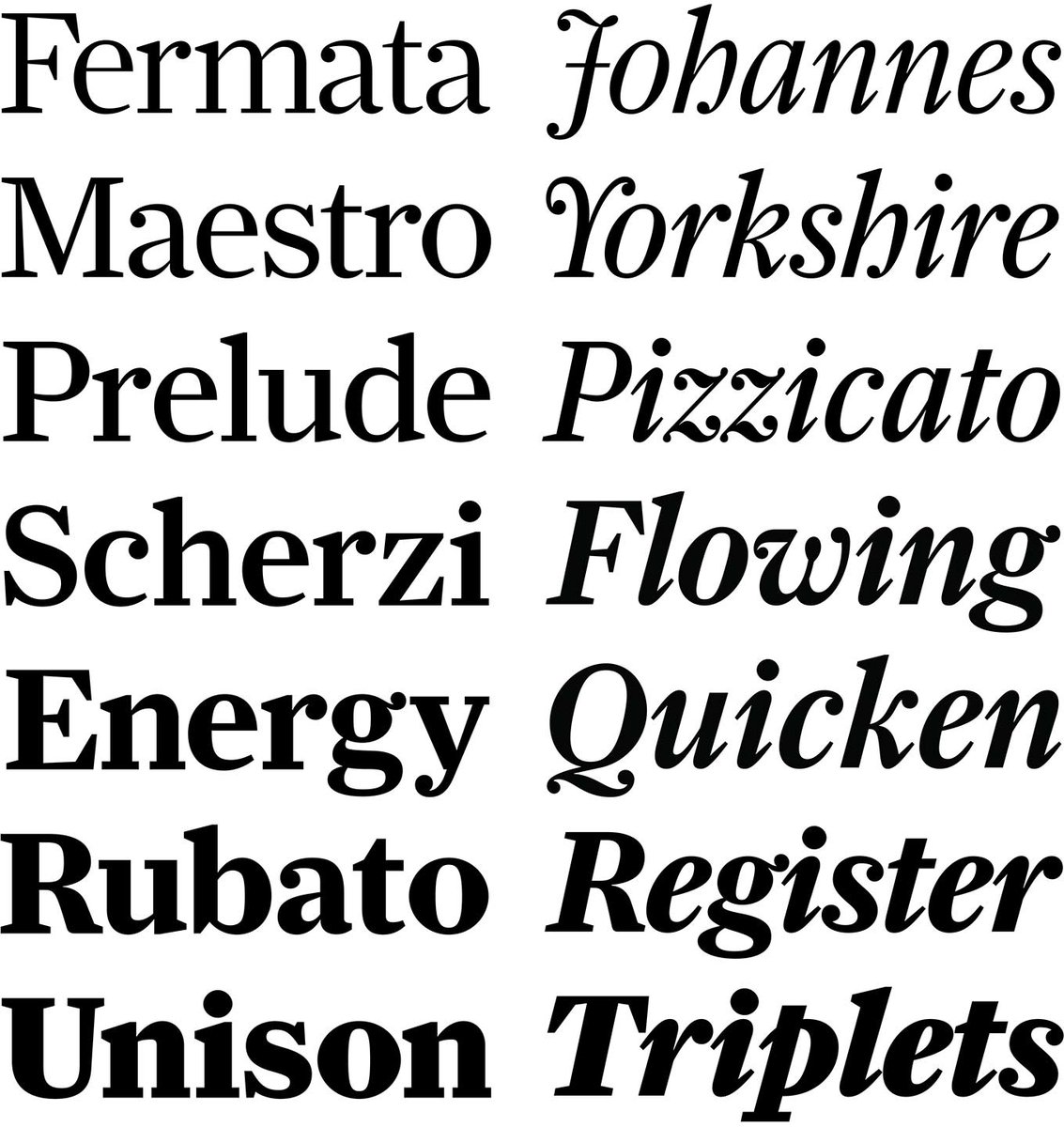
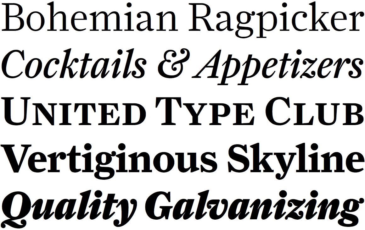
Typographer, type writer, researcher. Editor @FontsInUse. Graphic designer at Kaune & Hardwig, Berlin. He/him. Find me here: https://t.co/4I2SqQC3YZ
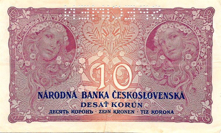
Berlin, Europe Katılım Kasım 2009
911 Takip Edilen5.9K Takipçiler
Florian retweetledi
Fonts In Use
Fonts In Use@FontsInUse·
The Fonts In Use team unanimously condemns the assault on safety, security, and basic humanity continually displayed by Twitter’s new ownership. We loved it here, but can no longer justify engaging in this platform. Find us at @FontsInUse" target="_blank" rel="nofollow noopener">typo.social/@FontsInUse and fontsinuse.com.
Fonts In Use tweet media
English
7
9
59
0
Florian
Florian@hardwig·
@LeoVazquezC @Mikeashworth12 Agreed! Stempel didn’t trust the appeal of these idiosyncracies, and offered a second series with conventional (Futura-like) terminals. Guildford Sans is equivalent to series I, but w/ the two-story ‘a’. It didn’t help: the design wasn’t a big hit, neither in Germany nor the UK.
Florian tweet media
English
2
0
2
0
LeoVC
LeoVC@LeoVazquezC·
@hardwig @Mikeashworth12 Thank you. It has it own style. the endings in the stems of the lowercase p, q, etc are interesting.
English
1
0
1
0
Eva Silvertant ❀
Eva Silvertant ❀@EvaSilvertant·
I found a way to escape Luc Devroye! Just pursue a gender transition and change your first name. Luc hasn’t documented anything from Martin Silvertant since 2016, and so he hasn’t identified Eva Silvertant yet! 🤭 No one tell him! Let him figure it out on his own.
Eva Silvertant ❀ tweet media
English
3
0
21
0
Hrant Հրանդ Փափազեան Papazian
@hardwig @EvaSilvertant Sorry, not true. As my letterpress teacher once pointed out, the best printers would actually file down their sorts to get a good fitting. Here's some evidence from the Pascal that I own: twitter.com/hhpapazian/sta…
Hrant Հրանդ Փափազեան Papazian@hhpapazian

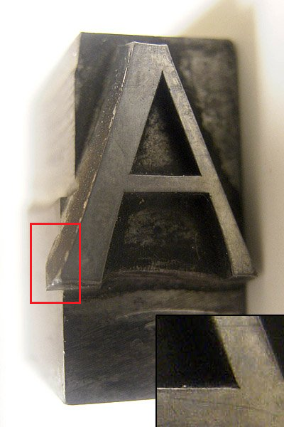
@fonthausen @typegirl BTW here's a photo of the "A" from the Pascal that I bought from Gerald Lange. (Bonus: zoom of a trap in the counter.)

English
1
0
0
0
Florian
Florian@hardwig·
@EvaSilvertant What I’m saying is, to achieve such tightly spaced and even overlapping pairs in metal type, one would need to make ligatures. And that’s unlikely, not only because ligatures for such pairs are uncommon, but also because the visual result isn’t really convincing.
English
2
0
1
0
Eva Silvertant ❀
Eva Silvertant ❀@EvaSilvertant·
@hardwig I thought they were clashes rather than ligatures. I do notice a difference in the angle of the apex of ‘Á’ vs ‘A’, but all Ás look consistent to me.
English
1
0
0
0
milesnewlyn
milesnewlyn@MilesNewlyn·
I'm surprised how many gross license infringements are caused by people thinking their @AdobeCC subscription means they can use font files. This is a rich source of litigation revenue for the 200ish font foundries on Adobe fonts.
English
4
0
1
0
Eva Silvertant ❀
Eva Silvertant ❀@EvaSilvertant·
Farnham (2004) by Christian Schwartz. I don’t know how it’s possible, but I only just found out Farnham is based on Fleischman! Quite embarrassing considering my love for the Fleisch of Man. Now, the connection is obvious. The ball terminal in the italic ‘w’ is a nice detail!
Eva Silvertant ❀ tweet mediaEva Silvertant ❀ tweet mediaEva Silvertant ❀ tweet mediaEva Silvertant ❀ tweet media
English
4
1
27
0
Florian
Florian@hardwig·
@EvaSilvertant Halyard Display is a contemporary design with some similar details in the italics.
Florian tweet media
English
1
0
2
0
Eva Silvertant ❀
Eva Silvertant ❀@EvaSilvertant·
Empire Gothic (1910). Interesting weight modulation! Note the high contrast in ‘e’, the sturdy spur and thin lower joint in ‘a’, the forward-falling ‘S’, the almost calligraphic ‘R’, and the sharp ‘t’ with a long apex. From ‘Keystone Products’ (Keystone Type Foundry, c. 1910).
Eva Silvertant ❀ tweet mediaEva Silvertant ❀ tweet mediaEva Silvertant ❀ tweet media
English
1
1
16
0
Florian retweetledi
Elizabeth Goodspeed
Elizabeth Goodspeed@domesticetch·
A little belated, but I'm so honored to have been asked to write the release essay for @frerejones’s incredible new type family Community Gothic that came out earlier this week! Also excited to use the typefaces in some design projects myself soon too... frerejones.com/blog/grit-and-…
English
2
3
63
0
Florian
Florian@hardwig·
@riccard0 @FontsInUse @Font_ID Right – it’s difficult to say. Maybe there was yet another alternate for A. Or maybe a sort from Semplicità ended up in the wrong case.
English
1
0
0
0
Riccardo Sartori
Riccardo Sartori@riccard0·
@hardwig @FontsInUse @Font_ID Thank you :-) So, based on the sample in the quoted tweet, it seems probable that also the publisher’s name is set with the same typeface (just with a different |A| than the one used for the city), and not Semplicità.
English
1
0
0
0
Riccardo Sartori
Riccardo Sartori@riccard0·
10th edition, 1949. The angled terminals of |L|T| (and the |G| in BOLOGNA) suggest Super Grotesk, the pointy |M|N| less so (while the publisher’s name seems to bet set in Semplicità). Any ideas @FontsInUse , @Font_ID ?
Riccardo Sartori tweet media
English
1
0
2
0