@cantonmeow What’s your take on circle? And the clarity act… that’s what’s causing the sell off (in theory)
English
NothingBurg
545 posts


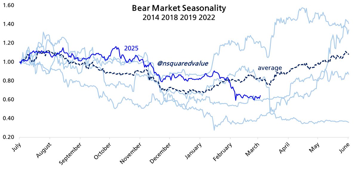
Guy with 750k followers who posts charts like this


#BTC ROI after cycle peak


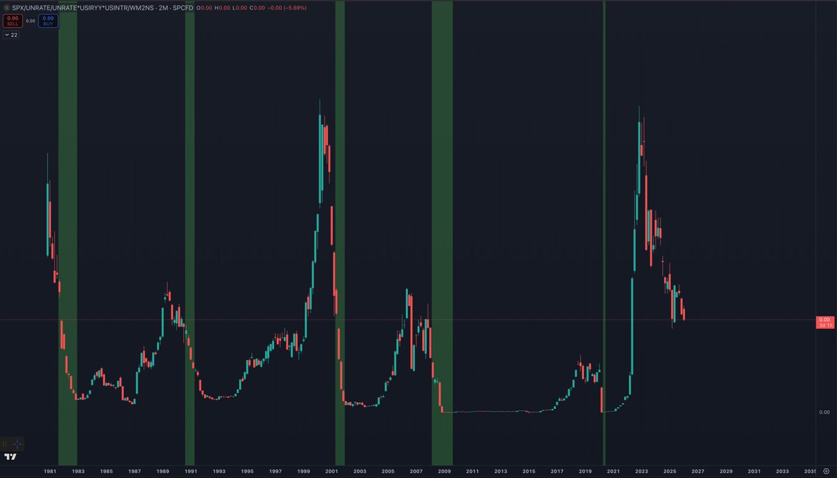
I have mentioned this chart a few times in the past, but it does really go to show just how extreme things got the last few years. The chart is SPX/(UNRATE^2)*USIRYY*USINTR Unravelling things after extreme euphoria is never an easy process. As things have been unwound over the last several years, most markets have gone higher on hopes of a soft landing. But there has generally been a flight to quality within each asset class as people buy what they better understand and think has value long-term, rather than short-term speculative investments. Unwinding euphoria has never been an easy or a fun process, but it is a process we have been going through for the last several years. As liquidity and monetary policy has stayed relatively tight the last several years, it has led to a general flight to quality within each asset class. This is why BTC outperformed most other things in crypto and why the MAG7 generally led the S&P 500. Starting out far on the risk curve, altcoin weakness was observed first as they bled to BTC for years. Then as the BTC bull market came to an end, BTC was noticeably bleeding to SPX. Then it became apparent that SPX was bleeding to Gold (which it already had been but more people started to notice). Notice how we are basically just working our way down the risk curve? As this chart falls back down to prior support levels, it represents us going back to normal times. What I love about this chart is that you can clearly see each business cycle and how every single one of them ended in a recession before the next business cycle began.