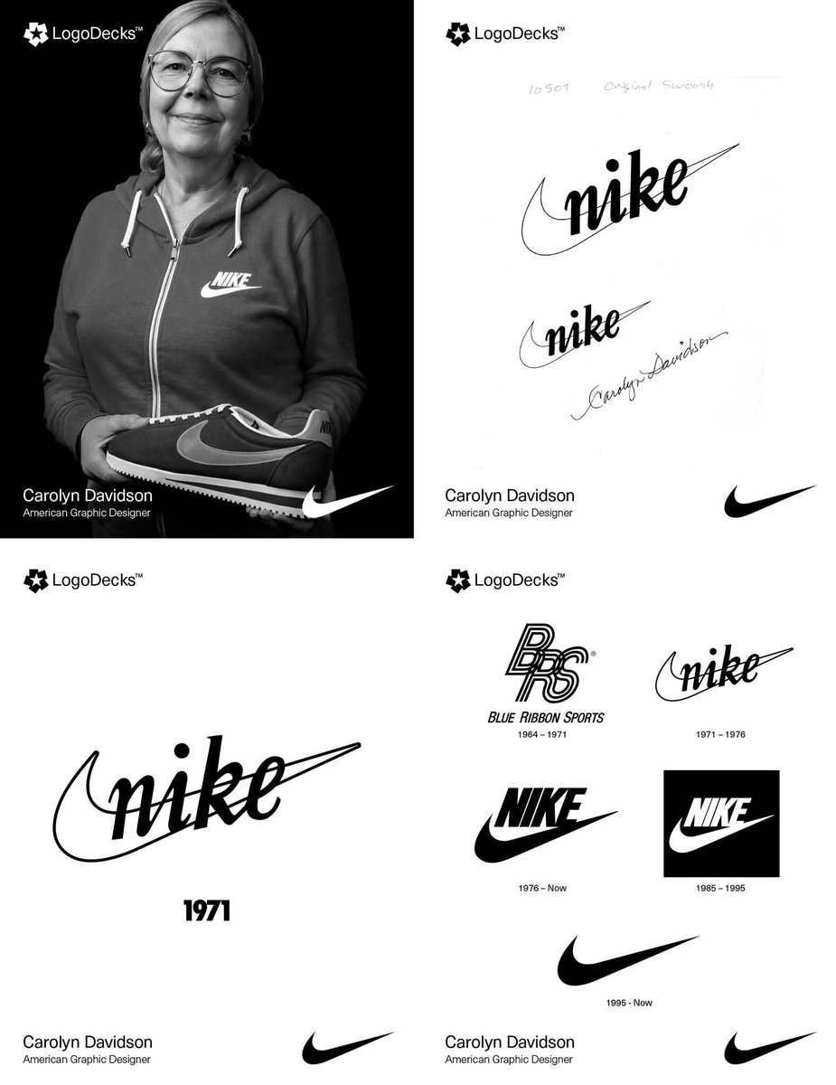
“It’ll Grow on Me”: How Phil Knight Nearly Missed the Power of the Swoosh.
The Nike "Swoosh," designed in 1971 by Carolyn Davidson, a Portland State student, draws from the Greek goddess Nike’s wing, symbolizing speed and victory. Phil Knight, Nike’s co-founder, initially lukewarm, said it would “grow on him.” The logo’s minimalist curve, once criticized as a mere checkmark, became iconic for its adaptability, stretching across products without needing the brand name.
In Greek mythology, Nike, the winged goddess of victory, soared above battlefields, crowning heroes with glory. Daughter of Titan Pallas and Styx, she symbolized triumph in war and sport, often depicted with wings, a wreath, or a palm branch alongside Athena or Zeus. The Winged Victory of Samothrace, a breathtaking 2nd-century BCE sculpture, captures her dynamic grace, embodying success and achievement. Revered by athletes and warriors, Nike’s legacy endures as a beacon of excellence.
Inspired by this divine figure, the Nike brand adopted her name and crafted the iconic Swoosh logo, evoking the goddess’s wing. This sleek, curved design symbolizes motion, speed, and victory, perfectly aligning with Nike’s ethos. Paired with the bold “Just Do It” slogan, the Swoosh has become a global emblem of athletic ambition, adorning footwear, apparel, and stadiums. From ancient Greece to modern tracks, Nike’s spirit of triumph unites mythology and modernity, proving victory is timeless.
#logodecks
Eu não sei o que a esquerda brasileira, no geral, está esperando pra começar a fazer política de outra forma. É escolha p/ cargo público. Amanhã tem mais. Meus vizinhos andam com o rei na barriga desde a passagem do 22. Detestável desde antes de fixar moradia na barriga deles.
Inside King Tubby's studio in Kingston, 1981. Scientist at the mixing desk, Kelvin from Musical Youth in the vocal booth. The bathroom where dub was born, the heir to Tubby's throne behind the board. From the BBC documentary Musical Roots.
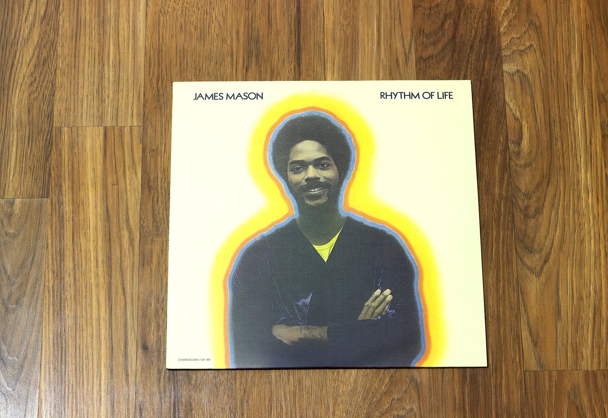
Album of the day. In the late '70s, guitarist and keyboardist James Mason decided to move on from being an ace player in Roy Ayers' Ubiquity band and cut a solo album on the jazz label Chiaroscuro. Recruiting the talents of drummer Narada Michael Walden (way before his fame as a big-time pop and R&B producer), Gene Torres on bass, and saxist Justo Almario, 1977's Rhythm of Life is a virtuoso gem of sophisticated mid-'70s jazz-funk and fusion. The album made great use of emerging technology of the time, employing mellow ARP Odyssey synth-laden grooves over Clarice Taylor's silky smooth voice. Perhaps the well-known cut on here is its lone single, "Sweet Power Your Embrace," a breezy jazz-funk ditty that's as infectious as any other from the era. Other highlights include the Roy Ayers-leaning "Free," "Funny Girl," "Slick City," and the swaying "Good Thing," which all bore a clear influence on acid jazz outfits like Incognito, Jamiroquai, and Brand New Heavies. An underground favorite upon its release, Rhythm of Life didn't quite reach a bigger audience as it was too funky for jazz stations and too jazzy for soul stations. It faded into obscurity until it was rediscovered in the '80s thanks to the UK's rare groove scene. James Mason never went on to release an official follow-up to this rare classic. As renewed interest grew into the 2000s, unreleased material surfaced.
Today, we take it back to the very beginning—1520 Sedgwick Avenue. Wishing a massive happy birthday to the legendary Coke La Rock, the man who helped birth the blueprint for every MC who has ever picked up a microphone. Before there were world tours, platinum plaques, or
Turning Pixels into Meaning: The Vision of Susan Kare.
Susan Kare is the visionary graphic designer who humanised personal computing through her groundbreaking work on the original Apple Macintosh. At a time when computers were intimidating and text-heavy, she used a simple grid of pixels as her canvas to create a visual language that made technology feel accessible and even playful. Rather than relying on technical commands, Kare introduced intuitive, symbolic icons that people could instantly understand. Her most enduring creations include the smiling “Happy Mac” startup icon, the Command symbol (⌘), and the Trash can, designs that translated complex digital actions into familiar, real-world metaphors.
Beyond iconography, Kare also shaped the typographic identity of early computing by designing foundational fonts like Chicago and Geneva, which balanced readability with personality on low-resolution screens. Her work was not just functional; it carried a subtle sense of humour and warmth that softened the machine’s edges. By blending clarity with charm, Kare helped transform the computer from a tool for specialists into a welcoming, everyday companion, influencing how millions of people interact with technology to this day.
#logodecks