Rob Simmon

19.9K posts

Rob Simmon banner
Rob Simmon

Rob Simmon

@rsimmon

Data visualization, cartography, & remote sensing. Ex @Planet & @NASAEarth. Blue Marble, Earth at Night, color. https://t.co/BDzRqYMing

Too close to the Hayward Fault Katılım Nisan 2009
1.7K Takip Edilen7.9K Takipçiler
Sabitlenmiş Tweet
Rob Simmon
Rob Simmon@rsimmon·
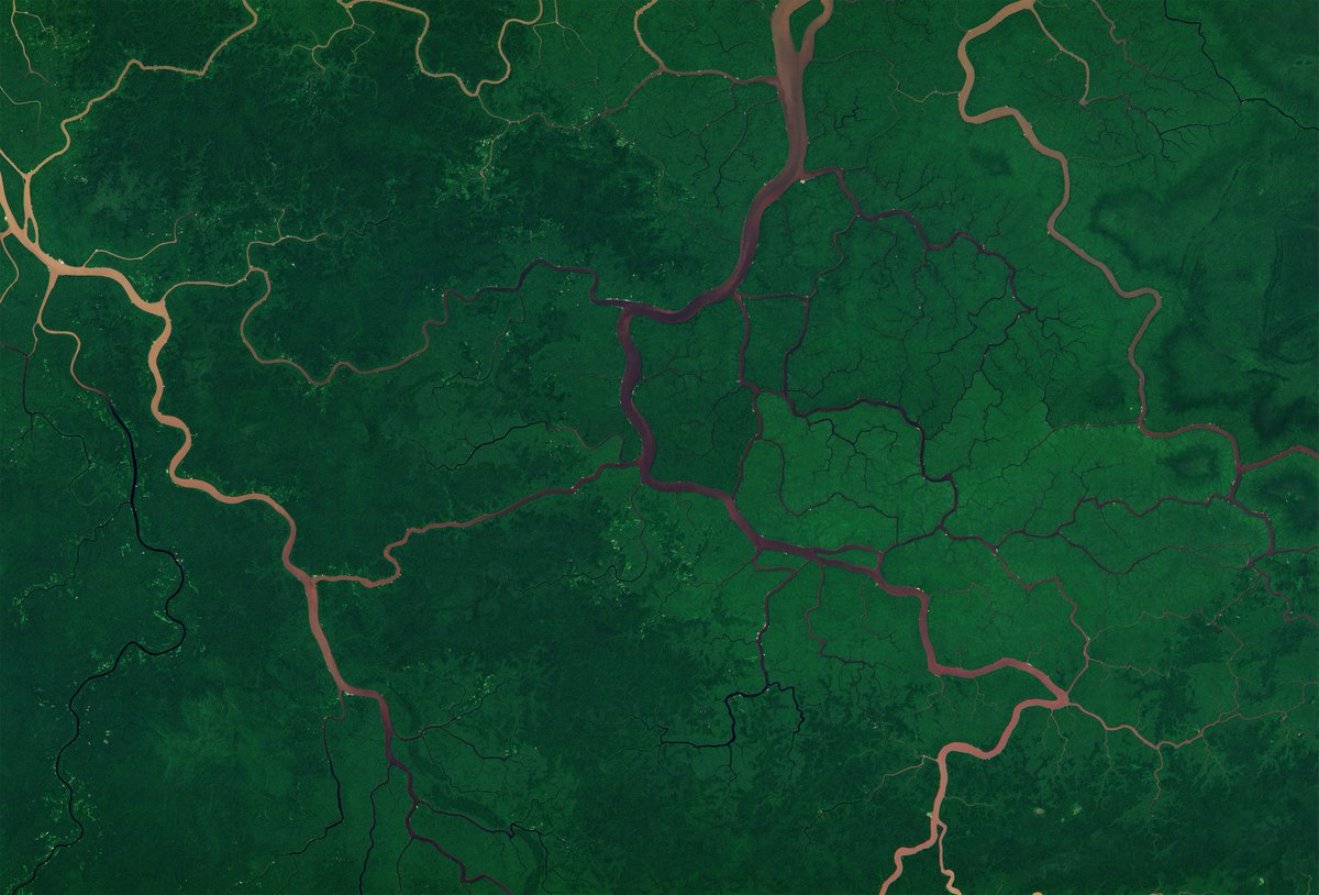
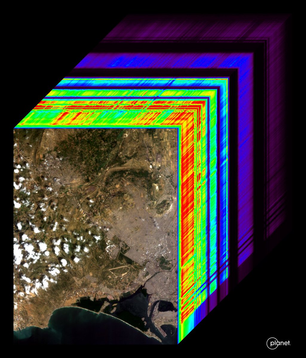
A Gentle Introduction to GDAL Part 7: Transforming Data Which ended up being just as much about remote sensing as it is about GDAL. #remotesensing #dataviz #gdal #foss4g #landsat @robsimmon/a-gentle-introduction-to-gdal-part-7-transforming-data-178df8640dd2" target="_blank" rel="nofollow noopener">medium.com/@robsimmon/a-g…
Rob Simmon tweet media
English
3
23
154
21.9K
Rob Simmon
Rob Simmon@rsimmon·
Created with mesoscale sector data from GOES-East and goes2go, satpy, gdal, QGIS, & After Effects. Coastlines from Natural Earth.
English
0
0
2
229
Rob Simmon
Rob Simmon@rsimmon·
12 hours of Hurricane #Melissa, one frame every minute.
English
2
3
13
2.2K
Rob Simmon retweetledi
mapsdotcom
mapsdotcom@mapsdotcom·
This map is not upside down. Why do we expect north to be on top? What happens when it's not? And has north always been 'up?' This beautiful map from @rsimmon provides some cartographic food for thought: maps.com/this-map-is-no…
mapsdotcom tweet media
English
2
3
9
862
Rob Simmon
Rob Simmon@rsimmon·
@marksubbarao Ironic that we created the NASA Earth Observatory because Air & Space wanted $$$$ to do something similar with their Looking at Earth gallery in the late 1990s.
English
0
0
1
56
Rob Simmon retweetledi
mapsdotcom
mapsdotcom@mapsdotcom·
Just about every hurricane forecast map shows you where the storm might go. Imagine a map that could also forecast who and how many people might be affected, including the portion of those with disabilities, or who lack cell phone or internet access. That's the goal of Hurricane Aware from @Esri. maps.com/who-is-threate…
English
1
5
12
1.7K
Rob Simmon retweetledi
Susan Merriam
Susan Merriam@semerriam·
Satellite imagery from @planet shows Biltmore Village, North Carolina before and after Hurricane Helene came through. The image on the left was taken on 09/28/2024 and the image on the right was taken 09/23/2024. #HurricaneHelene #Asheville
Susan Merriam tweet mediaSusan Merriam tweet media
English
0
2
8
10.5K
Rob Simmon retweetledi
Joe Morrison
Joe Morrison@mouthofmorrison·
We had collected an image of the dam in question about 3.5 hours after he tweeted at me - we have two in our open data bucket now if anyone wants to try their hand at change detection. Two 50cm shots taken about 12 hours apart (link in next tweet)
Joe Morrison tweet mediaJoe Morrison tweet media
JD Work@HostileSpectrum

If you have a tasking window, @mouthofmorrison, I know at lot of folks would love to see Umbra SAR coverage of the dam failure

English
5
10
82
28.8K
Rob Simmon retweetledi
Ryder
Ryder@ryderkimball·
It can can take a while looking back for a cloudless image of the Amazon, but the patience pays off @planet
Ryder tweet media
English
1
11
81
4.1K
Rob Simmon retweetledi
Will Marshall
Will Marshall@Will4Planet·
First Light from our first hyperspectral satellite, Tanager-1! This image is of Karachi, Pakistan on Sept 19th. The image has 420 spectral bands, and here we’re showing one in visible-wavelength, one near-infrared image, and one shortwave infrared image of the same site + the entire ‘datacube.’ An AI field day!! So pleased with how this instrument is working! 🛰️🧑‍💻 More details: planet.com/pulse/first-li…
Will Marshall tweet mediaWill Marshall tweet media
English
12
42
220
12.3K
Rob Simmon
Rob Simmon@rsimmon·
If you’ve ever seen RJ speak, you know how much his enthusiasm for visualization shines through. If you haven’t, this is a great opportunity to find out.
RJ Andrews@infowetrust

Next week I begin teaching PERSUASIVE DATA GRAPHICS in-person at San Francisco’s fabulous @Lett_Arc using original historic data graphics (and lots of modern digital ones too). There is one seat remaining. Learn more and sign-up here. letterformarchive.org/shop/persuasiv…

English
0
0
2
724
Rob Simmon
Rob Simmon@rsimmon·
@pdebuyl @NOAA @NASAEarth @PyTrollOrg The GOES image viewer is *so close*. But it doesn’t (AFAIK) give access to data. Just pre-rendered images, often with boundaries overlaid. If you want unadulterated 16-bit images, you need to go elsewhere. Science agencies have the funding if they make it a priority.
English
0
0
0
10
Rob Simmon
Rob Simmon@rsimmon·
New post! I’ve long felt that finding and using satellite data was harder than it should be. Why? And how can we make it easier? My thoughts: @robsimmon/making-space-data-easier-to-use-overcoming-challenges-and-expanding-access-7d16748f295c" target="_blank" rel="nofollow noopener">medium.com/@robsimmon/mak…
English
2
17
68
6.5K
Rob Simmon
Rob Simmon@rsimmon·
@postholer Good thoughts! I believe there’s room for a streamlined GUI at least at the agency level. And it’s important to make data accessible in some way to non-programmers.
English
1
0
2
132
Postholer - GIS Resources
Postholer - GIS Resources@postholer·
Once again, awesome article, Rob! "In the specific case of HDF & NetCDF I think existing standards should be re-examined" Absolutely! A simple multiple band GeoTIFF with appropriate metadata, because that's the first thing you'll do with those formats anyway. "longitude starts at 0 and runs to 360, rather than -180 to 180)" Since all coordinates are decimal, x & y (lng, lat), perhaps they should be between 0 and 1. z (elevation) should be relative to average planet radius (MSL like), again, between 0 and 1, +/-. "The ability to work on the command line and know how to program (with a very specific tech stack) seem to be a prerequisite to work in remote sensing. Why?" Because it's the least common denominator in terms of complexity. Create a new UI for every data source and what does that do for uniformly working with data? Different UI's and data acquisition methods are already a HUGE headache. I cringe every time I have to investigate a new gov site through some different UI brilliance. Give me a ReadMe file (meta data), directory listing and gdal with /vsicurl. That's the first step in every ETL pipeline. "Web-based tools may currently preclude the need to download and store huge volumes of data, but they will need functionality and interfaces that are at least as good as existing desktop tools to be widely adopted." Every spatial web app does not need to be a re-incarnation of QGIS or ArcPRO. In terms of visualization for specific data sets, simple interfaces and processes do just fine. Again, the user doesn't always want or need every tool. Sometimes they just want to briefly view it, get a feel for it and grab it from the command line! ;)
English
1
0
3
196
Rob Simmon
Rob Simmon@rsimmon·
@lavergnetho For a single-parameter dataset, yes, as bands. I’m not sure if there’s an upper limit but I’m pretty sure I’ve seen 100s in hyperspectral data. Photoshop also supports TIFFs with layers, but I’m not sure how standard that is. In any case, I prefer file sequences for time series.
English
0
0
0
35
Rob Simmon
Rob Simmon@rsimmon·
@micefearboggis Request to PI: “Hey, can I get that data we just talked about?” PI: “Sure, talk to my postdoc.” 🙃
English
0
0
0
29
Rob Simmon
Rob Simmon@rsimmon·
@lavergnetho GeoTIFF is my go-to. I thought CF recommended 0 to 360 for longitude, but maybe that was GRIB? I’ll need to verify. I haven’t succeeded working with OPeNDAP yet (it’s on my list).
English
0
0
0
83