Phil Wyatt
338 posts
Phil Wyatt
@tastrax
The spatial geek from down under down under. My comments are all mine as I no longer have an employer - woooohoooo!
Hobart, Tasmania Katılım Temmuz 2017
107 Takip Edilen88 Takipçiler

Nyall Dawson from the QGIS community is the winner of the Sol Katz Award 2025!
English
@SimonGIS Another station that gets a regular mention in Tassie bulletins is Boomerang North (Mt Bobs) 146.7E / 43.3S - operated by the Huon Valley Council. Again, not in the list but its only a rainfall station.
English

Looking for the 'source of truth' for BOM weather stations that align up to their observation products on FTP. I assumed it was this: bom.gov.au/climate/data/l… Missing quite a few.
English
@SimonGIS The portables in Tassie dont appear in the list you linked. I know NSW has heaps of them as well (>20).
English
@SimonGIS There are some portable stations that get moved around in Tassie - bom.gov.au/products/IDT60…
English
@SimonGIS Maybe the missing ones are owned by others but "trusted" by BOM?
English
@AntonyGreenElec Great coverage by @CaseyBriggs , especially given Hare Clark system in Tasmania!
English


@rawsalerts Well I am still waiting for corrections on a series of errors from 2 years ago. Don’t hold your breath expecting a quick change.
English

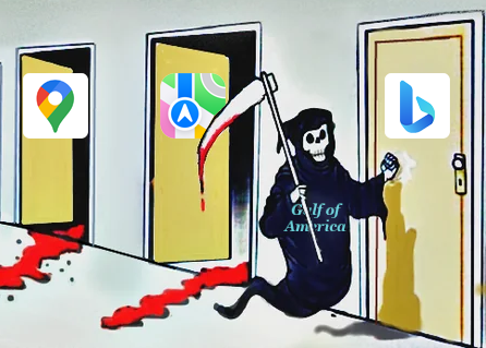
🚨#BREAKING: Google Maps has announced it will update its platform to reflect changes introduced by President Trump, renaming the Gulf of Mexico as the Gulf of America and displaying Mount McKinley instead of Denali.
English
@FloodMapp Accessible open data on river levels, current extent of flooded areas, high res LiDAR in impacted areas…..
English

📊 Poll: When it comes to #flood management in your area, what's your biggest challenge?
⬇️ Vote in our poll below—share your experiences and let's discuss solutions.
#EMGTwitter #FloodManagement
English
YouTube
English
English


Following on from my tweet about loading Sentinel-2 data, here's another example from a while ago for working with NASA's Harmonized Landsat and Sentinel data.
This example creates a cloud-free mosaic.
You do need an API key, but it's free. github.com/auspatious/hls…
English
@mapillary I would love to but is there a quick way to get to sequence number 1? I don't fancy scrolling my sequences for hours.
English

@elizlaraki ..and still 1,000’s of non existent lakes in Tasmania, Australia (many have been there for at least two years)

English

15 years ago, I helped design Google Maps.
I still use it everyday.
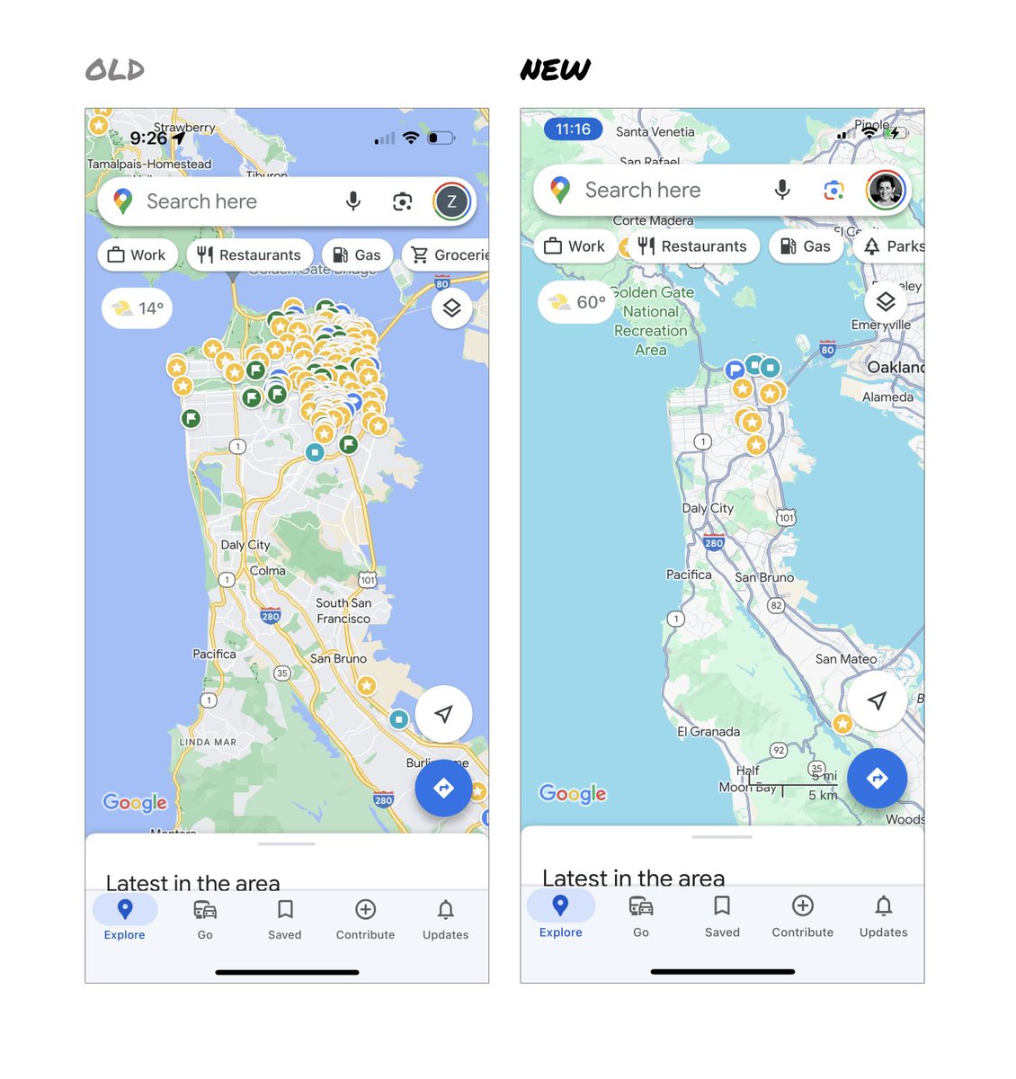
Last week, the team dramatically changed the map’s visual design.
I don’t love it.
It feels colder, less accurate and less human.
But more importantly, they missed a key opportunity to simplify and scale.
–––
Google Maps has started to widely roll out updated map colors:
- All roads are now gray
- Water changed from blue to teal
- Parks and open spaces are now mint green
It seems the goal was to improve usability and make the maps more readable.
Admittedly, I do think major roads, traffic, and trails stand out more now.
But the colors of water and parks/open spaces blend together.
And to me, the palette feels colder and more computer generated.
But color choices aside…
If the goal was better usability, the team missed a big opportunity:
Google Maps should have cleaned up the crud overlaying the map.
–––
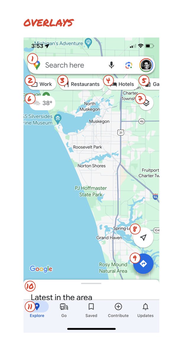
So much stuff has accumulated on top of the map.
Currently there are ~11 different elements obscuring it:
- Search box
- 8 pills overlayed in 4 rows
- A peeking card for “latest in the area”
- A bottom nav bar
(Personally, I would LOVE to see usage metrics for all these overlays.)
The map should be sacred real estate.
Only things that are highly useful to many people should obscure it.
There should be a very limited number of features that can cover the map view.
And there are multiple ways to add new features without overlaying them directly on the map.
–––
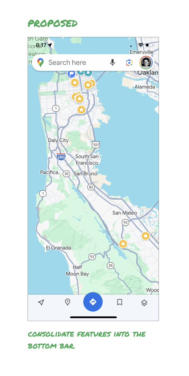
Here’s how it could look:
- Keep the search box
- Keep the bottom bar
- Remove everything else from the map
- Roll the most used features into the bottom bar
- Bury the less used features elsewhere in the app
I assume the search box and directions are top priority and should remain prominent.
My Location and map layers (satellite, traffic, etc.) could move to the bottom bar.
The explore overlays (restaurants, gas, etc.) could live in the bottom bar in “Explore” and open as cards.
The additional space in the bottom bar could be used for Saved, as a “More” option, or could be removed entirely.
There are many variations of how features could be arranged.
But the key points are:
- Dramatically simplify
- Strongly prioritize map visibility
- Bury legacy and low use features
–––
It’s normal for products to accumulate features over time.
But it’s also super important to stay vigilant and continually clean them up.
In many ways, it’s interesting to see history repeating itself.
In 2007, I was 1 of 2 designers on Google Maps.
At that time, Maps had already become a cluttered mess.
We were wedging new features into any space we could find in the UI.
The user experience was suffering and the product was growing increasingly complicated.
We had to rethink the app to be simple and scale for the future.
It seems like it’s time for Google Maps to do this again…
–––
For more on design + tips for early stage founders, follow me on X: @elizlaraki

English
@alexgleith @hannahdormido Spectacular… but missing Macquarie Island 🤣😂
English
I have my very own #dormidodots map from @hannahdormido and I love it!
Thank you so much, Hannah ☺️

English
@AntonyGreenElec @ElectoralLawAus @AusElectoralCom Lose all the advertising etc but please keep the democracy sausages!!
English
@ElectoralLawAus @AusElectoralCom How would these people cope with a NZ election where it is illegal to have any election signage or campaigning of any type anywhere in the country on polling day. NZ political parties comb the country on Friday night pulling down their signs.
English

"told him he wasn't allowed to vote while wearing a Yes shirt ... In a statement, a [@AusElectoralCom] spokesperson encouraged voters to not wear campaign clothing, as the law states people cannot campaign within 6 metres of a polling station".
abc.net.au/news/2023-10-1…
1/3
English
@alexgleith Next step, politics, where even vaguer answers are required 😂
English

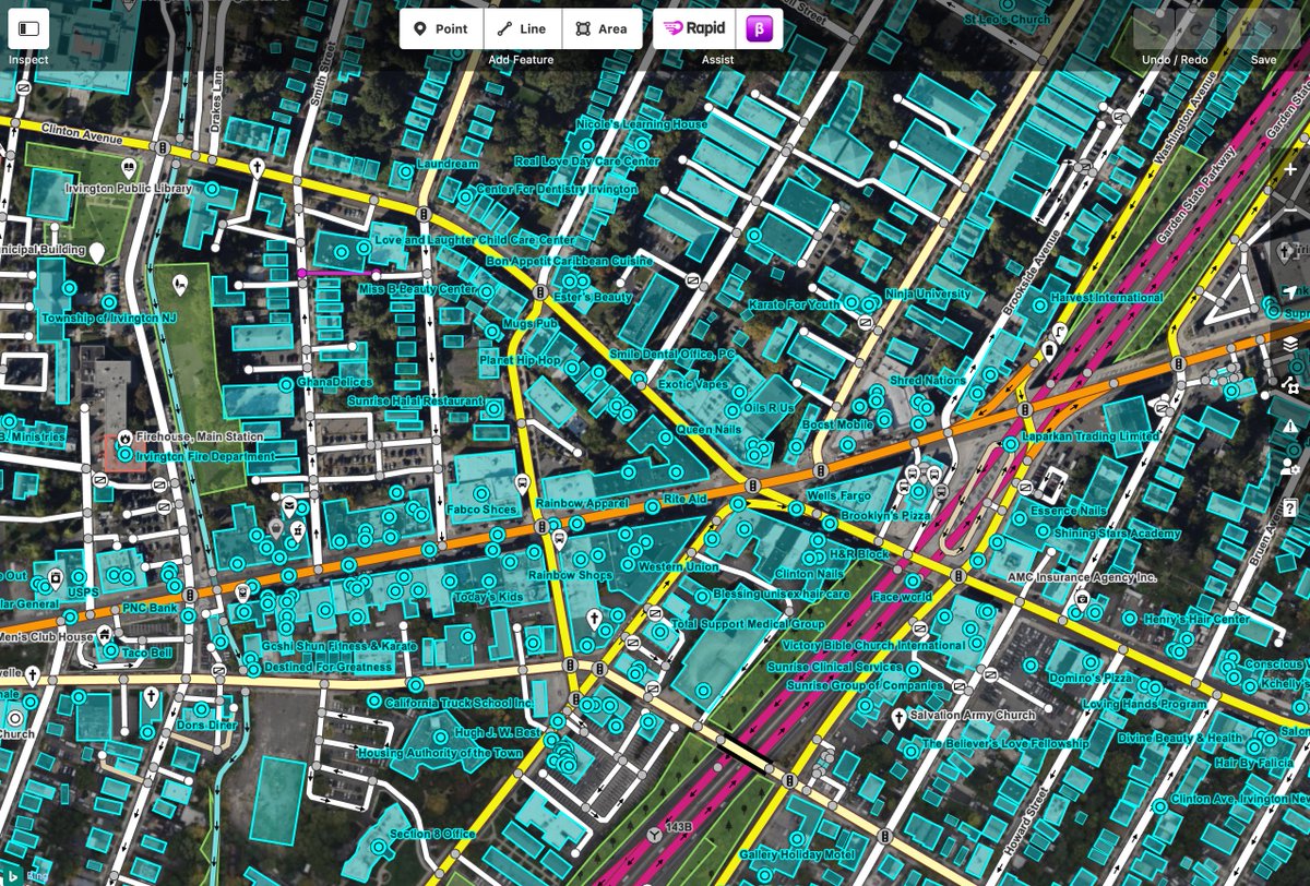
@bhousel @openstreetmap @OvertureMaps It takes time and personal interest for quality crowd sourced mapping.
English

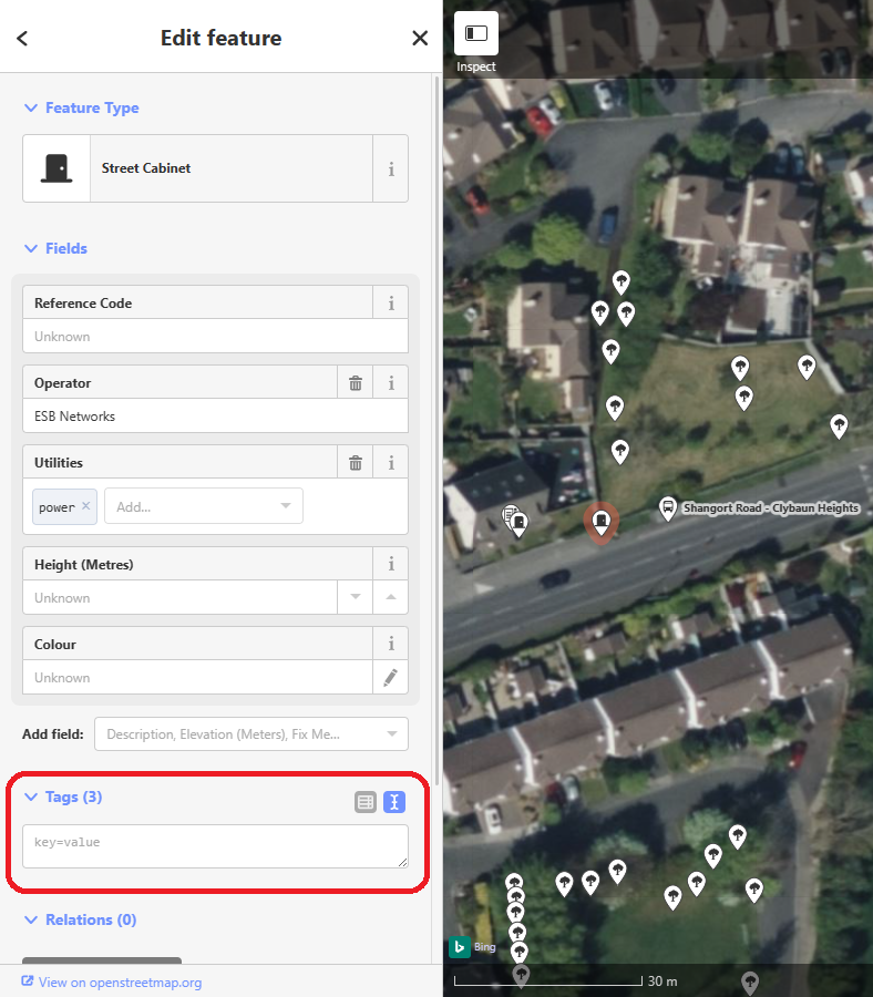
It is absolutely wild to me how much data is just straight-up missing from @openstreetmap. Whole towns with no buildings or POIs.
English
English