fomo leaderboards reveal how TERRIBLE memescope monday was
The 3rd most profitable trader only made $12k
If you made $2500 you wouldve been top 50
The top 3 used to require like $500k profit, and now it’s nothing
Just a giga terrible bundle fest.
You can now enable Claude to use your computer to complete tasks.
It opens your apps, navigates your browser, fills in spreadsheets—anything you'd do sitting at your desk.
Research preview in Claude Cowork and Claude Code, macOS only.
Today we announced a strategic relationship with Intercontinental Exchange (ICE).
• ICE has made a direct investment in OKX and joining our Board of Directors
• ICE will license OKX spot crypto prices to launch U.S.-regulated futures
• OKX plans to provide access to ICE U.S. futures and NYSE tokenized equities markets to our 120M users
Together, we’re advancing the infrastructure connecting digital assets and global capital markets.
Details from our Founder & CEO @Star_okx: okx.com/en-us/learn/ok…
Starbucks isn’t a coffee company. It’s the most successful un-regulated bank in the world.
If you’re building in fintech, especially in the crypto space, you should be obsessed with this. Here’s why:
➤ The "Ghost Money" Trick
Starbucks is sitting on nearly $2 billion of customer’s money. How? They made the "pre-load" feel like a game. When you move $20 into the app, your brain treats that money as "spent" already. By the time you’re at the counter, that $7 latte feels free.
Crypto apps could learn a lot from this. Most trading platforms make the deposit feel like a chore or a scary financial commitment. Starbucks makes it feel like you’re just topping up a gift for your future self. If we can make the "on-ramp" feel that low-stakes, the actual trading becomes a breeze.
➤ Stop showing only P&L (it’s depressing)
Most crypto apps are just a giant red or green number that tells you if you’re failing at life today. It’s stressful. Starbucks doesn't do that. They show you a little gold cup filling up with stars.
Even if you’re broke, you’re "winning" at the Starbucks game. Imagine a trading app where you earn "XP" or "Level Up" for consistency and learning, not just for having a green portfolio. It keeps people engaged when the market is sideways, which is exactly when most people usually delete their apps.
➤ The "Skip the Line" Superpower
Starbucks didn't just give us points; they gave us a shortcut. They sold us the feeling of walking past a line of 20 grumpy people to grab a drink with our name on it. That’s a VIP flex.
In the crypto world, we talk about "gas fees" and "blockchain confirmations" like we’re reading a manual. We should be talking about how the UX makes you feel like you’ve got a cheat code for the financial system.
➤ The takeaway?
If you want to build a killer fintech product, stop looking at banks. Look at the app that convinced millions of people to give them an interest-free loan in exchange for some digital stars and a caffeine fix.
The lesson is simple: treat the money like a game, the progress like a mission, and the user like they’re the only person in the room. ☕✨
OKX Card is now live in Europe.
We’re modernizing money by bringing compliant onchain payments into everyday life.
Spend stablecoins seamlessly, with real-time conversion and no legacy payment friction.
This is stablecoin-first finance, built for the real world.
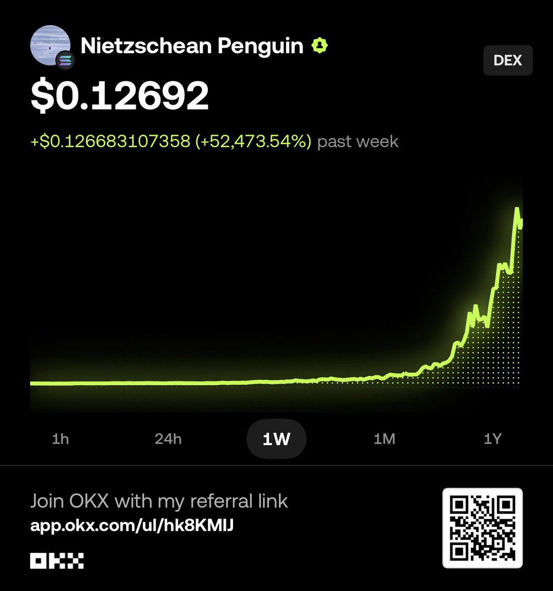
The success of $PENGUIN is a quiet masterclass in psychology.
Remove the mental friction. Hide the scary on-chain stuff. Let people just… participate.
We’re officially entering the era where the “chain” disappears and retail finally gets a clean on-ramp. And honestly, we’re still early.
I’ve been messing around on social trading apps like @tryfomo lately, a social-first crypto app where you copy top traders and jump into trending low-cap tokens in real time. It’s basically Twitter energy applied directly to your wallet.
And it got me thinking:
Why does losing $100 copying a “pro” not feel as bad as losing $100 on my own?
Turns out our brains are just professionally lazy. Here’s the degen psychology behind why social betting feels so good.
▪ The brain nap
Let’s be honest. Researching a five leg parlay or staring at candle charts after a long workday is exhausting. Copying a pro is cognitive offloading. Your brain would rather lose a little money than do the homework. You’re basically paying a fee to not think.
▪ The shared L
Losing alone feels personal. Losing because a trusted “expert” missed? That’s a team loss. The pain gets diluted. If the pro didn’t see it coming, you don’t have to beat yourself up either. Suddenly it’s not failure. It’s a vibe.
▪ The pro pedestal
Big following. Flashy track record. Our brains assume authority equals intelligence. That’s the halo effect. It feels safer to hide behind someone else’s conviction than to risk being wrong on your own.
▪ Dopamine by proxy
The moment a pro posts a “lock,” your brain gets a hit. Confidence is contagious. You start emotionally celebrating the win before anything even happens just because you’re riding with a winner.
TLDR
We’re not always paying for better outcomes. We’re paying for the luxury of turning our brains off.
Cleaning up a design system in a large company is never easy.
You’ve got dozens of teams working on different parts of the app. Everyone is shipping fast. Deadlines matter. And over time, small decisions stack up.
A slightly heavier font here. A different row height there. A quick custom fix that “just ships.”
Before you know it, the product looks mostly consistent… but not quite.
This isn’t a fixed rulebook or a one time cleanup. Products evolve, teams work differently, and goals change. The point isn’t perfection. It’s being intentional and at least conscious of consistency as you build.
Here’s a simple starting point that actually works at scale.
1. Choose a single source of truth
One version wins. If the design system and the product disagree, the decision is already made.
2. Audit where it hurts most
Start with the most used screens. Look for repeat problems like typography, spacing, width behavior, and states.
3. Lock the golden components
For core building blocks, there should be one approved Figma component and one approved code component. No forks.
4. Stop new inconsistencies
No new one off font sizes, font weights, or custom wrappers. Tokens only.
5. Fix in small, realistic phases
Either standardize one component everywhere over time, or fully clean up one surface at a time.
This won’t solve everything forever. And it shouldn’t.
But if every team thinks about these tradeoffs consciously before shipping, the product stays coherent instead of slowly drifting apart.
Figma’s “Design Systems: From the Basics to Big Things Ahead” is a great read on how design systems actually scale in real teams and why consistency is more about adoption than perfection.
figma.com/blog/design-sy…#productdesign#designsystems#uxdesign