
Vishal Gupta
2K posts
Vishal Gupta
@visualbit
Founding Team, Head of Design | AI × UX Strategist | Scaling Product Design with Systems Thinking | ex-Dunzo, ex-Instamojo | CUA™
Bengaluru, India Katılım Kasım 2009
686 Takip Edilen251 Takipçiler

This Is Why Bengaluru Auto Culture Is Legendary
No place on Earth can compete with the auto-rickshaws of Bengaluru when it comes to creativity and wild customization. Just look at this auto it has a ladder attached, Marvel, DC anime characters, and even a skateboard mounted on it. The level of modification is absolutely next level. It feels less like public transport and more like a moving piece of art and personality on three wheels.
have you ever seen autos in any other city with this much imagination, uniqueness, and bold styling. Only in Bengaluru will you find drivers turning their autos into something so iconic, expressive, and entertaining. Every auto seems to have its own story, theme, and character. This is exactly why Bengaluru stands apart the city’s auto culture is unmatched anywhere in the world.
#bangalore #bengaluru #autodriver #autorickshaw @BlrCityPolice @blrcitytraffic @CPBlr @Jointcptraffic @alokkumar6994 @DgpKarnataka @KarnatakaCops @Lolita_TNIE @ChristinMP_
English
Vishal Gupta retweetledi

i mapped every metro ride in bangalore using government RTI data
things i found interesting:
> the 3 busiest stations carry more people than the quietest 2 combined
> only 15% of people actually live close enough to walk to a station (!)
> some stations move 40k people a day. some move 689. 689?? that's like two buses. why is this station even a thing?
> purple line carries 1.5x the load of the green line but has the same ticket price and same train frequency
> the yellow line is running at 37% the load of purple, but with the same frequency and ticket price
click the link below to explore the map (desktop recommended)
English
Vishal Gupta retweetledi

I'm building a node-based tool that turns any SVG into animated SVGs using Gemini 3.1 Pro
it preserves the original aesthetics and the results are insane
English
Someone stopped a conversation mid-sentence and asked:
"What is the box?"
We had just said "think outside the box." And nobody could answer.
We had been using that phrase for years without ever interrogating what it actually asked of people.
A few days later I tried something smaller with my team. Two words instead.
"What if."
The room changed.
Wrote about why it works, where it breaks, and what it does to people over time.
Here is the full read:
@visualbyte/what-is-the-box-anyway-1c0a23f8e521" target="_blank" rel="nofollow noopener">medium.com/@visualbyte/wh…
#ProductDesign #DesignThinking #UXDesign #thethinkinglayer #tangibleux

English
The Feedback Trap: When “Listening to Users” Makes Products Worse open.substack.com/pub/visualbyte…
English
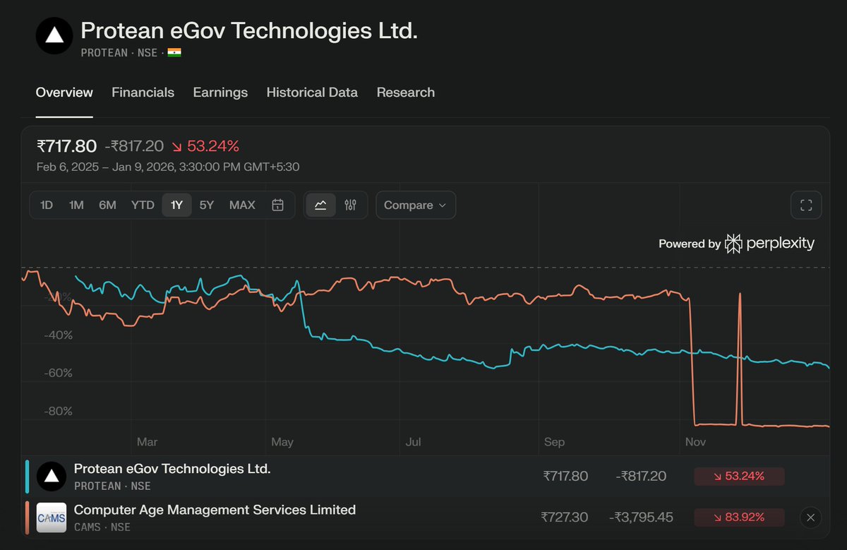
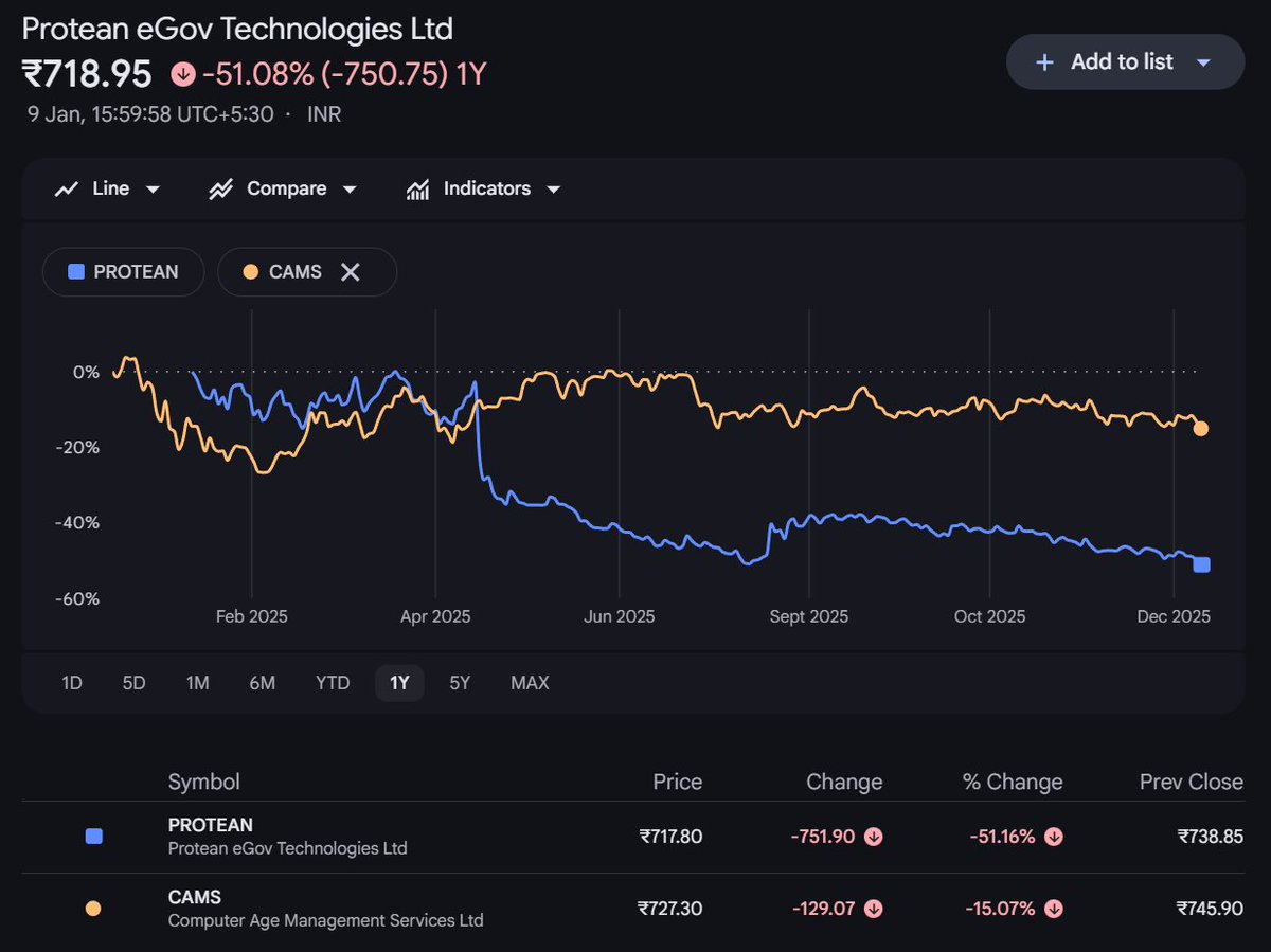
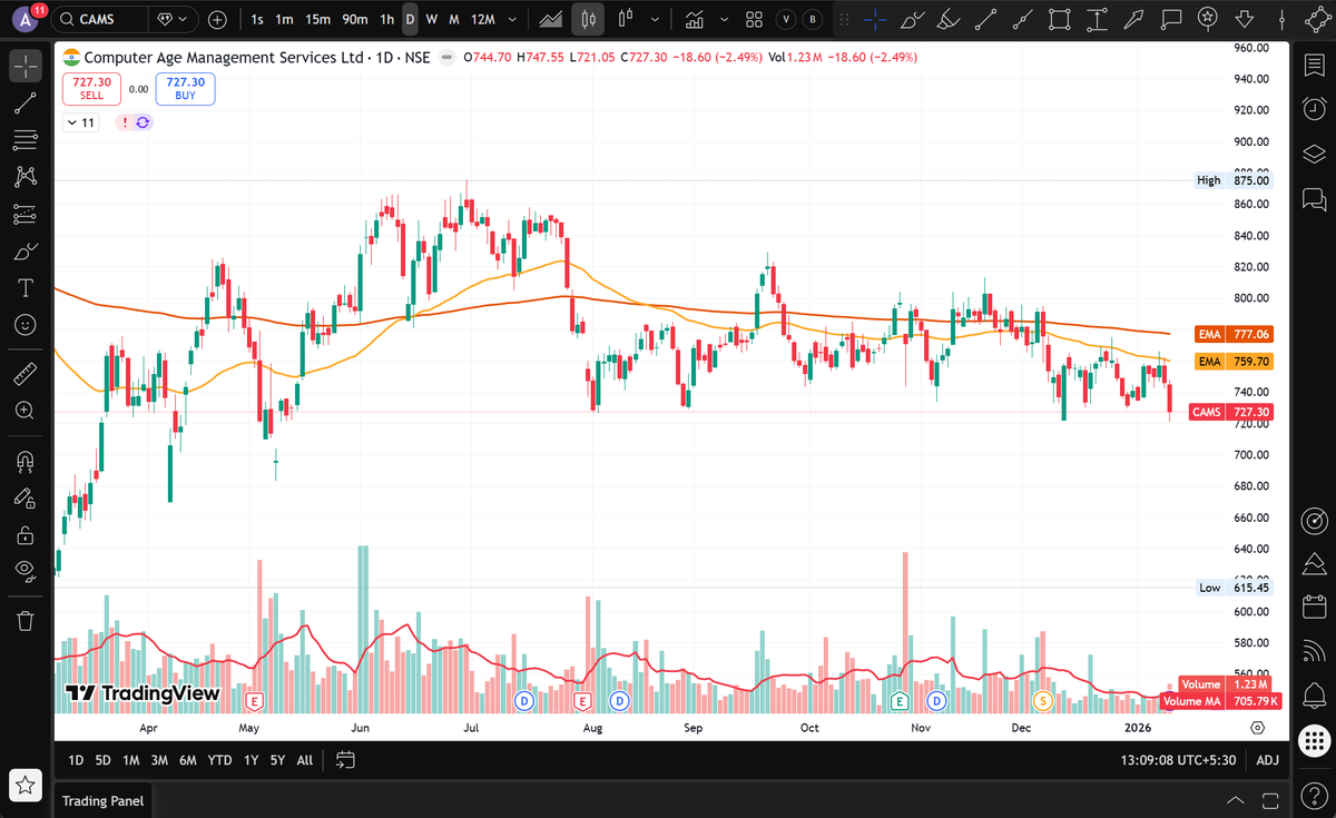
Which one is right? @perplexity_ai @Google
I see Perplexity is showing a big peak around November end. Very unreliable 👀
English

It’s not "pro" just because it’s complicated. It’s just lazy information architecture.
#UX #ProductDesign #InformationArchitecture
Ilya · イリア@ilyamiskov
It’s 2025 and cameras still use this archaic ugly ass UI with tons of multi-level menus. It’s amazing how photographers just eat and tolerate it.
English
People default to familiar mental models, even when the system has changed.
#MentalModels #HumanBehavior #DesignThinking #SystemDesign #UserBehaviour #CognitiveBias #RealWorldUX
Ghar Ke Kalesh@gharkekalesh
A passenger got off the Vande Bharat train to get tea but was left outside as the automatic doors were closed.
English
Everyone doing their job. Notice that person bowing down in respect. That is what we need.
🚨Indian Gems@IndianGems_
What is stopping Indian Railways from becoming like this?
English
Vishal Gupta retweetledi

Candour = Design for Humans
Two decades in product rooms has taught me this:
Teams rarely fail because of lack of talent.
They fail because of lack of candour.
I’ve seen it across companies:
→ Teams almost ship redesigns that everyone knows are clunky—until someone finally speaks up.
→ Engineers stay quiet on scale issues until late in the cycle—by then, weeks are already lost.
→ PMs push features no one truly believes in—because saying “let’s not build this” feels unsafe.
When candour is absent, teams perform theatre.
Polished decks. Polite nods. “Alignment.”
But under the surface, fractures grow.
When candour is present, the game changes.
Tough truths surface early.
The real debates happen in the room, not after launch.
Velocity compounds—not because teams move faster, but because they move clearer.
Candour feels risky in the moment.
But the absence of candour is far more expensive:
→ Bad UX slips through.
→ Months of effort vanish.
→ Teams burn out solving problems they saw coming.
Candour is not confrontation—it’s care.
It says: I value the work enough to challenge it. I respect you enough to be direct.
Empathy makes products lovable.
Candour makes them buildable.
Both are design for humans.
#ProductDesign #DesignLeadership #ProductManagement #TeamCulture #Leadership #TeamCulture

English

🚀 Just designed a Responsive AI Chatbot Dashboard in @figma complete with Light/Dark Modes & Variables for all breakpoints!
Giving away the Figma file + Tutorial (with all variables set up). Comment 'Figma' & I will DM you the link (Must be follow so I can DM)
#figma #uidesign #designsystem #ai
English
When a menu doesn’t open where you click, you pay a tax—every single time.
TL;DR
Windows 11’s centered Start menu improves visibility on ultra-wide screens and keeps parity across inputs, but it breaks two workhorse principles—Fitts’s Law and muscle memory—for mouse users. Anchor matters more than aesthetics.
What the change gets right
✓ Center-field visibility: On big monitors, middle-of-screen UI is easier to notice than a far-corner target.
✓ Input consistency: A single, centered panel feels uniform across mouse, touch, pen, and Win-key habits.
Where it regresses
⨉ Trigger → Outcome gap: The menu opens away from the button you pressed, adding refocus + pointer travel.
⨉ Lost “infinite” target: Corners let you slam the cursor without precision; a floating icon removes that advantage.
⨉ Moving targets kill skill: Centered taskbars shift with app count, so Start’s position—and your motor memory—drifts.
Design principles to steal for your product
→ Anchor to invocation. Menus should appear adjacent to their trigger (or where the pointer is) to minimize travel.
→ Prefer fixed coordinates for primary controls. Stability breeds speed.
→ Input-adaptive placement.
• Mouse: edge-anchored menus (+ bumper effect).
• Touch: near-thumb zones; edges aren’t faster for fingers.
• Keyboard: center overlay is fine—focus the search field immediately.
→ Context-adaptive rules. If invoked by pointer → open near pointer; by keyboard → center; by touch → thumb zone.
→ Offer a “classic” option. Power users will choose predictability; don’t make them install third-party fixes.
How I’d measure it
→ Time-to-first-selection
→ Pointer travel distance (px)
→ Mis-click rate / corrections
→ Repeat-use speedup (does motor memory form?)
Bottom line
Modern is good. Predictable is better. If you’re shipping a redesign, keep the novelty—but don’t upend the anchors users rely on daily.
#UXDesign #ProductDesign #InteractionDesign #HCI #Usability #DesignSystems #Windows11 #FittsLaw #DesignCritique
@tangibleux

English
@Finance_Bareek And what happens to the house bought after 20 years? Does the 1 Cr house value become zero?
English

🚨 The “Rent is Waste” Myth That’s Costing You Lakhs
“Rent money is wasted” is the biggest scam middle-class families believed.
Truth?
👉 EMIs often burn more money — you just call it “investment.”
Example 👇
•Home price: ₹1 Cr
•Loan: ₹80L @ 9% for 20 yrs
•EMI ≈ ₹72K/month
•Total paid = ₹1.73 Cr
That’s ₹93L extra (interest) — double the cost of renting the same house for years.
💡 Lesson:
•Rent isn’t always waste. It buys you flexibility + liquidity
•A home loan isn’t always investment. It’s leverage + liability
Owning vs Renting isn’t about emotions.
It’s about math + timing.
#stockmarkets #finance #realestate #investingtips
English
🌀 The Jalebi Loop of Design
In ancient Egyptian and Greek mythology, there’s a symbol called the Ouroboros — a serpent eating its own tail.
It represents cycles without end: creation and destruction, life and death, infinite repetition.
Design has its own Ouroboros.
Only, for me, it doesn’t look like a snake.
It looks like a Jalebi. 🍭
Attractive on the outside. Sweet in effort.
But once you’re inside, it’s sticky, tangled, and never-ending.
That’s what happens when we get stuck in iteration loops:
→ One option leads back to another.
→Tiny tweaks masquerade as progress.
Weeks go by, but decisions don’t get made.
→ A Jalebi has no clear beginning or end — and neither do these cycles.
How to escape the Jalebi loop:
→ Anchor to the problem. Write down what you’re solving before you open Figma.
→ Time-box iteration. Creativity needs boundaries; endless exploration isn’t progress.
→ Look for real signals. User feedback breaks loops faster than another internal debate.
→ Close the loop. Document decisions clearly so the team doesn’t spiral back.
Iteration is vital in design.
But iteration without direction is just self-consuming.
It’s Jalebi — the desi Ouroboros.
👉 Closing thought:
Good design isn’t about circling forever. It’s about knowing when to close the loop and move forward.
#UXDesign #ProductDesign #DesignLeadership #DesignProcess #Iteration #DesignMetaphors #StorytellingInDesign #DesignMetaphors #DesignThinking
English
🍬Melody khao, khud jaan jao — The Only UX Rule That Always Works
In UX, we often say “be in the user’s shoes.”
But too often, we try those shoes on while sitting at our desks.
Parle’s old Melody campaign nails it better:
“Melody khao, khud jaan jao” — experience it yourself.
For me, as a product design leader, it means:
Walk the exact path your user walks
Use the same devices, constraints, and frustrations
Don’t just imagine their journey — live it
The MELODY Playbook
A quick way to make this mindset part of your work:
M — Map the full journey, including the messy bits
E — Embed with real users, watch without steering
L — Log every friction point, even the small ones
O — Observe the real context — environment, mood, tools
D — Dry-run the journey under real-world constraints
Y — Yield insights into quick, testable fixes
A real example:
Designers love building discovery-rich menus.
But when you’re hungry, between meetings, or wrangling kids — most people don’t explore. They hit “reorder.”
Industry research shows nearly half of users order from the same restaurant weekly — yet many still struggle to find the reorder option easily.
⚡ Lesson: In real life, convenience beats discovery.
Design for shortcuts — especially the ones users are already primed to take.
Figma is where you shape; the real world is where you learn. Taste the journey — Melody khao, khud jaan jao.
#UX #ProductDesign #UserResearch #DesignLeadership #EmpathyInDesign #ServiceDesign
English
Untamed: A slow-burn masterclass in sense-making
Just finished Untamed. Six episodes, Yosemite as the stage, Eric Bana as an ISB agent threading a murder through terrain, weather, and egos. Dropped July 17 and already climbing the Top 10 for good reason. Netflix+1
What I watched as a designer
Environment as a system. The park isn’t a backdrop; it’s the rules engine. Constraints (terrain, weather, jurisdiction) shape outcomes more than any character. Good products behave the same way—systems make behavior predictable.
Cadence > speed. The show’s pacing—clues, silence, reveals—mirrors healthy discovery cycles. You feel progress without cheap dopamine. Teams need this rhythm when exploring messy problems.
Evidence beats vibes. Every “obvious” answer gets tested against ground truth—logs, tracks, timelines. That’s incident review energy. Replace “I think” with “Here’s what the traces say.”
Stakeholders with teeth. Rangers, locals, Feds—same case, different incentives. Great design maps power and motivation early, or you ship into a crosswind.
Misdirection as a risk. The story plants convincing false leads. In product, these are vanity metrics and loud edge cases. Name the bias. Park it. Move on.
Use of negative space. Silence, wide frames, and sparse dialog do heavy lifting. In interfaces, the equivalent is ruthless visual hierarchy and fewer toggles. Let intent breathe.
Clean exits. Endings resolve enough to move forward, not everything. Ship decisions with explicit debt: what we learned, what we’re leaving, what we’ll revisit.
If you lead design, try this with your team
→ Which constraint in your product behaves like the park (unavoidable, shaping every choice)?
→ Where is your investigation theater—beautiful dashboards, thin evidence?
→ What are today’s plausible red herrings (metrics, anecdotes, power users)?
→ How would you redesign your cadence to create momentum without noise?
→ What’s your “clean exit” doc for the next decision?
Verdict: Not “prestige TV that changes your life.” It’s a field guide for product teams who solve ambiguous problems under pressure—and want the work to hold up outside the conference room.
#UXDesign #ProductDesign #DesignLeadership #SystemsThinking #Sensemaking #DecisionQuality #Netflix

English
If you are wondering what is Goodhart's law, check this out → sketchplanations.com/goodharts-law
English
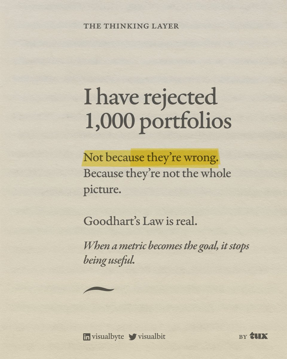
🙅No, seriously, I have not rejected 10,000 portfolios.
Lately, I’ve seen too many performative posts — “I rejected 1000 portfolios,” “Here’s what every junior designer is doing wrong” — that boil design down to a checklist of measurable outputs. (some even rejecting 10,000 portfolios)
But real product design? It doesn’t always fit inside a dashboard.
Here’s what that kind of metric fixation misses:
🔹 Trust isn’t a KPI.
🔹 Delight doesn’t show up in GA.
🔹 Brand perception, ethical design, and workflow sanity? Good luck cramming those into a single OKR.
Sure, metrics matter. But over-optimizing for what’s measurable leads to:
– Correlation mistaken for causation
– Short-term wins over long-term vision
– Confusing UX that keeps users stuck, just to boost “time on site”
– Designs that hit the metric but miss the mark
And worst of all? It teaches teams to play it safe — to tweak buttons instead of challenging assumptions.
Design is not A/B testing your way into greatness.
It’s not always clean. And it’s rarely viral.
Sometimes, the best work doesn’t look like performance — until it becomes the product people can’t live without.
Let’s stop celebrating rejection and start talking about what’s actually worth building.
#ProductDesign
#UXStrategy
#DesignThinking
#BeyondMetrics
#GoodhartsLaw
#RealWorldUX
#BuildBetterProducts
#DesignLeadership
#UserExperience
#EthicalDesign
#DesignTwitter
#PortfolioGate
English