Dhruv | BI Analyst

102 posts

Dhruv | BI Analyst banner
Dhruv | BI Analyst

Dhruv | BI Analyst

@workxDhruv

I help startups & small businesses make smarter decisions with Power BI dashboards | Microsoft Certified | DM to work together🚀

Ludhiana,Punjab Katılım Kasım 2025
113 Takip Edilen59 Takipçiler
Sabitlenmiş Tweet
Dhruv | BI Analyst
Dhruv | BI Analyst@workxDhruv·
Just built a Food Delivery Analytics Dashboard in Power BI🍕📊 
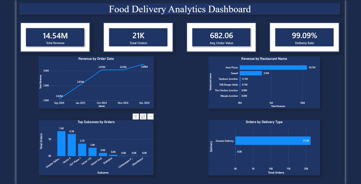
Analysed 21,324 real Zomato orders from Delhi NCR Key findings: 📦 21K total orders processed 💰 ₹14.54M total revenue generated 🛵 99.09% delivery success rate 🏆 Aura Pizzas dominates with ₹10.7M revenue 📍 Greater Kailash is the highest ordering subzone This is exactly the data every restaurant owner needs but most don't have visibility on Own a restaurant or food business? I can build this for YOUR data 👇 DM me "DASHBOARD" to get started 🚀 #PowerBI #DataAnalytics #Restaurant #FoodDelivery #Zomato #DataFamily
Dhruv | BI Analyst tweet media
English
2
0
3
230
Dhruv | BI Analyst
Dhruv | BI Analyst@workxDhruv·
@infomazeelite Manual approvals and scattered data after an ERP implementation basically means the ERP was configured around the old chaos instead of fixing it. What’s the most common workflow gap you see?
English
0
0
0
2
Infomaze Elite Pvt. Ltd.
Infomaze Elite Pvt. Ltd.@infomazeelite·
ERPNext works best when implemented around real business workflows. But many companies treat it as a software setup instead of system design. That’s where gaps appear: • misaligned workflows • manual approvals • scattered data • spreadsheet dependency #ERPNext #ERP #Frappe
Infomaze Elite Pvt. Ltd. tweet media
English
2
0
0
15
Divine Adebudo
Divine Adebudo@divineadebudo·
Just completed my Data Analytics Capstone Project. It's a 7-dashboard solution built entirely around time intelligence slicers, and interactive visualizations. Short thread 👇 @ezekiel_aleke @TechSphereAcad
Divine Adebudo tweet mediaDivine Adebudo tweet mediaDivine Adebudo tweet mediaDivine Adebudo tweet media
English
10
5
15
526
Dhruv | BI Analyst
Dhruv | BI Analyst@workxDhruv·
@bur__a @TechSphereAcad The Safety & Compliance page is what stands out — tracking preventable incidents, claim amounts by state, and DOT violations in one view is the kind of thing real logistics companies pay a lot for. Well done!
English
0
0
0
0
Burabari
Burabari@bur__a·
Weeks of learning, cleaning data, building models and it all led to this 👇 My Capstone Project with @TechSphereAcad is done! A full Logistics Operations data model in Power BI, this journey has leveled me up! 🚀 #PowerBI #TSAcademy #DataAnalytics
Burabari tweet mediaBurabari tweet mediaBurabari tweet mediaBurabari tweet media
English
5
4
41
847
Dhruv | BI Analyst
Dhruv | BI Analyst@workxDhruv·
@HowToPowerBI Never would have thought to abuse error bars like this 😂 Brilliant workaround. Does the flag position stay accurate when filters change the monthly max?
English
0
0
0
1
Bas (How to Power BI)
Bas (How to Power BI)@HowToPowerBI·
📊 Dynamic Data Flags in Power BI help users understand the total impact faster Here’s how to build it 👇🏻 Step 1: Create the Chart Set up a clustered column chart with months on the X-axis and variable on the Y-axis. Set space between categories to 0%. Step 2: Create the Parameter Add a New Parameter with two options - Half-Year and Quarter - using NAMEOF. This is the setup dynamic flag switching. Step 3: Create the visibility Measures for quarters and half-year flags. Step 4: Add Error Bars Enable Error Bars on the Y-axis. Set the Upper Bound to your Monthly Max - Start measure and the Lower Bound to a Dummy0 measure. This is the trick that renders the flags as vertical markers on the chart. Step 5: Add Data Labels Create a Data Labels Value measure using SWITCH to display either the Quarter totals or Half-Year totals based on the parameter selection. Follow for more Power BI tips & tricks ✨ #powerbi #flags #design #idea
Bas (How to Power BI) tweet media
English
2
1
10
556
Dhruv | BI Analyst
Dhruv | BI Analyst@workxDhruv·
@mnowakdesign Clean is an understatement — the three-scenario revenue projection (optimistic/base/conservative) with live Copilot alerts is genuinely product-level thinking. What stack is this built on?
English
0
0
0
13
Michael Nowak
Michael Nowak@mnowakdesign·
clean finance dashboard 🤌🏻
Michael Nowak tweet media
English
9
2
53
1.8K
Dhruv | BI Analyst
Dhruv | BI Analyst@workxDhruv·
@FolajimiDamilo1 @ezekiel_aleke First-ever dashboard and you already have profit profitability by product, COGS by city, revenue by sales rep AND a monthly volume trend? That’s not a beginner dashboard .Well done
English
0
0
0
5
Folajimi Damilola
Folajimi Damilola@FolajimiDamilo1·
Most people learn in silence, but growth becomes more powerful when it’s shared. I started my data analysis journey a while ago, and it’s been a rewarding process of continuous learning. Excited to share my first-ever Sales Dashboard created with Excel @ezekiel_aleke
Folajimi Damilola tweet media
English
1
0
12
1.3K
Dhruv | BI Analyst
Dhruv | BI Analyst@workxDhruv·
@designer_tanbir The room calendar view on the right is the standout detail here — showing guest relationships (family, friends) alongside check-in times is a thoughtful UX touch most hotel systems completely miss.
English
0
0
0
2
Tanbir Ahmed
Tanbir Ahmed@designer_tanbir·
Hotel Booking Management Software - Dashboard
Tanbir Ahmed tweet media
English
8
1
30
604
Dhruv | BI Analyst
Dhruv | BI Analyst@workxDhruv·
@AlaniJoshua_ compliance radar page is such a smart addition — most procurement dashboards stop at spend analysis. Flagging invoice risk % and maverick spend together in one view is exactly what procurement teams need. Great work
English
0
0
0
0
Dhruv | BI Analyst
Dhruv | BI Analyst@workxDhruv·
@stellaanalyzes 122M miles, 85K trips, $262M revenue — the KPIs are giving logistics excellence 🙌 Keep going, almost there!
English
0
0
0
3
stella.✧📊
stella.✧📊@stellaanalyzes·
still working on my Capstone Project.✨
stella.✧📊 tweet mediastella.✧📊 tweet media
English
10
6
51
1.3K
Dhruv | BI Analyst
Dhruv | BI Analyst@workxDhruv·
@ThisIsDikky @officialladi_T he stock analysis dashboard with Bollinger Bands and relative price change is impressive — most people learning Tableau stick to bar charts. You went straight for the deep end
English
0
0
0
4
Thelma Etuk
Thelma Etuk@officialladi_T·
do people use tableau? i'm still yet to see a dashboard created with tableau
English
14
1
33
3.1K
Dhruv | BI Analyst
Dhruv | BI Analyst@workxDhruv·
14-table data model into a 5-page dashboard — that’s not a capstone, that’s a full consulting deliverable ₦262.53M revenue with 61% profit margin is impressive, but the 56% on-time delivery flag is the real business insight. That’s the number that saves companies millions when acted on. Outstanding work!
English
1
0
1
4
GEAPSEAN | Data Guy
GEAPSEAN | Data Guy@geapsean·
Completed my @TechSphereAcad capstone project There were moments when the data frustrated me, visuals refused to cooperate, & relationships broke 😅 but seeing the dashboard come together made it all worth it proud of how far I’ve come S/O to @ezekiel_aleke for the guidance
GEAPSEAN | Data Guy tweet mediaGEAPSEAN | Data Guy tweet mediaGEAPSEAN | Data Guy tweet media
English
5
0
13
247
Dhruv | BI Analyst
Dhruv | BI Analyst@workxDhruv·
The story is in the data & design” — and you delivered both The Key Insights text box on each page is what separates good dashboards from great ones — most analysts show the data but never tell the story. 44.61% OTD rate flagged as critical with an industry benchmark comparison? That’s consulting-level thinking right there. Outstanding work Jakes!
English
1
0
1
6
Dhruv | BI Analyst
Dhruv | BI Analyst@workxDhruv·
3-page HR dashboard covering Workforce Analysis, Performance AND Training Investment — that’s the holy trinity of HR analytics The training completion rate alongside cost by department is exactly what CHROs need to justify L&D budgets. 2,845 employees tracked with satisfaction scores — this is enterprise-level thinking! Well done!
English
1
0
1
19
Dhruv | BI Analyst
Dhruv | BI Analyst@workxDhruv·
“Numbers mean nothing without human context” — this should be printed on every analyst’s wall A 56% on-time delivery rate isn’t just a number — it’s drivers being overloaded, routes being inefficient, or maintenance being ignored. 4 pages of dashboard to find THAT insight is exactly what good BI looks like. Well done Dennis!
English
1
0
1
14
Dennis Onyeka
Dennis Onyeka@OnyekaDennis·
Completed my @TechSphereAcad Capstone project.. Thank you Tutor @ezekiel_aleke Building a logistics dashboard taught me a massive lesson: numbers mean nothing without human context. ​The data showed a brutal 56% On-Time Delivery rate.
Dennis Onyeka tweet mediaDennis Onyeka tweet mediaDennis Onyeka tweet mediaDennis Onyeka tweet media
English
5
2
21
218
Dhruv | BI Analyst
Dhruv | BI Analyst@workxDhruv·
@Don_ice07 @ezekiel_aleke Safety and Operations Risk Analysis as a capstone shows real industry thinking Tracking DOT violations, accidents AND idle hours breakdown in one view gives fleet managers exactly what they need for compliance + cost reduction. “Beginning of a journey” — what a way to start it!
English
0
0
0
11
Is_reel
Is_reel@Don_ice07·
A massive thank you to TS Academy for the incredible platform, and especially to my tutor, @ezekiel_aleke Mr Ezekiel Aleke This capstone marks the beginning of my journey as a Data Analyst ready to drive real business value. Onwards and upwards! 💪 #DataAnalytics #TSAcademy
Is_reel tweet media
English
2
5
48
1.7K
Dhruv | BI Analyst
Dhruv | BI Analyst@workxDhruv·
Spend visibility + supplier reliability + operational control in one report — that’s the procurement trifecta The maverick spend tracking alongside on-time delivery rate is exactly what procurement managers lose sleep over. The purple theme across all 3 pages is clean and consistent too. Really well done!
English
1
0
1
9
ninaikpe
ninaikpe@ninafrancez1·
Hi #datafam, ever wondered how effectively procurement is balancing cost savings, supplier reliability, and operational control? I built this procurement report to explore how purchasing activities evolved, with a focus on spend visibility, supplier performance, operational efficiency, and procurement control. While procurement teams play a critical role in keeping organizations running smoothly, challenges such as delivery delays, rising supplier risks, invoice issues, and off-contract spending can quickly impact both budgets and operational performance. This analysis helps break down those challenges into clear, actionable insights that support better decision-making. The report is divided into three connected pages. The first page provides a high-level overview of procurement activity, helping users understand overall spend trends, savings generated, and how procurement performance varies across categories, purchase order types, and regions. The second page dives deeper into supplier performance, examining supplier reliability, lead times, ESG performance, preferred supplier utilization, and areas where procurement spend may be overly concentrated with single suppliers. The third page focuses on operational controls and process efficiency, highlighting maverick spend, overdue invoices, delivery delays, and procurement validation processes to uncover potential bottlenecks and governance risks. Rather than simply reporting numbers, the dashboard is designed to tell a complete procurement story - from where money is being spent, to how efficiently suppliers are performing, and where operational inefficiencies may be creating risk or reducing value. The goal is to provide leaders with a more transparent and data-driven view of procurement operations, helping them improve supplier strategy, strengthen procurement controls, and optimize overall procurement performance. You can explore the report here: shorturl.at/UQG5w @Zoomcharts #builtwithzoomcharts #Procurement #DataAnalytics #DataVisualization @MSPowerBI
ninaikpe tweet medianinaikpe tweet medianinaikpe tweet media
English
4
1
17
7.6K
Dhruv | BI Analyst
Dhruv | BI Analyst@workxDhruv·
Purple dark theme on a logistics operations dashboard is a bold choice and it absolutely works 🔥 The fact that you tracked 55.67% on-time delivery AND revenue trend simultaneously shows you understood what operations managers actually care about. “Raw data to polished project” — that’s the whole journey right there!
English
1
0
0
16
Mautin
Mautin@HoneyDewArt_01·
I just finished my Data Analytics Capstone Project and it is a breakthrough for me. Raw data is now a well-structured, polished project, achieved through cleaning, organising, focus, and problem-solving. Thanks to @TechSphereAcad & @ezekiel_aleke #DataScience #TechJourney
Mautin tweet mediaMautin tweet mediaMautin tweet media
English
9
2
46
708
Dhruv | BI Analyst
Dhruv | BI Analyst@workxDhruv·
4 pages covering Executive Overview, Fleet & Driver Performance, Route Profitability AND Fuel Safety metrics — this isn’t a capstone project, this is a full enterprise BI solution 🔥 The driver activity trend + incident per type combination on Page 4 is exactly what fleet managers need. Incredible work Isaac!
English
0
0
0
9
Isaac Mary Ayooluwa
Isaac Mary Ayooluwa@theayooluwanimi·
My capstone project is LIVE! It was not smooth, but it was real learning. Grateful to my tutor @ezekiel_aleke and academy @TechSphereAcad for the support through it all. x won't let me post my 5th insights dashboard🥲.
Isaac Mary Ayooluwa tweet mediaIsaac Mary Ayooluwa tweet mediaIsaac Mary Ayooluwa tweet mediaIsaac Mary Ayooluwa tweet media
English
16
9
111
2.7K
Dhruv | BI Analyst
Dhruv | BI Analyst@workxDhruv·
@PeterFatd1 This is every beginner’s story 😄 The turning point is always when you stop seeing rows and columns and start seeing patterns and decisions. Excel feels like noise until one day it becomes your superpower. What clicked it for Peter in the end?
English
1
0
1
8
Fatolu Peter || Emperor Analytics|| Data & Insight
Many beginner data analysts think the same thing at the start… “I don’t understand Excel.” “SQL is confusing.” “Dashboards look complicated.” “Maybe data analytics is not for me.” Peter was exactly like that. Every time he opened a spreadsheet, it felt like noise. Rows, columns, numbers everywhere — but no meaning. But everything changed when he learned one simple truth: Data is not about tools. Data is about storytelling. Once Peter stopped focusing on confusion and started focusing on insights… He began to see patterns instead of problems. He saw opportunities instead of errors. He started making decisions with confidence — not guesses. And that’s where most beginners get stuck. They try to learn everything at once… But they never learn how to think with data. If you are a beginner in data analytics, here’s the truth: You don’t need to master everything first. You need to understand what the data is trying to tell you. Because in the real world… Companies don’t pay for people who just know tools. They pay for people who can turn data into decisions. Just like Peter learned: From confusion → to clarity From guessing → to insight From beginner → to data thinker The question is simple: Are you just learning data… or are you learning how to see with data? #DataAnalytics #DataStorytelling #BeginnerToPro #SQL #Excel #BusinessIntelligence #LearningJourney
English
2
1
3
59