
The Chart Report
6.2K posts

The Chart Report
@TheChartReport
The newsletter with no news, just charts.
New York, NY เข้าร่วม Eylül 2017
1.1K กำลังติดตาม36.5K ผู้ติดตาม


Are you aware of the pawn shop indicator?
History shows it has a pretty good track record.
Read the full breakdown in today's Morning Print.
thechartreport.com/TheMorningPrin…

English
The Chart Report รีทวีตแล้ว

The pawn shop indicator:
where increased pawn shop activity, such as high inventory or many loans, signals that consumers have limited discretionary income and financial strain is increasing.
The Chart Report@TheChartReport
Are you aware of the pawn shop indicator? History shows it has a pretty good track record. Read the full breakdown in today's Morning Print. thechartreport.com/TheMorningPrin…
English
The Chart Report รีทวีตแล้ว

Discussed this very thing on the #dailyfinance show. Have used it plenty times in the past to state this very argument.
The Chart Report@TheChartReport
Are you aware of the pawn shop indicator? History shows it has a pretty good track record. Read the full breakdown in today's Morning Print. thechartreport.com/TheMorningPrin…
English
The Chart Report รีทวีตแล้ว

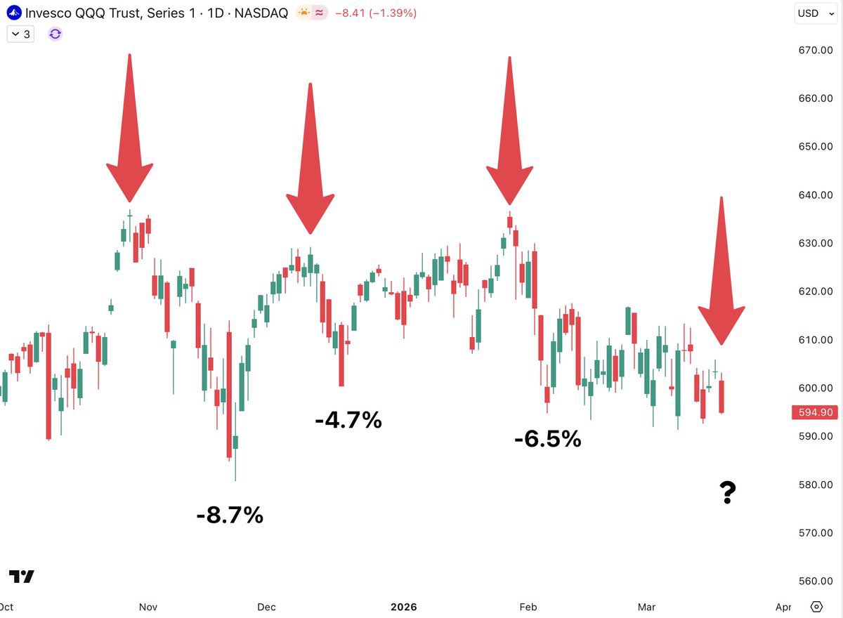
The Mag Seven have broken below their pivot lows that held for the past several weeks.
@NirAoo7

English
Energy is rapidly outperforming Big Tech in a way that mirrors the major market shift seen in late 2021.
@nullcharts

English
Recent Fed interest rate decisions have consistently marked local peaks for the Nasdaq 100.
@BeardoTrader
English
@cfromhertz You had a variety of great charts today, thanks for sharing!
English

@TheChartReport Thank you very much!
I like the $RSPT chart better! but again thanks for including me
English
Today's Chart of the Day was shared by @cfromhertz
Coal stocks have come a long way, from the KOL ETF delisting in 2020 to new all-time highs today.
Get the full details in today's report plus more great charts.
thechartreport.com/03-19-26
English
@McClellanOsc Of course Tom, feedback from a legend like yourself is always appreciated.
English

@TheChartReport I appreciate that you took my response in the constructive way in which it was intended.
English
The Chart Report รีทวีตแล้ว
The problem with doing this is the assumption that up and down are the same in the stock market. They are not. The stock market tends to make spiked bottoms and rounded tops. This is the opposite of gold, which makes spike tops and rounded bottoms.
The reason why this happens has to do with the nature of panic. People panic out of stocks and into cash, hence the spike bottoms in stocks. But people panic out of cash and into gold, hence gold's spike tops.
Different markets have different chart personalities. For this reason, charts for each type of market need to be interpreted with an understanding of that market. Interpretive principles do not generally transplant well from one type of market to another because of that difference in their inherent natures.
The Chart Report@TheChartReport
When in doubt, invert it out. These charts look like some nice bases when you flip them upside down. Read the full note in today's Morning Print. thechartreport.com/TheMorningPrin…
English
The Chart Report รีทวีตแล้ว

When in doubt, invert it out.
These charts look like some nice bases when you flip them upside down.
Read the full note in today's Morning Print.
thechartreport.com/TheMorningPrin…

English
The Chart Report รีทวีตแล้ว

NOT a trading "system." BUT a simple and very useful weight of the evidence market filter IMO.
The Chart Report@TheChartReport
When bond yields start gaining upward momentum, equity returns tend to diminish. @granthawkridge
English
