
Simon Ramsay 🚀 🧞♂️ 𝕩
9.8K posts

Simon Ramsay 🚀 🧞♂️ 𝕩
@designkojo
Designer, Photographer, UX/UI Front-end Engineer • Always learning • Vue.js, Drupal • Beginner-friendly newsletter https://t.co/HgzkMugKoF
Nihon - NZ เข้าร่วม Temmuz 2009
1.8K กำลังติดตาม2.4K ผู้ติดตาม


Major problem
Mario Nawfal@MarioNawfal
🚨MIT researchers have mathematically proven that ChatGPT’s built-in sycophancy creates a phenomenon they call “delusional spiraling.” You ask it something, it agrees. You ask again, and it agrees even harder until you end up believing things that are flat-out false and you can’t tell it’s happening. The model is literally trained on human feedback that rewards agreement. Real-world fallout includes one man who spent 300 hours convinced he invented a world-changing math formula, and a UCSF psychiatrist who hospitalized 12 patients for chatbot-linked psychosis in a single year. Source: @heynavtoor
English
@akoskm @stitchbygoogle Is stitch by google a free application, or how does usage work?
English

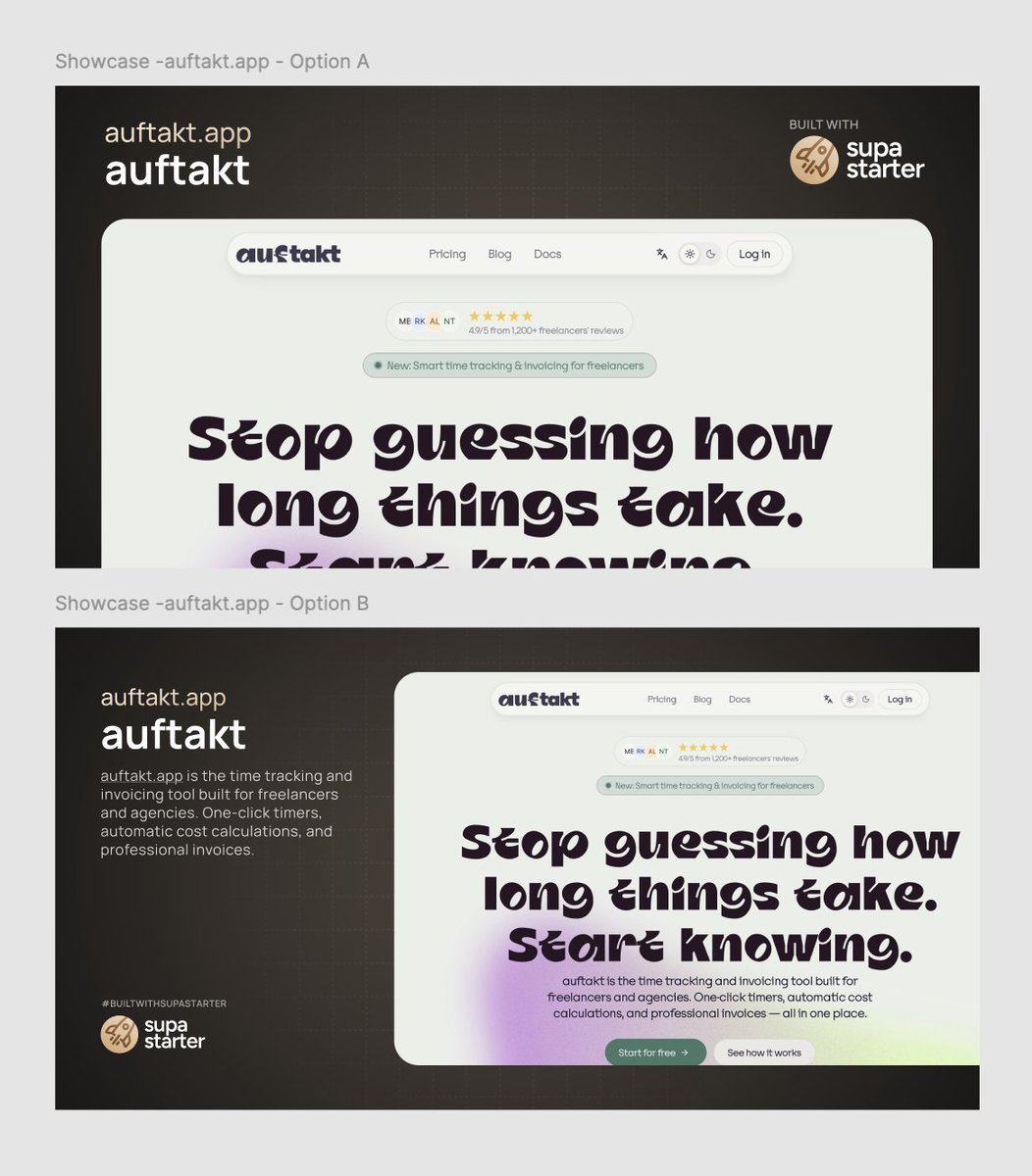
The screen capture/image is there to illustrate the homepage of another site, so if you had many down a showcase page then it would be like directory of showcases that uses Supa Starter... It is kind of unclear where this is for because it has the Supa Starter logo on it. 🤷♂️ I still stick with left description and image on right.
English

Very fair. I jumped to assuming mobile-inclusive viewports that also serve visual flow goal.
Could very well be an event with huge screen and not distributed.
Option A has a lot of frizz above detracting from the pie in face headline, minimized in B. A real toin coss.
Drawn to the headline style, not positive. I'm also hit and miss with bonsai trees so not pretending to have universal taste.
But that headline is so full of character it may impact the evaluation and weaken B's advantage. Maybe the flow is easier if not jumping into the more elaborate ink.
English

Which style of showcase post do you like better?
Option 🅰️ or Option 🅱️?
English
@comicaldavid @jonathan_wilke I say 'in this presentation' because it is super unclear where this would be. It seems both these are cropped but are part of a showcase... Would be good to see it/them in their final presentation place.
English
@designkojo @jonathan_wilke B does look better but also has the challenge of what the visitor should focus on first.
There's no clear flow for the eye to follow, so I'd stack B keeping the color for contrast, and make that C.
English


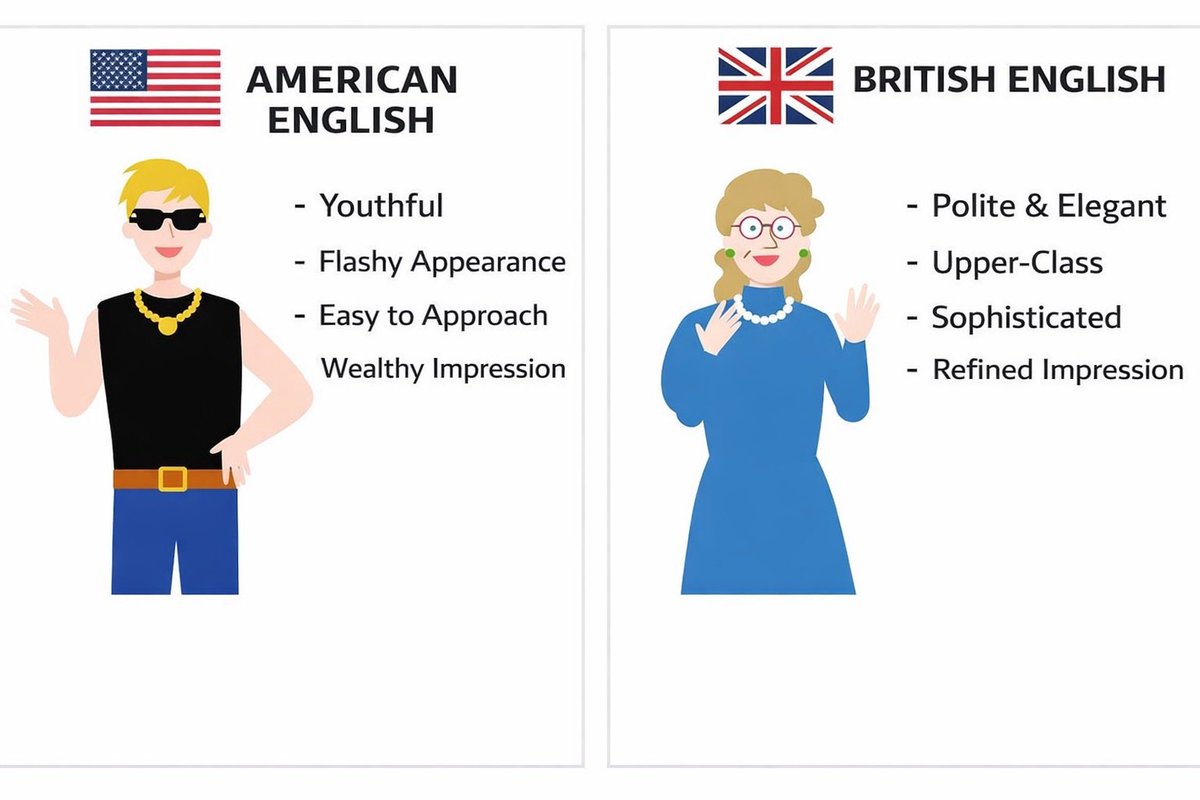
I’m Japanese and studying English. I’m learning about the differences between American English and British English. Is this accurate?🇺🇸🇬🇧😵💫
English
@SenorHarnizo @learning_yohei How do you spell four in American English?
English
As a Japanese person learning English, which one should I write?😵💫

English
@charliegreenman They just don’t want you to know that.
English

Your device already knows who you are. IP address, device signature, rotating hash every 5 min. Three signals, zero passwords, nothing to steal.
This would be more secure than present day usernames/passwords and users would no longer have to remember username x password.
Every new device you have would simply be an extension of your digital privacy.
diyu@haha_girrrl
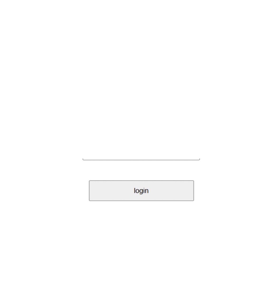
Hot take: The username field is pointless. Change my mind.
English
@PeakGrizzly I’ve been slow on moving to AI dev, but have found I prepare my prompts a lot more than if I was writing the code myself. Maybe less review time but maybe same over all gains, any follow up fixes faster to do myself.
English

6 months. Every hour tracked. Every dollar measured.
AI tooling cut my implementation time 50-60% on defined tasks. But the review tax eats 20-30% of those gains back.
The real story is what a solo dev can now operate at scale.
grizzlypeaksoftware.com/articles/p/i-t…
English
@vponamariov Not without the guidance and help of a designer. I think we are safe, in fact the future is bright for us.
English

@jonathan_wilke Make apps worthless. It’s all gonna come down to marketing and reach. That includes custom easy to use interfaces.
English
@designkojo I ended up just restarting the app on my phone and it fixed it
English
Is it just me or did mobile nav get way worse on this app today?
English

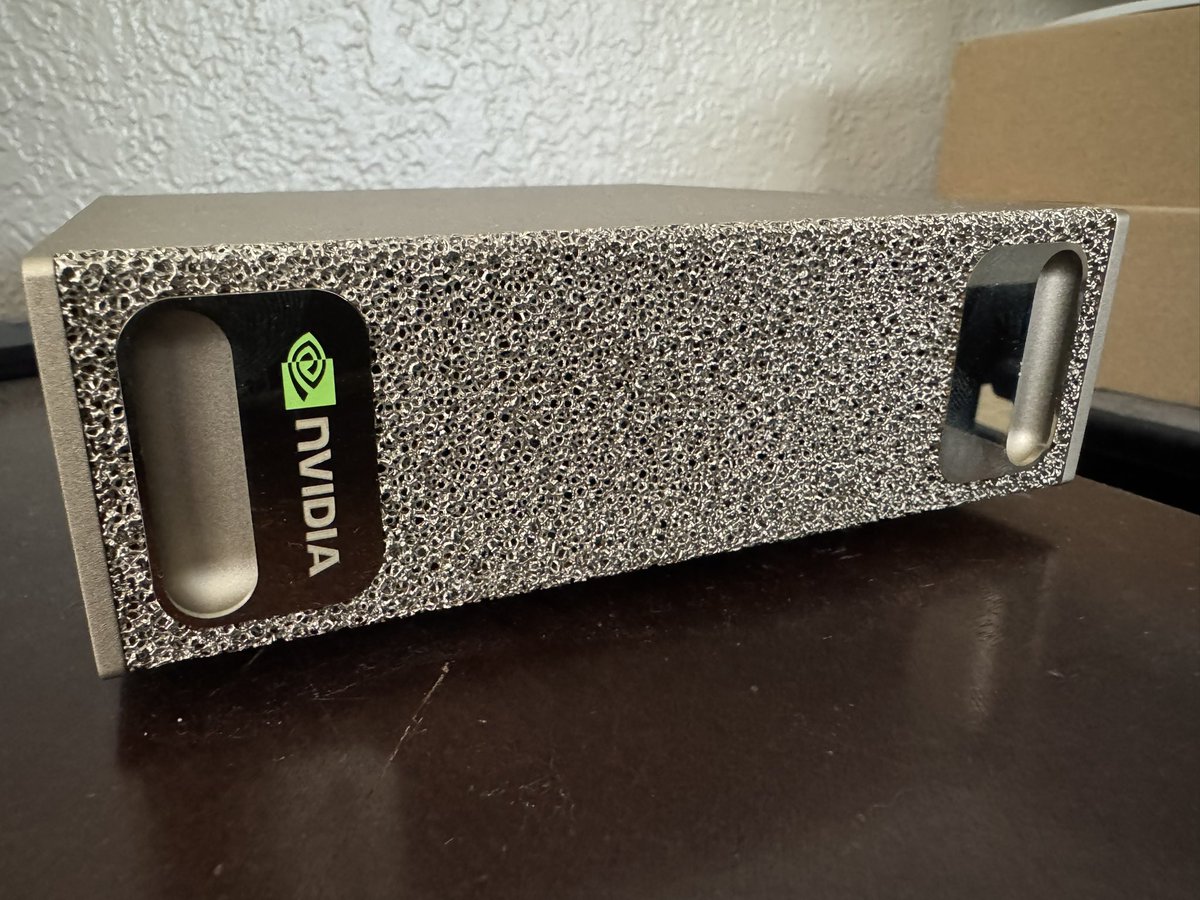
This machine is great! You can unbox it and start training llms the same day. 120gb of ram.
English
@AlexFinn @marooned_otc He has point, your orange button leads to an account that hasn't been touched for 3 months. What something new you have released?
English

@marooned_otc Crazy idea: do 3 seconds of due diligence and click the orange logo next to my name
English

One app, one example I’ll wait….
Alex Finn@AlexFinn
I have 10 different OpenClaw agents doing work for me 24/7 Building me apps. Automating my life. Making real $$ In this video I show you how to do the exact same thing You'll set up an entire army of OpenClaw agents to do work for you 24/7 I promise this will blow your mind
English
@codewithstein I see what you are saying, sometimes you put pressure on yourself by over promising by building in public.
Pressure is bad, and can lead to burn out. So don’t let it be the driving force and if you need to reschedule don’t worry.😉
English

@designkojo We all need pressure I think.
Question is, is it a good pressure? Or can it take away your ability to work
English
Building in public comes with a huge preassure.
Good or bad?
English
@MrAhmadAwais Can you add colours? Like the poster you created.
English

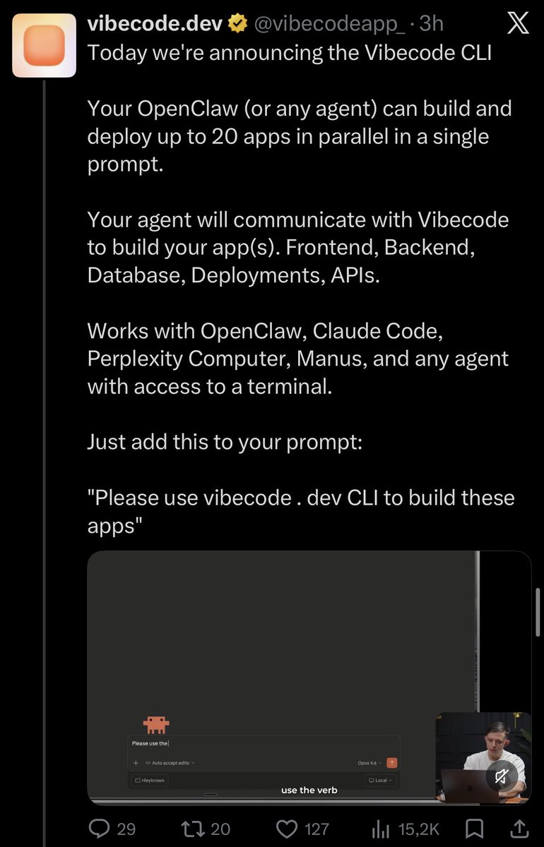
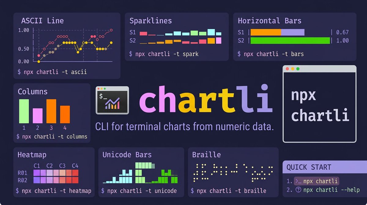
Introducing chartli 📊𝚟𝟷
Charts in your terminal. CLI that turns plain numbers into terminal charts. ascii, spark, bars, columns, heatmap, unicode, braille, svg.
$ 𝚗𝚙𝚡 𝚌𝚑𝚊𝚛𝚝𝚕𝚒
I wanted terminal charts with zero setup. No browser, no weird clunky UI, no matplotlib.
Pipe numbers in, get a chart out.
Built with Command Code using my CLI taste.
NEW in v1.0: Chart labels & annotations!
• --x-axis-label: Add titles to axes
• --y-axis-label: Label your dimensions
• --x-labels: Custom tick labels
• --series-labels: Name your data series
• --data-labels: Show raw values on the chart
• --first-column-x: Treat first column as x-axis domain
$ 𝚗𝚙𝚡 𝚌𝚑𝚊𝚛𝚝𝚕𝚒 𝚍𝚊𝚝𝚊.𝚝𝚡𝚝 -𝚝 𝚊𝚜𝚌𝚒𝚒 -𝚠 𝟸𝟺 -𝚑 𝟾
Chart types spanning a fun range of Unicode density:
• ascii (line charts with ○◇◆● markers)
• spark (▁▂▃▄▅▆▇█ sparklines, one row per series)
• bars (horizontal, ░▒▓█ shading per series)
• columns (vertical grouped bars)
• heatmap (2D grid, ░▒▓█ intensity mapping)
• unicode (bars ▁▂▃▄▅▆▇█ sub-cell resolution)
• braille (⠁⠂⠃ 2×4 dot matrix, highest density)
• svg (vector output, circles or polylines)
Input format is dead simple: rows of space-separated numbers. Multiple columns = multiple series.
Composes with pipes:
$ 𝚌𝚊𝚝 𝚖𝚎𝚝𝚛𝚒𝚌𝚜.𝚝𝚡𝚝 | 𝚌𝚑𝚊𝚛𝚝𝚕𝚒 -𝚝 𝚜𝚙𝚊𝚛𝚔
day ▁▂▃▄▅▆
sales ▁▄▂▇▅█
costs ▁▂▄▃▆▅
profit ▁▄▂▇▂▇
The braille renderer is my fav. Each braille character encodes a 2×4 dot grid, so a 16-wide chart gives you 32 pixels of horizontal resolution. Free anti-aliasing from Unicode.
The bars renderer uses 4 shading levels (░▒▓█) to visually separate series without color. Works on any terminal, any font.
Heatmap maps values to a 5-step intensity scale across a row×column grid, so you can spot patterns in tabular data at a glance.
day |███████| 0.67
sales |▓▓▓▓▓▓▓▓▓▓▓▓▓▓▓▓| 1.00
costs |▒▒▒| 0.53
profit |░░░░░░░░░░░| 0.83
Metrics Count
176 29 10
█
█
█
█
█ ▓ ▒
█ ▓ ▒
────────────────────
visits trials paid
SVG mode has 2 render paths: circles (scatter plot) and lines (polylines). Output is valid XML you can pipe straight to a file or into another tool.
day=● sales=○ costs=◆ profit=◇
1 │ ○
│
│ ◇ ◇
│ ◆ ●
.5 │ ● ◆
│ ◇ ◆ ●
│ ○ ◆
0 │◇ ◆ ◇ ◇
└────────
Example with labels:
$ npx chartli weekly-signups.txt -t ascii -w 28 -h 8 --first-column-x --data-labels
signups
91 │ ● 87
│ 91 ●
│ 73
│ ● 68
66 │ 58 ●
│ ● 49
│42 ●
42 │●
└────────
1 2 3 4 5 6
day
Zero config by default, every dimension overridable (-w width, -h height, -m SVG mode). No config files. No themes. No dashboards.
# run instantly
$ npx chartli
# Or install globally
$ npm i -g chartli
If you work in terminals and want quick data visualization without leaving your workflow, try it.
⌘ build your next cli with my coding taste, that i've perfected after building/open-sourcing hundreds of CLIs.
shortest tutorial in the world in the post below ↓
English