Sabitlenmiş Tweet
Hammad
10.2K posts


Hammad
@HammadCustoms
Making Clickable Thumbnails for Creators • Thumbnail Designer & Strategist • Work(ed) with: @ItsManuelBoza, @JDubTrades_, @TheCodaGuy, @WaqarAsim10 + more
Toronto, Ontario Katılım Temmuz 2017
889 Takip Edilen2.3K Takipçiler

@early90spants The camera turned off the but microphone kept recording
English


Never thought designing YouTube thumbnails would one day buy me my own car.
Feeling incredibly grateful to everyone who trusted my work. This is just the beginning. ❤️


English


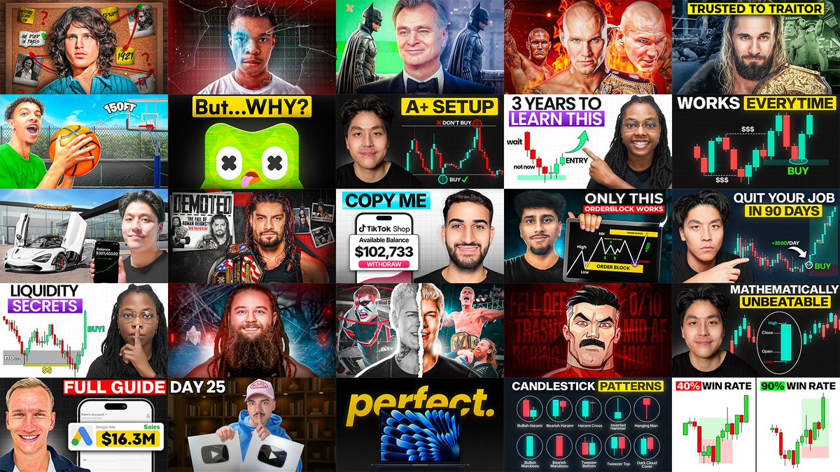
4 of the recent thumbnails i made👀
Comissions Are Open 💼


English


One thing I've noticed after studying thousands of thumbnails is that the most clickable ones usually have three things in common
1. Familiar
2. Credible
3. Intriguing
I call this the FCI Formula
1. Familiar thumbnails give your brain something it instantly recognizes. A well known face, a popular brand, a common object or a visual style you've seen before
2. Credible thumbnails feel believable. They don't look fake or misleading. The thumbnail presents the idea in a way that feels believable, making the viewer trust what the video is about
3. Intriguing thumbnails create a reason to click. They leave just enough unanswered that your brain wants to fill in the gap and that's where the curiosity comes from
The best thumbnails combine all three. If your thumbnail is familiar but doesn't create curiosity, people recognize it and keep scrolling. If it's intriguing but doesn't feel believable, it comes across as clickbait and if it's credible but unfamiliar, people may not understand it quickly enough to care
The next time you create a thumbnail, use this formula as a checklist

English

That McGregor fight was so disappointing last night...
also check this out these cool thumbnails we made recently


English

These YouTube thumbnails have generated $109,990 in directly attributed revenue
i just made a file with every thumbnail template we used
+ BONUS Giveaway breaking down secrets for making thumbnails that print
Comment "thumb" and i'll autoDM
(must follow for giveaway)
GIF
English


unpopular opinion, but titles are harder than thumbnails
and that's coming from a thumbnail designer...
a weak thumbnail can be saved with execution
a title is pure psychology, there's nothing to hide behind
that's why I do titles first, always. 15-30 min (or more) before I even think about opening photoshop
a good title branches into 5 thumbnail ideas instantly
start with the thumbnail and you'll spend 3x longer and end up with trash concepts anyway

English
One of the easiest ways to open a curiosity gap in a title is through authority.
"Doctor Reacts To World Cup Soccer Injuries"
The title instantly gives the viewer two pieces of information, creating an open loop
What we know:
- A doctor is reviewing World Cup injuries
-The injuries happened during one of the biggest sporting events in the world
What we want to know:
- What does the doctor notice that everyone else missed?
- What actually happened to the players?
- How serious were the injuries?
A doctor's expertise changes the context. Viewers expect explanations, diagnoses and insights they couldn't get on their own
The authority naturally creates a curiosity gap and clicking is how the viewer closes it.

English

A really good thumbnail trend to capitalize on now is Warped Faces
The reason this style works is because it immediately makes your brain think, "Something isn't right here." That split second of confusion creates a curiosity gap. In other words, it's a pattern interrupt. We're so used to seeing normal faces that even a subtle distortion instantly grabs our attention.
The important part though, is using it in the right context. A warped face naturally creates feelings of discomfort, tension, conflict or psychological intrigue. That's why you'll see it used so often in self-improvement, psychology, commentary, documentaries videos
If you tried using the exact same effect on a cooking tutorial or a travel vlog, it wouldn't work because it doesn't match the emotion of the video.
Like any other thumbnail trend, don't use it just because it's popular. First understand why they work, then ask whether that same psychology applies to your video. If it doesn't, forcing the trend will usually make the thumbnail weaker

English