Zentra

49 posts

Zentra banner
Zentra

Zentra

@ZentraDesign

Web & UI/UX Designer I craft clean, fast & high-converting websites in Figma + code Open to projects → DM

Katılım Şubat 2026
13 Takip Edilen6 Takipçiler
Sabitlenmiş Tweet
Zentra
Zentra@ZentraDesign·
Most real estate sites look like they were built in 2009. So I built what I'd actually want to see - dark, minimal, fast. Animated carousel. Scroll progress. Pure HTML/CSS/JS. Still learning. Thoughts? 👇 #BuildInPublic #WebDesign #UIUX
Zentra tweet media
English
2
1
2
351
Zentra
Zentra@ZentraDesign·
@richardrx Exactly. Most founders jump straight into listing features because it feels productive, but the visitor still has no idea if this is even for them. Clarity on the problem and the specific person comes first - everything else is secondary.
English
0
0
1
44
Richard - Design for startups
@ZentraDesign Yes, it's actually the most common problem of all. People don't know who they're selling to or how it solves a real-life problem for those people.
English
1
0
2
251
Richard - Design for startups
Dei mentoria pra 39 founders em três meses, e o pedido que mais apareceu foi ajuda com aquisição. Na maioria o furo estava duas telas antes do anúncio, uma landing page listando funcionalidade sem nomear pra quem, e depois do cadastro nada, nenhum onboarding, o cara sozinho com um dashboard vazio. Comprar tráfego só paga pra descobrir mais rápido que a tua página não fala com ninguém.
Português
8
2
112
4.5K
Zentra
Zentra@ZentraDesign·
@sabosugi The color transitions feel very controlled. A lot of shader experiments get noisy fast - this one stays elegant.
English
0
0
1
82
Zentra
Zentra@ZentraDesign·
@CollectUI @qclay_design The motion and transitions feel intentional here. A lot of sites overdo animation - this one actually uses it to support the hierarchy instead of fighting it.
English
0
0
0
35
Zentra
Zentra@ZentraDesign·
@CodeWithTamara The overall direction is clean and friendly. One thing I’d tighten is the hero - right now the main message competes a bit with the background. Making the value proposition sharper would help people understand faster what they’re looking at.
English
1
0
1
48
Tamara Martinović
Tamara Martinović@CodeWithTamara·
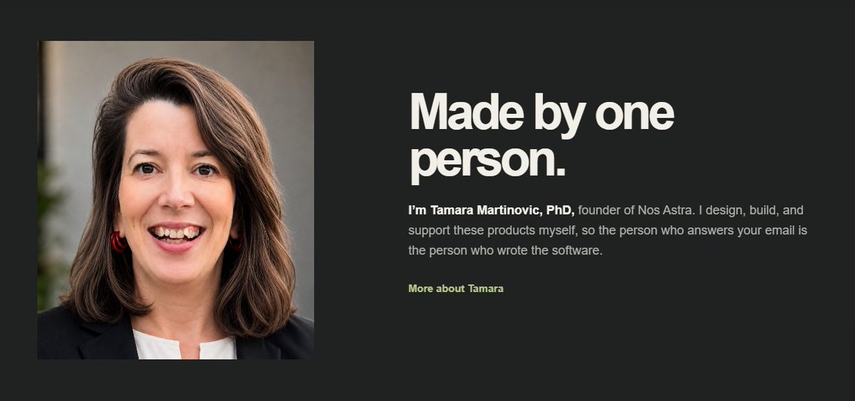
Roast my website 🔥 I finally finished the landing page for my business, which means I can now legally attempt to sell things on the internet 😂 Please: → Click every link → Test the contact form → Tell me the good, the bad and the ugly Full disclaimer: StackLight is UI only for now. You can register (or try, not sure if it works 😂) and click around, but nothing is actually running behind it yet. Give me a few more days, I'll get there 😉 nosastra.co
Tamara Martinović tweet media
English
13
0
40
1K
Zentra
Zentra@ZentraDesign·
@RoundtableSpace The speed is impressive, but I’m still more interested in how much human taste is needed after the first generation. Most AI layouts still need a designer to kill the generic feel.
English
0
0
0
19
0xMarioNawfal
0xMarioNawfal@RoundtableSpace·
Claude Opus 5 is unbeaten at web design Here’s a 16 minute tutorial on building insane web pages using just Claude Code + Opus 5
English
9
0
79
38.4K
Zentra
Zentra@ZentraDesign·
@benjitaylor Clean and confident. Good use of space and hierarchy - feels premium without trying too hard.
English
0
0
0
93
Benji Taylor
Benji Taylor@benjitaylor·
𝕏 Money is rolling out to Premium & Premium+ subscribers in the US starting today. To mark the milestone, we've also rolled out an all-new landing page. Now live: money.x.com
English
158
77
1.6K
94.4K
Zentra
Zentra@ZentraDesign·
@Shahtaj_b @framer Clean exploration. The softer palette works well with the card structure.
English
1
0
1
9
SHAHTAJ
SHAHTAJ@Shahtaj_b·
18/40 - posting design explorations Used overlapping cards and warmer tones to make the section feel more human, playful, and less corporate. Built in @Framer
SHAHTAJ tweet media
English
4
1
12
254
Zentra
Zentra@ZentraDesign·
@namyakhann Interesting direction. Hierarchy is almost there, but the visual weight is a bit too evenly distributed.
English
0
0
0
32
Zentra
Zentra@ZentraDesign·
@AmenaiSabuwala This is a good example of how not to do it. Too much visual noise and the value proposition gets lost.
English
0
0
0
39
Amena
Amena@AmenaiSabuwala·
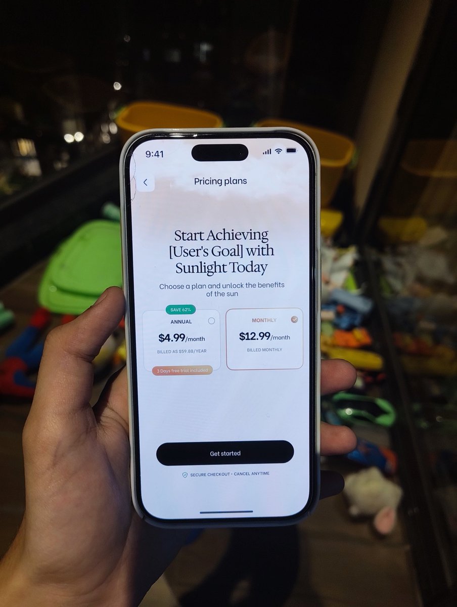
Imagine your paywall looks like this 🫠
Amena tweet media
English
6
2
31
2.1K
Zentra
Zentra@ZentraDesign·
@tolzyhub Would love to see them. Especially interested in how you handle micro-interactions without making the interface feel heavy.
English
0
0
0
15
Zentra
Zentra@ZentraDesign·
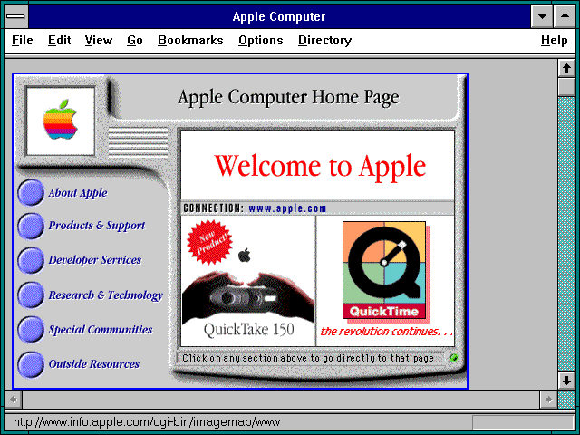
@WebDesignMuseum Interesting how some of these already understood visual hierarchy better than a lot of modern AI-generated sites.
English
0
0
0
99
Zentra
Zentra@ZentraDesign·
@Shine0x @monad @Backpack Solid improvement. Especially like how they simplified the main actions without losing information density.
English
0
0
1
41
Zentra
Zentra@ZentraDesign·
@WeekendVisuals @framer Clean direction. The color palette and overall structure feel intentional - good for a SaaS template.
English
1
0
1
20
Tanel Sepp
Tanel Sepp@WeekendVisuals·
Couldn't wait. Launched Fiidbakk in @framer community on Sunday evening. What's worse? It's paid. Brave ones who are not afraid of competition can like it in Framer community. Link is in the next post because can´t make 2 bad decisions at once.
English
6
1
22
827
Zentra
Zentra@ZentraDesign·
@framer Nice examples. Especially like the ones that don’t overuse effects and keep the hierarchy clear.
English
0
0
1
366
Framer
Framer@framer·
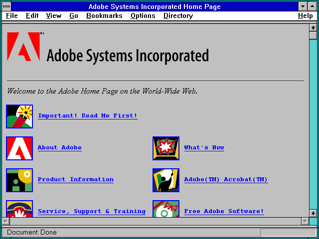
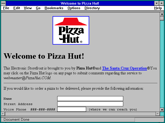
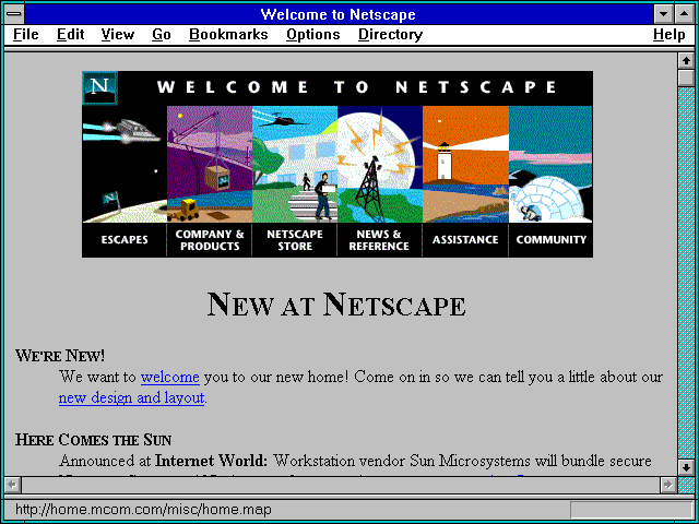
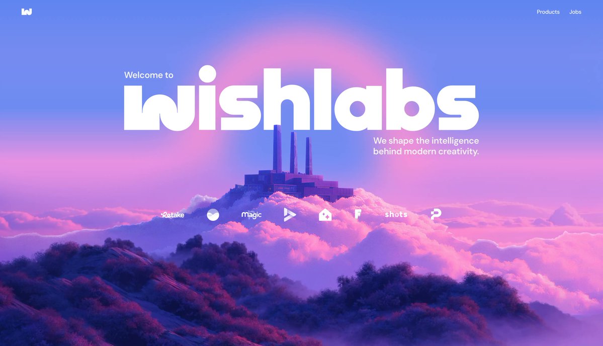
Check out these 4 stunning websites made in Framer ↓
Framer tweet mediaFramer tweet mediaFramer tweet mediaFramer tweet media
English
17
10
209
15.6K
Zentra
Zentra@ZentraDesign·
@TyroneC__ @gabriell_lab Smooth and clean. The transitions feel controlled - nothing overdone. Good example of keeping navigation simple but polished.
English
1
0
1
28
Tyrone C.
Tyrone C.@TyroneC__·
Bottom navigation exploration done in Framer Shoutout to @gabriell_lab where I saw the base for this nav
English
4
2
25
1.1K
Zentra
Zentra@ZentraDesign·
@gideonakin__ Clean and well-structured. Good use of hierarchy and spacing - feels intentional rather than decorative.
English
0
0
0
26
Gideon Akin +_+
Gideon Akin +_+@gideonakin__·
Throwback to when I designed the landing page for Kwara Designers Community
Gideon Akin +_+ tweet media
English
4
3
33
1.1K
Zentra
Zentra@ZentraDesign·
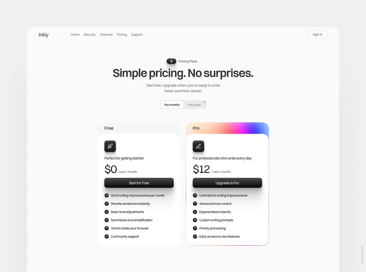
@robinspells Clean selection. Especially like the ones that prioritize hierarchy and breathing room over heavy visuals.
English
1
0
1
101
Zentra
Zentra@ZentraDesign·
@AntonDrukarov @framer Agree. Templates don’t die - only the ones that stop evolving do. The ones that adapt to current design language and new Framer features keep selling.
English
1
0
1
196
Anton Drukarov
Anton Drukarov@AntonDrukarov·
I see this question a lot lately: Is the @Framer template business dead? Well, templates have been around for as long as I can remember — Flash website templates, Photoshop effects, After Effects title, etc. The digital industry is constantly changing, but templates will always be part of it. That doesn't mean one particular template will stay in demand for years, though. Design changes. Tools change. Template creators have to adapt quickly to keep the momentum.
Anton Drukarov tweet media
English
14
1
75
3.5K
Zentra
Zentra@ZentraDesign·
@ranakabiria The output looks cleaner than most AI-generated sites I’ve seen. Hierarchy and spacing are unusually controlled for a one-shot.
English
0
0
1
850
Ahmed
Ahmed@ranakabiria·
Claude Opus 5 is crazy for web design. Prompt ↓
English
12
21
428
45.8K