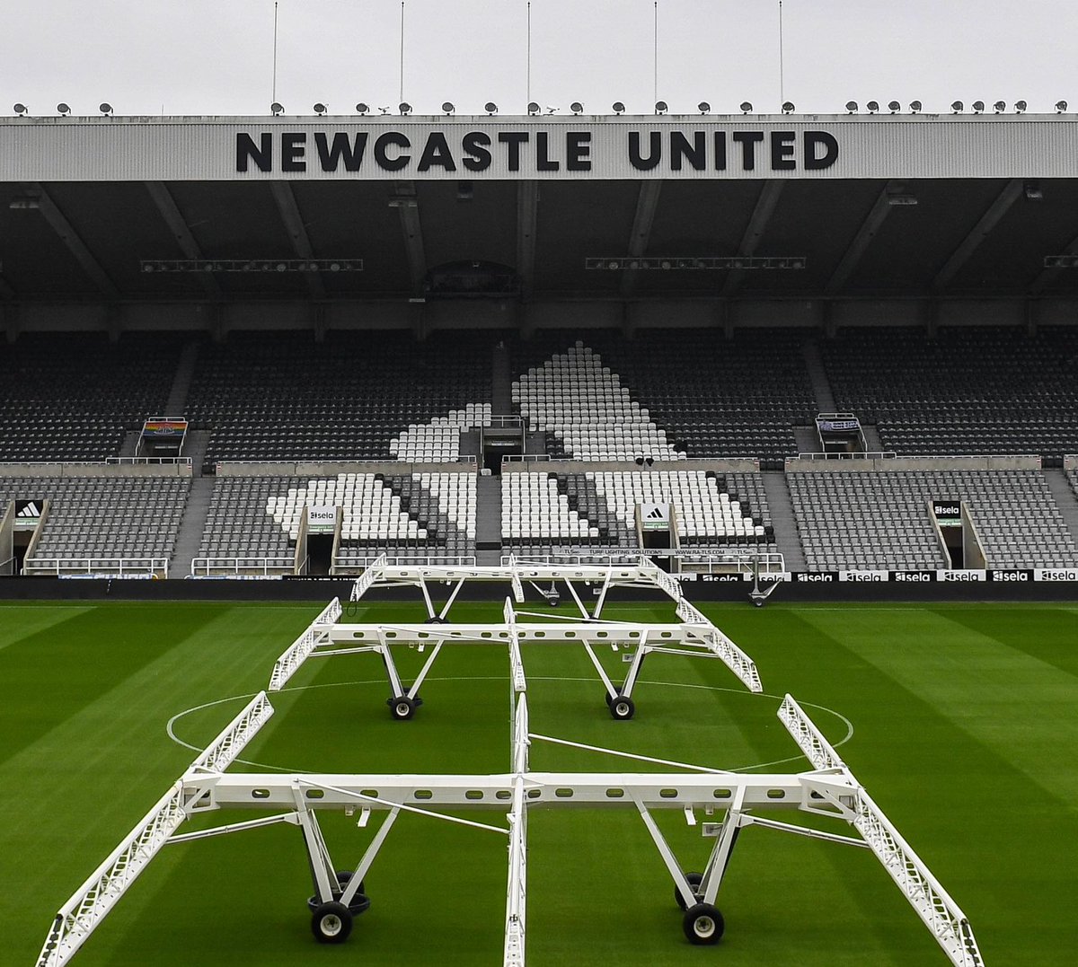
This needs more attention, how the owners thought about changing the badge but didn’t exhaust all options is criminal. This design is perfect for what they want, it ticks all the boxes and doesn’t change the overall identity. Get in touch @NUFC#NUFC
@bobizgrate@bazza080808 Cheers mate, yeah mate it could probably do with losing a few things , I've tried a few other styles a lot more simplified without some of the things on og crest
@bazza080808@alanjthain I do like this. Could it be streamlined even more, without the lion and flag on the top and the nameplate on the bottom? Would that annoy people?