GOBIBORG

5.3K posts

GOBIBORG banner
GOBIBORG

GOBIBORG

@gobiborg

TECHNO FUTURE IMAGINATOR. Design practice with motion and interaction.

Katılım Temmuz 2021
469 Takip Edilen351 Takipçiler
Dan
Dan@pizzaboy·
Today I am 35. And I've done A LOT in those years. + Joined the military at 15 + Deployed on operations + Gone from Help Desk to Lead Engineering Manager + Fathered two children + Married a beautiful woman + Owned houses + Owned 8 cars (not at the same time) + Ran a successful business for almost two years + Had a random music producer phase and played shows in the US But this is the year that I'm really going to focus on my mind and body. I've noticed over the last 1/2 years that it feels like anything I eat has a huge impact on my effectiveness. I'm starting this year with a 4 day water fast, followed by the most insane arc you'll ever see. May 5th 2027 I'll post before and after photos + health results/markers.
Dan tweet media
English
193
2
401
10.7K
GOBIBORG
GOBIBORG@gobiborg·
TEST.
GIF
English
0
0
0
16
GOBIBORG
GOBIBORG@gobiborg·
@aaronp613 Probably they are trying to make a move that XBOX recently did; not about the green colour but about the whole style.
English
1
0
1
1.1K
Aaron
Aaron@aaronp613·
Spotify is testing a new app icon on iOS as seen in the latest Spotify beta It is unclear if this is a temporary or permanent change
Aaron tweet mediaAaron tweet media
English
82
69
3.5K
374.1K
Adan
Adan@durreadan01·
Dynamic Island reveal is still one of the best videos made by Apple
English
22
89
2K
198.3K
kel.
kel.@kelxyz_·
i hate the word “user”
English
7
0
21
1.6K
GOBIBORG
GOBIBORG@gobiborg·
@ilyamiskov likewise never thought about seeing Microsoft getting appreciated for design over Apple and Google!
English
0
0
0
118
GOBIBORG
GOBIBORG@gobiborg·
@itskasturiii "i can bet this took several iterations and had to go through at least 5 rounds of exec feedback (design and engg)." maybe that's actually the problem here: x.com/mattiaswikman/…
Wikman@mattiaswikman

@jeazous To be fair this looks like it was designed by comitte. This happens when everyone have feedback and design isn’t allowed to say no.

English
1
0
0
311
Kasturi
Kasturi@itskasturiii·
after being a designer in big tech for more than 3 years now, i actually don’t care about an outsiders opinion (unless it’s a user). i can bet this took several iterations and had to go through at least 5 rounds of exec feedback (design and engg). when you see something shipped from big tech where they have a large design team, know that the designs had to go through a rigorous cycle and it took multiple iterations to get there.
DD@jeazous

designers on X are exhausting. for years they cried google never changes anything its so stale and lazy. now google actually overhauls everything bold new design and theyre like “ this is disgusting bring back the old one “ bro you literally begged for change for half a decade

English
10
2
111
16.1K
GOBIBORG
GOBIBORG@gobiborg·
good take but few unbiased outsider and common audience feedback goes far as valuable than 5 or 10 rounds of exec feedback. no ones said the same about icons of microsoft or apple when they came. like, the icons for Drive and GMail look really bad no matter how hard you look at them
English
1
0
0
299
GOBIBORG
GOBIBORG@gobiborg·
@robinbm_ @The1UX it's true that Microsoft's icons look better and it's also true that they don't like as shown in tweet. they look like this:
GOBIBORG tweet media
English
1
0
1
21
Robin☄️
Robin☄️@robinbm_·
@The1UX no because they don't actually look like this
English
3
0
1
152
GOBIBORG
GOBIBORG@gobiborg·
@Galvestz @SLKVinyl Agree. Each icon from Microsoft looks instantly good. Google looks like a mockup or design draft.
English
0
0
0
15
Guilherme
Guilherme@Galvestz·
@SLKVinyl Whyyy Microsoft is way better 😭😭😭😭
English
1
0
0
230
SLK15
SLK15@SLKVinyl·
New Google Drive logo but the inner triangle is upright again:
SLK15 tweet media
English
63
70
4K
117.4K
GOBIBORG
GOBIBORG@gobiborg·
@SLKVinyl You need to do the "see through gradient" part for green and yellow corners just like how you had done with the blue corner. In a way that you can see yellow stripe through the green stripe and blue striper through the yellow stripe.
GOBIBORG tweet media
English
0
0
2
307
GOBIBORG
GOBIBORG@gobiborg·
@avstorm Google Drive is bad; GMail is not good. Rest is cool.
English
0
0
1
293
Andreas Storm
Andreas Storm@avstorm·
If you'd like to try out the new Google icons, then I have something for you. All vectors, based on the first screenshots. figma.com/community/file…
Andreas Storm tweet media
English
7
17
414
17.8K
Rare 🇺🇸
Rare 🇺🇸@RareImagery·
@Shilllin X used to be the Wild West of social media, which made it fun. Now it’s locked down with rules, categories and a tyrant insulting users. It’s become dark and boring.
English
3
1
20
470
Alex 🥷
Alex 🥷@Shilllin·
Nobody knows the head of product at TikTok, IG, or YouTube…. Users just know the apps work. That’s the difference. When the product development takes a backseat to personal clout, everything else starts slipping…
English
31
27
279
15.4K
GOBIBORG
GOBIBORG@gobiborg·
@alxui_ux What’s the source of the original video?
English
0
0
1
74
ALX 🇺🇸
ALX 🇺🇸@alxui_ux·
Clean UI. Smart motion. Better trust
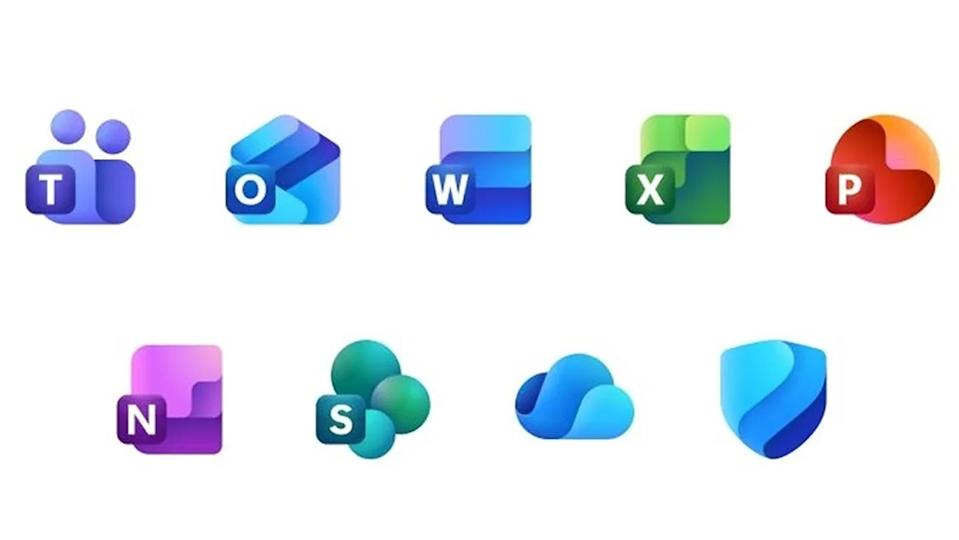
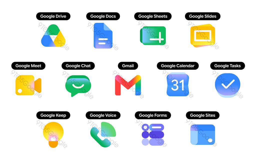
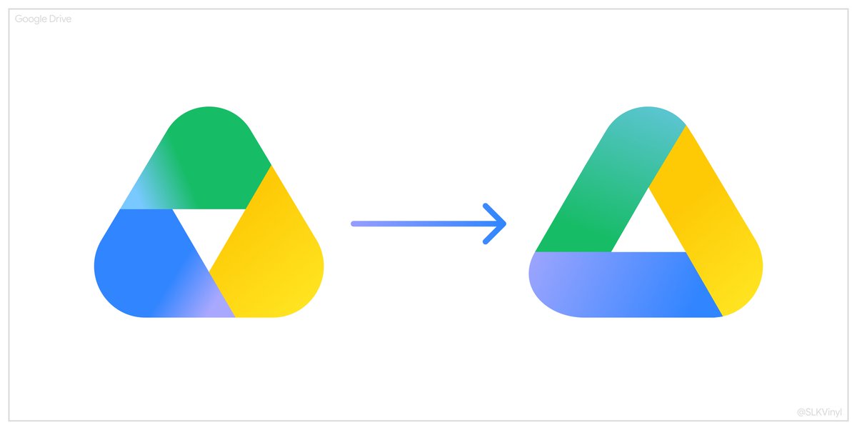
English
8
10
224
15K
GOBIBORG
GOBIBORG@gobiborg·
@phenom_XT I get your point but don’t think it’s about skeuomorphism either.
English
0
0
0
42
GOBIBORG
GOBIBORG@gobiborg·
@yashwanth941v Dumb question: what’s new or interesting here? I just see a decent looking app design. Is it just the X app on iOS that bad?
English
0
0
1
744
Yashwanth V
Yashwanth V@yashwanth941v·
I tried redesigning X for iOS 👀
Yashwanth V tweet mediaYashwanth V tweet media
English
149
58
2K
125.6K
Steve Lauda
Steve Lauda@stevelauda_·
Happy Sunday
Steve Lauda tweet mediaSteve Lauda tweet mediaSteve Lauda tweet media
English
11
0
55
2.4K
Aftermagics
Aftermagics@aftermagics·
Cavalry is slowly replacing After Effects🤧.
English
11
3
176
5.6K