Sabitlenmiş Tweet

Introducing Berkeley Mono Indie Commercial License. For aspiring small businesses and entrepreneurs. berkeleygraphics.com/typefaces/berk…

English
U.S. Graphics Company
11.8K posts
@usgraphics
Engineering graphics. Check out our new typeface, Berkeley Mono → https://t.co/dUqr2XX9Wm


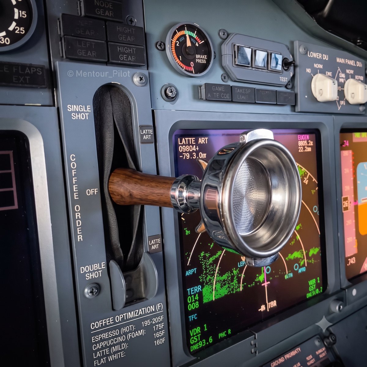
@usgraphics Or the order coffee lever

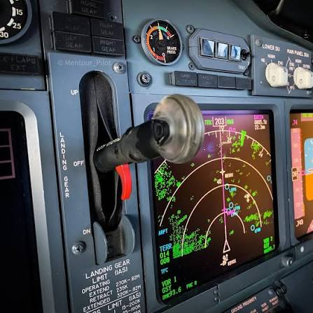
Physical switches and buttons are highly desirable in this age of touch-screenification, but these are two of the most regressive trends in modern design.


@_Stocko_ la.disneyresearch.com/publication/li… disney research generalized it.