
Glenn Hitchcock
7K posts

Glenn Hitchcock
@glennui
cd ~ / @poolsideai
Lichfield, UK Katılım Ağustos 2008
330 Takip Edilen8.8K Takipçiler


Glenn Hitchcock retweetledi


@paulelliotco @emilkowalski just added
npx skills add index-how/vocabulary
English

Design is full of codewords. Knowing them changes what you can ask for, and what you can get back, whether you're working with devs, or an AI.
“tint this neutral color”, “fix this widow”, “nudge it to the optical center”
I wrote them down: index.how/to/articulate
English
@seipent @emilkowalski just added
npx skills add index-how/vocabulary
English

@vladmoroz Cheers! Will keep adding to it as I dust off my memory going through various design tasks
English

@nicopriet0 All I can see is Beauty and the Beast with the broom
English


a medley of details from working with some very talented people @oyaaaaaaaasumi + @prekesh on poolside.ai
English
Glenn Hitchcock retweetledi

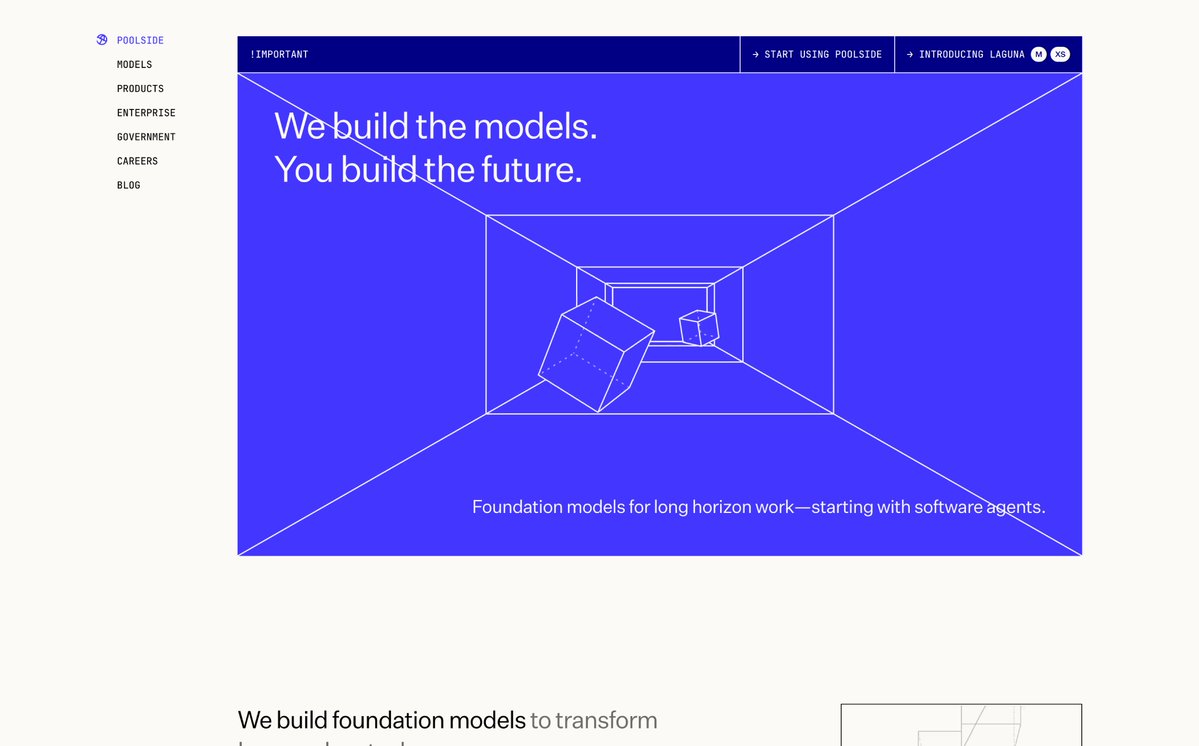
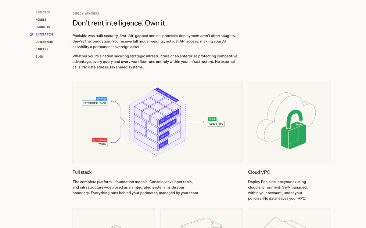
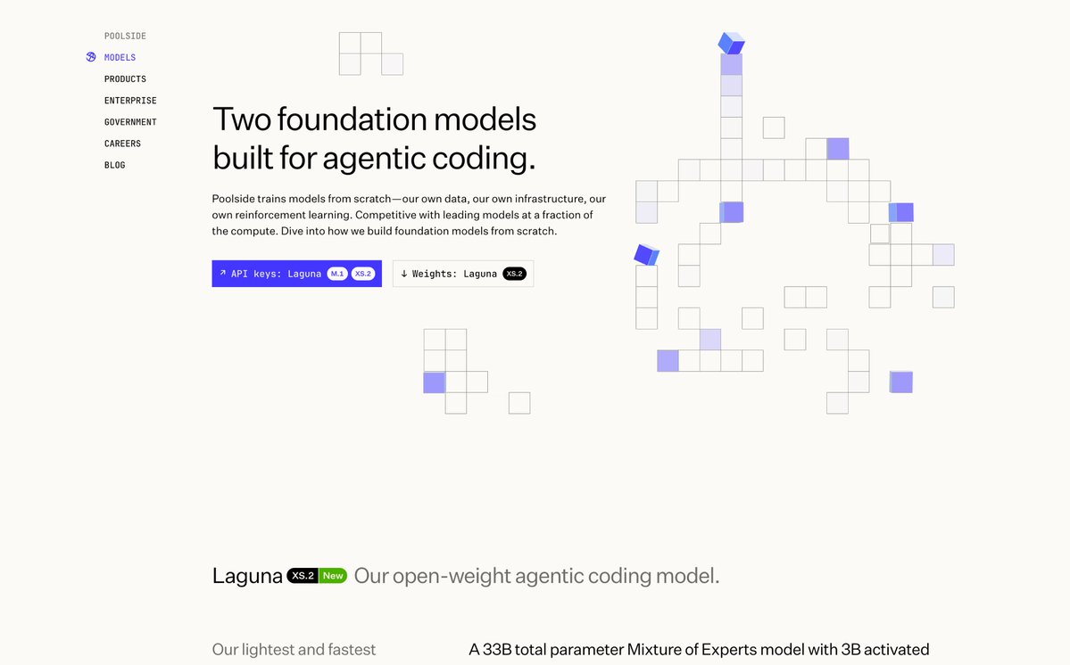
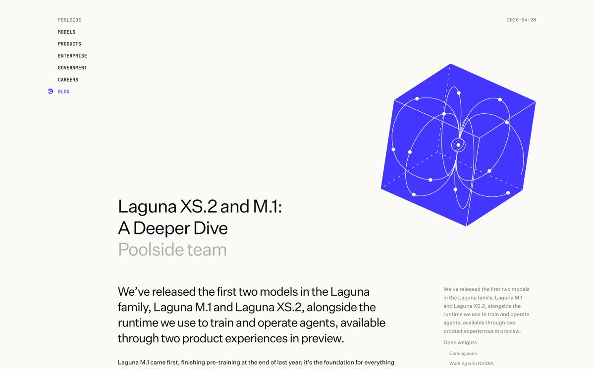
They don't tweet about it but poolside.ai secretly has one of the most coherent sites in the industry today
English
@JohnPhamous @joshpuckett @cjdowner we have TTFN, which is not a metric, but "ta ta for now"
please start using that to end your deng calls
English


@vladmoroz Think this was 2021, they may have changed it since!
English
@vladmoroz The modifier key would help select the deepest element, but any symbol (component) would interrupt it rather than select its nested elements.
Mainly to allow quicker piecing together of system driven designs, and surface powerful override choices in the inspector.
English
In most design tools clicks without modifiers select the shallowest frame under the cursor (outermost wrappers).
In Paper we target the deepest frame (most nested).
Thoughts on what we do?
English
@mayaisxyz @_christinacodes @jasminexli @samwhoo @vixclotet @RazberryChai @Bhrigu_Sr Thank you Maya! 🫶🏡
English

Welcoming neighbours to West Veopia; just a stones throw from the town plaza offering a blend of town living and nature dwelling. 🌱
So many great new residents! Check them out at veopia . net 💚
@_christinacodes @jasminexli @samwhoo @vixclotet @RazberryChai @Bhrigu_Sr @SMatsiutsia @bvvst @hugorcd @R74nCom @adjohu @pim_dev @nicoisonx @williamhzo @glennui @postimortem @abdussalampopsy @techchintan @Jeager0211 @amarelodandara @Thereallo1026 @sidhant_sarthak @osdotsystem
English


Glenn Hitchcock retweetledi
one of the projects i've been working on @poolsideai with @glennui the past couple months was working on our booths at AWS reinvent and neurIPS.
one of my fav things to work on were all the motion graphics for the various screens - in particular this transparent LED screen
English